Source unknown – Title unknown (201X)
Source unknown – Title unknown (201X)
Manuel Laval – Solos (2016)
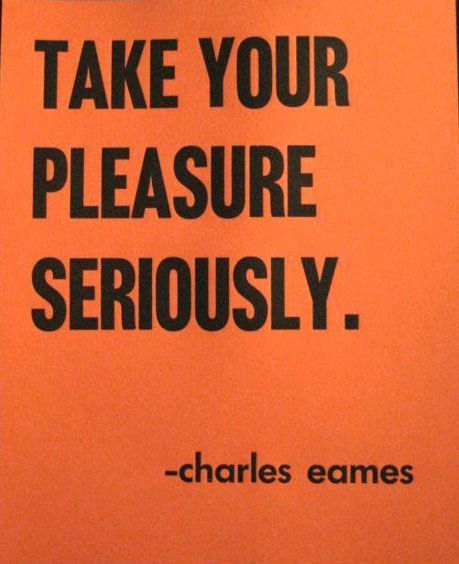
You will never be able to experience everything. So, please, do poetical justice to your soul and simply experience yourself.
—
Albert Camus, Notebooks (via fyp-philosophy)
[↑] Wayne Lazorik – Untitled (1970); [↓] Ray Bidegain – tuscany_1 (2007)
Juxtaposition as commentary

Viki Kollerová – On Being an Apple (2011)
After dinner, the weather being warm, we went into the garden &
drank [tea] under the shade of some apple tree; only he & myself […a]mid other discourse, he told me, he was just in the same situation,
as when formerly the notion of gravitation came into his mind. Why
sh[oul]d that apple always descend perpendicularly to the ground,
thought he to himself; occasion’d by the fall of an apple, as he sat in
contemplative mood.Why sh[oul]d it not go sideways, or upwards? But constantly to the
Earth’s centre? Assuredly the reason is, that the Earth draws it. There
must be a drawing power in matter. And the sum of the drawing power in
the matter of the Earth must be in the Earth’s centre, not in any side
of the Earth.Therefore does this apple fall perpendicularly or towards the
centre? If matter thus draws matter; it must be proportion of its
quantity. Therefore the apple draws the Earth, as well as the Earth
draws the apple.–William Stukeley reports an early version of Isaac Newton’s famous falling-apple-inspires-theory-of-gravity anecdote
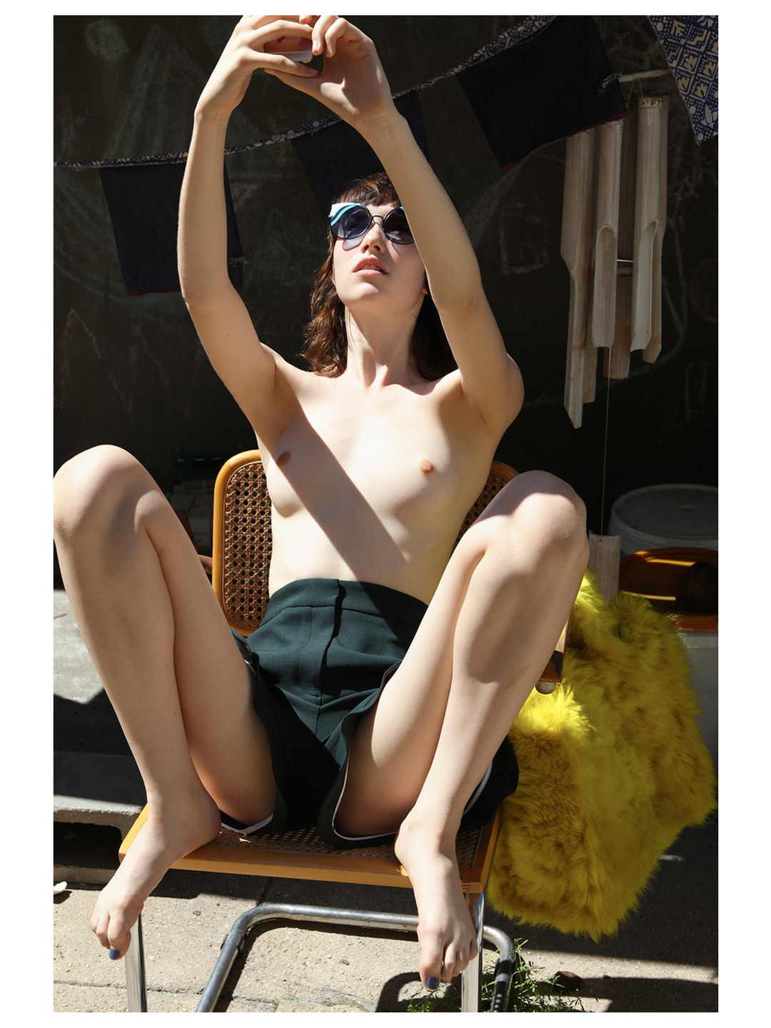
Roe Ethridge – Amazing Grace feat. Grace Hartzel in collaboration with Fendi for Document Journal (2016)
You can’t dismiss the importance of the author in the case of this image. But it’s hardly the first place I even want to go…
I mean: it’s lovely. Someone should write a dissertation on the skin tone. (Most work with exquisite skin tone accomplishes it by an Albers-esque limiting of the color palate. For example: you frame things in such a way that the color palate is limited to two complimentary colors and you limit the range of those two colors and this allows you to stretch the range of subtle gradation and range within skin tone.
And that’s part of what’s going on here–the fuzzy yellow purse, the blonde wood on the chair and the bleached khaki color of the wooden wind chimes.
It’s the flourishes that separate this work from your run-of-the-mill fashion editorial. Note: the rose gold of Grace’s phone, the azure line reflected in her shades and the green grass pushing up through seams in the concrete underneath the chairs chrome legs.
One could argue that perhaps the concrete goes a touch too green around the gills–but it’s not that bad, really. And the dynamic range in the picture is insane–especially given that the aforementioned trick with good skin tone demands a better range of mid-tones through limiting areas of extreme over and underexposure where this has (I’m guessing) probably a 9 or 10 stop range.
Let’s back track and address the author of this image: Roe Ethridge. The gallery world really likes to bend itself into pretzel shapes to justify the art-worthiness of his work. A lot of it is found or appropriated work that is retooled to a specific conceptual end. A metric shit tonne of ink has been spilled on the topic and everyone is saying the same things poorly.
Too much criticism hinges on a sort of scientific-mathematical proof of a point. I think some of it serves a purpose. Most of it? Not so much.
I get a lot of shit for being a ‘colossal dick’ when I take a particular facet of something I post here to task. Here’s the thing: the sheer fact that I posted something here means that something about it struck me as meritorious. Frequently it’s one thing and I spend ¾ of the post playing whack a mole with the stuff I want to disavow from it, but that’s another story.
My point is–to quote El Duderino: It’s just like my opinion, man. You should take it with a Gibraltar sized boulder of fucking salt. Your mileage will vary, etc., etc.
The only rule is does it blow your hair back? If so, that’s great. And if you’re interested in going a step further, start asking yourself why it blows your hair back? That is all I’m trying to do here. I’m trying to point to concrete correlations whether they are technical bits or free associations from my own experience that enhance the impact of the work.
If you disagree with what I’m saying–I’m not right automatically and you’re not wrong by default either.
Like it’s fine if you adore something that no one else really cares for. But excepting my brother–who is an asshole–it’s fine if you like the musical stylings of Creed. I don’t and were never going to see eye to eye. But generally speaking, I know a lot of people who like Creed personally but do not feel the need to evangelize for them being the greatest thing that happened ever to music.
That’s really one of the only things critics are good for–keeping artists and their fans honest.

Sannah Kvist – Untitled (2008)
Sannah Kvist = newest image maker crush.
If you’re looking at this and thinking of William Eggleston’s The Red Ceiling, then you’re eye is totally on fleek.
And like Eggleston she’s doing fascinating things with color. (I’m still too blown away by her work to start processing my thoughts just yet.)
But what’s even more interesting is the way that she borrows heavily from Stephen Shore, mixing in some Paula Aparicio and Mathilda Eberhard to keep it fresh and on the bleeding edge.
These days it takes a lot to get me worked up over an entire body of work, but I’ve spent several hours looking through Kvist’s Flickr account and she really is effing amazing.


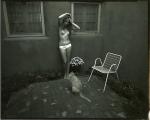
Vojtěch V. Sláma – [↖] Catherine in the Pond, Slatina, Czech Republic from Wolf’s Honey series (1998) [↗] Lucy, Jevišovice, Czech Republic from Wolf’s Honey series (2003); [↙] Ka. Te. Mi., Slatina, Czech Republic From Wolf’s Diary series (2006); [↘] On a Schooltrip, Stříbský mlýn, Czech Republic from Wolf’s Honey series (1999)
Is not the most erotic portion of a body where the garment gapes? In
perversion […] there are no
“erogenous zones” (a foolish expression, besides); it is intermittence,
as psychoanalysis has so rightly stated, which is erotic: the
intermittence of skin flashing between two articles of clothing
(trousers and sweater), between two edges (the open-necked shirt, the
glove and the sleeve); it is this flash itself which seduces, or rather:
the staging of an appearance-as-disappearance.
Suzanne Ballivet – Title Unknown (194X)
Angel lust (aka post-mortem priapism)
(Also, this reminds me of the opening scene in Deadwood: where the guy in the who is supposed to hang is worried about how he’ll die of strangulation instead of a broken neck and Sheriff Bullock says he’ll give him a hand. Bullock subsequently strings him up, kicks the platform out from under him and the guy looks bewildered and betrayed until Bullock reaches out and jerks the lower part of his body down violently, snapping his neck. The masturbating nun in the image above appears to not only be holding his hands behind his back but to also being dragging him down; there’s a sort of visual symmetry between her orgasm and his death.)


[←] Autumn Sonnichsen – Title Unknown (201X); [→] Polasquare – Ar shiúl ó na solas (2016)
Juxtaposition as commentary
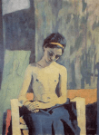

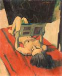
Felice Casorati – [↖] Vocation (1939); [↗] Ragazza di Pavarolo (1938); [↙] Reading a Book (193X); [↘] Nude Reader Reclining (1943)
Felice Casorati’s female nudes (c. 1930s) were known as shocking in
their time due to their unusual perspective. Whereas most female nudes
seem to dehumanize the female body by making it a subdued object of the
male gaze, here Casorati’s nudes are disinterested in their observer,
often seen occupied with other tasks like reading, reclining, or just
generally “looking away.” The unusual use of color also aids in turning
the female subject into a sickly/earthly figure whose existence is not
hypersexualized but instead becomes a source of uneasiness or intriguing
activity.
