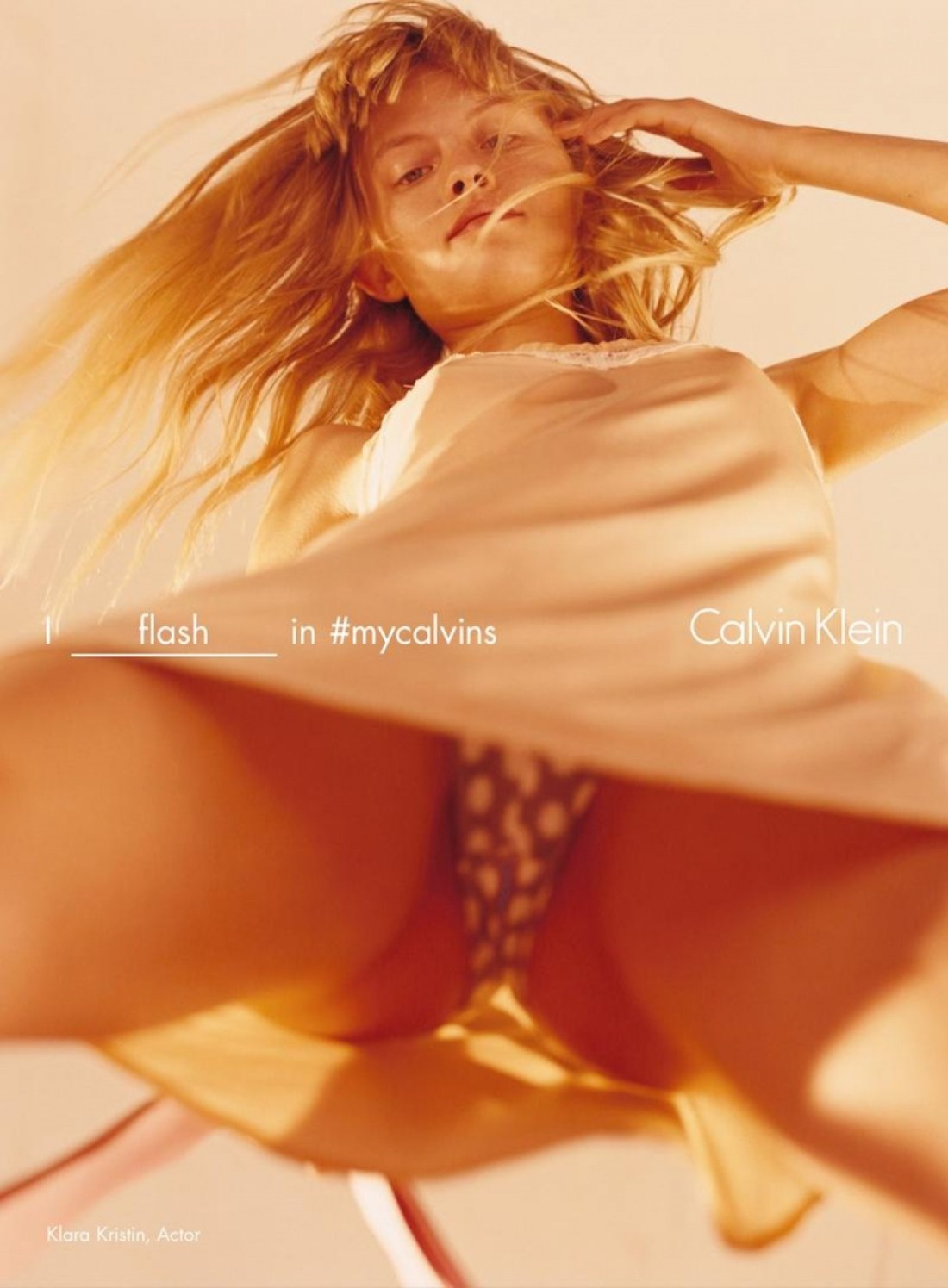
Harley Weir – Klara Kristin for Calvin Klein (2016)
Unless you reside under a rock, you’ve heard of the furor surrounding this image.
I’m normally the last person to defend haute couture edgy ad excess but in this case, I’m more than a little befuddled by the mass concern fapping fit this is causing.
While I’m not exactly a Harley Weir fan, per se, I have warmed to her work over the last few years and I know unequivocally that she’s no slouch when it comes to conceptual acumen.
There’s always going to be an ultra fine line between ‘edgy’ and ‘exploitative’. As a form, the so-called upskirt image is enormously problematic as it usually involves a complete lack of respect for consent.
There are those who will argue that this image makes a mockery of all the efforts and activism to shine a light on the problems women face because of persistent and pervasive street harassment. Honestly, I think that response is actually thoroughly lazy and intellectually disingenuous.
Yes, this resembles any of thousands of upskirt images. But there are some notable differences. The association with upskirt is implict–the viewer will make that leap independent of the image. But consider all the ways this image is different than standard upskirt fare.
Let’s ignore the text for the time being. The subject in this frame is standing with her legs apart, leaning forward slightly and making eye contact with the camera. Unlike surreptitious upskirt shots, the subject is aware, consenting to and participating in the production of the image–I mean there’s no way during an ordinary day that she’d stand like this, the reason she’s standing like this here is to straddle the image maker and her camera.
In case there was any doubt, there’s added text to make sure no one gets the wrong idea–I flash in #mycalvins. Note: that the implicit assumption inherent in the form is that this is an upskirt image; thus the subject is passive and unaware. That’s not the case here. But to obliterate any sort of ambiguity, the assumption is turned on its head by making the subject active in the exchange–it’s not upskirt, it’s flashing.
Next, the objection that the subject’s haircut is intended to make her look pubescent is countered by text identifying the model as Klara Kristin–who is 23, a grown ass women by any known metric. Further, she appeared in my sworn mortal enemy Gaspar Noé‘s latest ‘cinematic’ shit show Love (where Kristin engages in explicitly graphic unsimulated sexual intercourse on screen).
Lastly, the objections that it unnecessarily sexualizes her is actually aggressively countered by the actual grammar of the picture. Yes, we can see up Kristin’s skirt but she’s also aware of and there’s reason to believe that she’s consented to this sort of picture being taken even without the text. But the most stunning oversight of all is that yes, while her underwear is ostensibly the focus of the image, note that the point of sharpest focus is actually her face–and that runs counter, from the standpoint of visual grammar, to any of the knee-jerk objections that get tossed towards this work.
However, what’s most telling for me is Weir’s response.
So I think it’s stupid and slut-shame-y and dumb to argue that men are going to see this and it’s going to fuel more aggressive harassment. It’s like arguing that it’s not rape culture which fuels sexual assault, it’s clearly got to be porn that inspires men to rape. And sorry, but I’m done with that bullshit, specious, critically weak tea noise.