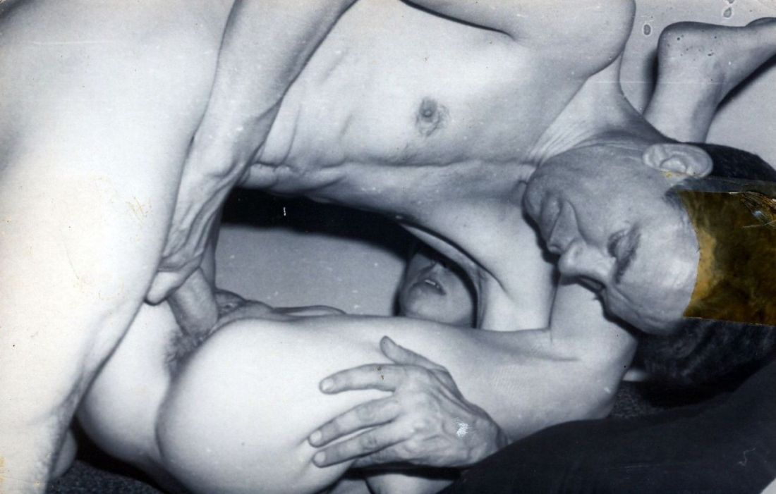
Source unknown – Title unknown (19XX)
This photograph is not an example of a photo ruled by the golden ratio.
However, the way the composition leads the eye through it does trace a track not unlike the Fibonacci Spiral.

Source unknown – Title unknown (19XX)
This photograph is not an example of a photo ruled by the golden ratio.
However, the way the composition leads the eye through it does trace a track not unlike the Fibonacci Spiral.

Sergei Shekherov – I Hadn’t Anyone till You (2015)
This would be utterly unremarkable were it not for two things:
Taken in the context of Shekherov’s status as a citizen of the Russian Federation and given that nation’s open hostility to LGBTQ+ folk, there’s a tension between the prosaic studio setting and the audacity of what is depicted.
The title speaks to something universal: the human feeling of being alone in the world and desperately seeking out a partner. Add the gayness of the work and the meaning deepens, encompassing the complexity of looking for someone when your experience and expression of sexuality is outside the mainstream norm–and how much more finding someone with whom you can share your authentic self means.
Then there’s the undeniable similarity to David along with the fact that unless I’m mistaken the clothed man is Shekherov–pointing to an experience of the erotic in relationship to masters and masterworks of art. (It reminds me more than a little of Luisa Terminiello work hard.
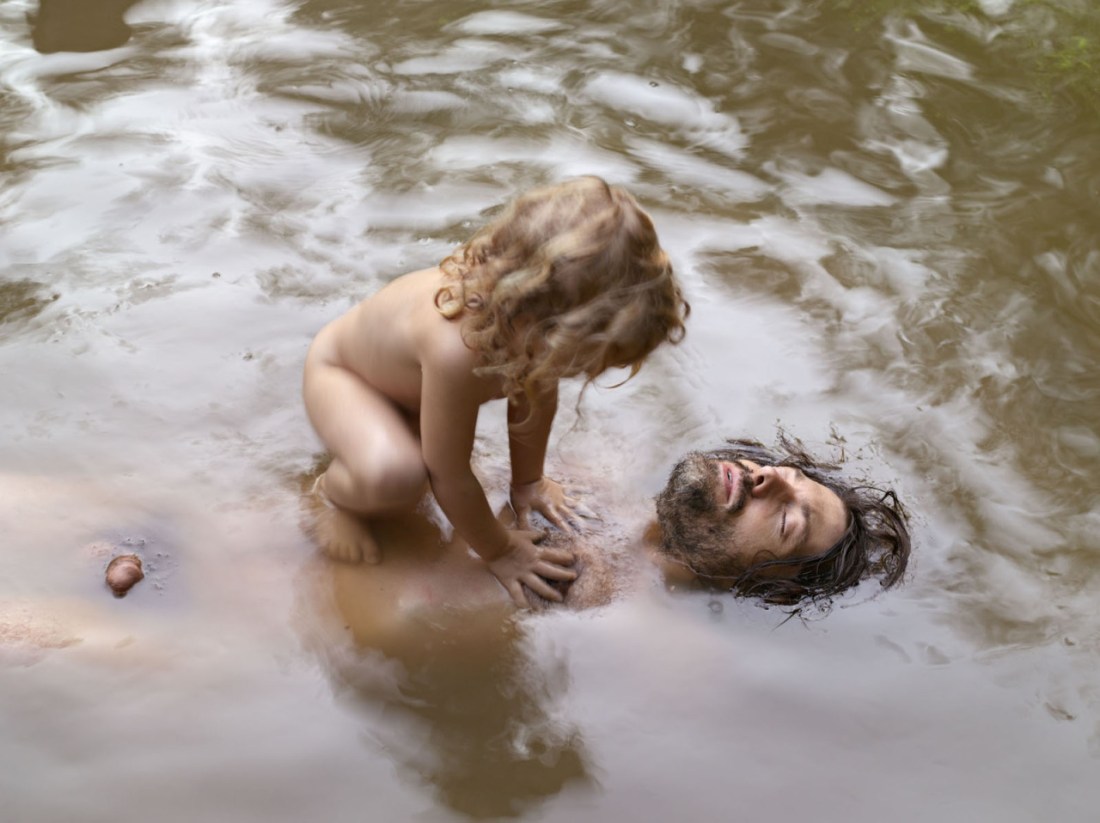
Lucas Foglia – Patrick and Anakeesta, Tennessee from A Natural Order series (2007)
If you’ve studied photography at all, viewing Foglia’s work–besides being an utterly joyful proposition–is likely to be a bit like Where’s Waldo; except instead of finding the ambulatory nerd decked out in a red and white striped shirt, you’ll be registering the effing myriad of prominent photo-historical influences.
There are two influences that I think are especially relevant to consider in the context of this image: Sternfeld’s Sweet Earth–which might best be seen as an initial survey upon which the series which contains this image (A Natural Order) is a more focused examination with a decidedly humanistic approach; and Fred Hüning’s ground breaking handling of nudity as entirely common place, even as it forms a spectrum from incidental to overtly sensual.
On a personal note, this image in particular resonates with me fiercely. The reasons aren’t something I can share in their entirety due to matters of privacy but I’ve maintained in a steadfast fashion that I have no desire to reproduce. There are two factors informing this notion:
However, during an intense conversation with a very dear friend–friend is nowhere near strong enough a label, perhaps ‘lover’ is closer were there a way to subtract explicit sexual intimacy from the term–she noted that she wants to have a child because while she understands and agrees with my analysis, the world isn’t going to improve unless people who care are willing to risk stepping outside of their comfort zone and try to build a better future. And the simple fact is: a better future requires the continuation of the lineage of people who believe in gentle dreams.
And in that moment and still in this moment, I felt a longing I cannot name and the only expression I can give it would be to have said to her: if it was with you, I would want a child, too.
Life is strange, yo; life is strange.

Hart+Lëshkina – Command to Look for Near East (2015)
Such thoughts/feels about HART+LËSHKINA; I am at a loss as to how to even begin addressing their work.
I guess as good a starting point as any is their compelling compositions. If you’ve followed this blog for any length of time, you’ll know that I’m hardly a proponent of vertically oriented photographs/digital images. In fact, I’m rather inclined to dismiss the vast majority of such work as #skinnyframebullshit.
HART+LËSHKINA‘s are a sterling exemplar of how to do vertically oriented framing masterfully–emphasizing an up + down over the left + right image reading default. (Also: while their vertical images absolutely stand on their own, they tend–at least with this editorial–to pair two vertical compositions as diptychs. This is a prescient strategy as far as balancing between orientation shifts but it also works to create a flow not only between images but also across the entire body of work.)
They do an insane amount with very few elements. (If you’ve ever worked in an essentially empty houses like this, you’ll know setting up rigorously staged images like these borders on impossibility.)
There’s a studied patience to everything–the way the pattern of the light passing through the windows is broken by the kneeling figure and broken again by the reflection off the open window we can’t see that is echoed by the open window we can see.
But the thing I like most is that instead of falling into the dichotomy of nudity as signifier for sexual subtext vs nudity as a natural extension of self (and when intersecting with visual representation, a means of expression thereof), this duo takes what I always feel to be the far more interesting route of poo-pooing the dichotomy and presenting it as if it’s simultaneously both and neither.
I also can’t help but think about another conversation I had recently about the pros and cons of the mass proliferation of digital. On the one hand, yes, there is absolutely merit to the notion that digital is a democratizing force. These days the obstacles to accessing a decent camera are fewer than they’ve ever been–and that’s not to discount folks the world over who are still struggling to find clean water and enough to eat. (In other words, it isn’t all about who has a camera and who doesn’t, there are ultimately other more pressing considerations.)
Yet, I don’t believe that this democratization has led to the sort of expansion in vital, important work. In fact, I think that the only real expansion is in half-assed, arrogant or just straight up bad work. And one of the fall outs from this is the expansion of a curatorial class.
As a curator (ostensibly), I have pervasive concerns about curation due to the fact that a curator’s purpose is to sift through impossibly large information reserves and then pass along the best and brightest bits. No matter how much careful consideration on the part of the curator, the resulting decisions are informed by personal bias, prejudice, etc.
On it’s own, that’s a huge problem. But then consider the fact that it’s impossible to sift through all the information and therefore every curator has enormous blind spots. For example: how long have HART+LËSHKINA been around and despite the massive overlap in what their doing and my own personal photographic preoccupations and I’m only now learning about them. (I mean: yes, they work primarily in fashion/editorial, which is decidedly not my bag, baby; still, it makes me wonder sometimes if maybe curators create more problems than they resolve.

Terry Smith – Cory on the rooftop of LeStat’s here in San Diego, California (2006)
This isn’t an image you’d ever claim was ‘good’; the focus is soft, the pose is awkward given the composition (or the composition is awkward given the pose–flip a coin) and although it’s less frequently imposed in creating male nudes, this orientation is inherently tied up in an art historical tendency of the body as object, i.e. the dominant eye standing above a supine figure.
All that being said, it is interesting because everything I just finished criticizing is what ultimately makes the image interesting–the soft focus causes the the boy’s skin to stand out against the filthy rooftop, the pose is neither full passive nor entirely active (due to the right leg being elevated off the ground and the objectification is clearly a primary impetus for the picture’s creation.
Also, I’m taken with this because while I’ve never been to LeStat’s, several of my friends do frequent it and speak fondly of the place.

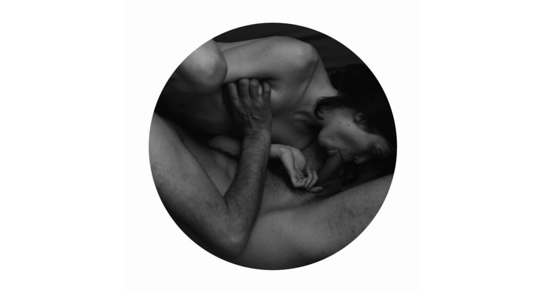
Source unknown – Title unknown (2014)
I am super supportive of work that’s trying to recast bullshit heteronormative assumptions pertaining to MMF.
The frustrating thing is the vast majority of it is artless garbage. (I mean seriously, do a Google search and see how fast you X out of the image results tab.)
I like this for two reason–first there’s at least a baseline of thought with regard to composition. Her body shifts the gaze from left to right. The angle of the cock she’s kissing the head of pushes back against that drift and subsequently you follow the angle of guy in the rear’s erection which he’s pressing into the boys puckered lips.
The lighting is warm and inviting and there’s just enough black in the frame to invoke the tone and tenebrism of someone like Rembrandt.
Second: this is one of those things that I look at and think, oh hey, decent concept but I think it would be better if…
In this case: I don’t care for the way this lens compresses space. (It’s probably a result of optical zoom on a zoom lens paired with APS-C sensor pushing towards the telephoto edge of the spectrum.) Also, the angle of view is super porny as far as let’s make sure everyone gets a good view of the action.
I can see pulling the camera back a couple of feet but then you’d have to deal with some of the additional negative space. In which case, she would have to have a finger in his anus or something to justify the wider perspective.
I’d actually love to restage this and execute the following adjustments: Turn the action so that the boy laying on his back is about 15 degrees off parallel to the focal plane (instead of perpendicular to it as above). Reposition the other guy so that he is kneeling behind the boy with respect to the camera, so that it’s possible to still present his action so that it is legible for the camera.
The woman would stay in more or less the same position she is now, but with the scene rotated 90 degrees so that you can see both the way she’s kissing him as well as her genitals since her butt would be facing towards the camera. Maybe angle her slightly so that it’s visible but not blatant.
The frame would be closer to a panorama and I’d play up the sort of Baroque lighting to sort of recall the gratuitously over-the-top everyone-rolls on molly and relives their birth scene from Sense8–which is actually a decisive nod to Eugenio Recuenco’s work.
Madeleine Froment – Untitled from Accord/#1 DM series (201X)
I make a pretty solid effort when it comes to familiarizing myself with the work of the artists I post here.
Frequently, I find that while a particular image resonates it seemingly telegraphs to my eye that the I will end up considering the rest of the work an–at best–mixed bag.
It’s frustratingly rare to find work which truly fans the flames of my curiosity.
But when @reverdormir2 posted this drawing by Froment, I was immediately taken by it; I don’t know, I think it’s the obsessive and perhaps even a little awkward details of the hair–the way her hair obscures her face, the careful rendering of the hair on his back, arms and legs, the texture of his beard contrasting against her tightly cropped pubic hair.
I clicked over to her web site and promptly dropped into a sensual erotic K-hole for the better part of an hour.
For the record, not all of her stuff works. But unlike the majority of intellectually dishonest wannabe creatives out there, she doesn’t foist the work on her audience despite its flaws. Instead, she presents the work in a fashion that patiently bridges the gap for the audience between the impetus for the work, the details that drive and enliven it–all subsequently recontextualized in the final work.
It’s really goddamn ingenious. However, what makes it even more exceptional is the degree to which Froment understands her own aesthetic peculiarities and formulates her installations in such a way as to further compliment it, but to also enrich the complex relationship between the work and the world it inhabits.
If you think I’m being a pretentious blowhard and talking out of my ass, just browse through her website and notice how the work flows from documentary like snapshots, to more refined images which in turn provide prima materia for her spare, meticulous drawings. Note: also the holistic way each project is presented to emphasize how the work is supposed to be viewed–ethereal (representative) vs actual (representational).
This is extremely high end work. And it’s thrilling to see an artist this young and this preoccupied with the sort of topics that I think are all too often excluded from artistic discourse–much to the detriment of Capital A Art, unfortunately.

Amy Harrity – Untitled (2016)
I often painted fragments of things because it seemed to make my statement as well as or better than the whole could.

Lucian Freud – And the Bridegroom (1993)
Can you believe a decade ago I detested Freud’s paintings? Like really super hated them–I think it was something about their stretched, obtusely rendered perspective.
I do not feel the same way these days and I’ve become borderline obsessed with his work. His use of color–minimal around the edges and growing more layered/nuanced the closer the eye draws to the subject(s).
It’s almost as if everything in the work is designed to draw attention to what can only be inferred–i.e. the psychological state of the subject(s).
It’s a brash maneuver to have everything function solely to the end of conveying something that can’t really be fully communicated through visual depiction.
That Freud manages it so frequently and with seemingly so little effort is so improbable, there’s only one way to accurately encompass it: unmitigated genius.
Here’s to being wrong–and the growth/evolution that arises from being willing to admit it.
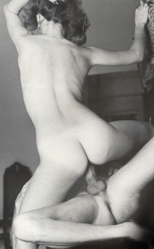
Source unknown – Title unknown (197X)
I am half agony, half hope.
— Jane Austen, Persuasion
