Apollonia SaintclarL’archipel du plaisir [Liquid joy II] (2016)

During my undergrad stint, I flirted with layout and design..

There was something heady about pre-CS Photoshop image manipulation that appealed to me. I could take existing pictures and turn them into reasonably compelling posters for campus events.

I called what I did graphic design. And for the most part, I never said it loud enough or in the company of anyone who was a legit graphic designer until after I graduated.

But as I came into contact with folks who paid their bills doing design related stuff. I quickly learned that being able to layout out a flyer was only a fraction of what graphic design entailed.

Pros were always obsessed with the pedigree of typefaces, serifs vs sans serifs, integration of content and form.

Generally, I found such people intolerable. The work they made was thoroughly accomplished in a utilitarian sense but lacked passion and flair. (It would take me a full five years to realize that although I wasn’t really interested in graphic design, I am very interested in the underlying notions of UX/UI in regards to design.)

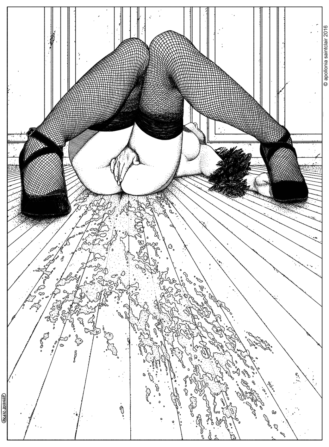
Anyway, I mention all that because two terms that design folks toss around a lot are ‘minimal’ and ‘clean lines’. And those are two terms I would use to describe Saintclar’s work.

As far as terminology goes: ‘minimal’ with ‘clean lines’ might as well be pointless in their ubiquity. However, given a visual context, they can be useful when it comes to orientation.

For example: Saintclar’s work always reminds me of Dürer. But it’s an association in negative–by that I mean, although Dürer’s work is maximal, he uses space and line in a very similar fashion to Saintclar.

Yet, what I also appreciate about Saintclar is that the artist uses lines in a surprisingly varied manner. They can imply shape, give form to negative space or–as above–emphasize dimenstionality.

What’s more: the framing is actually ingenious. A lesser artist would’ve inched the frame back enough to include the full swath of the messy on the floor. By allowing that to trail out of frame, the viewer is given a sense of continuity of space beyond the frame edge. Combined with the fact that the perspective is render in such a way so that vanishing point of the image is hidden behind the woman’s hand, it presents an image that is both erotically charged and artfully composed. (This is definitely not some #skinnyframebullshit due to its internally consistent use of composition and the fact that it is mindful of the fact that the viewer’s eye is meant to wander up and down instead of side to side.)

Source unknown – Title unknown (201X)

From a technical standpoint, these images are rull bad–over exposed (most likely due to a low-end digital device with limited dynamic range), the framing seems pretty much random/offers limited context regarding setting (most likely due to limitations presented by the layout of the room) and there’s no evidence of any kind of blocking/staging.

Now, that third bit ends up working–to a certain extent–in favor of the images. The more or less cluttered composition and technical limitations draw attention to gesture and expression. For example: I absolutely adore the way the young woman on the right is watching her friend attentively while her friend seems pretty much focused on her own personal interior experience. (It’s charming the way the young woman on the right is pretty much always trying to touch her friend’s skin–even if it is only a small part of her leg. Also, note how both their legs drift open as the sequence progresses.)

There’s something else I noticed that I think warrants comments. It’s difficult to see but I thought for the longest time that the images we posted out of order. I mean: in the first frame it looks like the young woman on the right has already discarded her underwear, whereas it’s definitely still on in the second image. I spent about five minutes looking back and forth to realize that she’s pushing the vibrator down the front of her undies in the first image. I really like the way that the young woman on the left is less apprehensive about being more undressed but seems more shy about masturbating in front of someone else, whereas the young woman on the right seems perfectly comfortable with masturbating but less so with being nude.

I feel as if this is one of those images that while decidedly not art in it’s present instantiation has a great deal of potential to be–with better craft and execution–Art. The subject is resonate, the interpersonal dynamics incisively rendered and whether intentional or not the staging of the sexual action away from the camera at worst sublimates the typical issues of the art historical male gaze; or, as I would argue: frustrates them.

And I will offer one piece of unqualified praise: even with the intense overexposure the attention to color is astute–the pillows contrasted with the sheets. The matching pink of the pink top and the other woman’s pink knickers vs. the orange top and purple knickers.

Ivan AlifanThe three graces (2016)

This does several things very well.

Although much of oil painting art historically centers on mythology (Greek and Roman or Xtian), most renowned oil painters were decidedly secular humanist in nature.

The tropes of mythology and religion were widely legible, there was built in interest (due to the universality of public familiarity) and generally if someone had money to hire an up and coming painter, depending upon their particular bent–mythology or religion could be counted on as a source of inspiration.

There was also certain visual coding associated with either. Whether it was the saints or a bible story or an incident from the Illiad, there were interesting technical considerations about staging, technique, etc.

But there was also the way many artist filtered the making of their work through their sexuality. I’m thinking here mainly of Leonardo and Michelangelo, but I’m pretty sure you can follow the trajectory of painting while illuminating this tendency.

What I find clever about this is the way that it–instead of making the myth/religion its pretext, it places its interest in the sexual front and center.

However, in doing this, it’s accomplishing a clever sleight of hand. Because if you know, The Graces were Aglaea (Beauty), Euthymia (Grace) & Thalia (Good Cheer/Festivity).

The first bit about this is to note that all three were Zeus’ daughters and therefore this isn’t just a lesbian menage a trois–it’s incestuous to boot–something you aren’t going to know unless you understand the mythological context.

It’s interesting to play attribute the correct name to the correct figure. My best guess is right-to-left: Aglaea (beauty is inherently untouchable), Euthymia is straddling Aglaea having her clitoris sucked on by Thalia–grace being a singular experience and good cheer requiring both being merry and making merry.

But what I think I like the most is that this is staged to titillate the voyeuristic viewer, but the angle is such as to thwart any sort of expectation that this scene was staged specifically for the so-called male gaze.

Source unknown – Title Unknown (201X)

It feels like this clip’s raison d’etre is: Beautiful Agony is cool and all but wouldn’t the format be improved by a more DIY approach.

As you can see there’s trade offs. this avoids BA’s almost universal flatness by setting the action in what appears to be a field in the waning light of the evening golden hour.

Instead of the crisp, clear sound, gusts of wind completely exceed the range of the on-camera mic–resulting in cringe inducing soundtrack blow outs.

Also, I don’t really understand the framing. Yes, it allows reasonably wide coverage wherever the subject moves. But the tripod in the lower right corner is distracting.

Perhaps that’s the point: a sort of Kubrick’s Full Metal Jacket-esque meta commentary (the numerous dolly shots that track camera men shooting similar tracking shots); but it comes off as a little too ambiguous to successfully tic that box.

Criticisms aside there are some goddamn fucking phenomenal things to celebrate here. When the sound is clear, there’s texture and timbre to it that conveys a blush worthy degree of explication to any otherwise implicit image. Further, it’s lovely how the cruddy video renders the patina of sweat in the dying light.

But as if that wasn’t enough where this clip actually comes into its own, is when you realize the seemingly orgasmic echoes are the result of a second woman–who is very much like the woman we are watching, positioned facing a camera mounted on the tripod visible in the lower right corner.

Nicholas Noisenestglamourmatic glowstick . subclitoral squirt gun (2012)

Believe it or not–despite my many misspellings, myriad grammatical errors and the fact that I routinely forget to include the sort of quantum connective tissue that connects my various notions–I am exceedingly self-conscious about my writing.

So I’m aware that by this point it’s almost a formula for this blog: I start of a post saying I really don’t like X, Y and Z but I’m super down with P, D and Q.

Yeah, yeah–sometimes I invert the order but mostly with the exception of the confessional personal posts or unmediated compositional analysis, I’m an appallingly predictable writer.

For example: the only way I know how to approach the above image is by first subtracting the things I (strongly) dislike about it. The combination of monochrome and strobe clearly asserts an affection for Nobuyoshi Araki’s Tokyo Lucky Hole.

There’s less than no love lost between Araki and myself. But from a technical standpoint this isn’t even thoughtfully derivative work–yes, Araki was using flash and B&W to capture salacious scenes but despite my distaste for most of his work, you can’t dispute the man’s tech chops. Whereas Noisenest–while at least not using the strobe mounted on his device, positions it in such a way that it casts an obtrusive shadow behind the woman. (It’s also #skinnyframebullshit.)

And for a work that appears so self-conscious about its family resemblance, the execution with the strong and the stylized tonal gradation, all work at cross purposes given the Araki impetus. (Araki is afterall and if nothing else grossly immediate in his presentation.)

However, all these (admittedly damning) critiques aside, it does strike me that this instinctively gets something about erotic photography that I haven’t realized before–specifically with regard to ostensible depictions of masturbation; namely: there’s a knee-jerk tendency to frame the scene as something habitual instead of something novel.

The distinction I am trying to draw is that we tend to make work featuring folks masturbating in bedrooms or bathrooms–spaces that exist hand in hand with a degree of personal privacy. Thus, images produced given that sort of framing, tend to serve more as mirrorrs; the viewer responds to them based on their response to the person depicted.

While that is probably an honest depiction of probably about 65% of masturbatory experience, there’s also the part that is experimental and boundary transgressive. The instinct that doesn’t want to be caught but wants to press up against the notion of this is private and that is public and never the twain shall meet.

I mean I don’t think I’m the only one who has masturbated in strange places either because the moment felt right to do so or a libidinal itch demanded scratching without recourse to all the locks and catches of safe privacy.

And I think there are certainly ways of hybridizing these two extremes, but I think if you can’t be bothered to present indications of a fully developed, three dimensional individual when depicting masturbation, that you can at least bother to recall the sense of urgency that drove you to transgress boundaries and use that as a conceptual starting point.

What Noisenest intended to do that with this image or not, he succeeds stunningly in at least that one regard.

Anna CladoniaVarious Portraits* (2010-2015)

I’ve been thinking about Emily Dickinson a lot lately.

Not due to any connection between It Sifts From Leaden Sieves and the fact it’s snowing balls outside right now. (Although I am hardly oblivious to the synchronicity.)

But, on that note, why do we teach Dickinson to middle schoolers by introducing them to the myriad complexities and nearly infinite scope of her work via the aforementioned poem and A Narrow Fellow in the Grass? It’s no wonder I hated her work until I revisited it in my twenties and immediately fell in love with the work and the incredible woman who made it. (Seriously: the think-question you tend to get asked on first dates about what person living or dead you’d most want to have dinner with, yeah… Emily Dickinson all the way. Even if I have grown to strongly prefer Bishop’s body of work.)

I promise… this seemingly self-indulgent ramble does relate to Cladonia’s devastating photographs–bear with me a bit longer.

My objection to the way Dickinson tends to be taught is that it tends to emphasize the allegorical (nature imagery) over the more metaphorical work. You’d do much better to start with the exquisite, goth-before-goth-was-a-scene I Felt a Funeral in my Brain… Couple that with the fact that the window to Dickinson’s bedroom overlooked a cemetery and even twelve year-old’s can easily grasp the incisive eye which uses words to describe the landscape of a morbid imagination.

However, once you dig into Dickinson–I mean really dig in–one line of hers takes on profound resonance: “my business is circumference.”

It’s an odd claim–especially from a woman who never traveled further than a day away from the house in which she was born. Yet, the acuity of her perception and her openness to the world and experiences in her immediate surroundings taught her in a fashion not unlike that of a storied traveler.

Cladonia exhibits a similarly circumscribed scope. Her photos are ostensibly portraits–largely shot in ramshackle Moscow apartments. But within those narrow parameters there’s evidence of an encyclopedic familiarity with the history of photography.

Beyond the essential Russian-ness of her work, the astute viewer can easily recognize winking references to virtually every Russian image maker I’ve ever posted on this blog–but especially to Igor Mukhin and Evgeny Mokhorev.

But there’s also grace notes from David Hamilton and Duane Michals.

Having and wearing your influences on your shirt sleeve doesn’t necessarily make for good work, unfortunately. But what Cladonia manages is less homage than a point of loving departure–she takes a great idea that resonates strongly with her and makes it her own.

In and of itself–that’s the mark of a truly great photographer. But there’s also the way she embraces and eschews obtrusive image grain, her spare and gorgeous use of autochrome-esque color (I + II). And that’s not even getting into her revelatorily explicit handling of masturbation and sexual expression.

 Evgeny TimofeyevNightlife (2015)

Although I’m not fond of virtually all Timofeyev’s work, I adore this picture.

It’s very in-the-moment, both philosophically as well as self-consciously aware of the flavor of the week with regard to prevailing trends in fashion and editorial image making  in 2015.

The flash contributes a (false) feeling of documentary immediacy–this scene is very obviously contrived. Yet at the same time the way the head is turned away–which can be interpreted as either the result of being in the throes of self-pleasure or (probably) more likely an acute preoccupation with retaining a degree of anonymity. (Really, if I’ve said it once I’ve said it a hundred times–putting in the creative labor necessary to figure out how not to decapitate the subject with the frame edge pays off in spades. And if you need further examples besides this, @thewillowrae has been goddamn fucking killing it lately.)

Clearly, this shot is intended to imply a masturbatory scene. At the same time it has this feel that both the photographer and the young woman, have maybe had a little too much to drink and the suggestion is made that a picture feigning masturbation be attempted. There’s a sense that while this is staged, that it’s teetering on the line between staged and actual by nothing more than the virtue of a strong willingness to entertain the premise.

Finally, I don’t normally like images where the verticals take on such an intense angle. Here it may be the thing I like most about the image is the fact that the tilt is motivated by the way which the woman is pushing her hips forward and leaning backwards against the wall to engineer a non-horizontal/non-vertical angled plane.