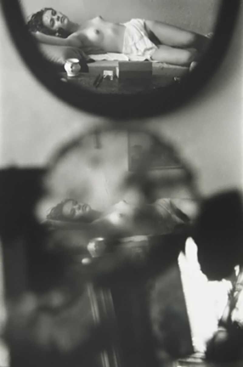
Saul Leiter – The Young Violinist {Young nude on bed, reflected in mirrors} (195X)
If Leiter came up in conversation, I would probably think: Leiter? Leiter… mid-century American photographer, maybe?
In other words: I know little about him or his work. So little, in fact, that I don’t know whether the photo above is more authentic than the one I first encountered:

The landscape orientation is more even handed. (There’s a better exposure balance across the frame–pay close attention to the reflection of the bedside table and the detail in the subject’s coiffure; also: the sepia-like toning contributes a nostalgic softness that resonates with the content in a flattering fashion.)
The horizontal frame is noticeably less contrast-y, however; this additional contrast contributes to the skinny frame both a sense of solidity and dramatic immediacy.
Which variation is more effective?–Well, I’m going to surprise myself by bucking my own generaized antipathy towards #skinnyframebullshit and side with the the vertical orientation.
Why?
I think it’s better to start off with the fact that we are accustomed to conceptualizing the orientation of a frame in terms of portrait (vertical) vs landscape (horizontal). Usually, one of my objections to this is that it suggests too much of a paint by numbers approach to composition. What is the photographer/image maker trying to depict? Grace Hartzel? Portrait orientation. A scene in nature? Landscape.
It’s not that it’s bad advice, necessarily. It’s that it begins from an unconsidered assumption–and thus the basis of the composition is taken as given. (Also: considering that as far as I can tell the portrait vs. landscape dichotomy is largely a function of standardizing output that is then retroactively applied to the creation of the photo or image.
I think it’s better to make a decision with regard to orientation based organically on the scene at hand and what of it you want the viewer to see (and subsequently how you want an audience to see what you are showing them).
A vertical or portrait orientation is naturally predisposed to drawing the eye of the viewer up and down over the frame; whereas, a landscape or horizontal framing creates a side to side visual flow. (I haven’t actually tested this theory but I suspect that if you were to divide art history into works that are explicitly spiritual vs work that is secular. The former would favor vertical orientation and the latter would favor horizontal orientation by–I would guess–at least a 3:1 ratio (e.g. if x is the number of spiritual works that are vertical and y is the number of spiritual works that are horizontal, then X:Y).
In this case the sepia horizontal frame does a better job of moving the eye over the work. Unfortunately–and this is another of the issues I normally associate with #skinnyframebullshit: there’s a self-consciousness with regard to the composition. Like, yes–the eye does move over it better but in scanning it you are faced with questions of what sort of gravity is acting on this scene? Oh, wait: the photographer is fucking with perspective. OK, but to what end? And that’s where a common sense question begins to lead you down a path away from anything suggested by the work itself.
Additionally, the less-contrast-y sepia version doesn’t clarify anything pertaining to what is too close in the foreground to be in sharp focus. My eye tracks right and gets trapped in the mirror frame in the horizontal version.
The vertical version opens that up a bit and because my eye enters the frame from left to right and then drops, I find myself scanning the image up and down across the entirety of the composition instead of getting stuck on one facet.
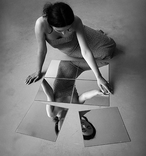
Lastly, I feel it’s relevant to add–I am more than passingly irked by the use of ‘young’ in the title. I get that it’s a clever way of echoing the two reflections in the frame–reflections which are in themselves already doublings. It reminds me of the way that men tend to refer to women they find attractive as ‘girls’. I’m of a mind that when men do this it is always a red flag. But I’m especially attuned to this because I watched Hannah Gadby’s Nanette last week and it shook me. I suspect if you were to watch it and come back to this photo, you’d have a pretty good idea what I’m trying to get at. Unfortunately, I’m not sure how to articulate it yet so you’ll have to accept my inarticulate pointing for now.