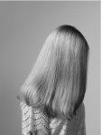
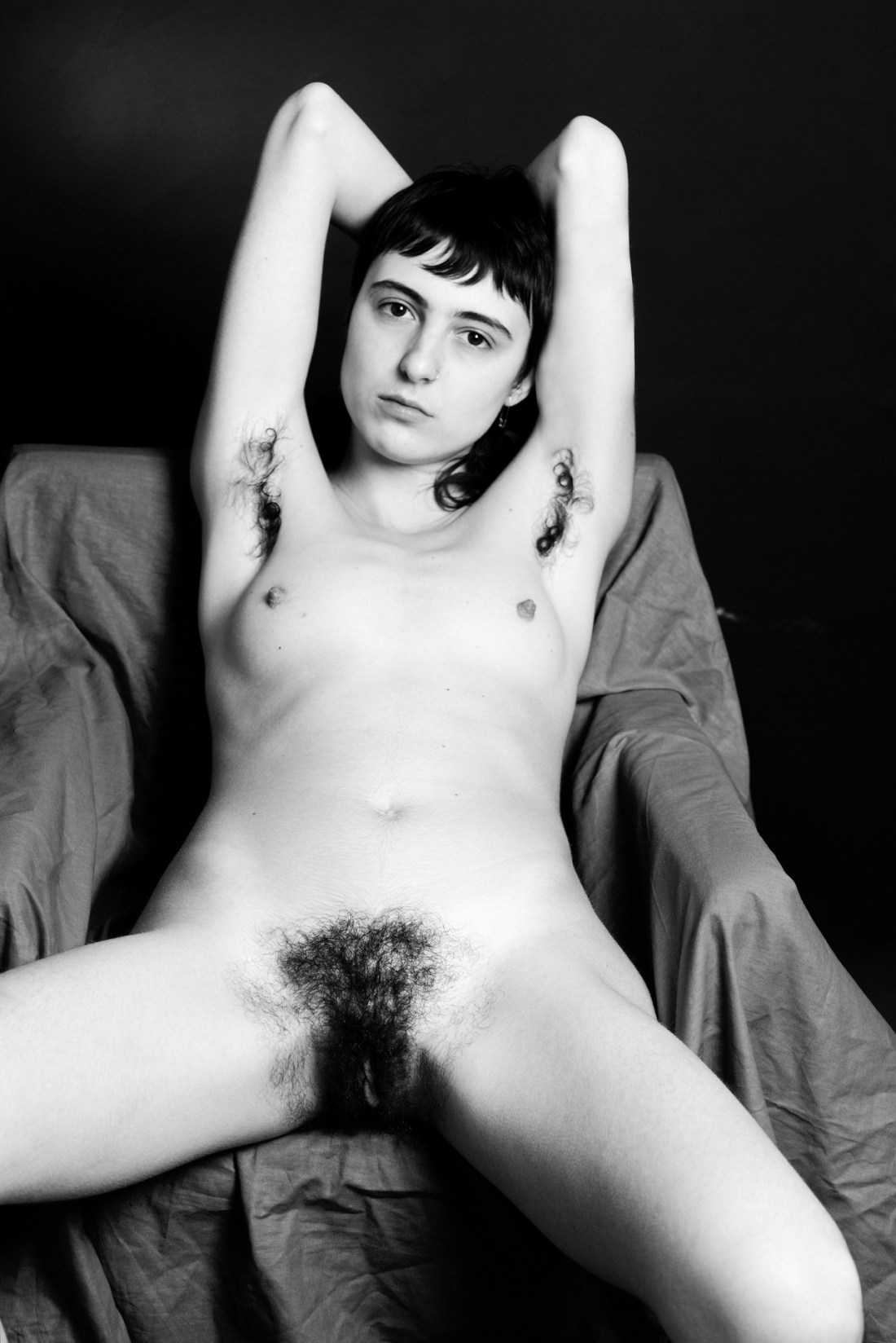
Source unknown – Title unknown (201X)

As much as there are performative heteronormative expectations when it comes to the FMM threesome, i.e. it’s perfectly upstanding, straight and good as long as penii don’t touch…

…it’s not something I’ve ever understood. But this makes me think about the mechanics of what porn instructs is the most common bodily configuration for two penis-havers engageing with a vagina-haver.

Like the owner of the lower cock is mostly passive. (If you’ve ever seen these scenes, it’s nearly impossible to get a workable rhythm going and the movement of the person in the middle is only really compatible with the person who is able to thrust and retract.

Second–while any sort of consensual sexual sensitivity is good in my book–there’s a way in which this configuration almost certainly amplifies the sensation of the person in the middle. Two of three orifices are full and there is skin to skin contact in both directions. That alone would be an emotional and intense feeling for me–even before you got down to whether it was pleasurable.

Then there’s also the way that in the heteronormative world there’s this proscription against penii touch. (For that reason I’m always interested in depictions of vaginal double penetration.)

But the rear wall of the vagina and the back wall of the anal cavity are not actually that thick, so there’s almost certainly a way that although penii aren’t touching they are engaged in conversation through a screen–like a supplicant confession to priest.

If any one of the the three orgasms, the body cavity they are inside would server as a resonating chamber of sorts.

And I think that’s why I end up looking at a lot of group sex porn–it’s not the fantasy of the explicit exchange that entices me, it’s the ease with which this sort of thing is depicted in pornography and the fact that that ease of trust and intimacy is nothing something I’ve ever known (or, unfortunately, am ever likely to know).

Giovanni PasiniChair feat. Eva Collé (2018)

At first blush, this is alluring. Hhigh contrast monochrome accentuates the skin, emphasizes the contrast between light and dark, skin and hair. And the angle of Colle’s thighs reiterate the negative space in the upper right of the frame–it exudes a sense of casualness.

After digging through Pasini’s work, however, I’ve come to a different conclusion: Pasini may or may not be a misogynist but his work utilizes visual grammar in a fashion that is profoundly sexist and super problematic.

It’s no secret: I don’t favor studio work. It’s not the studio itself I’m down on. It’s how the studio is customarily employed that irks me.

Studio work allows for greater technical control. You can get your lighting just right for the parameters of your project. Yet, there is also an directly proportional decrease in limitation. For example: if your project calls for a super model to be wearing a gown designed by a haute couture designer that features a five-figure price tag and standing on the ramparts of a Scottish castle, then–unless you’re David LaChappelle or Tim Walker–you shoot on location at an actual castle and do the best you can with the existing light.

Generally though the increase control with regard to lighting results in the limitation of any authentic sense of actual physical space. If we were talking in terms of the four W’s and H of classic new paper reportage, then studios represent a shift in emphasis away from questions of where, while allowing for greater room to elaborate on Who, Why, What and How.

Limitations are not in and of themselves inherently non-positive. In practice though, studio work has a decided tendency to diminish contextual information. (Don’t forget that questions of where also interact with questions of who, why, what and how.)

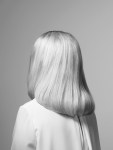
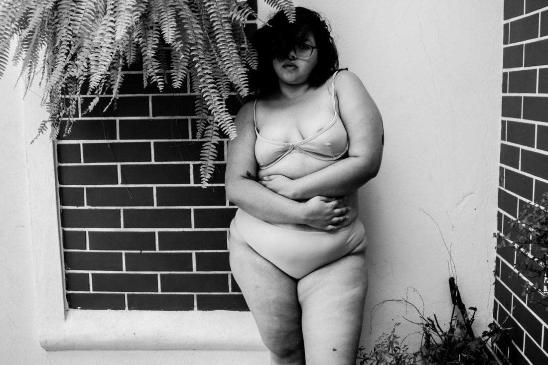
Pasini’s images are highly decontextualized–a nude model against an either dark or light background. (The image above is positive grounded in place in time by comparison.)

However, there’s also the way that his titling of the work further decontextualizes things. For example: the model’s name in the image above is not provided by Pasini–the model was added when the image was posted by the always noteworthy The Quiet Front.

As far as I can tell, Pasini doesn’t mention his models names at all. Odd when you’ve worked with popular models.

It’s almost easy to just think that he’s tact is to look at it as the-models-I-choose-to-work-with-are-established-enough-that-they-do-not-require-introduction. I can’t let it go that easily, unfortunately. Because there’s also the way in which Pasini’s work further decontextualizes the woman he photographs.

Take the image of Collé above. The title Pasini’ gives it is ‘Chair’. There’s also Chair, Chair (also Collé, uncredited again), Chair with Dr. Martens and back to just plain old Chair.

Or, if you think I’m cherry picking–consider Back, Back, Back, Back with secretions (really: ‘secretions’ is almost as unsexy as ‘moist’) and Back.

While we’re at it consider: Mature (and opulent) torso, Little girl lost and Panties down. (I’ll spell it out in the event that the mention isn’t enough to clarify why these are thoroughly problematic titles: you can argue that porn started or it porn merely reflects the programmatic of society at large which due to rich, white, cisgender and heterosexual men retain a white knuckled grip on the reigns of state, the beauty standard is young, white and cis-het-flexible female. Thus the title indicates that although the subject is mature (something I never would’ve inferred from only the picture) but also attractive because of a specific physical feature. Little girl lost applies the greatest male fiction ever invented–that of a sexually precocious young woman who has yet to reach the age of consent.

And Panties down is really endemic of everything up to this point: Pasini’s work focuses exclusively on presenting women as sexually available. (Let me preempt any of you #NotAllMen types: I am not saying that it’s inappropriate to make work that presents women as sexually available. Like seriously, have you spent any time on my blog?)

No: the issue is that at every step of the Pasini’s work makes decisions why diminish individual identity and agency in favor of characterizing them as sexually available and plugging them into a rote litany of titillatingly heteronormative tableux. The work is objectifying and sexist.

I have no idea if these facets are representative of the author or not. (I have my own opinion but I’ve purposely structured this so as to not cast uninformed aspersion.

I do find it galling that Pasini refers to his work as ‘art’. One the one hand I do not agree. However, it is precisely that designations that prompted me to articulate all the above. If you refer to your work as art, you are in essence inviting this (and even more in-depth analysis and criticism).

Lastly, while I generally go out of my way to make posts that are this openly critical of work, I made an exception here because I do think it’s interesting that the sense of casualness I mentioned at the start of this is actually something I’ve come to see as confrontational. There’s no way to know just from the photos–but I do feel as if Collé is at least consciously aware of the creepy factor of some of the work and is trying to present herself in a manner that runs counter to it.

Source unknown – Title unkonwn (201X)

In biology: a ‘raphe’ is a longitudinal seam that usually indicates some sort of mid-line.

There’s one in the medulla oblongata as well as one running from the anus through the mid-line of human genitalia. (pictured above you can see the perineal raphe.)

It is thought that the biblical account of creation where God removes a rib from Adam to make Eve is actually an errant translation and that the actual meaning was something closer to a reference to the fact that unlike most placental mammals, humans do not have baculum. (The folk wisdom is that since god took the bone from Adam and used it to make eve; the raphe is less seam and more vestigial scar tissue.)

Source unknown – Nicole Vaunt (2017)

Few places I have ever visited have gotten so thoroughly under my skin as Iceland. If my Seasonal Affective Disorder wasn’t already off-the-charts, I would have moved there by now.

What’s so great about it? If I told you it’s because it’s magical, there would be two distinct  responses: those who will grin stupidly/nod knowingly & those will look askance/skeptical–the former have visited, the latter have not.

I could talk about the light. But the light in-and-of-itself is not entirely exceptional. If you’ve watched any of Bergman’s films–you’ll understand why he and Sven Nyquist strove to work with natural light whenever possible. (Arctic light in the summer is pretty much ripped out of a Romantic Period oil painting.)

The landscape might as well be off-world–the stunning vibrancy of color contrasted against the harsh landscape is something that stops you in your tracks at least a half dozen times each day.

It’s not all rainbows and kittens: most folks view Iceland as a sort of Viking inhabited glacier. (I started having dreams about the place during my middle teens and it was all snowbound and empty. I found out after about a decade of having the dreams that Iceland is green and Greenland is ice–in fact, viking languages were apparently uber literal because the capital of Reykjavik means nothing more or less than ‘smoky bay’ and Iceland in the native languague is really Island; it’s westerners that make it seem like a stronghold of winter.) The weather is hardly perfect. I’ve seen it rain sideways while it’s still blindingly sunny. (But as the saying goes: if you don’t like the weather, wait 15 minutes–as is that ever the fucking truth.)

What appeals to me about this image is the degree to which it–by decontextualizing both the relationship of the landscape to light and color, it demonstrates the degree to which the landscape has texture. (I think that’s something I’ve always felt on an instinctive level but it would’ve taken me several more trips to come to that realization on my own. And as far as I’m concerned that’s really the single credo you need when asking whether or not a photo or image is good: does it show me how to see something that I might otherwise have never discovered? If the answer is yes, then that’s already more than halfway there.)

Brandy Trigueros – [↑] Untitled from The Dadabyte Theater (2017); [↓] Untitled from There’s No Other Like Your Mother (201X)

A while back a dear friend introduced me to Trigueros. I knew she was a photographer/image maker but our mutual friend didn’t show me her work until after we’d met.

Uh, she’s ridiculously talented y’all. Like woah!

Above, the topmost image is from her series The Dadabye Theater. It’s heavily informed by the visual aesthetic of Fernand Léger and Dudley Murphy’s avant-masterpiece Ballet Mécanique.

The lower image is from There’s No Other Like Your Mother–a series preoccupied with the death of both the artist’s parents as well as her own questions regarding whether or not to become a mother herself.

To appreciate the genius of the former you have to pay careful attention to the latter–I’m personally uncertain whether to term the work oneiric vs surreal but there is something preternatural familiar about the scenes. The compositions are clean with strong attention paid to conveying a totality of environment.

There’s also a killer eye for unity between form and function–a hallmark of high end design. (Her work reminds me a lot of Storm Thorgerson, actually.)

There’s also a lot of sort of kitschy, nostalgic and slightly off-kilter props. (My friend told me that she collects them specifically to use in her work.)

So while they are always used to excellent effect, there’s a way in which the kitsch, nostalgia and off-kilter fit even better within the frame of dadaism.

In my experience, it’s rare to encounter someone with such a strong sense of their own visual language. Trigueros has it in spades. But it’s quite another thing to be able to adapt your style to fit a particular framework. To me it’s incredibly astute that she decided to apply her preoccupations to an art movement where her interests not only fit but expand the original concept via their application.

Jouk Oosterhof – [←] Hanneke from Women with Vaginismus project (201X); [-] Emma from Women with Vaginismus project (201X); [→] Bertine from Women with Vaginismus project (201X)

I first encountered the portrait of Emma via @thephotoregistry–which continues to be one of the best things on Tumblr.

I liked the way that the texture of Emma’s hair is set off against her blouse as well as the smoothness of the background.

Upon closer reading: I realized the nature of the project–relating to vaginismus, a condition wherein an sort of vaginal penetration causes intense pain. (I have two friends who have this condition and what they’ve told me about it sounds absolutely heinous.)

Via Oosterhof’s LensCulture profile, she says of her process: “I carefully build the image, staging all details.”

That actually tracks given these works. Note: the lighting on the background alone is drastically different between the three images. The lighting on the women is less different but there’s still some variation. I’m especially fond at the way she’s both used the lighting to separate the women from the backdrop while also playing the background lighting against the foreground lighting to dramatic effect given the positioning and pose of the subject.

Jacque JordãoUntitled (2016)

As best as I can tell, Jordão is a Brazilian model with a killer fashion sense with an impressively varied range of projects in her portfolio.

Her Tumblr usually credits other photographers–there this is likely a self-portrait.

Technically, this makes a number of ‘mistakes’. For example: the reason that so many photographers and image makers prefer to work with seamless backdrops is so that the location becomes less of a consideration that the subject. (Also, you can light the subject in any fashion you choose with much less effort than working in an actual real-life environment with light shifting over time, physical obstacles getting in the way, etc.)

This notes he contrast of the bright white wall and the less brilliant white mortar and dark bricks as an astute backdrop for a monochrome image.

This is actually underexposed–likely a feature of this almost certainly being taken with a kit zoom lens, wherein the fixed aperture limits exposure adjustments to ISO and shutter speed. (This is almost certainly a lower ISO–as there really is very little noise.)

I haven’t actually opened this in Photoshop to check the histogram, but my gut says there’s probably 2/3 of a stop before the highlights well and truly blow–and you can usually pull them back just enough in post so they aren’t pure white.

Objectively, it likely would’ve been preferable to figure out what you’d need to set the shutter speed at to show detail in her hair, then split the difference between that and the settings which produced this image.

Yet… I can’t really fault things too much–because although the choices that went into producing this are arguably less than pristine, they do actually work. For example, I’d usually complain about the failure to align verticals with the left and right frame edges. Here, I can’t.

The downward tilt of the camera suggests that the viewer is roughly the same height as the model but is looking down in a submissive fashion. There is–fundamentally within the image at the level of visual grammar: a sense that the subject is intimidating.

In tandem with the way Jacque is standing in the shadow of the potted fern, with her hair swooping low over her right eye–there’s an added layer of enigma in the way her expression and even whether or not she’s looking at the camera remain inscrutable.

Source unknown – Title unknown (201X)

This is almost certainly an homage to Nobuyoshi Araki’s 1993 Erotos series. (Araki is someone about whom I have entirely mixed feelings; yet even I can admit the series is something special.)

I’ve thought about just leaving it there but it occurs to me that there’s a parallel between this and Greta Gerwig’s directoral debut Lady Bird–which is also something truly special.

If you don’t really follow cinema, Gerwig has made a name for herself as both an astute and incisive actress as well as a startlingly original writer–she co-wrote and played the titular roles in Noah Baumbach’s Frances HA and Mistress America.

Anyway, Lady Bird is every bit as good as you’ve heard. Yes, it’s gallingly lily white. And as much as diversity and inclusion are of crucial importance, Lady Bird aces the Bechdel test in a way that few other things have had the audacity to even consider.

In fairness, I should also confess my own bias: as someone who went to a parochial school (and had much the same relationship to it that Lady Bird does), who felt stultified in my mid-Atlantic, white bread hometown; further, as someone who managed to escape that town by gaining admission to a prestigious liberal arts program, the story was unnervingly resonant for me. (Also, it was like a peak at what my life might have been like if I’d grown up female–as a trans girl, it made me feel seen in a way that I’ve never experienced in my life, if that makes sense.)

Anyway, minimal spoilers ahead: there are three scenes in Lady Bird that run parallel to this image: In the first, Lady Bird (portrayed with an utterly incandescent lack of self-consciousness and vulnerability by the staggeringly talented Saoirse Ronan) is laying on the floor at her prestigious catholic school next to her best friend. They are both on their backs with their legs propped up against the wall snacking on pilfered communion wafers.

The viewer joins the scene en media res and while it’s clear they are talking about using the faucet in the tub to masturbate–their candor is intriguing. Lady Bird is trying to seem cool and worldly, but it’s her friend that actually centers the conversation in the politics of self-pleasure not as an exercise in social conformity but as a means of enjoyment. There is nothing salacious or even remotely titillating about the scene.  It’s solely focused on the way teenage girls talk about their experiences of being embodied with each other employing a guileless openness and trust.

But like everything in the movie, the jokes are polysemous–frequently doubling as self-deprecating asides directed to the audience, who is given the advantage of something closer to third person author omniscences w/r/t the narrative.

During a later scene, the viewer is shown the faucet of a tub. A bare leg enters the frame and braces against the pink tile beside the faucet. It’s clear that it’s Lady Bird’s leg due to the pastel polish on her toenails. It doesn’t hold on the shot. It’s presented matter-of-factly, devoid of any lecherous voyuerism–however, in the context of it’s function as a call back it’s honesty is thorougly disarming.

In a scene approaching the end, Lady Bird is called into the Mother Superior’s office–ostensibly for disciplinary proceedings. The nun, however, is far more interested in the psychology than the behavior. She tells Lady Bird that she was impressed with the way she describes Sacramento in such vibrant detail in her college admission essay that she seems as if she rather loves the place. (An on-going joke in the movie is how she considers the city the mid-west of California.) So it’s surprising for both her and the viewer to hear this interpretation.

Lady Bird realizes her typical brusqueness on the subject will not be well met, so she–brilliantly–counters with: I guess I just pay attention to things.

Without missing a beat the nun responds: some might say that loving something and paying attention are, in fact, the same thing.

I keep returning to what the nun said: paying attention and loving are two manifestation for the same underlying truth.

But back to the image–because no matter all the extraneous stuff I routinely throw at you to try to keep your attention–the reason you read this is because it’s supposed to relate to the work showcased.

I won’t argue that this is a good image. At the very least: it isn’t an image that’s easy to immediately digest. You look at it. Think wait. Did I see that right? Look again. Yes, it’s what I thought it was the first time. Wait, are you sure? Look again.

It occurs to me that the image above is erotic only in so far as it invites sustained attention–even if it’s only decoding how things are oriented in the frame. And to me that suggests a potentially worthwhile framework for disguishing pornography, from erotica, from art. Porngraphy is a specific text in framed in a more generalized context–heteronormative patriarchal expectations with regard to libido, lust and physical intimacy. Erotica is less focused on the specificity of the given text and more concerned with the expansive context. Whereas, art, is–in some ways–entirely focused on the marginalia expounded and clarifying the relationship and interpenetration between text and context.

There’s a saying that the mind is the body’s largest erogenous zone. The only way to stimulate the mind is by paying attention–by loving.