
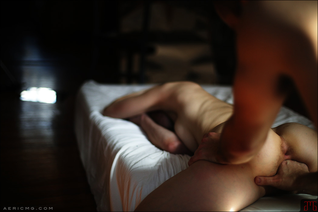
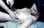
X-Art – Sex with a Mermaid feat. Lillianne (201X)

Aeric Meredith-Goujon – Sink, Shank, Chunk (2018)
Part of what impresses me about is the use of positive and negative space–there’s the chiaroscuro nay: tenebrism (most folks would’ve let the background go completely dark but this preserves a sense of space enough to suggest some sort of lived in environment).
The other thing that moves me is that it brings back a flood of memories–memories that are a little too closely held to share but suffice it to say that it is my experience that the above configuration is not only a great way to approach/warm-up to fisting, it’s actually maybe the best position for directly stimulating the g-spot. (In positions where the g-spot haver is stretched out supine, you experience a limited range of motion and are constantly working against gravity. Your arms can tire, muscles cramp and have your wrist painfully lock up. Wheres, when things are positioned as above, the fingers can press down alone, the thumb can be used as a fulcrum to rock the hand–it can take a bit to get used to it but you can also stimulate the clitoris while using the thumb as a fulcrum; additionally, you can vary and combine all three movements in response to your partner.)
From here it’s also possible to rotate your wrists side to side to create an intense sensation. (Not everyone enjoys this but those who do–in my experience–really enjoy it.)
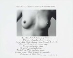
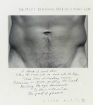
Duane Michals – [↑] The Most Beautiful Part of a Woman’s Body (1986); [↓] The Most Beautiful Part of a Man’s Body (1986)
[↑] In the oldest dreams of old men / Womens’ breasts still remain. / Long
after their desires have turned to dust. / They are their first
memories. / Warm, nurturing, home. / The point of satisfaction. /
Perfect in their gracious arcs. / Women wear their breasts as medals, /
Emblems of their love.
[↓] I think it must there / Where the torso sits on and into the hips /
Those twin delineating curves / Feminine in grace, girdling the trunk /
Guiding the eye downwards / To their intersection, / the point of
pleasure.

Source unknown – Title unknown (201X)
As long as you have
certain desires about how it ought to be you can’t see how it is.
–Ram Dass (via wordsnquotes)

Haruo Kaneko – Catharina (2017)
As an image, this doesn’t entirely work.
To make sense of the whys: visualize a vertical line dividing the frame into a left half and a right half. There’s a mass of shadow detail in the left half and a mass of highly detail in the right half.
Compositionally speaking this isn’t a terrible strategy. The difficulty is that there needs to be some unity between form and function–the balance between the two halves can only be considered effective insofar as it astutely parses the frame to make things more intuitively read by the viewer. (Catharina gazing to her left is an effort to addresses this shortcoming; however, given the left heavy, off-center staging doesn’t work anywhere close to well-enough to compensate. As such: the viewer only really considers the left 2/3 of the frame.)
What are some strategies that could have addressed these compositional flubs?
Given the left side having a heavy concentration of shadow detail (which we’re going to call positive space) vs the right being so heavily skewed toward highlight detail (which we’re going to call negative space), arguably the easiest fix would be to have Catharina sit in the right most chair and the shift so she’s looking back across the frame. (There’s a natural, subconscious urge to want to see what someone who is clearly looking at something is looking at–whether or not it’s possible to see the thing upon which their gaze alights. This is an astute strategy for directing the manner in which a viewer sees your composition.)
(Also–and I will admit to being extra persnickety in this one instance–given the clumping of positive space offset by negative space, it would seem wise to position Catharina so that she’s adding positive space to counter the compositional difficulties of this given frame. Plus, the plant behind her really does sort of look like it’s growing from her forehead.)
Also: this is neither centered nor oblique w/r/t position of the camera in relationship to the subject. The angle of the line of the slabs upon which the chairs sit is less something that draws the eye and more something that comes across as merely decorative. Given the discrepancy between positive and negative space, this halfway between angled and dead on centered works better the further you commit to either extreme. (Angled makes the more visually interesting composition however there’s a lot more room to make poor choices.)
The reason I’m posting this is less to call out aspects of it that are sloppy and more due to the fact I’ve been thinking a lot about poses recently. (And make no mistake Catharina’s pose here is fantastic.)
What makes it fantastic has several ingredients. Let’s break it down:
Generally speaking most nude photography/digital imagery deal to a certain degree in/with stylization w/r/t posing. A lot of hacky curators are pulling together shows on the female gaze without really giving much thought to the visual grammar of the work and more consideration to whether or not the photographer identifies as a woman.
It’s not just that presenting woman as sexually available is problematic. The inverse–and this is my fundamental disagreement with the notion of the so-called ‘female gaze’ is that it frequently adopts a similar tenor to a lot of fine art nude work made by folks who identify as men–in which there is a diminution of any emphasis on sexual availability and more of an emphasis on something more simultaneously chaste and titillating than more erotic/pornographic material.
There’s also the scores of photographers screaming about how nudity isn’t inherently sexual but then adopting the same stylistics of posing. The point I keep trying to make is that there’s a natural way of moving and being in a space where one is comfortable that what an observer might see could be considered salacious except that the bearing of the body is such that it conveys more of comfort or being completely and unself-consciously at ease. (I frequently lay on my back on my couch naked with one leg stretched out and the other kicked back over the back of the couch. I do it when I’m alone, I’d never do it while I had company over. (OK, that’s not completely true… it would depend on the company but then the company would change the context substantially.)
What I like about Catharina’s pose is that it’s part stylization. the shoulders back confidence vs the way her upper arms frame her breasts. Her hands run down at her feet–and it’s a bit like she doesn’t know what to do with them except that it almost looks like she’s scratching a bug bite of her foot when she was instructed to look to her left. There’s something that’s wonderfully unself-conscious about it, really.
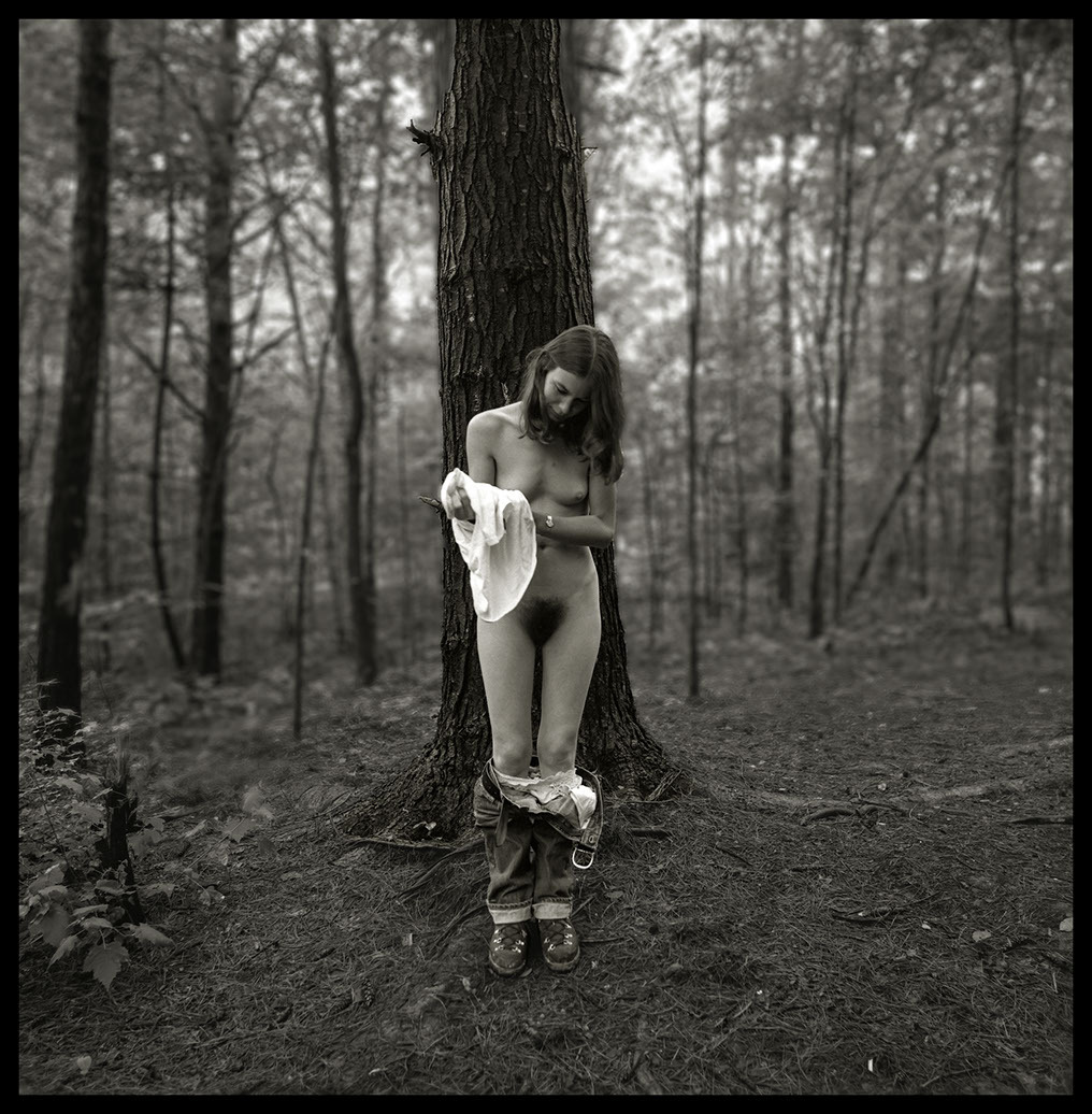
R. Michael Walker – Melissa Undressing, Red River Gorge, KY (1979)
Malcolm Gladwell’s assertion that it takes 10,000 hours of deliberate practice to become world class in any discipline has–by now–been thoroughly debunked. Simply from that standpoint of stifling elitism, I consider the kibosh that’s been put on this a tender mercy. Except…
I don’t think the notion that it takes time to hone your craft is actually–in any way–bad advice. If a young photographer/image maker came to me and asked what advice I have for them as far as achieving their dream, my response would probably be inline with what I was told when I first started making photos: lock yourself in your room and read until your eyes burn and don’t touch a camera for five years.
Or, that’s how I would’ve put it until recently. I think there’s a balance between doing and fueling the doing. And the 10,000 hours probably have less to do with conditioning and more to do with forcing you into a give and take relationship with your craft where you realize that sometimes you do it when you don’t feel like it and sometimes doing it when you don’t feel like it is detrimental to the doing. It’s only through trial and error that you figure it out.
Also, fueling your doing is less fulfilling but it’s easier to learn things that may take you much longer to address in your own work.
For example: the above image has crystallized for me a number of things I’ve been grappling with in my own work.
Long story, Cliff’s Notes ™ version–it’s only in the last 18 months that I’ve begun to see photos as dimensional. And by that I mean more than just the separation between foreground, mid-ground and background. It’s more than a little like Lotte Reinger’s multiplane camera–except expanding so the entire space in the frame is represented by distinct planes.
The experience of seeing space as constructed of layers has actually slowly shifted the way I think about composition. It’s still at a point where I’m not so great at articulate it but there’s a very clear feeling of it.
My notion of seeing space as layers of planes relates to depth of field. And generally depth of field has very proscribed uses. The majority of photographers/images makers think of bokeh as a means of emphasizing the subject while still conveying a sense of the subject in space without all the decontextualization that comes from staging things in a studio space. (In fact, it’s arguable that the quality of bokeh is usual measured across cameras and lenses by giving consideration to the bokeh offered by the fastest lenses available in an 85mm–or equivalent–focal length.)
(As a brief digression: if you’ve read anything written by folks who have worked as cinematographers for several decades, you’ll hear them talk about how different lenses are best suited for shots of a particular scale. I’m increasingly realizing that there is actually a good bit of truth to those claims.)
But the point is there’s a tendency to either go for the shallowest depth of field possible–the reason why fast 85mm lenses are considered the bokeh gold standard because they tend to support the shallowest DoF; or, for deep focus a la Group F/64 or Gregg Toland’s work on Citizen Kane.
In my own work, I favor a shallower depth of field but as I’m frequently working in medium or specialty formats, I’m limited by lenses that by and large are only considered fast in large format.
Really, your DoF should be used as a tool to help the viewer know how to read the frame you’re presenting them. The photo above for example: was most likely faster film shot in low-ish light with a mid-range aperture. Note how all the foreground is in focus and the focus starts to go soft at the rear of the tree directly behind Melissa. Note how this forms a compositional wedge from the lower corners through Melissa to the tree. The subject is pulled forward whereas the forest is pushed backwards. (Yes, digital devotees, you can capture your images in raw with everything in focus and then selectively unsharpen in post but it’s never going to look as organic as the above.)
Point is: I don’t think I’ve ever seen DoF used to quite this effect and I like it rather a lot.

[↑] Maurizio Cattelan & Pierpaolo Ferrari – Untitled for Toilet Paper Magazine (2012); [↓] Source unknown – Title unknown (2013)
Juxtaposition as commentary


[←] Philippe de Champaigne – The Dead Christ {detail} (c 1654); [→] Source unknown – Title unknown (2008)
Our wounds are often the openings into the best and most beautiful parts of us.
–David Richo (via blackshivers)


