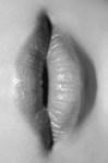
insideflesh – tight spaces (2018)
Is it my imagination or does this recall both the look and feel of Sergei Parajanov’s The Color of Pomegranates?
insideflesh – tight spaces (2018)
Is it my imagination or does this recall both the look and feel of Sergei Parajanov’s The Color of Pomegranates?

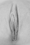
Source unknown – Title unknown (201X)

Source unknown – Title unknown (201X)
As for me, I am tormented with an everlasting itch for things
remote. I love to sail forbidden seas, and land on barbarous coasts.
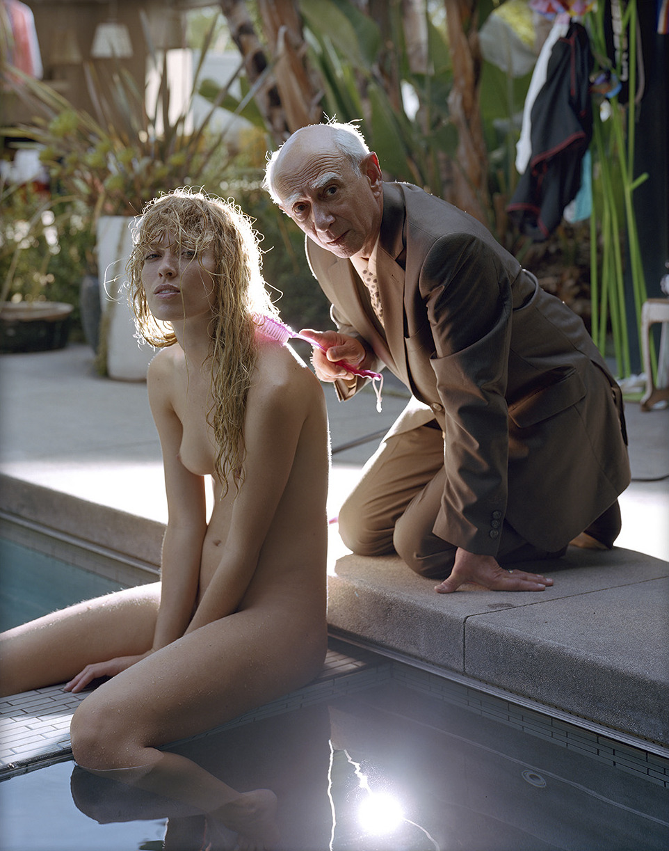
Torbjørn Rødland – Poolside (2017)
At some point I am actually going to be able to compose something coherent on Rødland’s work.
Today isn’t that day–unfortunately.
Thus, as a place holder please watch this interview produced by the Louisiana Museum of Modern Art. (The circumspect way he speaks about his work sets my teeth on edge. His positioning of his art as an outcropping of an effort to find value in the banality of stock photography, along with the influence of Jeff Wall and his frustration with realism are astute observations; however, I’m more interested in how his work seems to be the inheritor of Nobuyoshi Araki’s mantle–except Araki obsessively and explictly explored the intersections between pornography and art from the position of a pornographer, Rødland’s work strikes me as an inversion of Araki’s M.O. I’m just not yet to a point where I can coherently explain my thinking on the subject…)

stillcrazyafteralltheseyears6 – Untitled (2018)
When I see this image, I can’t shake the notion that photography and digital imagining can arguably be reduced to questions regarding contrast–e.g. inclusion vs exclusion (framing), luminosity vs. opacity, near vs. far, etc.
More directly linked with this image–and it’s genius–is the quintessential question of depth vs flatness.
No matter whether it’s photography or digital imaging, the result involves compression. Spatial references are reduced to micro-fine layers in an emulsion or an array of pixels. In other words: three dimensions are rendered in two.
Over time certain modes of visual shorthand have become codified–e.g. with skintone we have notions interpolated based on the Zone System or the red before blue before green rule of thumb.
As best I can tell these tendencies are meant to be aesthetically pleasing but the why they are attractive has to do with stylistics–the notion of skin as smooth and/or soft. (And this is more of a psychological prejudice than a factual one–I mean look at the back of your hand up close and it looks like a muddy landscape that has been sun baked until it takes on the appearance of craquelure.)
In other words, there is a notion that as far as Caucasian models are concerned there is a preference for either an alabaster or apricot tone–an ersatz synesthesia by consensus where tonality or color is in and of itself supposed to be suggestive of texture.
As a synesthete, I am constantly befuddled by this knee-jerk approach. I mean: show me an image of a swatch of twill pictured under strong light and I can actually feel the texture of the material on my fingertips.
Here though it almost works and how it works is by taking a step back to consider how photography/image making is about contrast and then juxtaposing something which easily conveys textural information (water) against something which does not easily convey textural information (skin).
Simple, elegant and something I’ll be trying to figure out how to apply to my own work going forward.

Chris Maher – 0876 Two Nude Women Abstract Vulval BW Photograph (2013)
One of the things I dig about photography/image making is that although I wouldn’t argue the form is inherently egalitarian, the line separating streamlined visual simplicity and lazy/creatively bankrupt work is an ultra fine one.
I think Maher’s work is actually 98% trash. And I wouldn’t say this is necessarily good–there’s some spill on the floor behind the left thigh of the rearmost subject which really should’ve been flagged off in order to underscore the interplay between bodies and landscape style abstraction.
It’s perhaps a bit essentializing but the simplicity of it and the clitoral piercing belonging to the subject closer to the camera manage to strengthen the tension between abstraction and concrete representation.
I think there’s arguably a way to take this general premise–stretch and otherwise complicate and enliven it so that it’s more than a simple (or, in this case, most likely lazy) meditation on form that is simultaneously tawdrily titillating.


[↑] Source unknown – Maria (201X); [↓] Abby Winters – Title unknown (2015)
Juxtaposition as commentary.
Source unknown – Title unknown (201X)
There were girls who would tear you apart with their lips.
–F. Scott Fitzgerald

deluckas13 – Untitled (2018)
There’s this delightful sense of yin and yang balance to this image.
Imagine there’s a diagonal line dividing the frame from the lower left to upper right; note: how with the exception of the highlight on the shoulder & back of the arm in the upper left corner, almost everything in the upper portion of the frame is composed of shadow to midtones (with heavy preference given to shadow areas); in the lower part of the frame it’s the inverse mostly highlight but hints of mid-tones, too.
I also really dig how the area of shadow at the left of the frame suggests a right pointing triangle–which strengthens the urge for the viewer’s gaze to move from left to right across the image. This in turn conveys a sense of the extended tongue slowly advancing over highlight-blown, pale skin.
There’s a second triangle formed between the slightly parted lips, tongue and shoulder grasping hand at frame right–which forms a roughly up pointing triangle. (This is part of why the image reads as if the tongue is being dragged upward and not downward.)
It’s nice how the image begins with the darkness of the underlit separation between bodies; whereas, the grasping hand at the right seems to merge two bodies into something singular and inseparable.
Plus, it’s really great how this is technically ‘gram safe–attending to the letter of the law while flipping both middle fingers in the direction of the the spirit of that law.
Most impressive, however, is the rare care both in underscoring the voyeurism inherent in the image as well as telegraphing that you are welcome to watch but this isn’t for the viewer or about the viewer so much as the viewer is just being allowed to see something and they should be grateful for the glimpse.