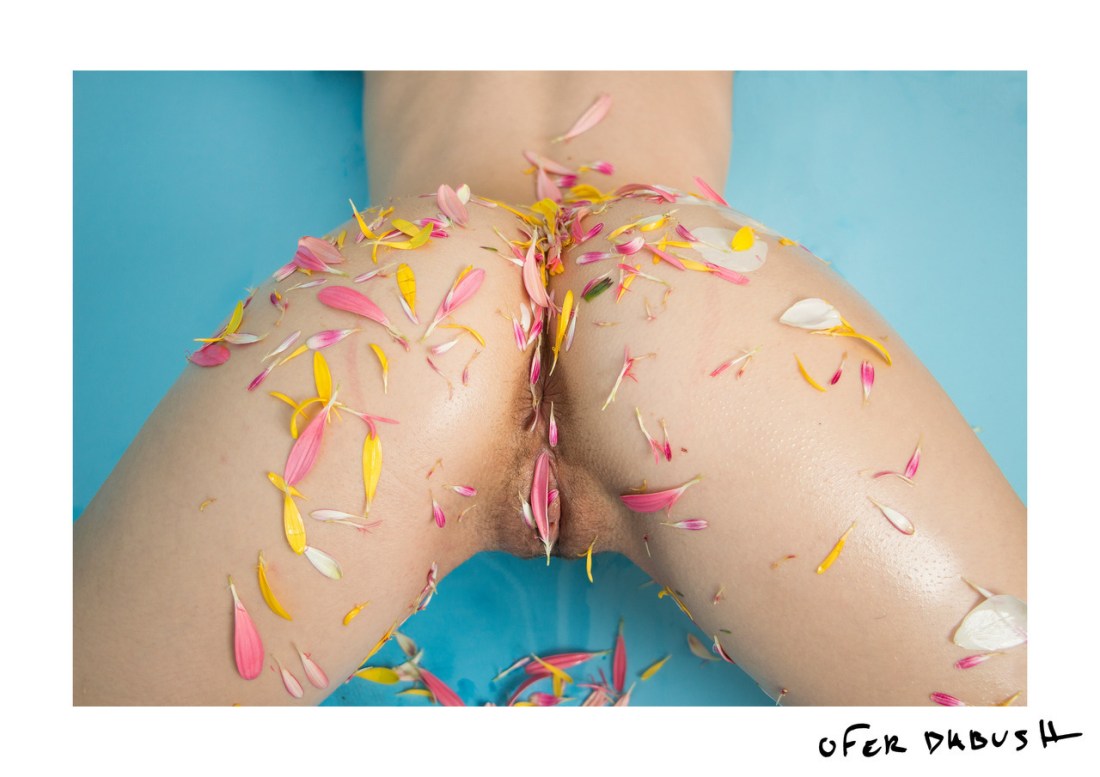


Petter Hegre – Aqua feat. Cleo (2015)
When it comes to Hegre and his ‘art’, I have mixed feelings.
One the one hand: no matter if it’s his artier forays (a la above) or his more pornographic stuff, he absolutely has a knack for carefully considered, subtly nuanced rendering of light–especially in terms of skintone.
The other hand? He has access to a stable of imaging gear far exceeding the inventory of most high end rental establishments. (For example: the images above were made using a PhaseOne IQ3 80MB medium format digital back–an item that likely set Hegre back $60K when he purchased it.)
I’m not going to hate on someone for having the wherewithal to invest in a camera that costs as much as a sports car. But more often than not I don’t see what that investment contributes to his work. For example: it’s not exactly ideal but there but there is more than a passing resemblance between these images of Cleo and Jock Sturges color work. (Yes, Sturges is working in 8×10 large format–thus there is again the issue of the preciousness of the equipment. Also, I think Sturges’ is probably a gold star pedophile and I think his efforts to sidestep this diminish his work. In the case of his B&W photos, they are–IMO–over-praised. However, his color work is not as easily shrugged off.)
Anyway, I was looking at the set from which I culled these images. (If you click the Aqua in the title, you can see the set 16 images of which these 4 are a part.)
Looking at all 16 images, it occurred to me that likely what bothers me about Hegre so much is his emphatic insistence that his work is art.
Now, if he means that his work exhibits technically accomplishment–that’s one thing. It’s rather another for him to hire a model, get her to disrobe and then take a bunch of pictures of her and then edit hundreds of photos down to a dozen or so of the best of the best.
Yet given the 16 images in this series, there’s not a great deal of consistency. The one vertical composition arguable has better tonality than the rest but it sticks out like a sore thumb. Also, the order in which the vertical composition is inserted actually distracts from the visual flow between images in the series. Further, the look at the camera ignore the camera on the part of the model is hell of indecisive. (Although, it occurred to me that although it is unlikely this was the intention: there is something about seeing vs not seeing that is highly erotic–i.e. when I am watching a lover body intersect with my own I may alternate between watch out bodies coming together to heighten the physicality of my arousal, however as arousal stretch ever closer to crescendo there grows a tension from which focus on visual stimulus may actually prove to be a distraction.)
It wasn’t easy to distill this series into a smaller grouping. I do think there are several of the images that could easily be dropped. There are several where the angle of her face is unflattering–but I suspect the image was kept because of the posture of her body. And I specifically dropped the one image that shows most clearly that Cleo is positioned in shallow water near a ledge where the water suddenly becomes deeper.
With this edit, it’s not so hard for me to concede that maybe Hegre isn’t as pretentious as a think of him as being. I mean if you sort of squint and take the sense of the portrait in the top left image, the sense of quiet reverie in the top right image, the sense of place in the lower left image and the sense of ethereal physicality in the lower right image–there is a fully formed and conceptually sophisticated single scene that suggests itself in the intersections between the images.
However, that I chose these images from a wider set and then ordered them in the fashion I did (which suggests something not unlike a narrative progression) is what it took for me to be able to see that.
Perhaps Hegre had something roughly analogous in mind. Or not. In all likelihood what he does requires a certain degree of open ended-ness in order to account for the various interests and appetites of the consumer. Really, I think that’s the crux of my frustration with Hegre: he could clearly produce more resonant and uncompromising work but he seems more interested in commercial viability. (Something which strikes me as a shame and a waste of talent.)