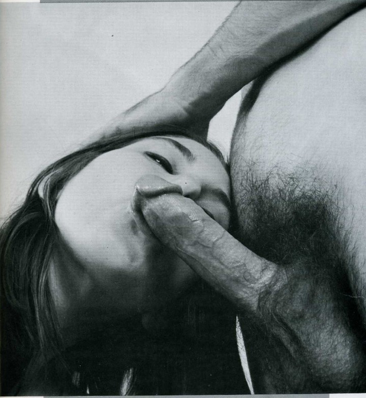
Bettina Rheims – MC6 II from Morceaux choisis series (2001)

I’m not especially familiar with Rheims work but from what I’ve seen of it, she seems to meet her subjects halfway.

What I mean by that is not something I know how to easily indicate. It’s kind of like this: most photographers/image makers operate with a reliable fixation on appearance as factual representation. In other words: they trade in the ontology of I can see this and I can show you this, so this must be ‘real’.

There’s a lot made of Rheims and her use of color in concert with insanely high quality printing to “[make] the flesh appears living and [contribute] a disconcerting realism.”

I don’t disagree with that summation. It’s more that I think the way Rheims uses her erotics as a mode of unsettling the viewer serves to create work that trades less in establishing sacred cow archetypes and more to show people as they are instead of how they would like to be seen or represented.

And isn’t that just the central tenet of artfulness–the dialectic between hyper-stylization as a destination in and of itself vs that rare effortlessness that takes oodles of effort to accomplish but the accomplishing carefully erases any sign of over-the-top intentionality on the part of the creator.

For something as heavily contrived as the above image is: shot in a studio, with precise lighting orchestration, there is something compelling about the way it absolutely doesn’t read as pornography in spite of what it depicts.

(Full disclosure: the above is not the image I wanted to post most of all. I am especially fond of this one from the same series but I couldn’t find a HQ scan of it, unfortunately.)

Source unknown – Title unknown (19XX)

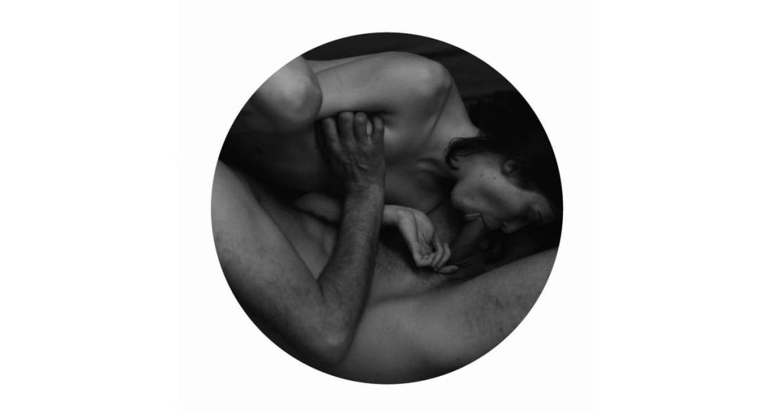
This reminds me of Nan Goldin’s work although I am reasonably certain it isn’t hers.

To the best of my knowledge, Goldin used color slide film exclusively. (I vaguely remember that she now uses digital–which makes sense given the gritty immediacy she trades in.)

That it’s B&W would be a huge departure for her.

Also, the orientation of the couple to the space they’re inhabiting is a bit over-stylized–the way her body enters the frame at a slant gives a sense of dynamic left-to-right leaning in, which in turn contributes to a physical sense of forward motion into the cocksucking motion–despite the fact that she’s pretty clearly moving her mouth up the length of the boy’s erection not down it. (That tension between bending in and pulling away, makes it feel a bit like a gif despite the fact that it’s a single frame.)

Again, though: there’s a way in which this image doesn’t seem to be for or about the viewer–it’s merely something the viewer has been deemed lucky enough to witness second hand. (And in that way, it’s also very much like Goldin’s work.)

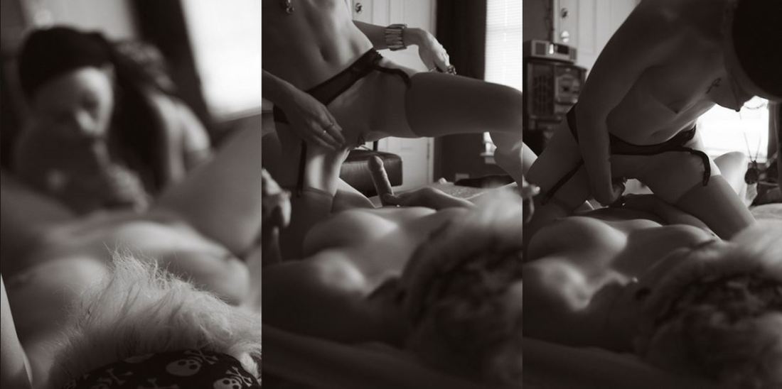
urbanfaerietalesTitle Unknown (201X)

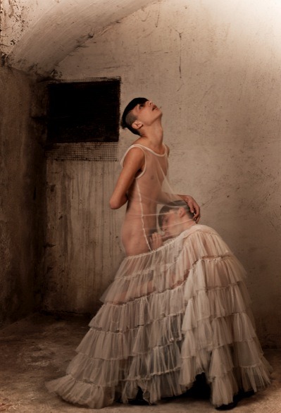
The above images are interesting–if a bit muddled. Yet, the way in which they’re muddled suggests several things to me about visual grammar. So like good Wittgensteinians, let us conduct a grammatical investigation!

A lone photo or image must stand on its own. However, as soon as you position photos or images adjacent to one another–each subtly shapes and informs how we read not just the one image or photo but how we read both of them together.

In the loosest sense there are two ways that photographs can relate to each other: as polyptychs or as sequences.

The above is not a triptych.

Strictly speaking, a diptych means ‘two-fold’. A triptych would indicate three folds. As such you can see panel A alone, panel B alone, panel C alone or panel A & B together or B & C together or A & C together or A, B & C all at once.

While polyptychs can be seen as relating to each other in a way that conveys are broader, overarching narrative–their construction is not intrinsically narrative. The each panel stands alone but that together each comment, enliven and enrich each other so that the piece as a whole comes to constitute more than the sum of its parts.

A sequence, on the other hand is fundamentally tied up with the movement of time. (To be 100% clear, a polyptych can be sequential but a sequence is not automatically a polyptych.)

There’s several things the above sequence does well. First off, the use of depth of field to direct the viewers eye is totally on point–in the first panel, only the top of the head in the foreground is in focus while everything else goes soft; in the second panel, the focus point is ever-so-slightly behind the kneeling figure; the final panel shifts the focus towards the middle ground between the two lovers.

Compositionally, the first and last panel are #skinnyframebullshit–there is absolutely no effing reason given the frame that vertical orientation contributes fuck all to the logical consistency of the whole.

In the first panel, the way the supine figure’s legs open up to the room begs for landscape orientation, further given the narrative auspices of the piece as a whole–it’s extraordinarily poor form to employ portrait orientation.)

The contrast and overall tonal range are best in the third panel; however, the frame feels constricted; it makes me nervous that it’s so clearly supposed to be set in this room but the view of the room is so claustrophobically limited.

The second panel is actually a fabulous example of when a vertical orientation actually serves a goddamn purpose–the frame reads up and down and by fitting it to a form that is predisposed to that sort of scanning, the image maker employs the appropriate visual grammar to convey to the viewer how to best engage with the image.

In summary, there is a great deal of raw potential here. I’m of a mind that this would’ve been more effective if all the images had been landscape oriented or if the second panel had been extracted and presented independent of the others (I do think you’d lose something but the image is strong enough to stand on its own).

Alternately–and probably even stronger–would have been if the first and third image were landscape oriented and the second image remains in its current, portrait orientation. This would’ve pushed things more in the direction of a polyptych and would’ve also suggested an altar piece–which is more in keeping given the almost liturgical tone of the images.

And that’s why I make such a big deal about using portrait orientation correctly. Maintaining that it doesn’t matter is the same as saying that the comma in Let’s eat Grandma vs Let’s eat, Grandma doesn’t make any difference in the end result.
Source unknown – Title unknown (2014)

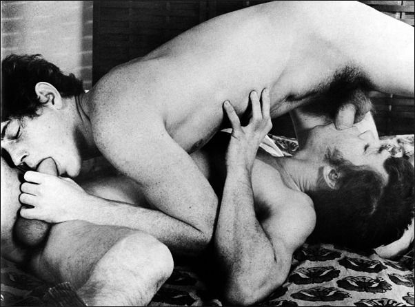
I am super supportive of work that’s trying to recast bullshit heteronormative assumptions pertaining to MMF.

The frustrating thing is the vast majority of it is artless garbage. (I mean seriously, do a Google search and see how fast you X out of the image results tab.)

I like this for two reason–first there’s at least a baseline of thought with regard to composition. Her body shifts the gaze from left to right. The angle of the cock she’s kissing the head of pushes back against that drift and subsequently you follow the angle of guy in the rear’s erection which he’s pressing into the boys puckered lips.

The lighting is warm and inviting and there’s just enough black in the frame to invoke the tone and tenebrism of someone like Rembrandt.

Second: this is one of those things that I look at and think, oh hey, decent concept but I think it would be better if…

In this case: I don’t care for the way this lens compresses space. (It’s probably a result of optical zoom on a zoom lens paired with APS-C sensor pushing towards the telephoto edge of the spectrum.) Also, the angle of view is super porny as far as let’s make sure everyone gets a good view of the action.

I can see pulling the camera back a couple of feet but then you’d have to deal with some of the additional negative space. In which case, she would have to have a finger in his anus or something to justify the wider perspective.

I’d actually love to restage this and execute the following adjustments: Turn the action so that the boy laying on his back is about 15 degrees off parallel to the focal plane (instead of perpendicular to it as above). Reposition the other guy so that he is kneeling behind the boy with respect to the camera, so that it’s possible to still present his action so that it is legible for the camera.

The woman would stay in more or less the same position she is now, but with the scene rotated 90 degrees so that you can see both the way she’s kissing him as well as her genitals since her butt would be facing towards the camera. Maybe angle her slightly so that it’s visible but not blatant.

The frame would be closer to a panorama and I’d play up the sort of Baroque lighting to sort of recall the gratuitously over-the-top everyone-rolls on molly and relives their birth scene from Sense8–which is actually a decisive nod to Eugenio Recuenco’s work.

Madeleine FromentUntitled from Accord/#1 DM series (201X)

I make a pretty solid effort when it comes to familiarizing myself with the work of the artists I post here.

Frequently, I find that while a particular image resonates it seemingly telegraphs to my eye that the I will end up considering the rest of the work an–at best–mixed bag.

It’s frustratingly rare to find work which truly fans the flames of my curiosity.

But when @reverdormir2 posted this drawing by Froment, I was immediately taken by it; I don’t know, I think it’s the obsessive and perhaps even a little awkward details of the hair–the way her hair obscures her face, the careful rendering of the hair on his back, arms and legs, the texture of his beard contrasting against her tightly cropped pubic hair.

I clicked over to her web site and promptly dropped into a sensual erotic K-hole for the better part of an hour.

For the record, not all of her stuff works. But unlike the majority of intellectually dishonest wannabe creatives out there, she doesn’t foist the work on her audience despite its flaws. Instead, she presents the work in a fashion that patiently bridges the gap for the audience between the impetus for the work, the details that drive and enliven it–all subsequently recontextualized in the final work.

It’s really goddamn ingenious. However, what makes it even more exceptional is the degree to which Froment understands her own aesthetic peculiarities and formulates her installations in such a way as to further compliment it, but to also enrich the complex relationship between the work and the world it inhabits.

If you think I’m being a pretentious blowhard and talking out of my ass, just browse through her website and notice how the work flows from documentary like snapshots, to more refined images which in turn provide prima materia for her spare, meticulous drawings. Note: also the holistic way each project is presented to emphasize how the work is supposed to be viewed–ethereal (representative) vs actual (representational).

This is extremely high end work. And it’s thrilling to see an artist this young and this preoccupied with the sort of topics that I think are all too often excluded from artistic discourse–much to the detriment of Capital A Art, unfortunately.