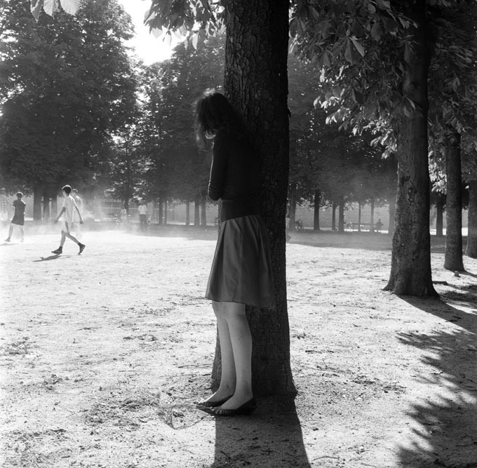
Olivier Kervern – Paris (2010)
I know the saying: those who can’t do, teach; those who can’t teach, teach Phys. Ed. But I’ve always loved teaching–that moment where the light bulb suddenly illuminates. I don’t know…it always feels like you’re doing something that actually makes a difference in some small, concrete way.
I daydream a lot and a frequently recurring motif is being a photography teacher. I coach imaginary students and construct pithy activities.
One such activity would be for each student to bring two contact prints of one roll of 35mm film to class. (Of course contact sheets, it’s foolish to attempt to teach students photography by allowing them to substitute a completely different standard–i.e. digital imaging.) On the first sheet, the student will have indicated their choice for the best 3 frames on the roll in white grease pencil; the second sheet will remain pristine.
The pristine copies will be reviewed by their classmates. Everyone–except the photographer–will vote to choose the top three images. Subsequently the student will reveal their picks and share why the picked them. The class would have a chance to respond and then I would inquire if the student agreed or disagreed–and to provide an accounting of their considerations in making their final decision.
In my head, there’s usually some overlap between what the photographer selects initially and what the class chooses. It’s all intended to be a valuable lesson in considering the reaction of your audience and standards and expectaitons with regard to interpreting visual grammar.
But as a teacher, as a photographer and as an individual, I’m always going to be interested in the discrepancies.
If you placed Olivier Kervern in this scenario, I’m pretty sure there would be zero overlap between his selections and the class’.
Given Kervern’s body of work I’d be inclined to not let him join the class. It’s really not very good. Except… this is extraordinary. And it’s never something I’d pick off of the contact sheet assignment.
Look at the photo. Seems pretty balanced between light and dark, doesn’t it. It’s not. Highlight tones make up roughly 2/3 of the frame, but the shadows seem to dominate–mostly because they control the foreground.
Then there’s the young woman–who appears to be simultaneously a part of the tree and a figure hiding behind it watching the boys playing on the field–a feeling of quite literally being rooted in the shadows, while also stepping out into the light. (This is part of why I’d never pick this based off a contact print, the fusing of the woman and the tree is almost certainly something done via post-exposure means.)
I also freaking adore the way that her voyeurism is not open to any sort of interpretation. There’s not enough context but even if you assume–which I don’t think is incorrect–that she fancies a boy on the field (who likely doesn’t even know she exists), the focus is too sharply directed towards the implication of the viewer’s voyeurism. In the watching her watching, we have more access to our own motivations than we do to hers.
Finally, there’s my empathic response. It’s very rare that I see a work of art and am willing to assert that the author understands what it is to be as lonely as I am. Pretty sure Kervern is an exception that proves the rule.
