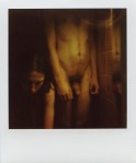
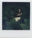
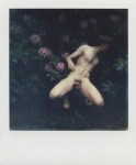
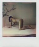
Jan Durina – [↖] Untitled, Prague (2015); [↗] Untitled, Ivan and Maria, Berlin (2015); [↙] Untitled, Tiergarten, Berlin (2015); [↘] Untitled, Maria’s Bed, Berlin (2015)
When I scrolling through my dash, I’m thinking about three things:
- Do I like this or that image?
- Is that or this image important to consider? (& if so: why?)
- Could this or that image present an opportunity to illustrate some notion that has been stuck in my head?
Things fitting the second criteria generally provide the prima materia for the best posts. The first are the easiest posts to write.
The third? Well, I have nearly 200 drafted items that in one way or another came to be saved as drafts because I thought I had something to say about them but–unfortunately–now I can’t figure out what to say about them but I still feel as if I can’t delete them either…
Seemingly without variation, my approach to this glut of things about which I want to say something but cannot fit thoughts to words, I tend to trot out a game I like to call pin the tall on the influence.
I’m resisting the urge to do that with Durina’s work. (Although seriously, if I’ve ever posted a veritable who’s who of contemporary internet famous image making, it’s absolutely Durina. Were this an academic setting I’d posit Ryan McGinley, Inside Flesh, Diana Reinoso, Myles Pedlar, Ben Zank, Errance L., and Dara Scully.
As far as a showcase of up-and-coming talent, it’s not a bad list. The struggle I have is that beyond a point–ticking off a checklist of influences is a little like one of those word find puzzles: a good distraction for 5 or 10 minutes but galling boring for any more extended period of time. (Hell, I don’t even like crossword puzzles and I’ll spend hours with those before I’ll waste more than a few minutes on those damn find a word bullshit things.)
I’m of a mind, however, that at a certain point we want art to demand that we, that is the viewer, do some work. I personally find it frustrating when art demands that I fastidiously obsess over influences. For example: I absolutely get why the Beastie Boy’s Paul’s Boutique is widely considered to be one of the best albums ever made. I won’t argue the point. But gimme License to Ill, over Boutique any day–if we’re talking about putting something on to listen to for the express joy of listening.
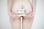
That’s why I think that Durina’s Polaroid’s are so impeccable. I mean Polaroid’s are exceedingly immediate. You depress the shutter and what you’ve got is what you’ve got–a singular physical artifact of the moment. (I’m going to gloss over the whole conceptual grey area that is using a medium typical pigeonholed for private porn creation as a medium for creativity and how compelling I find that grey area.)
Also, it’s EXTREMELY difficult to make a good Polaroid–and when you do it’s typically a testament more towards stubbornness than technical acumen. The colors are never quite right–but can be more luminous than anything this side of a perfectly exposed chrome. (Honestly, if I could afford to, I would use 65% B&W, 25% Polaroid and 10% slide film.)
That immediacy clear cuts all mess of influences on shirt sleeves and presents something surprisingly candid in its front-facing carnality. It’s as if the whole porn vs art false dichotomy as well as the naked bodies aren’t always inherently sexual can and do coexist because they are obverse faces of a single coin: the eternal battle between the sacred and the profane. Durina’s Polaroids dismiss that narrative and instead present carnal desire less as appetite and more as a symptom of physical embodiment. (I’m putting it poorly because it sounds as if I am suggesting that the same assertion that everything reduces to sexuality–and that’s offensive to asexuals. Here’s the thing though, I think asexuality and queerness have more of a home in these murky Polaroids than in much of the work hitting the interwebz today that is produced from behind a very LGBTQ+ prism.)