Pierpaolo Morra – Untitled (2015)

If you know a lot of cineastes and they irritate you with their endlessly self-conscious meta-commentary, ask them to name the best example of film noir. Sharks mid-feeding frenzy are a solemn affair by comparison. (I once saw someone successfully defend the Coen Brothers’ Blood Simple as the last true noir–a statement with which I hardly agree but you have to appreciate the audacity of choosing that as a last stand and managing to rout multiple attackers.)

This image gets me thinking about film noir. Particuarly Jules Dassin as the prototypical noir auteur. If you want to understand what noir entails, you could do much worse than studying The Naked City and Riffifi.

Ultimately though, I grudgingly agree with the camp that suggests Out of the Past as the last true noir. (I do understand the desire to attribute a more decisive dividing line a la Touch of Evil where you can pretty much say film noir was B&W and neo-noir is predominantly in color, but I think that glosses over a bunch of nuances–I’d argue Touch of Evil is neither noir nor neo-noir and instead exploited distinctions that subsequently demanded differentiation.)

Back to Dassin though: he’s interesting because he employs the ratcheting of tensions common in noir to a pointedly different effect. (Seriously, if you haven’t seen Riffifi, you’ll never be able to watch that scene in the secure vault in Mission: Impossible without shaking your head in visceral disgust.)

Dassin’s films are quite a bit more formal than your typical noir. They may share a common roster of themes and devices, but even after he was blacklisted and moved to Europe, his films never quiet shook the cast of the Hollywood Three Act structure.

That’s both why his films tend to be so bloody good but it’s also why they’re neo-noir or maybe preferable noir-ish.

In late 30s and 40s Hollywood studio films, if you watch closely you’ll notice that as far as B&W cinematography is concerned, there’s a zone system as applied to motion pictures at work. Things are lit in such a way that there is a pure white and a pure black in every frame and as many interval tones as is provided given the latitude of the film stock, creates a gray scale. It’s crazy. I know people who can’t light green screens as evenly as they lit white walls in studio films.

And yes, Dassin is willing to get muddy and grainy–but it’s usual in service of adding immediacy to the action at hand. Noir just didn’t function like that. It’s not that the DPs weren’t as skilled, it’s just that lighting was used in a far more expressionist fashion than as merely a means of illumination.

That’s why I dig this image. The rest of Morra’s work is (in my opinion) overly mannered. He’s definitely got a solid grasp on controlling tones but working in micro-shifts as he does, his editing needs to be much tighter. This image is underexposed but the underexposure works as a sort of life giving spark.

And I guess that’s really my underlying point. Modern image making gear has made it so you can point a camera in more or less the right direction and without thinking produce a pretty decent image.

But what will make you a better photographer is not what you get right or what you get wrong, it’s what you learn from what you get right and wrong.

So with that in mind, if you really want to become a stronger image maker: ditch shutter priority, aperture priority and matrix metering and embrace full manual everything.

Jan SaudekThe Dancer (2001)

Consider:

  • the staggering tonal range and varied texture in the concrete backdrop,
  • the painstakingly graded skin tone (for me invoking little as much as the incisive crosshatching in Dürer’s etchings),
  • the obvious resemblance to Michelangelo’s David,
  • the subject is presented slightly off-center, cheated toward the source of light at frame left and formally balancing every aspect of the composition.

There’s no denying Saudek’s mastery; sadly, I find my frustration with his proclivity for shooting the same/image images in perpetuity an insurmountable obstacle to engaging with his work.

I absolutely see inspired flashes of anti-authoritarian glee, subversion and rebellion amidst the cloying repetition–all attitudes that resonate strongly with me. Ultimately, the work either commands my eye or it doesn’t.

This is one is just motherfucking goddamn incredible.

Josh WoolAmanda – Brooklyn (2014)

You are probably familiar with Wool’s work whether you know it or not: he handled the darkroom/chemical processing of Victoria Will’s Sundance tintypes—which included the final photograph of Philip Seymour Hoffman.

This is a killer portrait. Just fucking lovely. But although I don’t want to slight Wool, I am much more interested in the subject: Amanda Jasnowski.

Full disclosure: I think Jasnowski is blushing-while-staring-at-the-top-of-my-Docs-and-kicking-dirt pretty.

But in light of my previous Jacs-Fishburne-is-a-goddess post, I wanted to take a moment to indicate Jasnowski as another artist who is not only a photographer willing to put herself in front of the camera, she also shares glimpses of her inner world via social media.

As a photographer her work which ranges from unnervingly precocious (i.e. Julia, November) to sloppy whimsicality of the All’s Well That Ends Well series.

That sounds like more of a criticism than I intend and I am not sure it’s envisioned that way but with Jasnowksi, her persona seems less curated and more openly experimental. As if in an age of the NSA, PRISM and digital encroachment into individual privacy, she appears to be externalizing the inner in a purposeful manner—showing her work, owning her process, successes, missteps, mistakes and all.

Which brings me back to this image—there’s a way in which every facet of the presentation cancels out other facets. There’s a vulnerability and a defiance. Softness of hair and light the hardness of the nose, the sharp, uneven crease between her lips. Her hair looped around her neck logically segments the composition which emphasizing the face but also suggests a noose.

It fits with Jasnowski’s persona: accepting the revealing as an act of concealment and merely reporting it as it is.

transitofvenus:

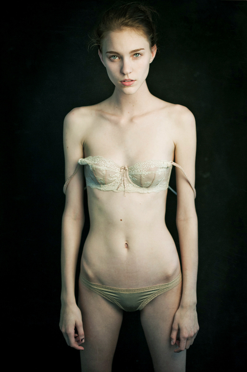
Mathieu Vladimir AlliardNicole Pollard (2013)

Such editorial-fashion portraiture is not my cuppa Joe. This though, I can’t get out of my goddamn head.

It’s the asymmetrical picked at nailpolish on her right thumb, the textured trim on her knickers, the way the light makes her hipbones look uneven, the mole above her navel, the contrast between the cream color of her bra against the sickly white of her skin somehow balancing against the dark background to create a strange vibrancy.

But it’s really the strangely intense blue-eyed stare somewhere between knowing, asking and boredom that is most captivating. I do not know what Ms. Pollard is thinking but I really, really, really would love to know.

Expressions are what elevates Alliard’s work above the paint-by-numbers editorial-fashion crap. His sitters usually appear edgily defiant and half feral.

A similar mien shows up in Ms. Pollard’s work. It’s less overt but she appears matter-of-fact, in control and as if she is prepared to give it to you with both barrels if anyone so much as thinks about giving her shit.

Somehow what Alliard customarily seeks and what Pollard offers, cancel each other out here. In the resulting void, something unexpected happens.

The single substantial criticism I have is #skinnyframebullshit. The only compositional logic governing the use of a vertical frame is to facilitate slimming–which is unnecessary and fucking stupid. Ms. Pollard is quite gorgeous but she’s fucking skinny. The bra straps hanging off her shoulders accomplish the desired purpose well-enough and do not require backup. Not to mention, the image would been moodier for landscape orientation as well as adding weight to the oddness of the expression.

boudoirboudoir:

(via Gilles Berquet la chair)

According to the American Cancer Society one (1) in eight (8) female bodied individuals will develop invasive breast cancer.

Breast cancer is the second leading cause of death for female bodied individuals (after lung cancer).

It’s great news that new instances have decreased and that prognoses have grown more optimistic. The American Cancer Society, Pink Ribbon and other organizations have done a solid job raising awareness, emphasizing early detection and spurring research.

For all that–which should not be diminished–what about the eight person in that room. What part does that individuals fear, suffering and, hopefully, heroic recovery have in the conversation about breast cancer?

Some photographers have started asking these questions. I chose the Gilles Berquet’s image its fetishization of the body (and some definite #skinnyframebullshit).

Still, there is a regal, animal fierceness to the image. A strength and dignity in the face of fashion lighting and overtones of sexualization.

It’s a sight better than the more focused but less adept work of The SCAR Project.

Although the best image I’ve seen encountered is Sandra Blánquez’s stunning Ponte el pañuelo contra el Cáncer de mama.

Matters of respective quality aside: this is important work and it deserves a much wider audience.

See also: this.