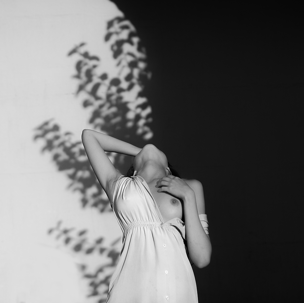
Haruo Kaneko – Catharina (2017)
As an image, this doesn’t entirely work.
To make sense of the whys: visualize a vertical line dividing the frame into a left half and a right half. There’s a mass of shadow detail in the left half and a mass of highly detail in the right half.
Compositionally speaking this isn’t a terrible strategy. The difficulty is that there needs to be some unity between form and function–the balance between the two halves can only be considered effective insofar as it astutely parses the frame to make things more intuitively read by the viewer. (Catharina gazing to her left is an effort to addresses this shortcoming; however, given the left heavy, off-center staging doesn’t work anywhere close to well-enough to compensate. As such: the viewer only really considers the left 2/3 of the frame.)
What are some strategies that could have addressed these compositional flubs?
Given the left side having a heavy concentration of shadow detail (which we’re going to call positive space) vs the right being so heavily skewed toward highlight detail (which we’re going to call negative space), arguably the easiest fix would be to have Catharina sit in the right most chair and the shift so she’s looking back across the frame. (There’s a natural, subconscious urge to want to see what someone who is clearly looking at something is looking at–whether or not it’s possible to see the thing upon which their gaze alights. This is an astute strategy for directing the manner in which a viewer sees your composition.)
(Also–and I will admit to being extra persnickety in this one instance–given the clumping of positive space offset by negative space, it would seem wise to position Catharina so that she’s adding positive space to counter the compositional difficulties of this given frame. Plus, the plant behind her really does sort of look like it’s growing from her forehead.)
Also: this is neither centered nor oblique w/r/t position of the camera in relationship to the subject. The angle of the line of the slabs upon which the chairs sit is less something that draws the eye and more something that comes across as merely decorative. Given the discrepancy between positive and negative space, this halfway between angled and dead on centered works better the further you commit to either extreme. (Angled makes the more visually interesting composition however there’s a lot more room to make poor choices.)
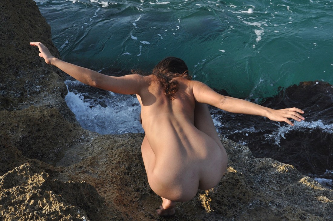
The reason I’m posting this is less to call out aspects of it that are sloppy and more due to the fact I’ve been thinking a lot about poses recently. (And make no mistake Catharina’s pose here is fantastic.)
What makes it fantastic has several ingredients. Let’s break it down:
Generally speaking most nude photography/digital imagery deal to a certain degree in/with stylization w/r/t posing. A lot of hacky curators are pulling together shows on the female gaze without really giving much thought to the visual grammar of the work and more consideration to whether or not the photographer identifies as a woman.
It’s not just that presenting woman as sexually available is problematic. The inverse–and this is my fundamental disagreement with the notion of the so-called ‘female gaze’ is that it frequently adopts a similar tenor to a lot of fine art nude work made by folks who identify as men–in which there is a diminution of any emphasis on sexual availability and more of an emphasis on something more simultaneously chaste and titillating than more erotic/pornographic material.
There’s also the scores of photographers screaming about how nudity isn’t inherently sexual but then adopting the same stylistics of posing. The point I keep trying to make is that there’s a natural way of moving and being in a space where one is comfortable that what an observer might see could be considered salacious except that the bearing of the body is such that it conveys more of comfort or being completely and unself-consciously at ease. (I frequently lay on my back on my couch naked with one leg stretched out and the other kicked back over the back of the couch. I do it when I’m alone, I’d never do it while I had company over. (OK, that’s not completely true… it would depend on the company but then the company would change the context substantially.)
What I like about Catharina’s pose is that it’s part stylization. the shoulders back confidence vs the way her upper arms frame her breasts. Her hands run down at her feet–and it’s a bit like she doesn’t know what to do with them except that it almost looks like she’s scratching a bug bite of her foot when she was instructed to look to her left. There’s something that’s wonderfully unself-conscious about it, really.