
Sanders McNew – Melanie King (2014)
Often, I drone on and on about the notion of ‘composition’–as if y’all magically know what I mean.
I mean I do try to at least apply the term consistently, usually meaning something like the way visual information is arranged and presented within a given frame.
Unfortunately, such a definition is a bit too open and inclusive as to be functionally useless.
Interrogating matters of composition might be better separated into several congruent examinations. There’s the notion of the frame. This gets tied up in ideas of inclusion and exclusion. However, there are also tangential concerns about the way things like the angle of view and tilt/pan/cant of the frame subtly informs psychological resonance.
There’s also questions of space. This can pertain to depth of field. The way a scene or setting is depicted. (Generally, it’s this to which I’m referring when I mention composition–the way a photography parses visual information in space through a lens in an effort to not only show the viewer something but offer them a particular way of seeing it.)
I’m not sure the above is a great photograph. I like it enough. But what I think is truly exceptional about it is how clear an example it is of parsing visual space for the viewer.
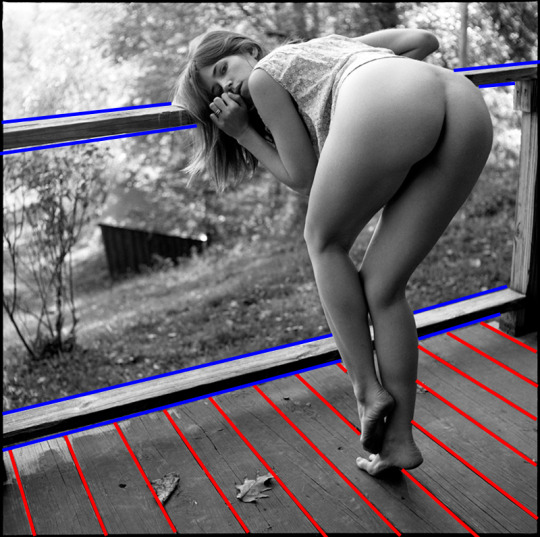
The default order of operation for reading images is left to right. Yet, that doesn’t always work. (As anyone fixated on making images exemplifying bilateral symmetry will tell you: it’s rare that things that appear symmetrical are truly and rigorously so.)
So one thing photographers do is to us contextual elements within the frame to guide the viewers’ eye over the frame.
The lines highlighted in red pull the eye upward and left and then the lines highlighted in blue shift the eye left-to-right. Melanie’s gaze directly into the lens closest the loop and the eye circulates following the lines highlighted in red inward, then the blue lines drift right and then we’re back at the beginning again.
What’s also skillfully applied here is Melanie’s position vis-a-vis the lines. She’s in front of them and therefore blocks them. That makes her the undisputed subject of the frame. (The DoF presents both her and deck in sharp focus but the scenery behind her goes soft and bokeh, further pushing her and the porch to the foreground.)

