
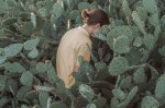


Brooke Didonato – [↑] Temporary view (2016); [←] Still pulling cactus needles out of my ass (2018); [→] Closure (2016); [↙] Self portrait outtake # 9,777 (2018); [+] Title unknown (2017); [↘] sinking in pink (2017); [↓] Title unknown from Quiet Places (2016)
There is something special about Didonato’s images; and it’s less to do with anything tone or style (her closest contemporary corollary is likely Ben Zank, but she’s also seemingly constructing her scenes with similar playfully confrontational absurdity to Yung Cheng Lin, echoes of questions regarding how humans perceive bodies in relationship to the environments they inhabit and how those relationships can provide uncanny fuel for surrealist interpretations (reminiscent of Evelyn Bencicova).
It’s even possible to step back even further and trace a direct lineage from the above group of artists to someone like Josef Koudelka.
I think what makes her work arguably better than any of the folks I’ve compared her to is that Didonato is also disrupting the tradition of which her work is a part. You can’t have looked at much of Stephen Shore’s work without seeing deft homages (Temporary view is almost certainly referencing Shore’s famous South of Klamath Falls, U.S. 97, Oregon, July 21, 1973); the way she prefers to present scenes with a mind toward a wider perspective, while also moving in close in a way that amplifies a sense of location while also preserving context is an insightful response to Uncommon Places and although I can’t point to an indicative example, the way light tangles in Didonato’s pony tail in Still pulling cactus needles out of my ass is both a visual rhyme with Shore’s sensitivity to yellowing light but also an adept encapsulation of Shore’s criminally ignored, irreverent sense of humor.


