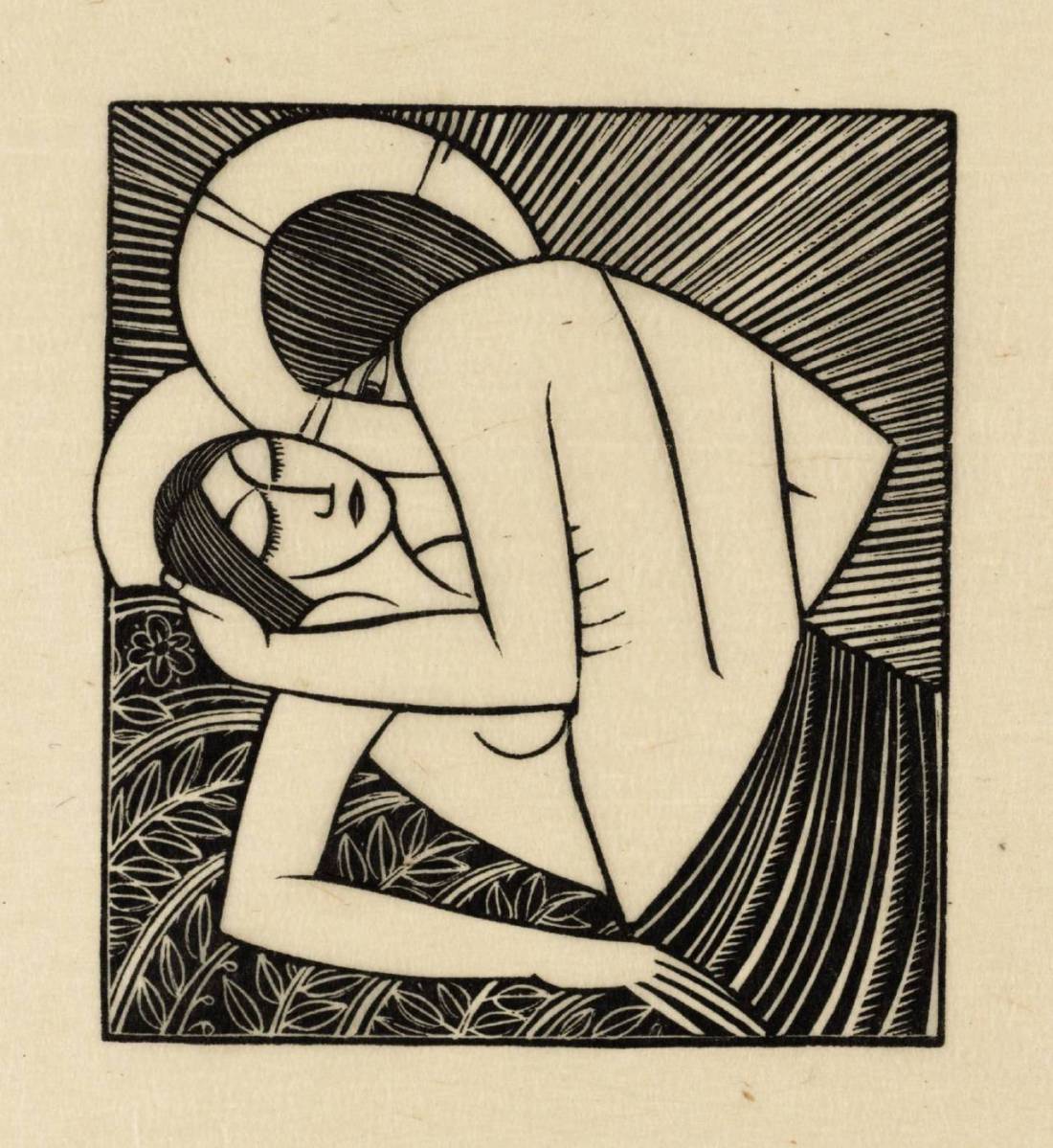
Source unknown – Title unknown (201X)

Regardless of what you think of my notion of #skinnyframebullshit, there is never, under any circumstances, ever any justification for capturing video in portrait orientation. None. Period. End of story.

That I’m giving this a pass should signal just how amazing I find this clip in spite of the shitty execution and poor quality this is one of those rare moments when porn bothers to show not only how I like to fuck but how I like to be fucked (and in the same video, OMFG). But it also makes me feel seen and like my sexuality isn’t just something that’s impossibly inconvenient to 96% of the rest of the world.

Also, trying not to come, coming anyway and then being so at the mercy of your feelings and connection with the other person(s) that there’s no time for  a break or respite and you end up coming again quickly and with such force that you literally feel the strain from how hard you clenched up for days afterwards.

Swoon. (To whoever made this–thank you. Also, please keep making stuff like this. It matters.)

Diane ArbusCouple in Bed Under a Paper Lantern, NYC (1966)

I’ve maintained for years that reading something on a screen vs on a page effects how you process the information. (My recall for printed materials is generally better-than-average; via digital interface noticeably less astute.)

As far as Arbus goes, I’m not a fan. Yes: Child with Toy Hand Grenade in Central Park is one of the all-time best street photography portraits. (And one of the reasons it’s so brilliant is because it was made as things started to escalate in Vietnam–intuitively connecting wars overseas with their psychic impact closer to home.)

I never knew what I didn’t like about her work–and here it’ll become clear why I started with memories formed reading something off a page vs on a screen–I remember reading something on the Internet, a criticism of Arbus that associated her well-known quote: I really believe there are things nobody would see if I didn’t photograph them.” with her interest in social outliers and the stigmatized.

I look at so many of her pictures and there is this circus side show feeling to them–an I’m going to show you what you don’t want to see. That’s maybe okay: spectacle sells, after all. (But also: maybe don’t rely on solely that?)

Her images always leave me with this feeling that she was far more interested in what made someone a freak than how such social castigation impacted a person’s humanity.

So while I’ve seen this image a dozen or so times before it wasn’t until I saw it in the context of Tumblr porn reblogs that I realized what it depicts–a couple making out while a vigorous handjob is administered.

There’s something more disarmingly honest about it for it’s focus on the familiar–Arbus being ostensibly white (Jewish), cisgendered and heterosexual.

Further–and again, now that I need it I can’t find it–there is a similar post-coital image of Sally Mann with her husband Larry that actually is almost certainly influenced by this Arbus’ image.

Source unknown – Nacho Vidal & Kristina Rose (2015)

This position is apparently called The Amazon. SWOON.

This gif? As much as I’m always harping about #skinnyframebullshit, I will admit there’s room to argue w/r/t still photographs/images. There’s not when it comes to video–go horizontal or stay your ass home.

Also, I had not seen the scene this is from before deciding to post it. I have subsequently seen enough of the video to know that it’s both too extreme, sexist and seemingly unconcerned with consent to be something I’m ever going to be into. Still, I do think this is gif is sexy af and the segment of the larger clip it’s from is slightly less obnoxious than the rest of the video.

Eric GillStay Me with Apples (1925)

I knew fuck all about Gill prior to first seeing this woodcut.

My initial reaction was something akin to adoration; the intersection of the sacred and the profane, and the subversive muddling of those boundaries resonates with me strongly.

I know I wail on the point like it’s a horse carcass but I was raised in a rigidly Xtian household. My mom dragged the family to church several times every week and insisted we attend parochial school.

It was a living hell. And while I experienced emotional, mental, physical and sexual abuse as a child, most of those experience can’t hold a candle to the sun compared to the trauma that came from merely existing in such an stridently authoritarian milieu.

Standoffishness was my default safe space. I can trace that instinct back as far as I retain memories. At a certain point, though—things began to shift. I felt more and more alienated from the proceedings.

I was in my late teens. I’d stopped going to church with my family and began tagging along to other churches with friends. By and large, the services were far less dour and severe—there was upbeat vitality, which helped for a time—the increase in sensory stimulation distracting from my feelings of not belonging.

Invariably, the orgiastic performance—hands held high above heads, swaying (the posture of an expectant child waiting for a distracted parent to pick them up), gibberish glossolaliac syllables dribbling from the mouths of frenzied parishioners—would lead the pastor to remark rapturously on how the spirit was strong with us this morning. How he could see it move over those gathered together to praise the name of the Holy Lamb, like the wind whipping up waves on a stretch of open water.

I never felt it. Not once—not even a little; not even at all.

For years, I thought I was defective, broken. That other people were able to experience something from which I was completely cut off.

I’ve been trying to write this post for several weeks. Each time I approach it, I have more to say but end up communicating less and less.

I took a step back and actually read a bit about the artist. Turns out he was a real sick fucking puppy (pun intended, sorrynotsorry)—unconscionably so: carrying on incestuously with both his underage daughters and dabbling in beastiality.

One of the convenient criticisms of the social justice movement is that in confronting inequality head-on, there is a tendency to perpetuate an equal and opposite form of inequality—the sort of uncritical thinking that equates affirmative action with separate but equal stratification as an attempt to remediate systemic racism.

Increasingly, we’re seeing push back to social justice-tinged critiques. Damien Chazelle’s awards season darling La La Land experienced push back for it’s overwhelming whiteness and its erasure of LGBTQ+ folks. And the pushback received push back by—primarily white, cishet men arguing that it’s still a great accomplishment in cinema regardless and that SJW folks are once again all-too willing to throw out the baby with the bathwater. (Full Disclosure: I haven’t seen La La Land; I have seen both Moonlight and Arrival and while I understand why the former has gotten so much praise–representation matters and on that account it’s huge and ground breaking–but it’s also flawed in a way that Arrival is not. I’m hardly going to dismiss Moonlight; however, those folks who elevate it above Arrival are a bit beyond the pale in my personal estimation.)

(There’s actually an emerging term being employed to name this reaction: anti-Art criticism.)

When I was a filmmaking student, the film department brought in a professor from the theater department to teach directors how to work with actors. It was one of many occasions where I fell afoul of The Powers That Be.

I remember being told that an actor could only convey one distinct emotion at a time. And to expect anything else was to knee-cap the authenticity of the performance.

It still ranks as one of the most bullshit pronouncements that I’ve ever encountered.

Something you probably won’t understand if you didn’t grow up sheltered by Xtian conservative parents is the degree of importance placed on MPAA ratings for movies. For example, I hadn’t seen a single R-rated movie until I was 15 and saw The Silence of the Lambs.

It was a revelation and I have—to date—watched it more than 200 times.

If you’ve only seen it a couple times, you probably won’t have paid much attention to the line that Lecter offers Clarice when she notes a drawing in his cell: It’s the Duomo as seen from the Belvedere; do you know Florence?

That one line combined with a fascination with the Renaissance Masters led me to fantasize for years about visiting Florence. From the age of 19 on, I would check airfare several times a year only to decide it was too rich for my blood.

Then I ended up in a Survey of Wester Art 101 class taught by this affable but deeply anxious and shockingly undynamic professor. Somehow, he saw my intense interest and while the class was a wonderful experience. It was my engaging with him that caused it to be so. I remember we really dug into Florentine art. The professor wanted us to be able to parachute in and have an idea of the lay of the land. Our final exam featured a section of slides taken from the streets in Florence and we were to make an educated guess as to where in the city we were and then using a provided map navigate to the location where a stipulated work was on display.

I never had even the foggiest inkling that I’d ever be able to use that knowledge until the planes collided with the towers bringing them toppling along with air fares.

Several days later—at a restaurant with my mother—she told me to put her money where my mouth was and wrote me a check for what I was short to finally get off my bum and do what I’d been dreaming about for years.

So two months after 9/11, I flew to Italy.

I remember the plane started its descent. We dipped into the clouds, but the ceiling was thin and as we emerged almost immediately; through the window I saw golden hour light painting the historic bridges from west to east: Ponte Vespucci, Ponte Alla Carria, Ponte Santa Trinity, Ponte Vecchio and Ponte alle Grazie.

I don’t think time has ever passed so slow in my life, landing, taxi, baggage claim, customs, the cab ride from the airport into the city.

When I finally arrived at my hotel, I literally three my suitcase into my room and bolted out into he street—following the Arno as it snaked beneath the same bridges I’d seen two hours before.

I stood at the center of Ponte Vecchio and watched the sun set; this strange feeling of both fulfillment and anticipation.

From Ponte Vecchio, I veered north. Where Via Por Santa Maria becomes Via Calimala, the strains of an aria reached my ears–an outdoor performance in Piazza della Signoria. Via Calimala becomes Via Roma; and at Via degli Agli, you round a blind corner and are confronted with the green and white marble of the Baptistry. My eyes slowly scanned right–the Cathedral with Brunelleschi’s double brick dome and Giotto’s campanile.

I was gobsmacked. I stood completely overcome. It was a full five minutes before I recalled that I had a body to which I was tethered. There was no subjective experience of an object. I was just in the thrall of a beauty that pierced me to my very soul.

In that moment, I knew what all those pastors had been saying. What it feels like to be in the presence of God. I realized that I had been wrong to think I would only ever feel that in a building made of wood, stone and brick built by the faithful. I’d felt it before in smaller ways. Watching a beautiful sunset, reading a story that moved me, listening to music, making love. I’d actually felt it hundreds–if not thousands of times before.

I stumbled upon an article this week about a recent study suggesting music gets you just as high as sex or drugs.

I’ve arguably done more than my fair share of drugs. So I can totally relate to this pronouncement—even if, in my experience, I get higher off of music and sex than I ever have on drugs (i.e. multiple orgasms and disc one, side one of Godspeed You! Black Emperor’s Lift Your Skinny Fists Like Antennas to Heaven on vinyl are always better than any drug I’ve ever had.)

Back to the anti-Art criticism thing for a minute…

Isn’t it contradictory to give Gill a pass for his reprehensible behavior while also taking issue with the pervasive whiteness in the work of someone like Richard Linklater? Or, to compare apples to apples: why is it acceptable to still appreciate the above while repudiating the work of say Woody Allen and Roman Polanski?

In some ways it’s easy. I detest both Allen and Polanski. And in fairness, I’ve been seen any of the former’s supposedly seminal work—only his more muddled, watered-down and self-indulgent early work. But with both, I do see a tendency in their work to both not only attempt to justify their behavior through their artistry but to suggest that what is problematic about their proclivities actually somehow makes them superior to those who criticize them.

But for something even more apples to apples, consider D. W. Griffith. You cannot talk about contemporary film without addressing his legacy. And he was mad problematic. But the pervasive influence of his work is undeniable.

So I reject the notion that we have to reject everything out of hand due to specific problematics. Personally, I believe that you can hold two conflicting positions in your mind—and further, I’d go so far as to say if you can’t then you do not have an especially refined critical faculty.

But I do think it’s in poor taste that we’re comparing someone like Damien Chezelle or hell, even Richard Linklater (whom I like) to someone like D.W. Griffith. Objectively neither have contributed to the medium in a similar fashion. (Although, in fairness, I do think history will be kinder to Linklater in say 50 years.) So the notion that through a selective imposition of critical theory, it might be possible to elide entirely correct critiques of problematics is just in really poor faith. (And really, when you get right down to it, anti-Art criticism is an effort to re-approriate critical theory in the service of maintaining the hegemony of a dominant whiteness in art and media.)

Honestly, I don’t know enough about Gill to say whether those problematic things about him can sit side-by-side with his work and result in his work still being considered meritoriously. His biographer Fiona MacCarthy seems to think it does.

For my part, I do not read the above work as advocating incest or deviant sexuality. It seems more as a general suggestion that contrary to religious proscriptions, sexuality—much like music and drugs—does provide access to realms where the membrane between the desert of the real and the experience of self-transcendence are thinner, more permeable.

So I don’t have to give Gill a pass to acknowledge that this image appeals to me because of my own entanglement with the cult of sex, drugs and rock ’n roll. But I also won’t obfuscate the problematics. My praise for Gill will, in other words, never be full-throated so much as reserved and carefully considered.

And my experience of sex is like the obverse of that experience of music, whereas the hearing of music is something I feel, sex is a means of aligning all of my senses in a single pursuit. The experience of sharing my body completely with a partner or partners is the closest I know of approximating a self-transcendent experience.

That’s why I adore this image–it deals in my bread and butter, the mystical cult of sex drugs and rock and roll.

Paola AcebedoTiran Como Conejos (2012)

I’m of the mind that anyone/everyone is capable of making an objectively good image.

This begs the question: if anyone can do it, does that preclude lens based work from consideration as art?

Well, if you’re a photographer or image maker you already know the answer: of course not! There’s more to photography/image making than producing an objectively good image.

First off: you have to know a successful photo or image from an unsuccessful one. And this is one of the things with which photography/image making will forever struggle: each and every one of us has been inundated with lens based visual culture since birth–as such, everyone thinks they’re already a subject matter expert. (I’ve been running this blog for 5 years and I was a freaking MFA Photography student for a bit before I got seriously disenchanted with the whole charade and dropped out; point being I’ll be the first one to admit that my knowledge on the subject is found–more often than not–to be lacking.)

But distinguishing between a successful photo or image and an unsuccessful one isn’t always straight forward. Much in the way that you can ask a room full of 18 undergrads to define love and receive 36 different, often conflicting responses, show a group of folks an array of 36 different photos/images and while there’s likely to be more overlap than you did asking them to define love, there will be no immediate agreement.

I think: a lot of people privilege their own perspective. (And I do not mean that pronouncement as an implicit value judgment–only insofar as one is aware of and takes account for this bias; I will not abide blissful ignorance or arrogant equivocation.) Most beginning photography students believe themselves to be the next Cartier-Bresson just by virtue of the ontology of their status as a photo student. Hell, I did too when I first started.

The difficulty with that perspective is that you tend to use your misguided belief in your own creative infallibility as a means of justifying the importance of your Perspective. Yes, there is value in those truly outstanding makers who teach us new ways of seeing. However, of those, truly great visionaries–and pro-tip: a true visionary isn’t going to dub themselves as such (sick and tired of advertisements for hacky visual crap by the likes of dimwits like Zach Snyder and Gore Verbranski being termed ‘visionary’)–the ones who never bothered to scuffle along, stumbled and fell repeatedly trying to learn both the basics of visual grammar and the grown more intimately familiar with the history of the form, are the exception that proves the rule.

It’s dumb (again not a value judgment, more a noting of self-imposed limitation) to think you know better just because you’re doing the work.

Second, being able to distinguish between an objectively good image and an objectively bad image is one thing. Much in the same vein that we teach children to choose between right and wrong only for the child to grow up and realize that decision making in the real world rarely affords such simplicity. Frequently, you’re left with work that isn’t exactly bad but isn’t actually good either. (This is actually something I’m struggling with in my own work: the hard wired urge to include the objectively good over the technically muddled but luminously singular work.)

I’m not controverting @reverendbobbyanger‘s recent Sunday Post reminding that: good enough is not. I’m merely saying that photography and to a lesser extent image making–due to the rapidly advancing technology available for digital intervention/manipulation–WYSIWYG… it’s not like a painting where you can shift things around to suit your purposes after you’re well and truly off down the road.

But I’ve danced around enough the reason I’m getting into all of this is because I think the above image is a stellar example of reclaiming an image that was objectively muddled.

The image itself does not work. Yes, the compression of color is interesting–the cabinets, tile and dishwasher create a palate accentuating the skin tone in such a way that it sort of permeates the scene–much the way the smell of sweat and sexual effluvia swirls around the entwined bodies of spent lovers. There’s also something to the staging that seems exaggerated and awkward but at the same time conveys something of the experience of saying to a new love, I’m not sure I can get off again but maybe let’s try anyway.

Note how the camera is askew in alignment with the back wall–i.e. the right side of the camera is angled back and away from the wall, as opposed to being on a rigorously parallel plane to it. Further, the vertical frame edge is not squared with the seams of the cabinets/tiles in the backsplash; the slight uptilt only serves to exaggerate these flaws. (Emotionally, this was the right choice and it opens up the frame, providing more context; conversely, the dishwasher and the area in the top, right hand corner really screws with the visual flow as the eye scans the image.)

In other words, there are interesting things about the image. But it doesn’t exactly work. How do you solve a problem like that?

Well, Acebedo, broadens the context but presenting the image as if it were pinned to a page in an old album with yellowing scotch tape. It renders the image more inherently visceral. (Also, mysterious.)

But the thing I like most is how it preserves the anonymity of the participants. I cannot even begin to articulate how adamantly opposed I am to decapitating anyone in an image to preserve anonymity. There is always a way to include the head in the frame and then to–if need be–creatively obscure it. This is a great example.

Finally, I love that this adopts the fine art photographic tendency of naming a picture in such a fashion where the title merely describes the image. (A great way of underscoring that the image speaks for itself.) Here, you don’t have to have taken a day of Spanish to be able to perfectly translate the title: They fuck like rabbits.

Also, you really should check out Acebedo. There is something profoundly lonely about her work but it replaces sadness and longing with the feral possibility inherently in being alive and breathing.

Kirill KikiboyTitle unknown (2016)

Under the usual circumstances, I’d advise you to steer clear of this guy and his work. It’s just another example in an interminable string of dime-a-dozen cishet asshat male image makers who possess a modicum of technical acumen and believe this gives them the right–nay: obligation–to produce work that has no raison d’etre whatsoever beyond the beatific rendering of sexually objectified femininity.

But as much as I detest the rest of his work, this image is difficult to disavow.

I find it exceptional because of the way that it uses the extremely shallow depth of field to shift the emphasis away from her genitalia and to the way he’s holding her foot. (If I was a better person, I’d say that bokeh is consistent with Canon glass.)

This being the case: the focus is less implicitly carnal and more tied up in a symbolic shift in power dynamics.

Another point: I won’t suggest this is #skinnyframebullshit–given the angle of her left leg, it reads up and down as opposed to left and right.

Interestingly though, while there is a compositional logic to support the vertical orientation, I’m pretty sure this was originally a horizontally oriented frame that was cropped down in post. (I think this for a number of reasons but the main two are that it’s not exactly easy to square a camera vertically with only one hand–you end up with your elbow thrown up like you’re doing the funky chicken in a Jazzercise class; also, the top 15% of the frame is negative space–yes, it ends up balancing out the fact the the image is decidedly bottom heavy… yet that’s not something that would be easy to see in the moment of trying to visually parse the scene.

I’d actually be super interested in the original framing of this–assuming my gut feeling on this is correct. I think it’s probably a more immersive image for the added narrative implication.

viiviidi m p u l s a t i n g from Serene Minimalism collection (2016)

This is quite lovely but I would argue that it’s not–strictly speaking–pornography.

But, you inquire, there’s a great big old erect phallus carefully positioned and–presumably–ready to get down to business.

I mean, yes…that’s true. But notice there’s nowhere for it to go.I mean you can argue it’s going there but I don’t see it like that.

There’s something here about anticipation–a desire without a means of satiation.

The image possesses an unresolved tension. In the face of that tension, other things effervesce; for example: the style of this is exactly half woodcut, and half Matisse cut-out.

It also reminds me a bit of shunga–which tends to exaggerate the act of sexual congress but also features awkward positioning or feet and arms. I mean it’s clearly that the cock haver’s feet are splayed out to the left and right but they don’t seem to completely align quite right.

I do really love the tension between the two hands. The hand on the kneeling figure’s left flank is so worshipful and reverent. Whereas the other hand is so forceful–holding it just below the elbow joint allowing it to both pull back and twist the arm, rendering it immobile and to a degree controlling the body to which its attached much the way a leash and maneuver a pet.

urbanfaerietalesTitle Unknown (201X)

The above images are interesting–if a bit muddled. Yet, the way in which they’re muddled suggests several things to me about visual grammar. So like good Wittgensteinians, let us conduct a grammatical investigation!

A lone photo or image must stand on its own. However, as soon as you position photos or images adjacent to one another–each subtly shapes and informs how we read not just the one image or photo but how we read both of them together.

In the loosest sense there are two ways that photographs can relate to each other: as polyptychs or as sequences.

The above is not a triptych.

Strictly speaking, a diptych means ‘two-fold’. A triptych would indicate three folds. As such you can see panel A alone, panel B alone, panel C alone or panel A & B together or B & C together or A & C together or A, B & C all at once.

While polyptychs can be seen as relating to each other in a way that conveys are broader, overarching narrative–their construction is not intrinsically narrative. The each panel stands alone but that together each comment, enliven and enrich each other so that the piece as a whole comes to constitute more than the sum of its parts.

A sequence, on the other hand is fundamentally tied up with the movement of time. (To be 100% clear, a polyptych can be sequential but a sequence is not automatically a polyptych.)

There’s several things the above sequence does well. First off, the use of depth of field to direct the viewers eye is totally on point–in the first panel, only the top of the head in the foreground is in focus while everything else goes soft; in the second panel, the focus point is ever-so-slightly behind the kneeling figure; the final panel shifts the focus towards the middle ground between the two lovers.

Compositionally, the first and last panel are #skinnyframebullshit–there is absolutely no effing reason given the frame that vertical orientation contributes fuck all to the logical consistency of the whole.

In the first panel, the way the supine figure’s legs open up to the room begs for landscape orientation, further given the narrative auspices of the piece as a whole–it’s extraordinarily poor form to employ portrait orientation.)

The contrast and overall tonal range are best in the third panel; however, the frame feels constricted; it makes me nervous that it’s so clearly supposed to be set in this room but the view of the room is so claustrophobically limited.

The second panel is actually a fabulous example of when a vertical orientation actually serves a goddamn purpose–the frame reads up and down and by fitting it to a form that is predisposed to that sort of scanning, the image maker employs the appropriate visual grammar to convey to the viewer how to best engage with the image.

In summary, there is a great deal of raw potential here. I’m of a mind that this would’ve been more effective if all the images had been landscape oriented or if the second panel had been extracted and presented independent of the others (I do think you’d lose something but the image is strong enough to stand on its own).

Alternately–and probably even stronger–would have been if the first and third image were landscape oriented and the second image remains in its current, portrait orientation. This would’ve pushed things more in the direction of a polyptych and would’ve also suggested an altar piece–which is more in keeping given the almost liturgical tone of the images.

And that’s why I make such a big deal about using portrait orientation correctly. Maintaining that it doesn’t matter is the same as saying that the comma in Let’s eat Grandma vs Let’s eat, Grandma doesn’t make any difference in the end result.