Untitledhttps://embedr.flickr.com/assets/client-code.js
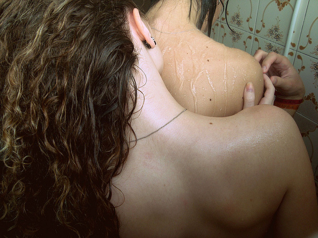
Camilla CattabrigaUntitled (2015)

I’ve said it before but it bears repeating: if you are a young photographer who wants to work in B&W, invest the time and energy necessary in learning to use analog.

Digital is garbage when it comes to B&W–especially at higher ISOs. (If you only have a digital rig, then you should unequivocally set it to some sort of monochrome setting before firing the shutter. Desaturating in post is always going to produce a tonally muddled image; monochrome settings aren’t much better but every little bit helps.

Also, an image maker it smacks of lazy, knee-jerk, half-assery when you stamp your work with a text-only watermark. I mean, an image maker is ostensibly a visual artist, so it’s just a wasted opportunity. (And that’s completely glossing over my rabidly anti-watermark idealism.)

Still, overlooking those concerns, there’s something fascinating about Cattabriga’s work.

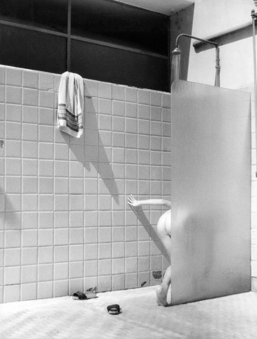
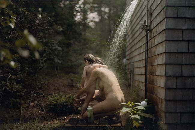
She uses what I’d term wide or establishing shots and extreme close ups. With both, she pursues relatively flat compositions–alternating classical one-point symmetry and more minimalist, De Stiji at a cant asymmetry.

I could point to dozens of young, internet famous image makers she riffs off. But I think what’s most interesting about her work is the aforementioned alternating between wide vs tight shots.

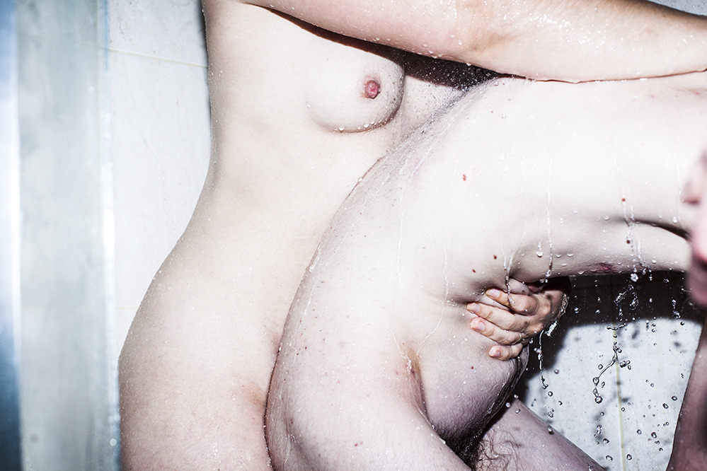
I like her wide shots well enough. They demonstrate a rare contemplative patience. These type of shots tend to outweigh the closeups by a rate of about 4 to 1. This allows the close-ups to convey an unusual immediacy.

As much as I think that like the term post-rock is generally (and rightly) derided by the bands whose music is so labeled, it does at least point to some incredible music.

I feel similarly about the oft touted term ‘female gaze’. Generally, the people who embrace the term are full of shit. (Looking at you, Masha Demianova.) But I can’t look at Cattabriga’s close-up work and not be 120% convinced it applies.

And I’m not sure she sees it in her own work. The above image does not feature in the Nicole E Flavia series of which it is a part. I think generally a tighter edit would’ve added punch to the images but there is something to this image that pairs a little too well with some of the other close-ups, primarily I’m thinking of this one (which is effing incredible).

Also, I love how the image above depicts a state of eroticism that is independent of the audiences experience of titillation. The image doesn’t exist as any sort of invitation, it’s merely a record of white skin, touch and the proximity of bodies in a confined space.

I don’t think there’s ever a justified reason to decapitate people when making an image, but here’s a case where it almost works as long as these images are considered within the context of the entire series.

Chadwick TylerAli Michael for P Magazine (2015)

I get a lot of guff from people when it comes to my notions of what constitutes logical framing decisions.

I suppose my two responses to that would be something like:

  1. The received wisdom that one needs to learn the rules before breaking them applies, and
  2. That I am aware that I tend towards dogma with regard to certain aspects of image making–so take what I saw with a big old boulder size grain of salt.

In truth, I don’t really spend a lot of time thinking about it. The proliferation of lens based imaging methods has democratized visual culture only insofar as anyone who can lay hands on the equipment now claims to know what they’re doing. In my experience, however, the predicted increase in vitality of work turned out to be a trumped up pipe dream.

I really don’t like this frame. It’s clearly trying very hard to seem like a shot from the hip, every second of living the hip lifestyle obsession circle jerk is pure fashion poetry waiting to be memorialized by a snapping shutter. (If it was legitimately that, I’d be non-plussed but generally accepting of it.)

I don’t like that this is so carefully posturing as that but it’s difficult to hold the grudge since the Michael’s pose is so spontaneous and clearly unintended. (The fashion/glamour everything that’s not airbrushed must go aesthetic, infuriates me.)

So I find awkward poses like this–when they ever see the light of day–to be endearing. It’s like an admonition to remember that people are beautiful not only when they are trying to be or not succeding at being, they are beautiful because they are people doing the best they can with what they have.

The pose also reminds me of another image I had saved as a draft but I didn’t know how to address.

Philip-Lorca DiCorcia – Wellfleet [Emma and Naomi] (1992)

If any of you knew me AFK, you would quickly realize that I am always late to the party.

I stumbled onto my favorite band of all time just before they went on a more than decade long hiatus. It took me almost two years after all the initial hubbub and hype to stop and read Patti Smith’s Just Kids (which I’ll have you know accomplishes the rare feat of being unfathomably better than all the good stuff you’ve heard about it).

Same goes for DiCorcia. I had no idea who he was until the David Zwirner Gallery resurrected his exceptional Hustler series two years ago.

I didn’t make it to that show. (I mean to go to shows all the time. I’ve been meaning to make the Jeff Wall show on now at the Maria Goodman Gallery for more than a month but I never venture north of 32nd Street, so 57th might as well be on the other side of the country. I know that’s silly but that’s how my mental illness makes it feel.)

This image–although it is from a different series, namely A Storybook Life–  makes me realize missing the Hustlers show was a monumental mistake because it seems like he’s doing something fascinating with color.

I’m not sure I can do more to point to it but my instinct is refer to the above image as painterly. Intellectually, I know that’s something likely to get you cut by a fine art photographer. And I think what’s really going on is something very much anti- the-prevailing-conversation-about-the-place-of-color-in-fine-art-photography.

It feels like if the statement that B&W highlights the foreign in the familiar, then I think that DiCorcia is actually attempting to employ color in the same way that B&W is taken for granted. It’s an audacious conceit, actually.

Further–and I’ll own my bias from the outset by admitting my abject contempt for Jock Sturges–I feel like this is a kind of implicit critique of recurring Sturges motif of nudists showering, of which this is perhaps the most famous.

Nate Walton – Alex Papa in Malibu (2014)

Echoes of Nan Goldin’s Kathe in the Tub, Berlin, 1984.

I effing love this image. The way the back lighting creates such stunning separation between the background and Papa’s body–especially her face, neck and torso. The tension between her stillness and the dynamism of spattered droplets frozen in the air–how they convincingly resemble the grain in high speed color negative film.

Lula HyersUntitled (2014)

Were you to take the current bumper crop of twenty-something lifestyle/fashion image makers, write their names on slips of paper, fold up those slips and place them into a hat, shake the hat about and pull out a name at random, any name would share some obvious parallel with Hyers’ work.

I am certain that Hyers would be at least passingly familiar with the large majority of names in that hat. She probably even considers many of them influences. The thing is: her work is also frequently better than the work of at least ¾ of those names that might emerge from the hat.

A bold statement: yes; but if you stop and look at her work–I mean engage with it–you can’t dispute the assertion. Add to that, Hyer’s still being a teenager and Jesus Harold and Maude Fucking Christ on Christmas her aptitude is freaking unbelievable.

And while I am of a mind that she’s better than the majority of her peers/influences, what she does better than just about anyone is the way she presents bodies and the sometimes related sometimes unrelated sexual expression of bodies as almost an afterthought–allowing her broad latitude in presented the truth of those in her life without misrepresenting the complexity of the moments she captures or relying on knee jerk shock value.

It’s surprisingly mature work for someone so young. And although comparisons to those aforementioned twenty-something lifestyle photographers are astute (along with correlations to Goldin and McGinley), I feel there’s a closer relationship with the frenzied urge to document life exemplified by one of my favorite photographers Igor Mukhin.

What I see matters little next to  than simple truth that this work is breathtaking; I cannot wait to see where it goes from here.

whenitgetsheavy:

Libby EdwardsCollab (2012)

Not only a weird angle, this is rather unlike the rest of Edwards’ images.

The strobe bleaches right up to the very verge of burning away texture and color from flesh–waterline tracings still show a membranous sheen against skin.

Water fragments and refracts, a hissing sizzle bouncing between and dotting bodies; arcing strings stretching and shivering–quick silver in a vacuum tube.

And oh just look at all the secrets two hands hide in their showing.

  1. Right edge of frame: a thirty party watching, approaching; casting a shadow figure bent beneath the spray.  (The Observer Effect) EDIT: Alveoli Photography sees this differently. The ‘third’ hand is actually his left hand reaching over to trigger a short cable release. This makes more sense than my interpretation since the third person would have to be roughly 6’7" to account for the positioning i had in mind.)
  2. & her hand’s Apollian claiming a quote from the greatest sculptor, Bernini.

This is sexy a fuuuck.

Igor Mukhin

Normal
0

false
false
false

EN-US
X-NONE
X-NONE

/* Style Definitions */
table.MsoNormalTable
{mso-style-name:”Table Normal”;
mso-tstyle-rowband-size:0;
mso-tstyle-colband-size:0;
mso-style-noshow:yes;
mso-style-priority:99;
mso-style-parent:””;
mso-padding-alt:0in 5.4pt 0in 5.4pt;
mso-para-margin-top:0in;
mso-para-margin-right:0in;
mso-para-margin-bottom:10.0pt;
mso-para-margin-left:0in;
line-height:115%;
mso-pagination:widow-orphan;
font-size:12.0pt;
mso-bidi-font-size:11.0pt;
font-family:”Garamond”,”serif”;}

If it moves, Igor Mukhin likely shoots it; if it doesn’t, he’ll still take aim.

With nearly 5000 images—split between B&W film scans and Leica AG M9 captures, amassed over 6.5 years—perusing his photostream is like mainlining a hyper-distilled, chaotic mélange of interesting, occasionally ingenious work.

My head doesn’t wrap around such profligate excess easily—limitation is too central a feature in my own process. (Read: I am poor.) But I can let that slide. What I fail to fathom is how Mukhin’s haphazard, throw-it-at-the-wall-to-see-what-sticks curatorial approach works at all, let alone results in such jaw-dropping examples of all that photography should embody.

(To avoid unnecessary disappointment, skip his staid personal website.)

A mass of thick dishwater curls pulled aside—dry except where darkened behind an ear, down her back.

Shower mist glistens along a shoulder, the angle of her neck—a second skin.

Invisible lips press against the spine, a slow finger tracing a familiar line—A bout de soufflé.

Tongue sealed up soft in her mouth like clay beneath a highway where she waits in memories amid seasons of traffic and lulls praying to taste the wet sting as vertebral notches open her like jagged teeth of a spinning saw.

(Standing in line for a movie once, there was a girl dressed in backless black with bandaged stitches all down her back. I came within an inch of touching her wound before realizing what I wanted to do, that I shouldn’t.)

The words to truth are terrifying. I am trying to say: do whatever it takes to open me.