
Laura Makabresku – Untitled from Lovers series (2017)

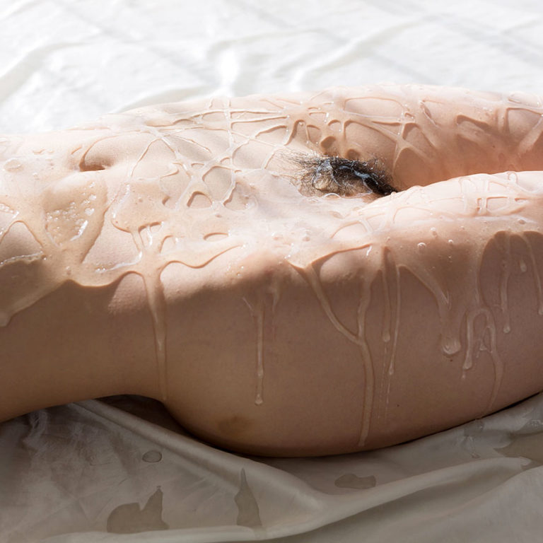
Legs Japan – Liquid Masturbation feat. Shino Aoi (2018)
As an image, this is unqualified rubbish–it’s overexposed (the white of the drop cloth is so hot it blows out most of the dimensionality of Aoi’s left side) and other than depicting a naked body covered in goop there’s no readily discernible point to it. (You can click on the link to more of the pics from the series but even once you find out that Aoi lays down on the drop cloth and then is showered in lube and ‘masturbates’, knowing what’s going on and what the goop is honestly adds nothing to the proceedings.)
Why post it then?–Well, it got me thinking about texture. (Or, more accurately: I’ve been thinking more than usual about texture since this post back in June.)
For some reason: the notion that texture in photographs is a kind of sum greater the the total of the parts. This was around the same time I happened across this video from Wired where a musician explains the concept of harmony in five different levels of difficulty.
The musician starts off asking what this obvious bored kid think harmony is. He explains that it’s when two people sing together and it sounds nice. The musician tells him he’s right and the proceeds to use Amazing Grace as an example. He plays the melody with one hand and then askings leadingly if it doesn’t sound lonely. He then brings in his second hand to harmonize and asked the kid which one he preferred. The kids says the one with two hands. And the musician says that’s exactly right because with more notes we can communicate how more emotion with the melody.
The second person is a teenager. She defines harmony as when two people–usually a high and a low tone voice–blend the two voices together to sound better. The musician repeats what she’s said but adds that harmony is a melody played with feeling and a sense of some sort of story from where it begins to where it returns home again. (I really think that’s more of a revelatory way of framing it than I can accurately articulate.)
He then does something interesting. He noodles through Amazing Grace purposely hitting a sour note. But he backs up and then shows that by knowing you want to hit that note on your way home, you can surround it by notes that actually make it make sense in the given the context.
The rest of the video is great but I don’t pretend to understand the more complicated music theory stuff–once you get into add 9 and suspended notes, my eyes cross and I start to drool. But it’s amazing to watch the way that Herbie Hancock and the musician can just communicate with musical language like two old friends who haven’t spoken in a long while.
I’m less inclined to say that texture necessarily works the same way as harmony does in music; yet, to the extent that we can say that a 2D photograph or image has dimensionality and/or texture, it’s as a result of a confluence of factors designed to emphasize visible textural cues.

Cheyenne Montgomery – water (2008)
Do you ever wonder where stock photos/images come from?
Well, if you’re on Flickr you can opt in to Getty Images and then Getty comes through and if they see something they like/think they can sell; the image is added to their databases.
Montgomery opted in and has 300+ photos listed with Getty now.
Her images might best be labeled ‘sites & sights’–as they favor day-to-day (read: banal) documentation with an emphasis on travel and family events.
I can’t say I’m particularly taken with the rest of her work. I mean she’s clearly exercising her visual thinking muscles even when a good percentage of her strategies/choices faceplant)–although I will grudgingly credit her for avoiding the typical ‘gram flavor of the week aesthetic which tends to be endemic in work with a similar approach. She instead embraces a moodier, muddier vibe.
The above image is exceptional. The shallow focus emphasizes an Impressionist-adjacent interplay between color and texture. This is–in turn–heightened by the unresolved tension between any definite interpretation of what is depicted, i.e. is this a hug, a fight or a rescue?
It’s not unlike fred hüning‘s work, actually; yes–he’d never have zoomed in this close; but everything else is very much in keeping with his style and conceptual preoccupations. (I’d not be surprised if Montgomery is a fan of his work.)

Source unknown – Title unknown (201X)
I have no ideas where this is from. But I am totally enamored with it.
There’s a nice conceptual bridge between the pulling the seat of a swimsuit from where it seems to ride up whenever you’re in and out of the water with the opening of the lily.
There is a symmetry between the gesture of spreading/stretching. An emphasis on texture–skin, lacquered nails, mesh, flower.
I am almost curious as to whether these clips are actually linked in the original source or if they were assembled from two disparate clips by someone with a really good eye for editing.
There’s an argument to be made they have to be from the same source. The nail polish and backgrounds–pink with the mesh, blue with the flower–that seem to suggest a similar approach to production design.
However, the light is different between the two–like not just a different color balance but a different approach. Also, the blue background in the scene clip with the lily, not the lines of vertical noise. You’re not getting anything like that in the pink background of the previous clip.
Alternately, whether or not they are from the same source: these work together because they embody a sort of Jimmy Marble meets Tommy Cash vibe that’s really a very NOW ™ aesthetic.
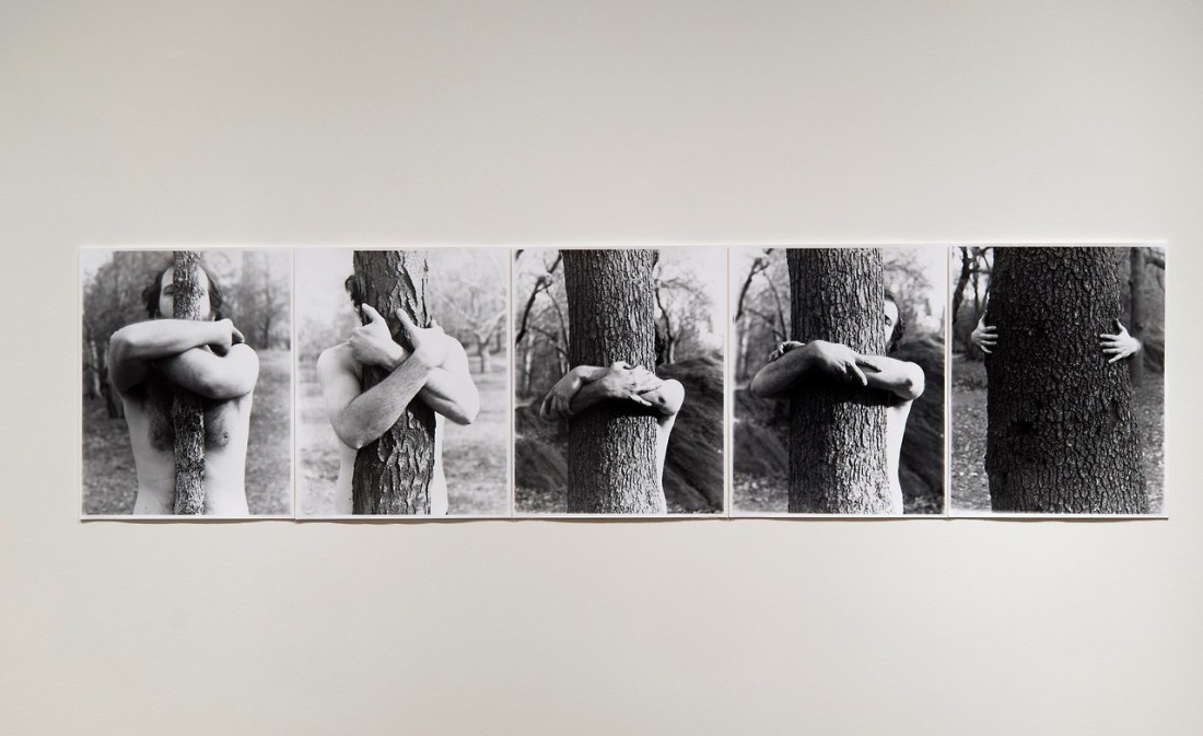
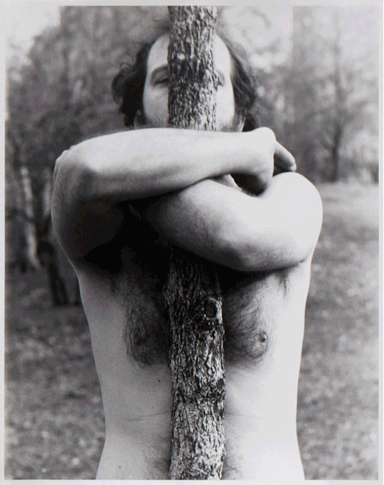
Alan Sonfist – Myself Becoming One with the Tree (1969)
Me (to myself): this sequence is naturally predisposed to a .gif format.
Myself (to me): you know how to make a a .gif, you lazy ass hussy.
I can’t say the idea of making photo sequences into .gifs was is original. I stole it from this post featuring a .gif of Duane Michals’ 1969 The Human Condition.
But I do sort of take issue with that post because although culture dictates that the .gif is how we are most accustomed to processing photo sequences, the sequences were not originally contextualized as animation. Thus while this is definitely a good idea to get people into work they might not otherwise encounter, you really absolutely must be honest about the intervention upon the work, IMO.

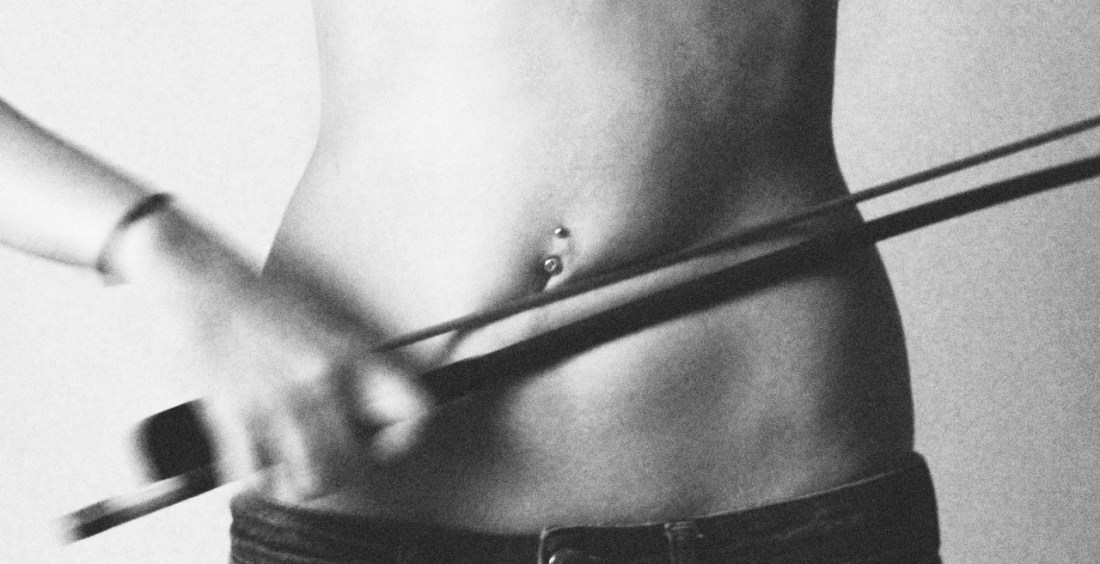
Sølve Sundsbø – Untitled for The Leather Issue of Exhibition Magazine (2012)
I would like you to
show me, if you can, where the line can be drawn between an organism and
it’s environment. The environment is in you. It’s passing through you.
You’re breathing it in and out. You and every other creature.
—Wendell Berry
Mike Suchmann – Title unknown (201X)
Scrape your knee: it is only skin
Makes the sound of violins
–Joanna Newsom, Only Skin from Ys (2006)

Witchoria – Cancel from Human Error series (2016)
What else is going on
right this minute while ground water creeps under my feet? The galaxy is
careening in a slow, muffled widening. If a million solar systems are
born every hour, then surely hundreds burst into being as I shift my
weight to the other elbow. The sun’s surface is now exploding; other
stars implode and vanish, heavy and black, out of sight. Meteorites are
arcing to earth invisibly all day long. On the planet the winds are
blowing: the polar easterlies, the westerlies, the northeast and
southeast trades. Somewhere, someone under full sail is becalmed, in the
horse latitudes, in the doldrums; in the northland, a trapper is
maddened, crazed, by the eerie scent of the chinook, the sweater, a wind
that can melt two feet of snow in a day. The pampero blows, and the
tramontane, and the Boro, sirocco, levanter, mistral. Lick a finger:
feel the now. [Ed: emphasis added.]
—excerpt from Pilgrim at Tinker Creek by Annie Dillard (via house-of-fortitude)
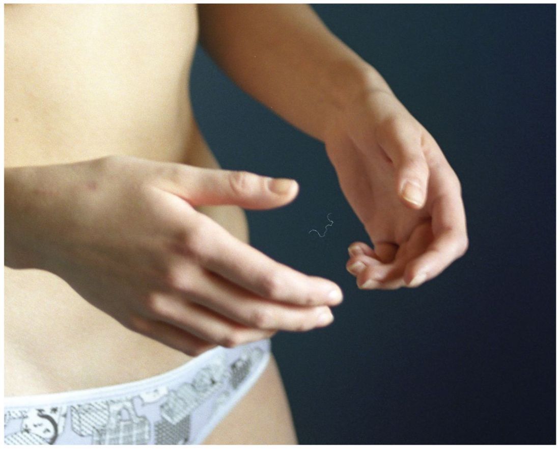
Kate Smuraga – Untitled from nobody important, no one else series (2016)
Three hundred seventy-one days ago, I featured Smuraga’s work.
The photograph didn’t exactly fit the format of this project. But it felt important to include at the time.
I now feel vindicated in my insistence upon including it–and not merely due to the fact that she seems to have recently earned a LensCulture showcase.
In the intervening year and change, her work has continued to mature. I’d have guessed her trajectory would’ve involved gaining a bit of confidence and then mining her work for a more audacious/confrontational tone but she appears to have leapfrogged that phase and doubled down on a more intricately layered and increasingly contemplative approach to creation.
Yet, for all the additional complexity and nuance, the work is simpler and more welcoming while also simultaneously and seemingly improbable: discomfiting.
I’m hesitant to delve into any sort of at all involved exegesis as the recent work feels like a bit like a clever quip or joke which once explained any trace of wit is leeched out. (& since I’m sitting here accusing myself of copping out as a result of not really having anything to insightful to contribute: wave-particle duality and the almost ironic interpenetration of imperfection with the concept of beauty. All of that fits hand in glove with her overarching examination of femininity and the politics of representation, but there’s also some very meta-commentary on process that is unnervingly precocious.)
The other thing I wanted to point to is to illustrate how fundamentally important attribution/credits are for this kind of work. It’s sort of like John Berger’s famous example from Ways of Seeing about how Van Gogh’s Wheatfield with Crows is one context, whereas labeling it as the last picture Van Gogh painted before committing suicide, is another.
The same absolutely applies here. The credits are integral to this piece for a bazillion reasons but the most salient of those are: authorship matters, if you didn’t make something and you like it there’s a duty to due diligence to try to find out who made it (anything short of that involves a level of flagrant disrespect which is rude at best and more than likely marks the credit stripping poster as a real piece of shite); in this case knowing that the author is female absolutely shifts the context of the image–what (with attribution) reads as meditation on the agency that physical embodiment allows women and how that cuts both ways in the current grossly sexist af culture shifts not only if say a cishet man made the image (regardless of authorial intention, a completely BS parameter for any sort of critical consideration, actually since communication has meaning not because words/actions/ideas point to something internally but because they occur in the stream of life and culture and as such occur in context and derive meaning from their positioning within that context), but if attribution is missing there’s not really enough context for the image to really signify anything beyond what it simply depicts. And not that it isn’t rich however you encounter it, but a lot of the things that are wonderful about it have to do with notions of gender and representation, I mean I’m pretty sure this is a self-portrait, too… Suffice it to say that without attribution, the water becomes very muddy, very quickly.
(Also as an aside: I adore those knickers. Does anyone know where I might be able to acquire ta similar pair? Thanx in advance.)
[↑] Cang Xian – To Add One Meter to an Anonymous Mountain (1995); [↓] Ann Mansolino – Untitled from Thresholds III series (201X)
Juxtaposition as commentary
