
Source unknown – Title Unknown (201X)
Folks always give me shit about how I fixate on the framing/composition of a photograph or image. Yet, framing/composition contribute or detract immeasurably from the legibility of a photograph or image.
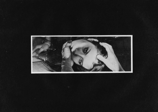
Take this, for example: it reads vertically and thus represents a rare instance where a skinny frame is logically consistent composition decision.
I’m fairly certain that this is not a panoramic photograph. (I’d wager it’s been cropped from a wider scene and digitally desaturated.)
Under normal circumstances, this is the sort of thing I avoid showcasing–except this is remarkably well-realized on two counts:
First, the affected white border around the image giving it a lurid news paper clipping/traditional dark room work print feel. (Both contribute a tactility to something that emphasizes the extremity of touch.)
Second, note the way different parts intersect in the space delimited by the frame–his hands, her face and handcuffed hands.
It’s partly the juxtaposition between the highlight detail of skin against the impenetrable background shadows, partly the way each feature converges at right angles to each other within the frame.
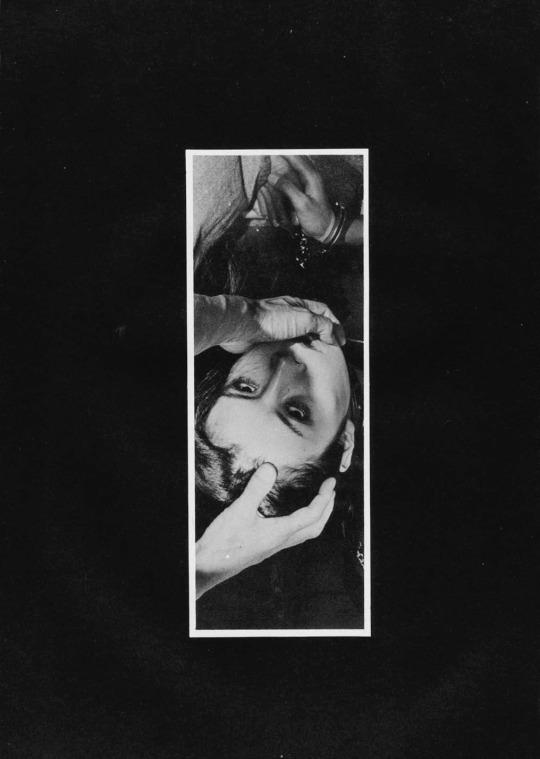
It’s also the way the camera is a witness as opposed to an intercessor. For example, rotate the image 90° clockwise gives you this:
Now maybe it’s just me but there is a certain way that with this orientation and hands entering the frame from the lower half (such as this) suggests that the hands belong to the photographer/image maker. Many folks are rightly criticized for this tact–looking at you Insuh Yoon. (Alternately, I did see this image made by Bang Sang Heyok, that while not a good image is–as far as I’m concerned–a successful proof of concept that there may be situations where the image maker/photographer insert themselves into the scene may actually serve a non-creepy purpose; in this case I appreciate that the image maker is attempting to preserve the anonymity of the subject in such a way that doesn’t not require decapitating them with the frame edges.)
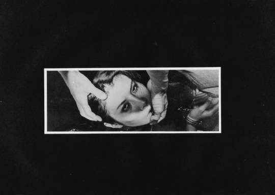
Let’s take it another step, actually. Here are the same images rotated 180° & 270° degrees respectively.
To my eye, the 180° rotation doesn’t read as well. I see the handcuffs before the hands. With the mass of negative space at the bottom of the frame, your eye immediately retreats and locks on the handcuffs.
The 270° one is more surreal–how are the hands at that angle unless there has been some sort of gravitational trickery with the staging/positioning of the camera. In other words, this orientation undoes the physicality established by the original orientation. And, given that this is ostensibly a BDSM image, that exact physicality is the raison d’etre of the image.
Lastly–and this goes out to the naysayers who take issue with my #skinnyframebullshit ethos: the argument that you employ to dismiss my objections is that there is fundamentally no difference between the way you read the original and the 270° rotation. And you aren’t wrong. You encounter the same information in the same order with both orientations but the logical consistency of the composition and conceptual interpenetration given the various orientations not to mention the shift in psychological impact is the reason I harp so much on the fact that image orientation matters a whole lot more than I think you’ve really bothered to stop and consider.
