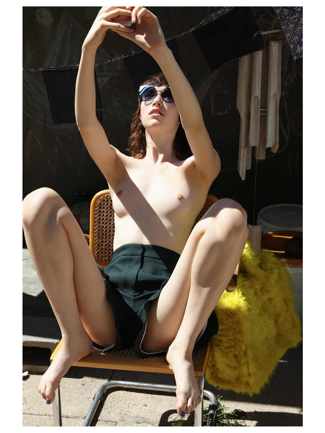
Roe EthridgeAmazing Grace feat. Grace Hartzel in collaboration with Fendi for Document Journal (2016)

You can’t dismiss the importance of the author in the case of this image. But it’s hardly the first place I even want to go…

I mean: it’s lovely. Someone should write a dissertation on the skin tone. (Most work with exquisite skin tone accomplishes it by an Albers-esque limiting of the color palate. For example: you frame things in such a way that the color palate is limited to two complimentary colors and you limit the range of those two colors and this allows you to stretch the range of subtle gradation and range within skin tone.

And that’s part of what’s going on here–the fuzzy yellow purse, the blonde wood on the chair and the bleached khaki color of the wooden wind chimes.

It’s the flourishes that separate this work from your run-of-the-mill fashion editorial. Note: the rose gold of Grace’s phone, the azure line reflected in her shades and the green grass pushing up through seams in the concrete underneath the chairs chrome legs.

One could argue that perhaps the concrete goes a touch too green around the gills–but it’s not that bad, really. And the dynamic range in the picture is insane–especially given that the aforementioned trick with good skin tone demands a better range of mid-tones through limiting areas of extreme over and underexposure where this has (I’m guessing) probably a 9 or 10 stop range.

Let’s back track and address the author of this image: Roe Ethridge. The gallery world really likes to bend itself into pretzel shapes to justify the art-worthiness of his work. A lot of it is found or appropriated work that is retooled to a specific conceptual end. A metric shit tonne of ink has been spilled on the topic and everyone is saying the same things poorly.

Too much criticism hinges on a sort of scientific-mathematical proof of a point. I think some of it serves a purpose. Most of it? Not so much.

I get a lot of shit for being a ‘colossal dick’ when I take a particular facet of something I post here to task. Here’s the thing: the sheer fact that I posted something here means that something about it struck me as meritorious. Frequently it’s one thing and I spend ¾ of the post playing whack a mole with the stuff I want to disavow from it, but that’s another story.

My point is–to quote El Duderino: It’s just like my opinion, man. You should take it with a Gibraltar sized boulder of fucking salt. Your mileage will vary, etc., etc.

The only rule is does it blow your hair back? If so, that’s great. And if you’re interested in going a step further, start asking yourself why it blows your hair back? That is all I’m trying to do here. I’m trying to point to concrete correlations whether they are technical bits or free associations from my own experience that enhance the impact of the work.

If you disagree with what I’m saying–I’m not right automatically and you’re not wrong by default either.

Like it’s fine if you adore something that no one else really cares for. But excepting my brother–who is an asshole–it’s fine if you like the musical stylings of Creed. I don’t and were never going to see eye to eye. But generally speaking, I know a lot of people who like Creed personally but do not feel the need to evangelize for them being the greatest thing that happened ever to music.

That’s really one of the only things critics are good for–keeping artists and their fans honest.

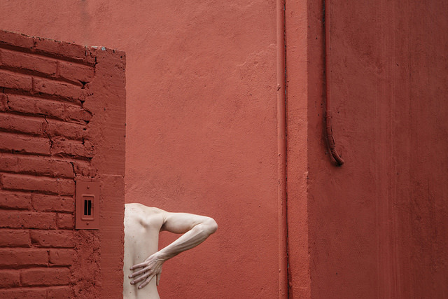
Dylanne Leefoundation (2015)

This is essentially monochromatic as everything from the skin tone to the dark red of the wall in shadow at frame right is hanging out in red’s third of the color wheel.

It’s interesting because I’m not entirely sold on the composition. Yes, it functions and has a mostly consistent logic to it. And as much as I’m of a mindset that unless your camera shoots in native B&W whether analog or digital, that no one has any business ever using desaturate to create B&W images, this would actually work as a grayscale image (with only some minimal contrast tweaks).

That begs the question of whether or not color is essential to the image? On an objective level, I would argue it isn’t. However, within the context of Dylanne Lee’s work–who FTR isn’t one person it’s a image making duo from Mexico City–the only thing that consistently defines the work is it’s interest in instilling stolid scenes with a sort of inertia as potential for momentum instead of absence of it.

By that expression, the color makes sense. (And I think someone more fluent with color theory than I am could probably to the imagistic equivalent of diagramming a sentence to demonstrate how the color activates a dynamism that would read as more contemplative in B&W.)

I suspect this may be film. If so, it would benefit enormously from a dye-transfer print, IMO.

CAH – Cam Damage (2015)

camdamage is an artist. Full fucking stop.

I mean she’s disarmingly pretty and if she’s taken a bad picture, I either missed it or have lost track amidst her steady stream of effing stellar work.

Still, I feel like commenting on her appearance misses more than half the point. It’s like Jon Stewart’s on fleek insight into the media response to Caitlyn Jenner’s transition: Caitlyn when you were a man we could talk about your athleticism, your business acumen…now you’re a woman and your looks are the only thing we care about.

What makes her beautiful is more than just her appearance. If you follow her–which if you don’t then real talk you are abso-fucking-lutely doing Tumblr wrong–you know she is a wickedly intelligent and kind individual, with a sarcasm setting that isn’t just a louder 10 but goes all the way to 11.

At risk of using a meaningless cliche, she’s down-to-earth. Not in that she makes an effort to be some with whom everyone can relate– but that she presents herself as someone who tries really hard but fails what feels like far too many times to justify the investment of time and painstaking effort. She stumbles, admits them, gets back up and tries to roll that giant fucking rock up ye olde hill of impossible climbing once again.

Her work to grow and evolve as an individual, her courage and uncompromising determination shine through in her work in a way for which I know of no precedent with which to compare it.

The saying goes: talent hits the target no one else can; genius hits a target no one else can see.

By that token, Cam’s work signals her as a genius.

(Oh, and this picture is stunning: the vague vignetting effect of the strobe and the way it casts just enough of a shadow to cause her to pop from the background. The skin tone is both natural and gorgeously accentuates muscle tone. The unraveling braids, armband tattoo and perfectly executed eye light are all artifacts of high-end glossy fashion editorial methods in service of presenting something closer to a candid portrait. Just goddamn fucking killer!)