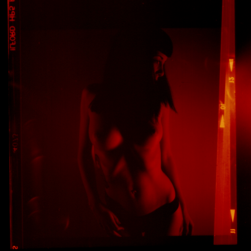
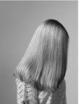
Lundesnombreux – Untitled (2014)

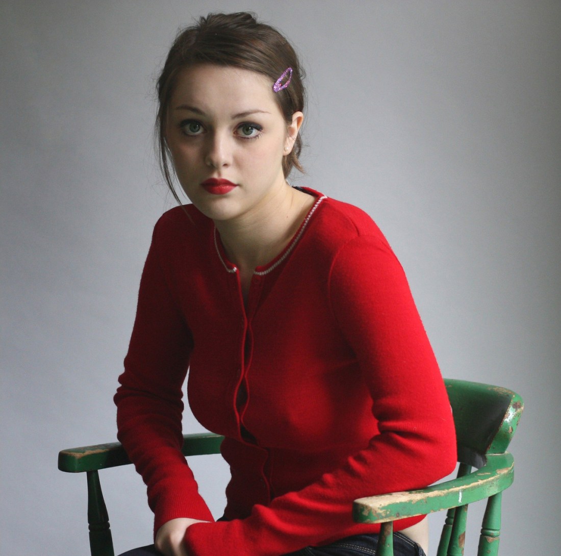
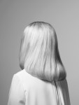
Craig Morey – Christelle (200X)
I see Morey as being of-a-kind with someone like Petter Hegre–folks with a quality stable of gear who generally toe a quantity as quality line in terms of their voluminous output.
You can split hairs; for example: Hegre has a better facility with color management (although his compositions, editing, conceptualizations and general familiarity with the history of photography seems knee-jerk at best); Morey, on the other hand, likely has an assiduously cultivated preoccupation with Jan Saudek (yes, Saudek would never get as close to his subjects as Morey but Morey favors imperfectly textured backdrops with little if any apparent separation between the subject and the background–which is all very Saudek-ian).
Honestly, the pose above is awkward AF. There’s a tension in the way the drape of her jacket is falling down her shoulders. It looks as if she’s doing the sort of thing where you rip off a bodice and stand their open to the world bosoms heaving. Except… her shoulders are not wide and squared, they are folded in. (I do this instinctively when folks stare at my chest, tbh.)
Also: you wouldn’t pull your shirt up like that. It’s likely that she’s hooked her thumb in the arm hole of her top but it looks as if Christelle is closer to trying to pull her tank down to cover herself.
This awkwardness would be distracting if it weren’t for her expression: it’s 100% what do you think you’re looking at? But that mien could cut either way: accusatory or flirtatious.
I’m not familiar enough with Morey’s oeuvre to definitively state that this is either/or dichotomy is a recurrent feature; however, based on what I have seen it seems plausible that it is.
If so, I think that’s actually something worth thinking about as far as making portraiture. In a lot of ways, taking a picture of someone the audience already knows is easier. Think pictures of celebs–we know them already so we’re filtering what we see through a prism of what we already know about the personality. It means that the portrait in a moment in time is designed to contribute to something that is already fully featured in the viewers’ minds.
And of course the photographer/image make knows the person they are portraying. But if the audience doesn’t–there’s a far greater burden for the author to use the scant space of a frame to convey some sense of the person. And I think this capturing the tension between experiential polarities is actually a damn fine tactic for accomplishing this. (It reminds me of the debate about whether or not one of the great portraits of all time Vermeer’s Girl with the Pearl Earring is turning towards or away from the viewer.)

Joana Choumali – Untitled from Emotions A Nu series (2013)
Choumali is an Ivorian image maker who focuses primarily on work featuring African woman.
Her focus is primarily vibrant, super-saturated color (and she’s really fabulous as using the intersections between non-complimentary colors to flatter her subjects.
She also works occasionally in monochrome–and her work here is rather audacious.
I’m not really a fan of studio work. And although that’s what Choumali does more or less exclusively and while I do consider her color work both incisive and bold, it is her monochrome stuff I can’t shake.
Part of it is that I will always be a fan of complication. By that I mean studio photography allows for more control. You can set up in advance, orchestrate the lights, get everything just so and then you can invite the subject and focus on interaction as opposed to juggling 18 other things at once.
Unfortunately, this tends to mean that studio work is pristine and allows for the setting to be decontextualized in favor of allow a laser sharp focus on the subject. Choumali pushes things–ambitiously–in quite a different direction.
Here the almost Pollock-esque speckled backdrop both separates the subject from the backdrop (enhanced with some perhaps less than as subtle as you’d really hope for dodging along the subject’s back and hips. It contributes a solidity to this woman that the shadow her body cases flattens back out.
The solidity is counter balanced expertly by an ephemerality that is echoed in the pose is the subject kneeling or rising? Is her pose contrite or self-accepting and joyful?
I speak virtually on the daily with photographers who are interested in shining a light on the notion of vulnerability with their work. Choumali does exactly that magnificently.

Jouk Oosterhof – [←] Hanneke from Women with Vaginismus project (201X); [-] Emma from Women with Vaginismus project (201X); [→] Bertine from Women with Vaginismus project (201X)
I first encountered the portrait of Emma via @thephotoregistry–which continues to be one of the best things on Tumblr.
I liked the way that the texture of Emma’s hair is set off against her blouse as well as the smoothness of the background.
Upon closer reading: I realized the nature of the project–relating to vaginismus, a condition wherein an sort of vaginal penetration causes intense pain. (I have two friends who have this condition and what they’ve told me about it sounds absolutely heinous.)
Via Oosterhof’s LensCulture profile, she says of her process: “I carefully build the image, staging all details.”
That actually tracks given these works. Note: the lighting on the background alone is drastically different between the three images. The lighting on the women is less different but there’s still some variation. I’m especially fond at the way she’s both used the lighting to separate the women from the backdrop while also playing the background lighting against the foreground lighting to dramatic effect given the positioning and pose of the subject.

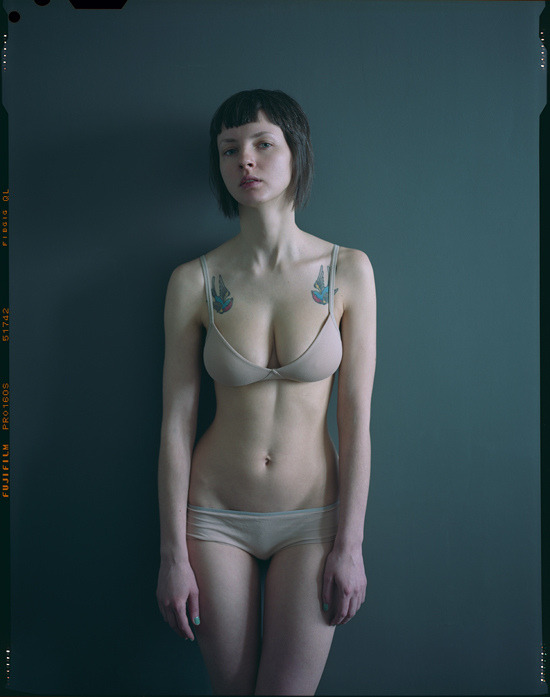
Source unknown – Elize (201X)


Bill Durgin – [↑] Nude-8 from Figure Studies series (2010) [-] V with Plywood and Mosaic from Studio Fantasy series (2015) [↓] Untitled from Nudes and Still Lives series (201X)
Truth told: I don’t get nearly as much hate mail as other similar Tumblr blogs–but I do get it.
Lately there’s a theme which you can essentially summarize as follows: you think you are being ‘deep’ but really you’re just showing yourself to be an idiot.
This sentiment is usually appended with evidence of my idiocy–which 9 out of 10 times demonstrates the anon to be incapable of fifth grade reading comprehension. (Seriously, though: if I had a nickel for every time some fuckwit represented what I actually wrote as stating the opposite of what I actually wrote, I’d be dead.)
I swear I am bringing this round to Durgin, please indulge me a little bit longer…
I’ve spent the last 7 weeks or so pulling together materials and doing so writing towards the end of :::deep breath::: trying to see if I can maybe get my ass into a graduate art program.
It has been a very slow, largely unpleasant process. I’ve found that–while I would never say that putting comments together for these posts is “easy”, per se… it’s not something that usually stresses me out. (Sometimes it does but that tends to be the exception that proves the rule, honestly.)
On the other hand, it is ridiculously time consuming… but I digress.
Anyway, what working on these applications has shown me is that while I am sure there are more than just the two forms of writing I am now going indicate, for me, writing seems to come in two flavors: exploratory and clarifying.
Exploratory means something like following a path for nothing more than curiosity w/r/t where it ends up. Clarifying means something more analogous with showing your work while solving a math problem.
The first one is more or less what this blog entails. Grad school application writing prompts are my in line with the latter.
All five of the applications I am in the process of completing are fixated on the ability to clearly and concisely explain my creative process in writing. You’d think I’d be really goddamn good at that by now. Alas that’s not the case.
The difficulty I’m having–and it has taken a positively stupid amount of time to get clear on this–is, simply: as much as I am interested in process (hell, this coming from the girl who wants to travel all over the face of the earth and do video interviews with creators I fancy about their respective processes…), I am EXTREMELY resistant to the framing of process first-and-foremost in terms of questions-of-how and secondly (or, perhaps not at all) in terms of questions-of-why.
The best way to render this abstraction concrete is to think of questions-of-how like a recipe–say for chocolate cake. You have your list of ingredients with respective proportions for each, a summary of implements required to prepare it and instructions on how everything is combined.
And here I should stop and point out that this is an appealing notion from at least the perspective of inclusion–it makes art seem like something anyone can do. The problem with that is at the same time it makes art making seem easy: and that is a mistake of enormous magnitude.
Art making is damn difficult. And whereas you may go to make a cake and find out you don’t have eggs–there is rarely an equivalent in art making for getting in your car and scooting to the store to buy eggs.
That’s why questions-of-why matter–because it’s the answer to the question of why that’s going to sustain you when you see no possible route forward in your work.
The way I think of it is: the recipe is not the cake it makes and a recipe does v. little to fill an empty belly.
How does all this relate to Durgin’s work? Perhaps, I’ve been gazing at my own navel for too long with this applications but I feel like there is a way in which he has systematically fetishized his process in his product.
I mean any time you’re dealing with studio work, you are dealing with de-contextualizing environment in an effort to focus with less distraction on the subject. In a way this work is a deconstruction of studio practice–wherein the relationship of the subject to the studio is emphasized over and over. And the subject emphasized is frequently abstracted to the point of being a place holder or a suggestion of form.
Durgin is exceedingly adept in his use of color–it’s very different, however, than most of the folks I usually name check when on the topic. It’s not like Amanda Jasnowski’s impeccable sense of the interactions between colors or Laurence Philomene’s color as signifier (this is not entirely the way I want to say it but ‘form’ is too heavy handed and ‘tone’ is too innocuous) or Prue Stent, who is one of the few people I know of whose work seems to aspire to interrogate color as Platonic forms.
Instead, Durgin seems impressively attuned to the way the directionality and intensity of illumination affect color fidelity. (He straight up references this is several of his pieces by including those ubiquitous color charts in the composition.)
There’s all sorts of commentary on mass digital consumption, boundaries and glitches in the work. And this makes me think it’s perfectly suited to addressing questions-of-how with regard to process.
And not to slight the work, but I’m not able to grasp from reading the work, any sort of clue as to the questions-of-why. The work is exquisite and technically refined to a level that is extraordinarily rare. I just don’t understand the drive to get to this level merely to exercise mastery. There is something profoundly lonely about this work–all of it. That’s interesting and I think I for one would be interested in seeing what transpired when the work was allowed to interact with that emotional resonance in a less coded, more straightforward fashion.
But to circle back to where we began–the asshats who write in criticizing me for think I am ‘deep’ are correct on at least one count: more often than not I am being entirely superficial in my comments on here. I’d like to go deeper more often. And there’s not always the available time or energy to allow for that. Unfortunately, it’s also sometimes down to the fact that no matter how much I want to, my brain won’t cooperate.
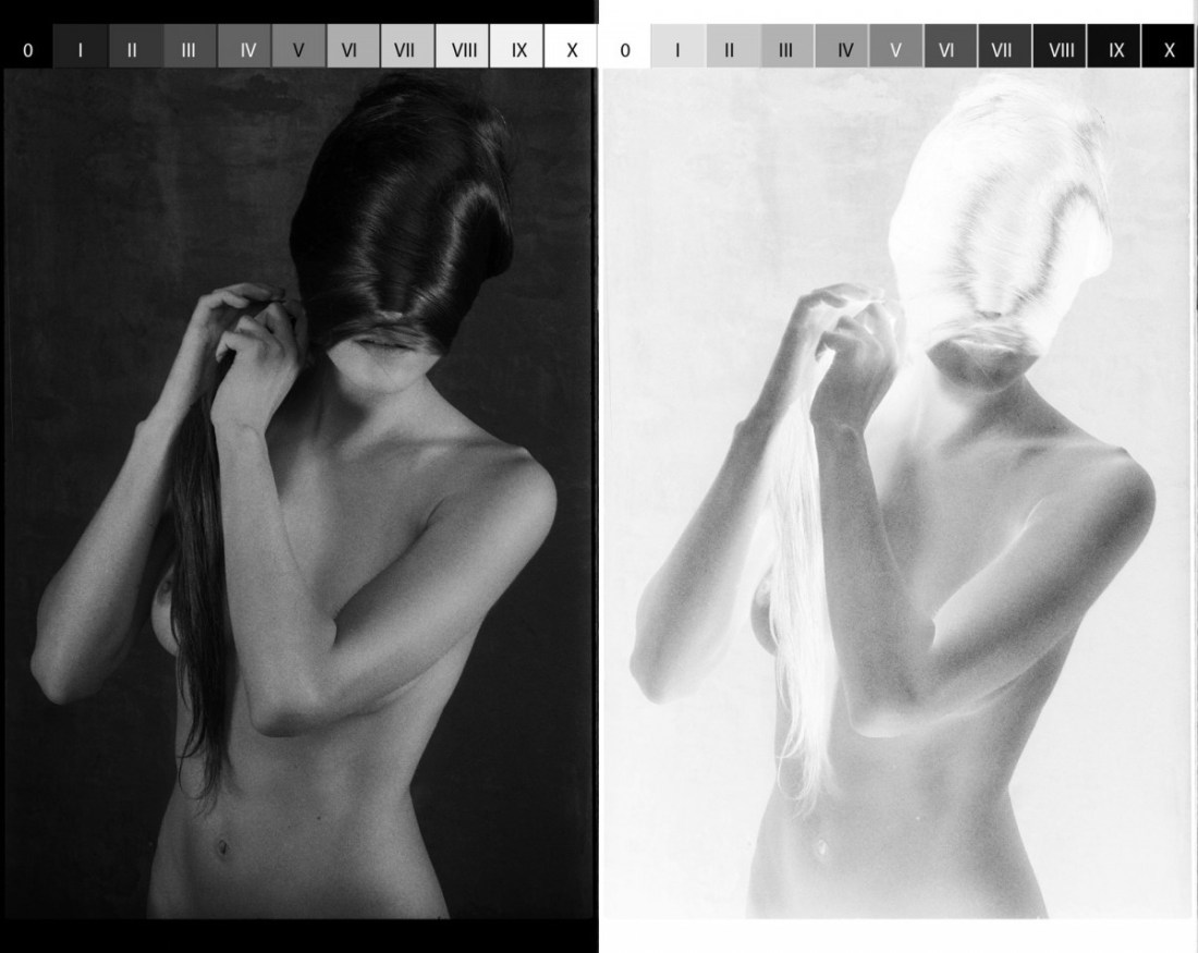
Davide Rossi – Alice Daniele (20XX)
Learning is a bit like a hat hook.
Say I’m wearing a knit hat–this one for example.
Further, say I’ve been trudging around in a snowstorm and it’s rather damp, so I peel it off and go to hang it up.
I can attempt to hang it on the wall all day but unless there’s a hat hook, all my efforts to hang it up are doomed to failure.
Learning is sort of like a hat hook. You can’t learn something until you have a place for what you learn to go–for lack of a better way of saying it: counter-intuitively, the learn something you have to already have some idea of what to do with what you are being taught.
I first encountered the notion of the Zone System in a cinematography workshop back in 2004. In hindsight the teacher was awful–he introducing it as a system of determining exposure codified by Ansel Adams and read this section from the Wikipedia article on the Zone System to us pretty much verbatim.
My response was well what the fuck does this have to do with fuck all else? (I lacked a hat hook (place) for my hat (what I was ‘taught’.)
Now that I do get the basic parameters of the Zone System, I have changed my tune a bit–it is EXTREMELY useful when producing a print or critiquing/responding to monochromatic work to employ the Zone System as a framework for analysis.
The image above is actually the first time it’s clicked in my head that the Zone System has application to not only printing and analysis/criticism, it has applications to the creation of the image itself, too.
Let’s back up a wee bit to get a nice running start. If you’ve ever taken a picture with any sort of attention, you’ll know that while modern cameras can do a reasonably good job left to their own devices. BUT! Should you want something a little more polished, you have to provide the camera some information. You can roughly encapsulate such information by suggesting the camera needs to know what’s white and how much light from the scene it should capture.
Modern cameras are super super smart about identifying what’s white–auto white balance is damn remarkable. The reason that we have manual white balancing functions is because you can creatively fuck with color by say holding a green sheet up paper in front of a sensor and telling the camera to recognize green as white. (As an example, the ubiquitous cinematography trend in the late 90s and early 00s, was to call pure white, white and then shoot under fluorescent lighting–which gives everything this nauseated green cast; think: Fight Club and to a lesser degree The Matrix.)
With B&W analog–everything is based off the notion of middle grey. (Zone V in both of the above images.)
In analog photography, you aren’t able to pre-visualize or relay on a histogram to determine optimum exposure (although if you’ve got megabucks like Daddy Warbucks, you can do Polaroid test shots… sigh, if only…).
In order to judge exposure analog photographers use a light meter. That light meter can be built in to the camera itself or be an independent handheld device–either way, it conveys what the optimum setting is to render an 18% middle grey value depending upon where you are taking the reading.
That last part is important. Like White Balance, you can selectively manipulate your image depending upon what you decide the camera should treat as middle grey.
I actually took the above image and chromakeyed out the tonality of all of the zones, individually. It looks like this:


Note: the fact that Zones VI-X are not represented within this image. (This would indicate that at the time the photo was made, an 18% grey value was attributed to a tone a good bit darker than actual middle grey.)
And while this is super useful in explaining the relationship between the negative (in this case Kodak’s Tri-X rated at 320iso) and ostensibly a print, to be ideally illustrative you’d want the image on the left above to appear all the way to right and to add a photo exposed to provide maximum dynamic range. Although that might end up detracting from the point since a pristine exposure will absolutely allow a talented print maker to replicate this effect in a print; however, a less than pristinely exposed image loses some of that latitude. (It’s hard to tell because I’m looking at a scan of a negative and not an actual negative and the relationship between the value of middle grey in digital vs what the human eye interprets is fundamentally different, still, it appears that this photo was underexpose by several stops from square one.)