Danny LaneJohn Yuyi for Purple Magazine  (2017)

Perhaps the primary reason I’m less than fond of studio/studio adjacent work is that the point is–to greater or lesser extent–emphasizing decontextualization.

It’s sexy knickers on a model in a catalog vs you finally trying them on in front of a full length mirror.

If you’re going to make studio work, it’s a good idea to embrace the decontextualization and to show the viewer something about why the absence of more context was a necessary precondition of the work.

The above photograph succeeds marvelously at this task. It’s simple. A beautiful model, in front of a plain white wall. Light left to right, after the Baroque fashion. The pose is unusual, dynamic–fashionable in its artifice, but open, confident.

It’s an astute use of space–the balance between the positive space of the Yuyi’s body/posture vs the wall and shadows cast on the wall.

Heiko Thiele – Lili (2016)

My oldest friends is fond of describing me as ‘a girl with simple, yet highly specific needs’.

See where the notion of a basic bitch usually orbits Uggs (God, Why?), Yoga pants (I hate how they look but fuck me if they aren’t comfy) and Pumpkin Spice Latte (ewwww, ewww. Just no. Get outta my face with that shit).

My basic-ness relates to seltzer. I take it very seriously, y’all.

At this point La Croix’s coconut sparkling water is 1/3 of what fuels any sort of forward momentum. (I have super mixed feelings about their other offerings, the raspberry, for example is effing foul.)

But La Croix is primarily a US thing–so leaving the US is always a bit of a thing. There’s passable orange seltzer in Iceland but mostly you’re better skipping flavored variations there. I’ve yet to find a seltzer that isn’t atrocious in The Netherlands. (Tips welcomed since I’ll be back there again early this fall.)

Berlin is one of the few places I visit where I can actually get pretty damn excellent seltzer. I tend to prefer lightly flavored seltzer’s but the Spreequell Classic is probably my favorite unflavored seltzer out there.

I’m not fond of the flavor the model is sipping above. (It’s like carbonated apple juice, if I remember.) And the flavored Spreequell water is generally to be avoided. (Well, except their version of Orangina–I consume very little sugar so it’s sickly sweet to me but I actually enjoy the taste/texture of it.)

/basic-ness

John RaphelChelle (2016)

I’ve been unofficial on Tumblr for like eight (8) years give or take. I’ve run this blog for 5+ years and I am honestly to the point where I spend about three times as long waiting for the next page of my dashboard to load than I do scrolling down each page. (The handful of images I like every day hardly even slow me down–it’s like toggle the heart and keep scrolling.)

But I stopped dead when this slid into view.

I read it left to right; eyes scanning until they reach her face and then in a reverse crescent downward–mirroring the curve of the center line of Chelle’s body.

The bit of her her right leg you can see in the lower left-hand corner is like a dead end that then returns your eye back up the same trajectory it descended.

On the return trip: you notice the black scarf around her neck and how her skin is a bit shiny–as if it’s warm and she’s just starting to sweat. (Also note: the color in her face compared to the pale of her skin. This is further emphasized by the scarf as dark dividing line.)

It’s a fine line but one could argue (and I would be such a one to argue) that her  sternum, clavicles and shoulders are all edging towards overexposure.

Objectively great skin tone is probably somewhere halfway between her upper body and face. Yet, what I like about this is that with the shallow depth of field (which one notices as one follows the reverse trajectory of the the initial scanning arc), the contrast between her flesh and the background points even more attention towards the handling of color.

But although I wouldn’t call this good skin tone–it’s actually better than great because it shows me something in a way I’ve never seen it before. And the overall effect here is that light and color are being employed by a photographer to accomplish something more sculptural than photographic. (If you’ve ever spent any time digging through images of Michelangelo or Bernini, you’ll understand what I mean.)

There’s one other sort of meta thing I walked away from this image finally grasping. I’m always flummoxed that anyone bothers with this blog. I mean it’s very much a solipsistic reflection of my ego trying to referee the all-out, 24/7 melee between my id and superego.

But it occurs to me that the reason that people might respond to it is because underneath all that this is very much a personal act of resistance against unmindful consumption. (Frequently writing these posts is like pulling teeth–because my natural inclination is to take in and take in and take in, without every really stopping to dwell on what I’m taking in and how I feel about it. What it’s trying to show me and what it’s trying to show me are telling me.)

Perhaps, I’m giving myself too much credit. But I do think it’s important to resist unchecked, uncritical and unmindful consumption. If this blog manages that for even a handful of you, then it’s an unqualified success in my eyes.

Gregoire Alexandre – [←] Fer 1 (2012); [→] Fer 2 (2012)

You attend to the shape, sometimes by tracing it, sometimes by screwing up your eyes so as not to see the colour clearly, and in many other ways. I want to say: This is the sort of thing that happens while one ‘directs one’s attention to this or that’. But it isn’t these things by themselves that make us say someone is attending to the shape, the colour, and so on. Just as a move in chess doesn’t consist simply in moving a piece in such-and-such a way on the board-nor yet in one’s thoughts and feelings as one makes the move: but in the circumstances that we call “playing a game of chess”, “solving a ches problem”, and so on.

                –Ludwig Wittgenstein, Philosophical Investigations §33

We don’t know what’s
going on here. If these tremendous events are random combinations of
matter run amok, the yield of millions of monkeys at millions of
typewriters, then what is it in us, hammered out of those same
typewriters, that they ignite? We don’t know. Our life is a faint
tracing on the surface of mystery, like the idle, curved tunnels of leaf
miners on the face of a leaf. We must somehow take a wider view, look
at the whole landscape, really see it, and describe what’s going on
here. Then we can at least wail the right question into the swaddling
band of darkness, or, if it comes to that, choir the proper praise.
                  

                —Annie Dillard, Pilgrim at Tinker Creek

Jorge Golgo QuinteroNuda 1605A (2016)

It’s the height of irony to me that so-called ‘internet famous’ image makers are so at odds with so-called fine art photography aspirants.

The former tend to have models pose in such a way that they are standing either right next to a window or a window is implied just beyond the frame edge; the latter tending to favor a more studio-tinged set up, i.e. the subject standing in front of a seamless backdrop.

Although the resulting work might as well be as different as day from night, both are–in point of fact–motivated by a similar conceptual tact: de-emphasizing the relationship between the body and the space the body inhabits.

Now, I can’t really say I’m especially fond of studio work. (Truthfully, it’s all a bit ubiquitous and cloying to my eye.) And I can’t say that I’m over the moon about this image–I mean there are some pretty serious problems with it.

I do want to acknowledge that there is something unusually vital about this image. It’s playful in a way that most of this type of work just straight up isn’t. Yet, that playfulness that contributes a vibrant vitality, also points a little too handily towards what makes the image so fundamentally problematic.

The image is very male gaze-y. The coy pose bestows a dynamism to the work by contextualizing nudity in a fashion whereby being nude is rendered transgressive by the implied relationship between the model and the audience. (I’m naked and want you to see me, but shhh don’t tell anyone, it’s just for you–in other words, she’s enacting the same misogynist charade that makes gross ass cishet men harass women on the street.)

(There’s maybe an outside chance that Quintero might be familiar with Robert Mapplethorpe’s famous bullwhip self-portrait, but that’s likely giving more credit than is due given the totality of his work.)

The difficulty is that conceptually the image undercuts itself. Yes, the pose is dynamic. But it’s overt stylization actually works against it due to the fact that the artifice of the pose is brought into sharper focus due to the fact that the model is so close to the background and that the strobes are set up in such a fashion where the flash fill is so bright it’s casting it’s own shadow in addition to the shadow cast by the key illumination.

Such artifice only draws further attention to the hyper-stylization of the image, which in turn casts a pall on the dynamism of the pose when it’s considered in the broader swatch of art historical sexism.

Mr. Instant PhotographyGorgeous poetic Ginger (2016)

The form of this recalls the Arseni Khamzin’s photo I featured last year–the down tilt of the camera, the balancing between positive and negative space.

I prefer the sharp, 3-D affect of Khamzin’s work but the way the muddy lighting renders the subject above so that it appears his skin tone is actually being leached from his body by the white-white of his surroundings. (I also love the insouciance with which he’s aware of the camera but trying to appear as if it could only be so lucky if he granted it even the most ephemeral of eye contact.)

The model’s pose is in keeping with the sculptural traditional of contrapasto–one leg is weight bearing and rigidly position, the other is more expressively position, whereas the arm one the opposite side from the weight bearing leg is active, the second arm (opposite the non-weight bearing leg) is also less active and more focused on balancing the composition. (Here those traits are reversed as the left hand and right foot are the ‘weight bearing’ anchors and the right arm and left leg are more expressive and distributive of weight.)

There’s also a nice dynamic to the pose, where it seems as if he rolled away so that he’d be more visible to the gaze interrogating him but also at the same time, he’s protecting  his body with his hand across his belly and bracing to potentially have to roll back towards the viewer.

From the standpoint of visual grammar, although I agree that the frame edge can be used in such a way as to imply a continuity of space between what is in the frame and what remains unseen just beyond the edge of the frame, the frame edge is usually inviolable.

The frame edge here is inviolable. Thus with the exception of half of his thumb, all of the fingers on his right hand are removed and his left leg is amputated mid-shin.

To my way of reading this speaks to an intrinsic acknowledgment by the image maker that the subject retains a degree of autonomy despite the photographers imposition of the boundaries of a frame upon the scene.

Viki Kollerová – On Being an Apple (2011)

After dinner, the weather being warm, we went into the garden &
drank [tea] under the shade of some apple tree; only he & myself […a]mid other discourse, he told me, he was just in the same situation,
as when formerly the notion of gravitation came into his mind. Why
sh[oul]d that apple always descend perpendicularly to the ground,
thought he to himself; occasion’d by the fall of an apple, as he sat in
contemplative mood.

Why sh[oul]d it not go sideways, or upwards? But constantly to the
Earth’s centre? Assuredly the reason is, that the Earth draws it. There
must be a drawing power in matter. And the sum of the drawing power in
the matter of the Earth must be in the Earth’s centre, not in any side
of the Earth.

Therefore does this apple fall perpendicularly or towards the
centre? If matter thus draws matter; it must be proportion of its
quantity. Therefore the apple draws the Earth, as well as the Earth
draws the apple.

William Stukeley reports an early version of Isaac Newton’s famous falling-apple-inspires-theory-of-gravity anecdote

Jo SchwabUntitled (2015)

Studio work de-emphasize setting and by extension temporality. The notion–or at least the notion as I understand it–is that this contributes to an isolation of the subject and through that isolation any adornments or distractions are removed and the viewer is confronted by the visual embodiment of an individual identity.

I think what bothers me about studio work is that I’ve always felt it jumps up and down and screams: look, I’m telling you the truth! Unfortunately, I feel that other factors shift and upend the implicit truth value.

Arguably, good studio work requires image makers to remove their own intentions from the picture so that the image will function as a sort of confrontation of the viewer; the camera and the image maker disappear, in a fashion, and the audience is placed in direct correspondence, vis-a-vis another person.

But the relationship between the image maker and the subject isn’t some sort of catalyst that foments the reaction and completely burns away in the process. It fundamentally shapes the resulting image. In other words, the pose and composition are only half the equation. Invisible things–like the mood of the image maker, the mood of the subject, how warm or cold the studio is, the shape and form of the relationship between the subject and the image maker. (Does the image maker want me to like the subject? Be wary of them?)

There’s at least half a dozen reasons why I dig Schwab’s portraits. Partly, I feel like he gets out of the way more the most folks who embrace studio portraiture. There’s a simple, effortlessness–which I know enough to realize is anything but–to his images. You get the feeling that you aren’t face to face with someone who is trying to be liked or disliked. His work feels very much like that moment when the facade cracks and the real person shows through–like that de Botton line about hav[ing] to be quite heavily invested in someone to do them the honour of telling them you’re annoyed with them.

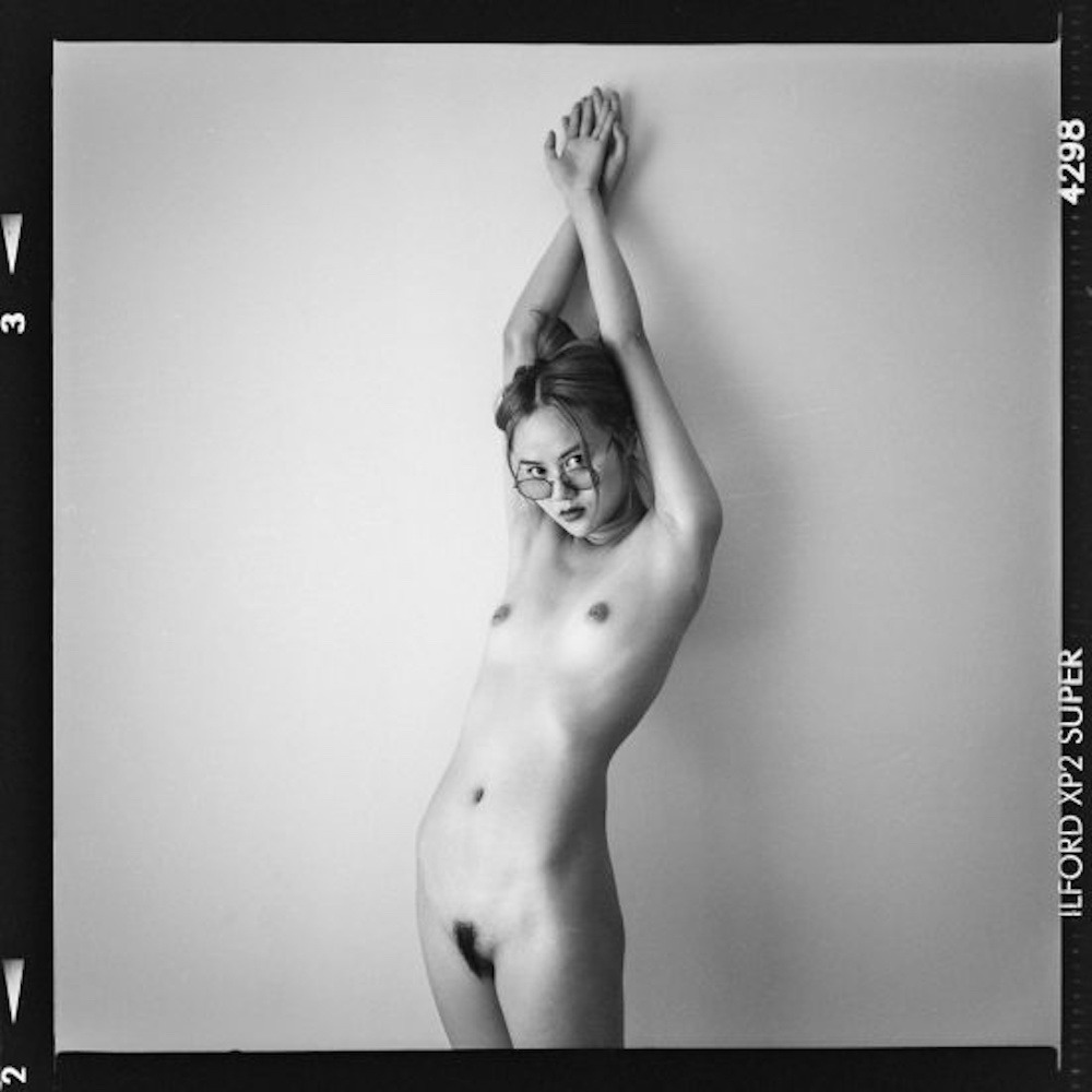
Not that Schwab’s subjects are annoyed with the viewer… it’s more that their expressions belie emotions outside the norm of decorous interpersonal interaction. The model in the above image seems that she could’ve been given the same instructions–give me a look of “world weary ennui” that Sally Mann gave her daughter in this image.

I especially like the lighting in the image above. It’s simple and imperfect. I’d guess a key light with a softbox on the left, overhead and angled down, with some sort of bounce board or reflector on the floor–giving that background just a little kiss of light to separate the subject from the background.

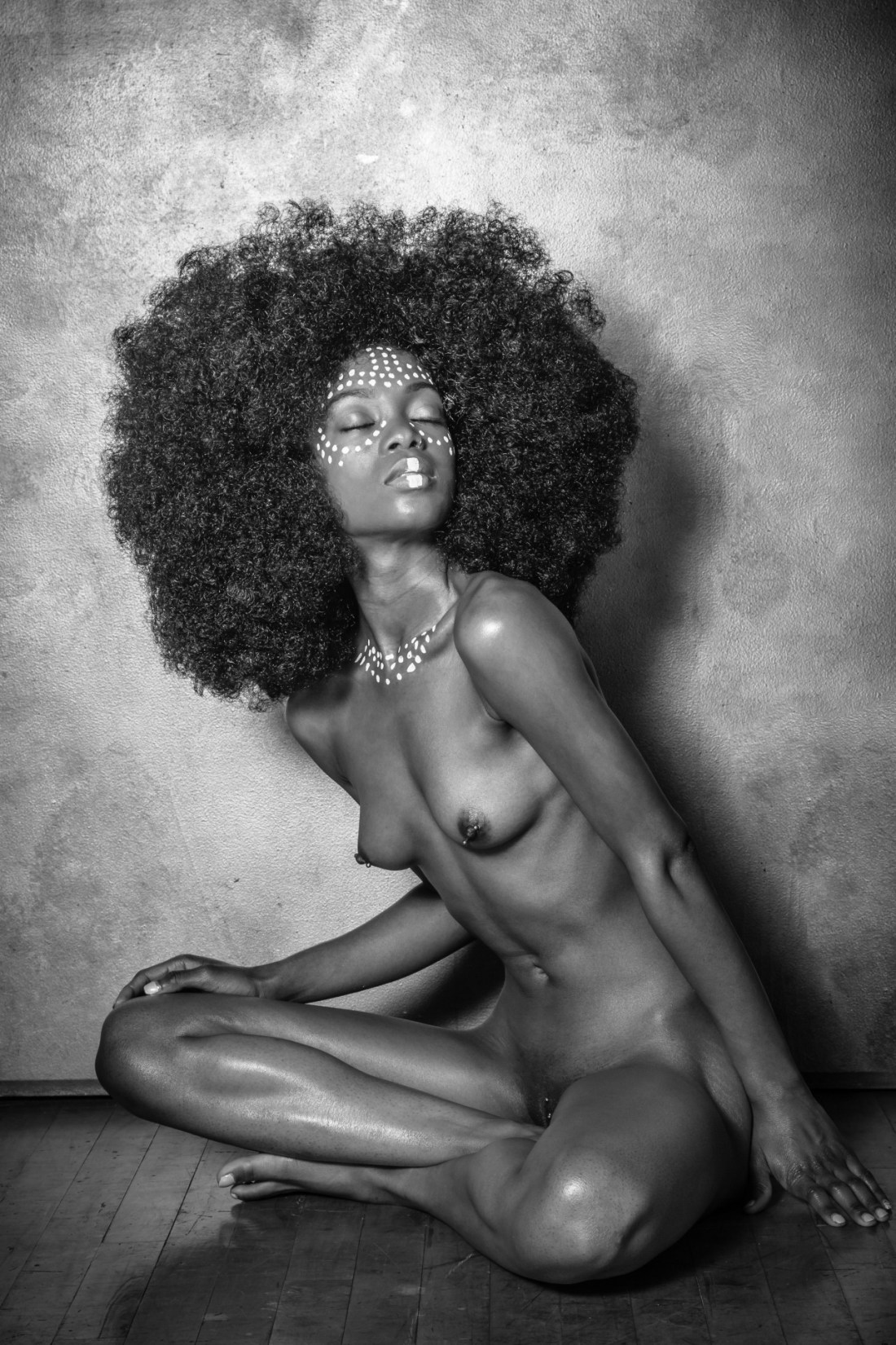
But note also how background behind her hair remains completely dark, pushing her hair forward in the composition, emphasizing the texture. In fact, I think that’s one thing that holds true of the work beyond the amazing expressions–there’s a ridiculous capacity to use extensive technical acumen to parse the frame in such a way that the subjects take on something more akin to a sculptural dimensionality.

It’s really quite impressive.