Author uncredited – COS PRIMAVERA/ESTATE (2017)

When you start learning photography, you’ll have a lot of maxims thrown your way:

  • 400 speed film stock should always be shot @ 320 ISO
  • Expose for shadows; develop for highlights.

The premise behind both of this isn’t nefarious. I mean the 400/320 thing actually was a huge benefit for certain Kodak B&W stocks–all of which are no extinct (to my knowledge).

But you’ll have someone like me who rates a a half dozen rolls of 400 speed stock at 320 ISO and is subsequently displeased with the result so then goes on to shoot another half dozen rolls at the 400 box speed and is equally dissatisfied and only then realizes that maybe it’s the film stock that’s not working for me.

The expose for shadows; develop for highlights is useful. But I’d rather teach someone how to actually use the Sunny 16 rule to shoot without a light meter and then teach the expose for shadows and develop for highlights after the student has spent a year or so honing their dark room chops saving overexposed prints.

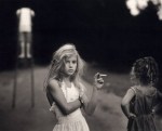
There is one thing I heard Mark Steinmetz suggest in a lecture that is actually indi-fucking-spensable. He talks about how in the afternoon, you’re walking down the street with your camera loaded with B&W film and you find that walking on the side of the street in shade, everything looks flat and muddy but if you cross to the sunny side of the street, shit just pops off your negs.

The reverse is true of color. Too much light is a bad thing but if you cross over to the shady side of the street.. bingo, your colors look better. (And, in truth, your colors are never going to look better than golden hour or for like three hours after its rained in the spring but the clouds are still hanging around and the grey against the green just super saturates everything. Swoon.)

But the point is well taken here. There’s entirely too much light for this image to have worked in color. This is likely digital–but it’s smartly executed–the gray scale grade of the background means that you can actually let the white of the suit blow out completely at points but the lost detail in the highlight tone just conveys a brighter white. (With only a few exceptions the only folks doing anything interesting in digital cinematography are actually exploiting this same trick.)

[↖] Sally Mann – The Last Time Emmett Modeled Nude (1987); [↑] Mary Ellen MarkAmanda and her cousin Amy, Valdese, North Carolina (1990); [↗] Sally MannCandy Cigarette from Immediate Family series (1989); [↓] Jen ErvinUntitled (2015)

Follow* the thread.

* There’s a photo that featured on a poster in my undergrad dark room–by an American woman circa the mid-to-late 1990s; it’s a B&W photo (a platinum print?) of a girl–perhaps 9 or 10–standing in dripping wet one-piece swimsuit next to a split rail fence (I think?). Maybe one of her siblings is climbing on the fence, I think there are two other people in the photo. The girl is making eye contact with the camera and is mugging a bit. The surroundings scream American suburbs. Also, I think the title of the image possibly has something to do with summer in Connecticut and it was on a poster from either a gallery or advertising a book (I can’t remember which). I am more than a little irritated with myself for being unable to remember it. (I swear it was Corinne Day but I’ve been unable to find the same photo in anything of hers online.) If anyone has a clue what I’m referring to–please for the love of all that is holy, drop me a line. The point of this post was supposed to be how young photographers don’t even necessarily have to be familiar with the full history of fine art photography because frequently the work that influences them draws influences from folks that are even more prototypically working within the same conceptual realm/with a startling overlap in their creative concerns.

Cameron HammondBecky Billman (Cake Magazine #14, 2014)

Browsing Hammond’s work I’m reminded of Elmer Batters.

That’s not the most straight forward association, at first blush. However, both produce work that employs a limited but sharply honed visual grammar as well as never attempts to hide the fact that it’s driven by obsessive preoccupation with specific paraphiliae–with Batters it’s stockings, feet and low riding undies, with Hammond it’s sun-drenched summer scenes with swimsuits, water, the utilitarian re-purposing of waist bands and bra straps in lieu of pockets and a sort of hedonistic preoccupation with stereotypical summer/beach foods (popsickes, hotdogs, ice cream, etc.).

What’s interesting is despite Hammond’s limited palette, he does actually make remarkably distinctive work. And what I like about this image in particular is that it’s a good bit more flagrant in it’s coy flirtation than the rest of the work–which presents it more in an off-hand, casual voyeurism sort of mode;whereas this is more confrontational.

But what really works is the synergy between depiction and technique. This image feels very bright to me and I find myself squinting at it to take it in–much as I probably would if I was standing more or less where the camera is. (It’s too contrast-y to be an Eggleston but it uses color to a strikingly similar effect.)

There are other indications in Hammond’s work that this effect isn’t an accident, rendering the accomplishment quite the feat of technical ingenuity.

EL3 Imageryromahni-7 (2014)

The B&W work EL3 Imagery has authored is so bad it borders on offensive.

It’s
mostly that his compositions are either utterly dull or nonsensical.
Yet, there is sometimes interesting considerations show with regard to
color.

He’s clearly going for and falling well short of a portraiture of immediacy feeling a la the fabulously talented ryanmuirhead;
and while he lacks the brashness, audacity and stones of radical
reinterpretation of what constitutes complimentary colors that vk-photography​‘s work, there is something instinctively compelling about EL3 Imagery’s crisp rendering of ultra vivid reds, greens and blues.

In
the case of the above, I don’t have 3D glasses handy but I’m reasonably
sure this would likely take on added dimensionality if I were to look
at this while wearing them. That’s not quite enough to carry the image
but it’s not something I can recall thinking of an image previously.

Katherine TurczanAnya and Carolina from Brezhnev’s Daughters series (201X)

In the indispensable Ways of Seeing, John Berger shows us the same painting–specifically, Van Gogh’s Wheatfield with Crows–twice.

With the first instance he presents it much as it would be encountered in a gallery, with the title and artist. However, the second time he merely labels it something to the effect of the last painting Van Gogh made before killing himself.

Criticism has been leveled against this scene. Chronologically, Wheatfield with Crows is only known to be one of the final paintings.

In my mind the criticism misses the point and by doing so goes a great distance towards proving the contention: context of presentation shapes the way a work is approached and subsequently understood.

Katherine Turczan’s work–to coin a phrase–really cultivates my pearl by representing both why fine art photography matters as well as why it’s–in the same breath–an intolerable, insufferably pretentious circle jerk.

Consider the ’essay’ which accompanies Brezhnev’s Daughters:

Brezhnev’s Daughters, the title of this project refers to what women call themselves in Dneprodzerzhinsk, Ukraine, the birthplace of Leonid Brezhnev and the industrial heartland of Ukraine.  The women say that they are Brezhnev’s children because they have inherited the future of the failing land and their father has abandoned them.

Dneprodzerzhinsk, Ukraine is about 8 hours from Kiev along the Dnepro River the heart of Ukraine’s mining and manufacturing production.  This area is like many cities in the east, an industrial wasteland with factory stacks ablaze filling the skyline.  The landscape takes on the quality of a bad Hollywood movie about the apocalypse. The industry in these towns is a double edge sword; one that contaminates and sickens yet employs most of its people.  This is where Ukraine’s working poor live.

In these parts of Ukraine it is very prestigious to work in the sex industry.  The industry offers economic opportunity to many women other than what the factories can provide. Their sexuality is their strength and they use it as a form of emancipation to support their families.  They are very proud of this.  Many young women work as welders during the day for pay that is not sufficient to feed their families, while at night they pole dance. Brezhnev’s Daughters is a portrait of these and other women in the industrial south who are faced with these complex choices. 

These photographs are made with an 8×10 camera and printed on Gelatin Silver Paper.

As far as such things go, it’s all but flawless. And without a doubt it enlivens/amplifies the resonance of the photographs. The trouble is: it also muddles them.

That which is distinct in Turczan’s work is not what makes the work’good’.

Katja, Mariya and Liana resemble thousands of other candid model shots produced by the internet hordes. (Admittedly, these were shot with a large format 8×10 analog camera.)

Karolina could very well be a reclaimed Jock Sturges’ discard; Yulia is a straight-up Atget heist.

What is distinct about Turczan’s work is where it doesn’t bother to sweep it’s shoddiness under the rug. Sasha is #skinnyframebullshit; Oksana avoids the same mistake (the difference for anyone who cares, is mentally reconsidering the shot given the opposite orientation and comparing and contrasting) but as with the previous image just isn’t an especially technically astute image even if both are alive in a way few of the other images are.

I do like the photograph I’ve posted here. It one of maybe three in keeping with the explanatory essay. But not only is it in keeping with the essay, there’s a dialogue between the contextualization and the work that sharpens both.

And it occurs to me that academnified fine art photography operates from the premise of creating work that clearly indicates both what it is and what it is not. Popular image making on the other hand starts and more often than not ends with the assertion this is interesting. Such taxonomical considerations are vital to my own process, but I think at a certain point you have to focus on what is instead of what isn’t. Too much work tries to be everything to everyone and ends up nothing to no one. But it’s interesting that the work which insisted clearly in its own specificity somehow manages to transcend that specificity more often than not.