Jim MalucciNereyda Bird for Lui Magazine (2017)

This is a veritable cornucopia of textural exquisiteness.

The chicken wire. Also, the shadow it’s casting.

The water droplets on Bird’s skin–and the variation in appearance: highlight aliased with shadow against highlight, shadow aliased by highlight on shadow.

The mottled refraction of light in the pool’s water.

Brick, concrete made to appear macadam-y.

Palm fronds.

There’s some compression going on that I suspect was introduced in post. Nereyda is noticeably separated from the water by noticeably dodging the exposure around her left side.

A remote flash unit bringing the trees in the background up a little would’ve helped make it pop even more.

The thing that I don’t understand here–and it’s really a small criticism–but with the depth of field the range of sharp focus seems to start on the shadow cast by the chicken wire–so behind the plane on which Nereyda’s face is positioned. The shadow of the chicken wire is all that is needed to convey what it is and how it relates to the overall image. I think I would’ve preferred a shallower depth of field combined with closer attention to her face. The location scans clearly whether it’s in focus or not and I think that it would’ve been better to trust the texture to sell the image than to salvage the concept of the image with selective editing that would’ve been unnecessary if the original image were made with a slightly different set of creative decisions.

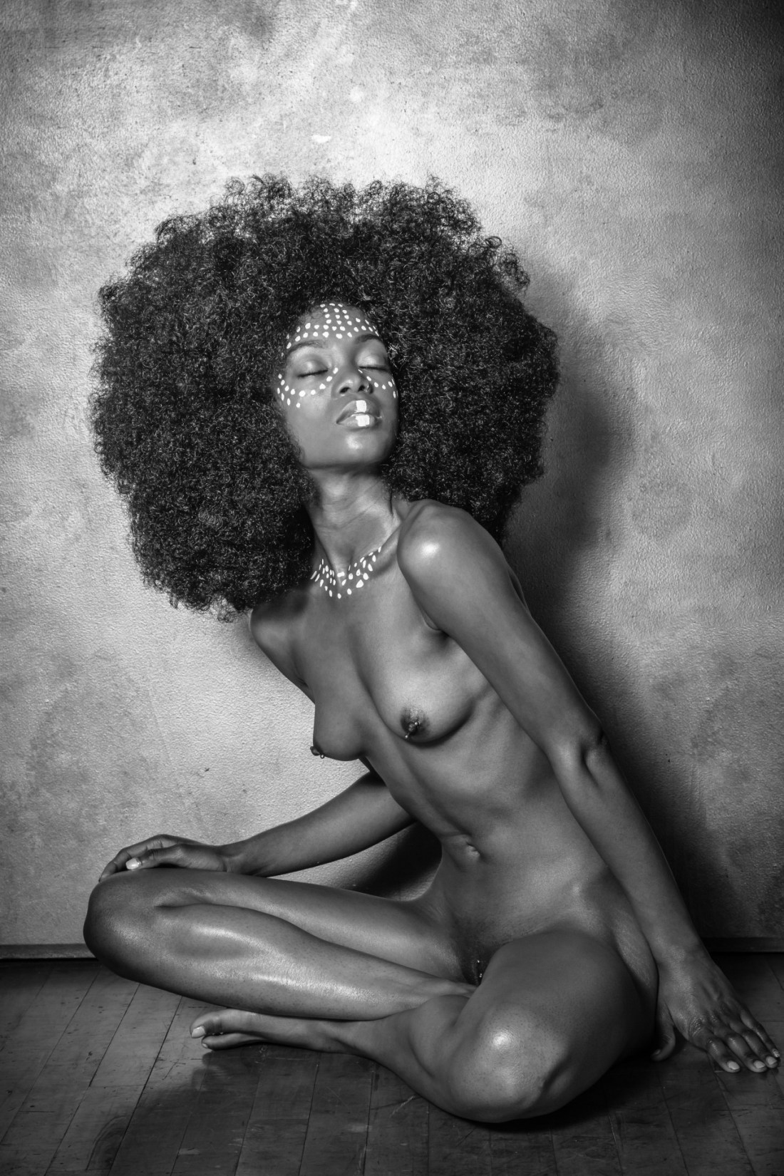
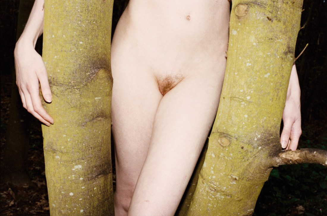
ErotobotDinks (2014)

I have a outsize obsession with visible texture. When it’s done right–it is like I can almost feel that which I am seeing, sliding beneath my finger tips through nothing more than the act of maintaining an attentive gaze.

With its gooseflesh, dirt, the black mirror-like water, water droplets on goosebumps and even Dinks’ hair, this would’ve had less impact if it had approached me out of a crowd and broken a baseball bat in half over my head.

It’s unquestionably pornography. And honestly being somewhat familiar with Erotobot’s work–all of his photos feature a discomfiting edginess. Shot in abandoned buildings or seeming post-industrial wastelands. It’s dark and sinister; explicitly and graphically depicts sex–frequently of a rather rough variety. Like just looking at the work, I worry a bit that he’s another in a long line of perverts making beautiful work through sometimes questionable disregard for consent, boundaries or interpersonal respect.

But despite how over-the-top the obscenity is in this image, my reading of it leads me in rather the opposite direction. Straight up there’s no way getting this shot didn’t take time. Evidenced by the goosebumps and the fact that Dinks would’ve had to get undressed and roll around in the puddle and dirt for this scene to have come about.

Yes, it’s possible that there were degrees of unseen coercion. And I don’t know if it’s because I want so much to like this–if you feel I’m wrong, please chime in (consent is just about the most important thing to me and if/when I fuck things up, I welcome correction)–but this feels consensual.

The way it’s played toward the camera. Dinks’ expression speaks of wanting so desperate it actually feels like a kind of physical pain that can only be assuaged by sating the desire. There is something here the resonates with an honesty that I find entirely unnerving. (I relate to this so hard.)

But there’s also a way in which Dinks (and maybe that’s not her name but I hope it is because it’s awesome) is presented as seductive but also maybe a little bit dangerous–as in while the image is presented so that the viewer can station themselves between photographer and subject–and thereby presume the show is for them and them alone; standing in such a position carries a lot of potential risk for harm, violence or some sort of untoward resolution.

Beyond that I only know three things:

  1. I am devastated this was not an photography I created,
  2. I wish it was a photograph of me, and,
  3. I suspect that the way that Art and Pornography can happily coexist has less to do with hybridization and a lot more to do with setting out to create something meaningful and evocative instead of easily salacious.

Arseni KhamzinUntitled (2013)

…holy shit: this. is. FAN-FUCKING-TASTIC!

It’s a compositional marvel, really–the interplay between line, texture and shadow vs. light is exemplary.

The subject is slightly off-center to the right of the frame; allowing the top and right of frame to be counter-balanced by the much darker shadows cast by the subject and chimney.

There’s an intoxicating variety of sumptuous texture–poured concrete, mortar, corrugated metal, skin, hair and fabric. (It’s an especially inspired touch that the lines on the tartan print blanket reiterate the two point perspective of the composition, but in their slightly imperfect alignment, they server to further direct attention toward the subject.

Why does it all work so well? Two years ago I would’ve just offered the cop out of attention to detail regarding texture and balance but actually, the frame works off a simple 45 degree clockwise re-orientation of the rule of thirds.

And I’m not even to the best part–this is a Pietà! Yes, it’s oriented differently. Traditionally, Pietà present Jesus from head to toe starting with his head at frame left and his feet towards frame right. [Can someone with a little bit more comprehensive of an Art History background explain the relevance of such positioning? I suspect there’s something to it (sacred vs profane, which would be interesting given the fundamentally humanist trappings underlying the codification of the trope)–not unlike the direction Ganesh’s trunk curls having distinctly different meanings.]

Yes, it’s also short a figure and the genders are swapped–or so it seems to me. But there’s really some fascinating reinterpretation going on surrounding the trope. I can’t help but think the point of this variation has something to do with the loneliness of existence and a sort of embodiment of that notorious line from Donnie Darko: every living creature on earth dies alone.

Lastly, this was made on Impossible Instant Black and White Film with Hard Color Frame–which in my experience is not the easiest film to use if you want to produce a thoroughly luminous result such as the above.

Stunning and exceptional.

Elaine BezoldWrap (2014)

I’m not entirely sure what to make of Bezold–her work is all over the place.

When the work lands, there’s a sort of an Allison Barnes and Mark Steinmetz arguing over coffee about the merits/detriments of Emmet Gowin vs. Garry Winogrand to it.

I don’t think the above necessarily lands but it exemplifies something about Bezold’s work that doesn’t fit with any of her potential influences–there’s a nearly pathological preoccupation with texture.

This image is a relatively flat matte with the subject is standing pretty much right up against the wall but the texture of the wet, coiled hair is still clearly represented.

In other images (for example: this, this, or this), there’s a better use of space and depth (also: strobe–in the last two) to present a perfectly exposed image in a way that is interesting and compelling.

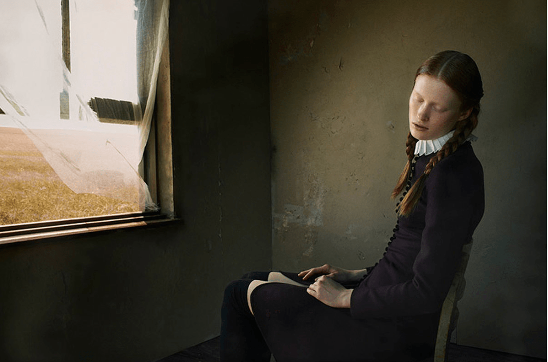
Bruno DayanWinter’s Tale for Ilva Hetmann and Erin Axtell Flair Italy (2011)

I really like this image.

A big part of my attraction is tied up with perhaps the closest thing I have to a legitimate paraphilia, namely: I get unspeakably aroused by things which press up against the boundaries separating traditional conceptions of the sacred vs the profane.

In this image it’s the Amish inspired wardrobe rubbing up against a quasi-masturbatory sensuality. (I can’t tell if the white on her thighs is her pulling her dress up to reveal knee-high stockings and a swatch of skin–essentially exposing herself to the open window and summer breeze–or if it’s pattern that’s a part of her pants; either way, it’s extremely evocative.)

The other part of it is the art historical resonance. This image immediately aligns with at least three other undisputed masterpieces: the young woman’s expression is a riff on Bernini’s sculpture The Ecstasy of St. Teresa and the view out the window of the scorched grass is obviously intended to invite associations with Wyeth’s painting Christina’s World, as well as Malick’s film Day’s of Heaven.

Also, perusing Dayan’s other work, this project is interesting as it steps well outside his usual pre-Raphaelite sensibilities.

Source Unknown – Title Unknown (19XX)

Although I am not especially into retro/vintage porn thing, I do kind of dig that this image was snapped, printed and published in a magazine that someone held onto long enough to scan and upload it in the Internet age. (Not to mention the way the center fold presents here resembles a similar sort of photo stitching used by someone like Accra Shepp.)

While from an art historical standpoint, it’s enormously problematic to suggest that part of what determines whether something is capital-A Art is survival–how many brilliant works have we already lost because the author wasn’t a white cis man?

Yet, there is something to be said for the test of time. This is an imperfect image–I really can’t overlook the way her legs have been amputated by the frame lines render her legs perpetually spread toward the viewer–not unlike a dead butterfly pinned through the thorax to felt under glass.

There are several allowances that while they certainly don’t mitigate the objectification, they do perhaps soften it: the young woman eschews eye contact with the camera, she’s wearing both a top (ostensibly her own, instead of a wardrobe piece), earrings and a watch; lastly, the three different textures of the back of the couch, the cushions and the carpet are sumptuously rendered in nearly synesthetic detail.

It seems as if the direction she’s been given is that she’s beginning to masturbate. As much as one can accurately judge an expression based on a fraction of a seconds representation of it, she seems very much on board with the notion; however, the contrivance of her pose and self-consciousness directly address the inherent on-your-mark’s-get-set-go! approach that underlies the majority of heteronormative porn.

I feel like if this wasn’t a porn shoot and the goal wasn’t based on a vague erotic notion of depiction of orgasmic paroxysm as narrative denouement, then this image–if it had been content to wait patiently and adopt a wider, less implicitly violent/objectifying frame–could’ve been pornographic art instead of artfully depicted porn.

It strikes me that current international literary cause célèbre Elena Ferrante (and feminist enfant terrible) is addressing something on a similar track when she points out in a recent interview:

Yes,
I hold that male colonization of our imaginations—a calamity while ever
we were unable to give shape to our difference—is, today, a strength.
We know everything about the male symbol system; they, for the most
part, know nothing
about ours, above all about how it has been restructured by the blows
the world has dealt us. What’s more, they are not even curious, indeed
they recognize us only from within their system.