staceyelizzabethh:


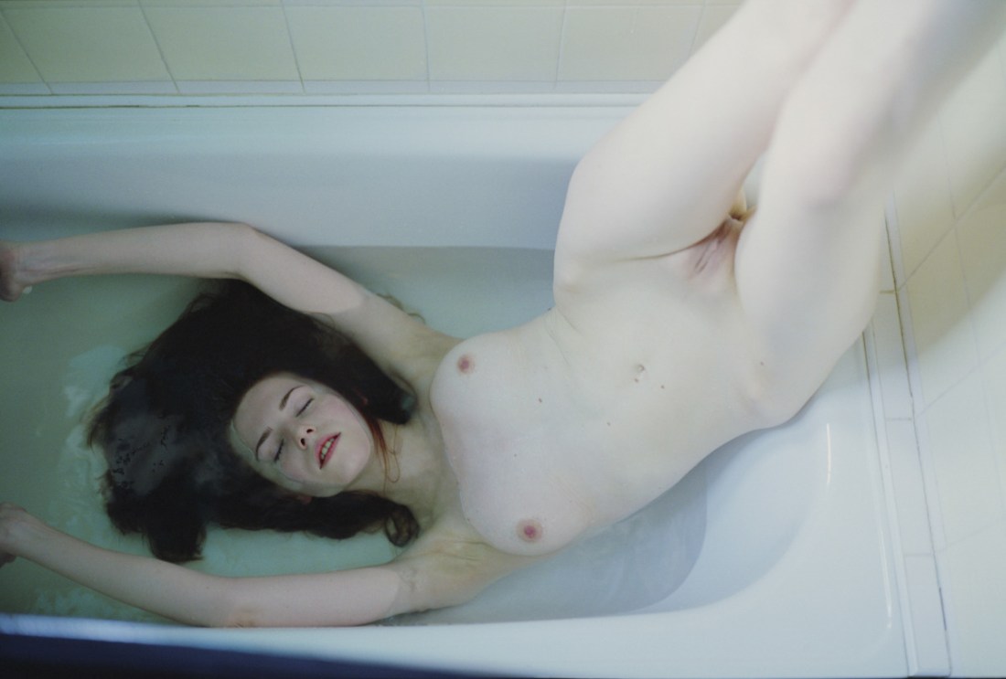
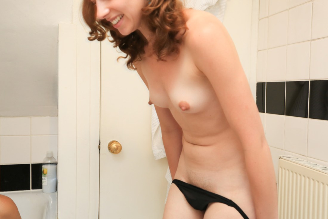
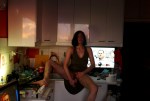
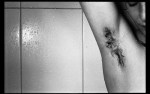
Source: as best as I can tell these six images were likely gathered and arranged by fulme. (The top-center image seems to predate this assemblage.)

In theory, I am a proponent of bricolage.

However, if you are working digitally, there is very little that isn’t at hand for you to use. To me this muddies the already precarious distinction between ‘formal’ collage and MacGyver free association.

I don’t know how to illustrate it except to point to another image that was making the Tumblr rounds back in early October. It’s a really solid idea but the execution is lame brained–half a grapefruit on a white background super-imposed over what looks like the legs of a model wearing a white one-piece American Apparel swimsuit.

On the other hand, the six images above were carefully selected. The similarity in tonal range and luminosity is striking. Further, the arrangement serves to activate the images in different ways, promoting interplay, building and relieving tension by means of line, color, echoing of shape, conceptual mirror, etc.

Highly astute work deserving of recognition.

danish-principle:

Joanna Szproch [also : The Quiet Front & Dripbook]

Welcome to Swoon Town. Population: me.

This. Is. Just… woah & woah again & amen.

Yes, it flouts conventions I drone on & on about: hands cut off at the left frame edge, legs amputated mid-calf by the right third of the upper margin.

Underlying these choices, however, is a logic strengthening the ambiguity of Eva’s pose: is she being lowered into the water or pulled from it?

& ambiguity in keeping with the image’s liminality; lingering as it does between color & desaturation; at once strong & vulnerable, artful & lascivious.

I cannot even begin to list the host of things that go through my head when I look at this image. But two things seem vital to mention. First, I am jealous of Eva. Not because she is so much prettier than me & not because I wish this was me instead of her (even though I do a little, okay: a lot.). It’s that I want to be seen by someone (anyone, honestly) the way Szporch sees Eva through her camera.

Also, in the interest of full disclosure: I wish I had made this image. It is chapter & verse the sort of work I try–& more of than not fail–to make.

toutdroitaller:

Mark James

(Note: I can neither confirm nor deny tout  droit aller’s attribution.) EDIT: The source listed (fallinglondon) is run by Mark James. (Sincere thanks to the anon who took the time to point out what should’ve been obvious right off)

This image is a train wreck.

Although the left frame edge is more or less in-line with the vertical of the tile grouting, the lens’ wide angle focal length, the rightward pan and slight up-tilt, the tile’s verticals are distractingly misaligned against the right frame edge.

Given the obvious motion blur along the bridge of her nose, I would be thinking the camera was hand-held, except there is an awful lot of illumination in a fairly tight space. I’m thinking more screen capture from a video than slow shutter speed.

And that’s really a goddamn shame because despite of the sloppy composition, there are some ingenious accidents.

Either a knee or shoulder extends beyond the edge of the tub at the lower left corner of the frame; it doesn’t especially matter which because either speak to the presence of another person in this cramped bathroom.

There’s also the young woman’s exquisitely unselfconscious pose, stooped slightly forward to slide her black panties down, the image freezes her in the moment just before she reveals the top edge of her pubic fringe. The too bright light accentuates the musculature of her hips and abdomen. The angle of her shoulders in relation to her hips causes a down tilt in her breasts, emphasizing her erect nipples against her own skin and the door behind her.

Her expression is loaded–a mix of playfulness, anxiety and maybe something not unlike hunger.

And though I am against employing the upper frame edge as a tool to preserve anonymity, in this case an additional point of tension is established between what is seen and what remains hidden.

Igor Mukhin

Normal
0

false
false
false

EN-US
X-NONE
X-NONE

/* Style Definitions */
table.MsoNormalTable
{mso-style-name:”Table Normal”;
mso-tstyle-rowband-size:0;
mso-tstyle-colband-size:0;
mso-style-noshow:yes;
mso-style-priority:99;
mso-style-parent:””;
mso-padding-alt:0in 5.4pt 0in 5.4pt;
mso-para-margin-top:0in;
mso-para-margin-right:0in;
mso-para-margin-bottom:10.0pt;
mso-para-margin-left:0in;
line-height:115%;
mso-pagination:widow-orphan;
font-size:12.0pt;
mso-bidi-font-size:11.0pt;
font-family:”Garamond”,”serif”;}

If it moves, Igor Mukhin likely shoots it; if it doesn’t, he’ll still take aim.

With nearly 5000 images—split between B&W film scans and Leica AG M9 captures, amassed over 6.5 years—perusing his photostream is like mainlining a hyper-distilled, chaotic mélange of interesting, occasionally ingenious work.

My head doesn’t wrap around such profligate excess easily—limitation is too central a feature in my own process. (Read: I am poor.) But I can let that slide. What I fail to fathom is how Mukhin’s haphazard, throw-it-at-the-wall-to-see-what-sticks curatorial approach works at all, let alone results in such jaw-dropping examples of all that photography should embody.

(To avoid unnecessary disappointment, skip his staid personal website.)

The earliest instance seems to be this post; beyond that your guess is as good as mine.

This image demonstrates at least a cursory concern for composition. The focal point of the image is not the center of the frame. There is a consistence in the angle and space allotted to the outside-edge-of-the-tub/floor and the inside-of-the-tub/tile wall. The model is watching what is happening in the frame not searching for approval from the viewer. She is presented nearly whole in the frame. Lastly, the flash is exposes the white fiberglass perfectly, stopping short of overexposure.

I love that this young woman is still wearing stockings and cute top. Along with the polish on her nails, the image retains color that levels out what would have otherwise been the tub being too white or her skin blanched.

There is clearly an urolagnia element to this scene. Yet it is– for me at least–mediated by the geyser-like appearance which although certainly urine echoes tropes surrounding female ejaculation.

In other words, some forethought and technical skill went into making this image. It’s gritty and transgressive but quality is not sacrificed just because its content features fetishistic elements.

Ryan McGinley

Normal
0

false
false
false

EN-US
X-NONE
X-NONE

/* Style Definitions */
table.MsoNormalTable
{mso-style-name:”Table Normal”;
mso-tstyle-rowband-size:0;
mso-tstyle-colband-size:0;
mso-style-noshow:yes;
mso-style-priority:99;
mso-style-parent:””;
mso-padding-alt:0in 5.4pt 0in 5.4pt;
mso-para-margin-top:0in;
mso-para-margin-right:0in;
mso-para-margin-bottom:10.0pt;
mso-para-margin-left:0in;
line-height:115%;
mso-pagination:widow-orphan;
font-size:12.0pt;
mso-bidi-font-size:11.0pt;
font-family:”Garamond”,”serif”;}

Untitled (Bathtub) 2005

And as we staggered towards a frightening dawn, I swear all I everevereverevereverever believed in was all of us together all along.