Source unknown – Title unknown (200X)
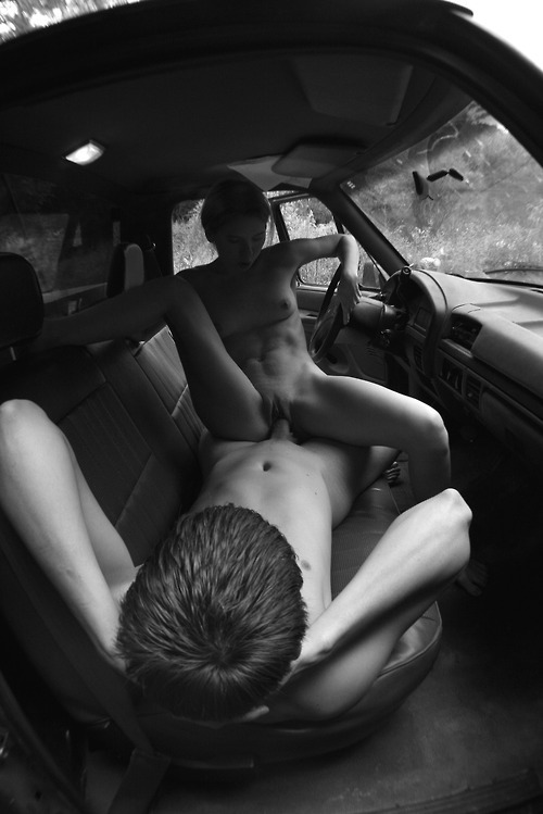
This appears to be an earlier image from the same sequence as something I posted way back when Acetylene Eyes was just a baby blog. (The similarities run beyond both being taken in a truck cab: that’s the same boy and the pattern stitched into the upholstery is an exact match.)
But there’s other similarities, stylistic overlap. I noted in the early post before #skinnyframebullshit was a fully qualified thing, that the vertical orientation was counter-intuitive given the tableau.
The astute reader will pause here to inquire but aren’t you being disingenuous? You’ve said on a number of occasions that whether the eye scans left to right over the image or top to bottom can be a part of the logic governing the decision between landscape vs portrait orientations?
I have two responses.
- You have to distinguish between actual 3D space and how three dimensions are rendered in 2D representation.
- I noted that about the previous posted image as well: the top 20% of the above frame and the bottom 10% contributes nothing to the compositional logic. (It’s negative space that doubles down on information that would otherwise be conveyed to the viewer even if it was cropped out.)
Let me expand that first point a bit further: from the standpoint of visual grammar, the image is telling the viewer that it has something to say about elevation. But that isn’t supported by the image. One only sees, what a meter of elevation from the low point of the stitched seam in the lower right almost corner to the halfway up the open passenger side door? (Depth of field, i.e. front to back representation of 3D space in 2D vs top to bottom orientation for the purpose of emphasizing a sense of concern with the relationship of various elevations are not interchangeable.)
Also, whereas I commented that the previous image would benefit from slight shifts in the poses, I think that a horizontal oriented frame would add a narrative denotation to the reading of the image. (Something which is conceptually appropriate given that the question what constitutes narrative is so similar that it runs virtually parallel to questions of the mechanics of eroticism.)
If her right leg were braced against the door frame instead of bent as such, it would open the frame up more. From which point it would be logical to cheat her a little bit further towards the edge of the passenger side bench, reposition the camera with a bit more of a down-tilt so that you can see a bit of the grassy shoulder outside the car door and perhaps something of what he’s doing with his hands–his current position above is hell of awkward.
My point is it’s a reasonably good notion for a image that unfortunately muddies matters when it comes to thoughtful execution.
There are some technical considerations to belabor, too. Gun to my head, I’d say this was shot digitally and desaturated in post. Shutter speed is below 1/30 of a second. My gut says its 1/8th of second given the slight motion blur of her left leg.
I can’t really quibble with the overall exposure across the image. Yet if this is, in fact, digital, then you’d want that highlight contained just inside the upper limits of the histogram.
Then you’d have room to selectively dial things some detail back into the some of the heavily shadowed areas in the frame.