When printing something one is given two options: portrait or landscape.
As best I can tell this is a vestige of painting: vertically oriented images were favored for portraits while horizontal frames lent themselves to the panorama of landscapes.
Although arguably more of an unconscious convention in painting, this logic has been actively internalized by photographers and virtually enshrined by digital image makers.
The trouble is two-fold: the logic of photography is not interchangeable with the rules and precepts of painting (no matter how the latter interpenetrates the former). When applied to each other, these conventions produce schizoid, contradictory compositions.
Photography—and by dint digital imaging which however misguided is based upon it—has internalized the landscape orientation. Unlike painting, I do not think this internalization has been unconscious—after all, if you have ever looked at a strip of 35mm film on a light-table there is an easy-to-see bias towards horizontal framing. (I am so accustomed to this that when I encounter vertical compositions now, I tend to tilt my head sideways when looking at them.)
Portrait orientation is not without its uses in photography and digital imaging. Unfortunately, it more often than not contributes very little to the compositional ‘sense’ of an image; serving expedience by quickly fitting the subject to the frame—instead of forcing the image maker to contemplate the discontinuity between the subject/frame and subsequently address it in a more artful manner.
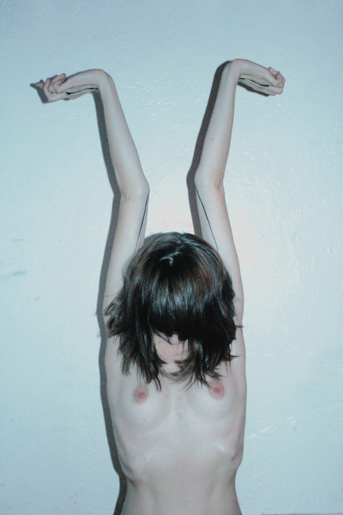
The above has almost certain been cropped. But I would wager its orientation was originally vertical. (The individual responsible for the image contacted me with assurances that the image was originally horizontal but was cropped to accentuate the vertical.) And although I think horizontal framing would have worked better (EDIT: Having seen a sample of the original image, it is better), I will admit that unlike the vast majority of portrait orientations, the image maker is clearly aware of the manner in which the shift affects how the image is seen.
The frame echoes the subject’s form. On its own, that is the worst of lazy justifications; however, in this case the poses, the simple line work of what I find to be one of the sexiest tattoos I have ever seen and the narrowed view work as a visual approximation of the feeling one gets from indulging in a much needed stretch.
Further, the portrait orientation allowed the photographer to be closer to the model, lending a sense of heightened intimacy while also preserving anonymity.
Finally, I would be remiss not to admit a large part of my reason for posting this is the model’s unnerving resemblance to someone upon whom I currently have a maddening crush.