choomathy:

this series was fun. I remember my tutor tried to get all “damn girl I love your work with feminism what a deep concept” and I was like nah I just like baths and … nipples

Baths and nipples, indeed.

Jaw, meet the floor. Floor, jaw. Get familiar with each other because every time I look at these my brain explodes.

I guess I can see reading a feminist agenda into this but I’m inclined to immediately link it with Bernd and Hilla Becher’s industrial typologies.

But either way, this as precocious as it is astonishing. Crazy props to Chloe Killip for not only having something captivating to say but finding the most breath-taking way of saying it.

Robert Weissner Bree Addams (2013)

As it is, the framing functions. The desk more or less echoes Ms. Addams knees; the window edge starts a wee bit shy of the first vertical third but the vertical blinds and radiant light not only accentuate her form it contributes an implicit leftward momentum to the image.

Her weight is supported by her right arm and foot–her left leg shifts behind the other at the knee, her left hand is extended only for the sake of balance. It’s interesting because this posture suggests between her arms and torso a form close enough to round up to an equilateral triangle–drawing attention to her breasts (exquisitely semi-silhouetted behind sheer fabric), reiterating the shape of her pubic hair. .

With only this image to go on, I’d be pretty excited about digging in to the image maker’s other work. Alas, I think the praise here needs to go to Ms. Addams.

Don’t get me wrong, Weissner isn’t half-bad. He’s got enough technical chops to give his work a faux art sheen. The trouble is: he seems to see himself as a Dan Smith when his work is inline with the ‘art’ as a pretext for sating voyeurism of someone like Fox Photo-Art.

Credit where it’s due: technical acumen is nothing to sneeze at and this is one image is lovely and I certainly prefer Weissner to Fox Photo-Art’s rubbish. Unfortunately, there is so little distinguishing their work from each other or the scads of other female-nudes-all-day-every-day-because-I-own-a-dSLR-and-can-afford-to-hire-beautiful-models that I just have to shake my head and close another tab.

staceyelizzabethh:


Source: as best as I can tell these six images were likely gathered and arranged by fulme. (The top-center image seems to predate this assemblage.)

In theory, I am a proponent of bricolage.

However, if you are working digitally, there is very little that isn’t at hand for you to use. To me this muddies the already precarious distinction between ‘formal’ collage and MacGyver free association.

I don’t know how to illustrate it except to point to another image that was making the Tumblr rounds back in early October. It’s a really solid idea but the execution is lame brained–half a grapefruit on a white background super-imposed over what looks like the legs of a model wearing a white one-piece American Apparel swimsuit.

On the other hand, the six images above were carefully selected. The similarity in tonal range and luminosity is striking. Further, the arrangement serves to activate the images in different ways, promoting interplay, building and relieving tension by means of line, color, echoing of shape, conceptual mirror, etc.

Highly astute work deserving of recognition.

mpdrolet:

Sisters #045, Prague, 1989

Stéphane Coutelle

I love everything about this image–the poses, expressions, tones and textures.

There’s something beyond aesthetic attraction, something more analogous to sympathetic resonance.

The location and the year: Prague, 1989–the eve of the Velvet Revolution.

Then it hit me: bodily closeness, dreams and wanting to touch, be touched.

And I flashback hard to Wim WendersWings of Desire–one of the greatest masterpieces of cinema about an angel who decides to become human after falling in love with a trapeze artist.

It’s one of my favorite films. But what really interests me is how both it and this invert the notion of installation (art inhabiting space) and allow space to inhabit art.

Maybe I am insane but gazing at this image I can very nearly feel the vibration of change like a train telegraphing its arrival along the rails.

Yes, we drift like worried fire but we hope and love and believe beauty will save the world.

Yann FaucherUntitled (2012)

Frustrating and illogical composition aside, there is so much to love here: suffused summer light bleeding from the window like a wound, suffusing the fringe of a beautiful body and clotting—white and diaphanous—on curtain gauze; eyes closed lightly, mouth open just a little; long arms dangle, finger tips tracing the textured braille of the bed sheets; above his right knee, and the forgotten change left on the sill that will stick for a moment when he stands again.

The content of the work is stunning, trading in sincere portraits of primarily nude male-bodied models. When [gender neutral pronoun] does make images of female-bodied individuals, the result is a sort of Fassbinder-ian waiting for those quiet moments wherein women are no longer divided into a me & the-me-the-world-sees and are finally alone with their thoughts.

It kills me to say it but all this potential is greatly diminished by Faucher’s thoughtless reliance on #skinnyframebullshit. I don’t know what it is more insufferable or sloppy.

There needs to be a reason, a compositional logic behind a vertical frame. I don’t know if in making portraits Faucher considers portrait orientation more fitting—though [insert gender neutral possessive] grasp of the technical seems more nuanced than that. It might also be an effort to comment on the way audiences view images (what with smartphones leading the #skinnyframebullshit charge). If that was the case, I could accept it. (I am not against vertical frames; I am against using them without any good reason.)

I admit that I haven’t looked closely at the rest of Faucher’s images; but the sense driving the framing seems to be the grievously mistaken notion that the frame should echo the length of the window. Only, due to the camera’s pan and the lenses wide angle of view, the visible portion of the window is closer to a square than a rectangle.

The window bay’s leftmost vertical angle does not align with the left frame edge. A small point, yes; nonetheless one that would have been de-emphasized with landscape orientation.

In this case the oddity of the angle indicates other glaring inconsistencies: the boy’s body is not balanced within the frame– the top of his left knee is lopped off by the right frame edge, his left foot hacked through the ankle and heel by the bottom frame edge. Then there’s the dead space directly above his head…

Don’t get me wrong the work is good; but it also has the potential to be so fucking much better. Unrealized potential pisses me off. (However, I suspect this says more about me than Faucher.)

Source Unknown

The psychedelic background reminds me of some of the stuff Ryan McGinley has shot in caves. The pose would seem to even further suggest him, except that he’d shoot in a studio with more even lighting and acknowledgement of the camera.

Were I to see this image in a magazine, I probably wouldn’t give it pause. But the way it is presented here–on what appears to be a cheap bathmat, suggesting an implicit POV shot–contributes a luridness in which I am always inclined to revel.

graciehagen:

Illusions of the Body was made to tackle the supposed norms of what we think our bodies are supposed to look like. Most of us realize that the media displays only the prettiest photos of people, yet we compare ourselves to those images. We never get to see those photos juxtaposed against a picture of that same person looking unflattering. That contrast would help a lot of body image issues we as a culture have.

Within the series I tried get a range of body types, ethnicities & genders to show how everyone is a different shape & size; there is no “normal”. Each photo was taken with the same lighting & the same angle.

Celebrate your shapes, sizes & the odd contortions your body can get itself into. The human body is a weird & beautiful thing.

Photographer: Gracie Hagen

Although I can’t say I am completely on-board with the execution; Hagen’s project seems especially relevant in light of the last two posts.

As with most great conceptual work, the shoulders back, breath held with muscles flexed posturing vs. the body at rest is so simple it comes across as cliche. (What is a cliche but a pat way of expressing a difficult sentiment, after all; part of why the Modern Art = I could do that + Yeah, but you didn’t equation such an on point observation.)

What irks me is the extent to which the ‘body at rest’ poses appear affectedly exagerated. (Perhaps I missed the memo and that’s the point? However, I don’t see how that accomplishes the stated aim.)

For me, the portrait of Nicole Pollard seems problematic in the way it draws attention to her extreme thinness. I find myself alarmed by the dissonance between her expression (which suggests to me power and agency) and what I see as the implied frailty of her body. I guess my question is, since your posts tend to favor thin models, how do you decide what is too skinny? Without shaming anyone for their bodies (fat or thin), how do we decide what is triggering?

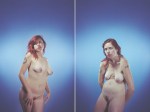
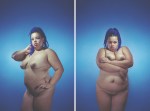
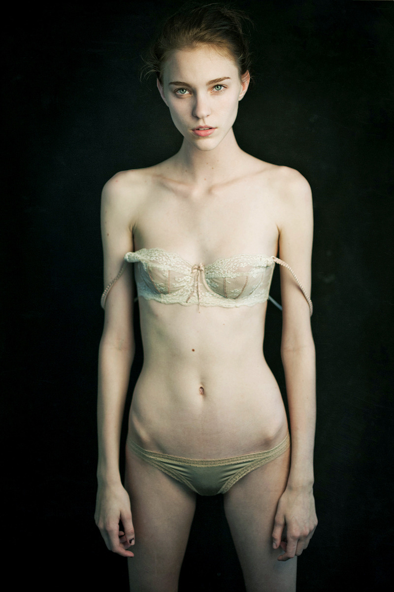
Honestly, I vacillated over whether to post Mathieu Vladimir Alliard’s image of Nicole Pollard.

From a curatorial standpoint, it doesn’t fit especially well. I avoid anything smacking of ‘fashion’ and I’m not fond of the eye-contact with the audience featuring so prominently in portraiture.

Then there’s the matter of Ms. Pollard’s presentation which I agree is problematic. I may have soft-balled it when I touched on it in my post, however.

The unsubtle cues emphasizing her bony bonafides (framing orientation, hanging bra straps) bother me–I made a point of mentioning them; but for me, they weren’t trigger though I am not naive enough to think they couldn’t be for someone else. (Thus much of the hesitation about posting the image.)

The eventual decision to post was motivated by three considerations:

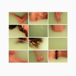
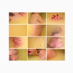
  1. Acetylene Eyes, in spite of all its ‘intellectual’ posturing, is my own personal fuck you letter to the vast majority of depictions of interpersonal desire from which I feel irrevocably alienated; in other words: I post the shit that get my all haute and bothered. This image somehow managers to reach in and flip a very primal switch in my brain. As such, it belongs.
  2. The Photoshop work–there seems to be some minor dodging and burning around the edges as well as skin tone grading which I referred to as ‘sickly’ when ‘cadaverous’ would have been far more appropriate–is rather removed from the commonplace bullshit pulled by the glamoratti. (And although disconcerting it actually serves the image here.)
  3. Lastly, as you noted: Ms. Pollard’s expression–suggesting ‘power and agency’–is both haunting and thoroughly compelling.

These considerations are offered neither to justify my post or diminish the degree to which you found it triggering. I simply feel any answer would be incomplete in their absence.

I strive to make this blog an open-minded community accepting of and open to diverse expressions of desire. Sadly, I fail at that more often than I succeed and I think it’s important to own that. I would love to post more images feature a broad range of ages, more PoC, different body types and more imagery made by and for trans folks. But I refuse to post images just for the sake of appearing diverse–that’s exploitative as fuck and I have ZERO interest.

I won’t deny the obvious bias for ‘young’ and ‘thin’ w/r/t to content. I could be like: tough shit that’s my preference but that’s such a bullshit copout. So is saying that the majority of the images out there conform and it’s too difficult to find images that don’t. All I can do is apologize and admit I am struggling to address these shortcomings.

But more directly to your question: how do I decide what is too skinny? I am not sure I have a good answer or even a bad one. All bodies are different. Person A & Person B can both be 5’4" and 125lbs and carry their respective weight very differently. There’s no way to know looking at an image things like whether the person has a crazy metabolism or only consumes 350 calories a day and is constantly light-headed and distracted by gnawing hunger.

In my perfect utopian dream world, I’d like to think that as long as people eat a reasonable amount of somewhat healthy food when they are hungry and exercise with some regularity that whatever their weight is, is what it should be. In the same breath, however, if someone has the willpower to go hungry, I will be the last person to condemn them. (I take the principle of your body, your choice to an admittedly radical extreme.) What I will vociferously protest is the normalization of such behavior.

But how do I accomplish the contradictory aim of allowing an individual the power of radical self-determination while eschewing the societal pressure which seemingly demands starvation as a prerequisite for acceptance? (I am not trying to dodge the question, I just really really don’t know the answer.)

I feel–as usual–that I can only really speak in my own case. Since I was maybe eight or nine, I’ve been a beanpole. Even though I was skinny, I’ve never suffered from any delusions that I was attractive or that anyone wanted me. Now that I am pushing forty, my breakneck metabolism has slowed and I’ve more or less maintained the same diet and exercise regimen I’ve kept for the last twenty years. I’ve put on weight and I am extremely (and perhaps dangerously, if I am honest about it) unhappy with my body.

I didn’t realize how important and foundational being skinny was to my sense of self-worth until it was gone.

What does this have to do with anything? Well, as my best-friend maintains: we seek out the traits we are afraid to allow ourselves to embrace in ourselves and choose, instead, to love others who embody those traits. I think this notion serves here.

Sorry, your question is important. Beyond what I’ve said and hidden between the lines, I don’t know how to answer. Although in my admittedly limited experience, it’s the questions without answers that are the ones the most worth asking.

P.S. For those who don’t know: azura09 is a very dear friend who has an amazing mind is writing and epic poem re-appropriating all this zombie apocalypse nonsense and re-writing the book of Revelation with a radical eco-terrorist subtext and is goddamn gorgeous. (You can check out her killer guest curatorial stint for Acetylene Eyes earlier this year: here.)

transitofvenus:

Mathieu Vladimir AlliardNicole Pollard (2013)

Such editorial-fashion portraiture is not my cuppa Joe. This though, I can’t get out of my goddamn head.

It’s the asymmetrical picked at nailpolish on her right thumb, the textured trim on her knickers, the way the light makes her hipbones look uneven, the mole above her navel, the contrast between the cream color of her bra against the sickly white of her skin somehow balancing against the dark background to create a strange vibrancy.

But it’s really the strangely intense blue-eyed stare somewhere between knowing, asking and boredom that is most captivating. I do not know what Ms. Pollard is thinking but I really, really, really would love to know.

Expressions are what elevates Alliard’s work above the paint-by-numbers editorial-fashion crap. His sitters usually appear edgily defiant and half feral.

A similar mien shows up in Ms. Pollard’s work. It’s less overt but she appears matter-of-fact, in control and as if she is prepared to give it to you with both barrels if anyone so much as thinks about giving her shit.

Somehow what Alliard customarily seeks and what Pollard offers, cancel each other out here. In the resulting void, something unexpected happens.

The single substantial criticism I have is #skinnyframebullshit. The only compositional logic governing the use of a vertical frame is to facilitate slimming–which is unnecessary and fucking stupid. Ms. Pollard is quite gorgeous but she’s fucking skinny. The bra straps hanging off her shoulders accomplish the desired purpose well-enough and do not require backup. Not to mention, the image would been moodier for landscape orientation as well as adding weight to the oddness of the expression.