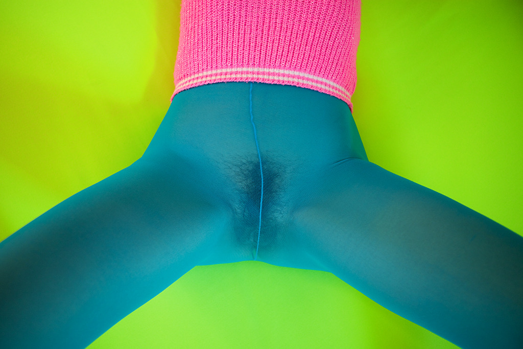
Maurycy Gomulicki – MINIMAL FETISH_9895 (2010)
This is problematic for the same reasons I took this gorgeous Kodachrome to task.
It’s a teensy bit off balance– the angle of the legs in relation to the lower corners and the uneven grading of the pistachio backdrop; however, I’m unsure whether it’s a lazy approximation on the part of the artist or an expectation that viewer will get the jist instinctively round it up.
Don’t get me wrong, the interplay of colors is LOVELY. (So much so that when it disappeared from my likes before I could post it, wyoh enacted some of her ‘net wizardry and tracked it down from little more than my muddled recollection of it.)
Gomulicki is trained as a designer and painter. His work is fixated on both documentation and vibrant-to-the-point-of-surreality color palates. And I can’t look at this or any of his images without relating them to amandajas’.
I don’t think it’s difficult to see why: Jasnowski is an image maker preoccupied with image making as a mode of design, after all; and she deploys a strikingly similar palate in her work.
But that connection triggers another question: what is the relationship/where is the boundary between image making & design?
And how does any answer inform the question of the purpose of color in image making practice?
