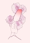
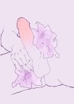
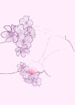
Giovanni Littlslr Dionisi – Full Bloom for Toh! Magazine (2015)
The delicate use of color in these is what initially commanded my attention. Each illustration features an ever so slightly different soft pastel background and the so subtle it’s almost pallid minimalism of the flowers focuses attention on the red to pink gradations evidencing vigorous stimulation.
As far the line work goes it always impresses me when someone can imply a great deal of detail with only the most minimal representation. And while I did immediately appreciate that here, there is definitely more to it.
Note: how the jaggedness of the lines which delineate the outer parameter of the essential form. (The hands in the second image approach a nearly cartoonish level of semiotic implication.) The less vigorous interior lines might, in another work, suggest vagary or something intended to be left open to the viewer imagination. But with these illustrations the unsubtle is the encaustic that enables mere implications to be more easily apprehended.
I read those gentler more seemingly ponderous interior lines as a statement on fragility/vulnerability. It’s a ballsy approach and I think it elevates the work substantially.
