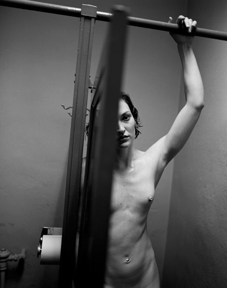
Ken Schles – Untitled from Night Walk series (198X)
This is a fan-fucking-tastic photo for dozen of reasons.The eye scans the frame left to right, following the crossbar over the stall doors. The stall divider plunges sharply, emphasizing the door as obstruction–this is actually crucial to the legibility of the scene (for example: if the door was open a bit wider it would seem that the woman was looking either at the back of the door or along the back of the door toward the camera, drawing attention away from her and towards the scene space between her and the camera; any less of the stall door and it wouldn’t read as easily as a stall door, just as some sort of shadowy occlusions).
The Dutch tilt imposes a dimensionality that a perfectly level and balanced frame wouldn’t have permitted. Also, it forces the viewer to do some of the work w/r/t organizing shapes. Note: how the stall divider, out of focus stall door edge in the foreground and the back corner divide up the picture plane; how this is also echoed with the horizontals, the upper stall cross bar and the top corner of the door.
All that is further augmented by the use of light. There’s a truncation of mid-tones… perhaps two zones mostly centered on the walls, her arm hooked over the cross bar and her left breast. The nuance in tone in the highlights and shadows is crazy. A less talented photographer would’ve taken a stylistic approach, much how a painter layers on paint to create the illusion of three-dimensional space in a two-dimensional representation.
Schles goes a different route. light falling like a drape over the scene. It’s not just more realistic, it adds a numinous immediacy to the scene.
The balance between light and dark is extremely astute, also. I can’t think of another image maker–okay, maybe Uta Barth… but I digress who could so aggressively chop of their frame up into three distinct sectors, while keeping everything organically interrelated and holistic. In the parlance of the Corleone’s: the composition is the offer and the lighting is what renders the offer impossible to refuse.
Not white of the toilet paper, adjacent to the darkest portion of the frame, the porcelain white of the left side of the woman’s face and how despite how the rivulet of deep black that is the door edge in the foreground, the blur caused by it being too close to the lens to allow for sharp focus, creates a similar burnt in sort of hazing similar to the transition from the toilet paper to the aforementioned lower shadowed blot. The way the shadow from her hand over the upper crossbar bleeds outward, not merely in how it would be case but also tying the triangle in the upper right corner seamlessly back into the whole.
Then there’s her inscrutable expression, and why the fuck is she naked and drenched–is her hair wet and dripping, is she sweating? The answer remains eternally unclear.