Craig Morey – Christelle (200X)
I see Morey as being of-a-kind with someone like Petter Hegre–folks with a quality stable of gear who generally toe a quantity as quality line in terms of their voluminous output.
You can split hairs; for example: Hegre has a better facility with color management (although his compositions, editing, conceptualizations and general familiarity with the history of photography seems knee-jerk at best); Morey, on the other hand, likely has an assiduously cultivated preoccupation with Jan Saudek (yes, Saudek would never get as close to his subjects as Morey but Morey favors imperfectly textured backdrops with little if any apparent separation between the subject and the background–which is all very Saudek-ian).
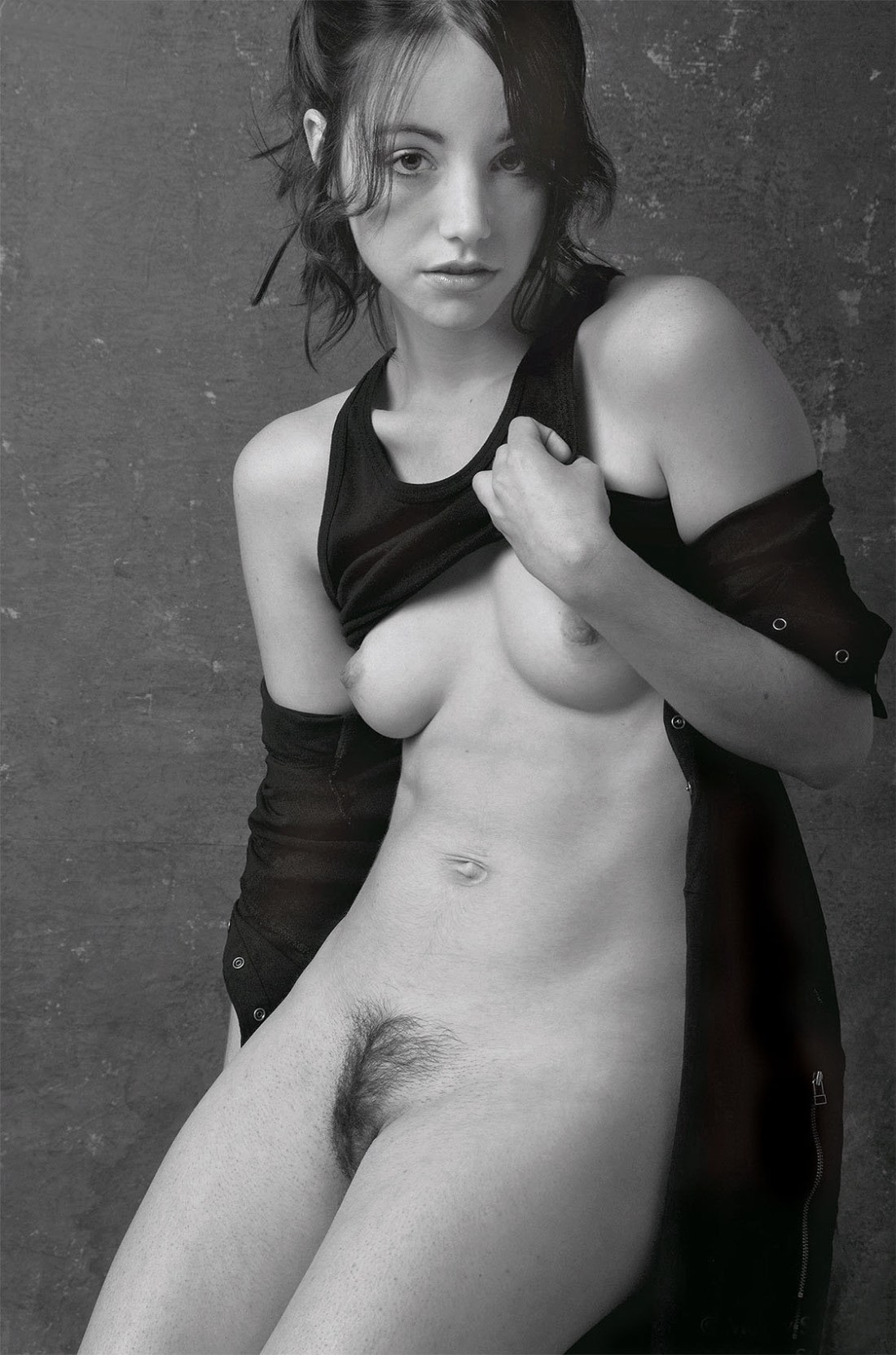
Honestly, the pose above is awkward AF. There’s a tension in the way the drape of her jacket is falling down her shoulders. It looks as if she’s doing the sort of thing where you rip off a bodice and stand their open to the world bosoms heaving. Except… her shoulders are not wide and squared, they are folded in. (I do this instinctively when folks stare at my chest, tbh.)
Also: you wouldn’t pull your shirt up like that. It’s likely that she’s hooked her thumb in the arm hole of her top but it looks as if Christelle is closer to trying to pull her tank down to cover herself.
This awkwardness would be distracting if it weren’t for her expression: it’s 100% what do you think you’re looking at? But that mien could cut either way: accusatory or flirtatious.
I’m not familiar enough with Morey’s oeuvre to definitively state that this is either/or dichotomy is a recurrent feature; however, based on what I have seen it seems plausible that it is.
If so, I think that’s actually something worth thinking about as far as making portraiture. In a lot of ways, taking a picture of someone the audience already knows is easier. Think pictures of celebs–we know them already so we’re filtering what we see through a prism of what we already know about the personality. It means that the portrait in a moment in time is designed to contribute to something that is already fully featured in the viewers’ minds.
And of course the photographer/image make knows the person they are portraying. But if the audience doesn’t–there’s a far greater burden for the author to use the scant space of a frame to convey some sense of the person. And I think this capturing the tension between experiential polarities is actually a damn fine tactic for accomplishing this. (It reminds me of the debate about whether or not one of the great portraits of all time Vermeer’s Girl with the Pearl Earring is turning towards or away from the viewer.)
