w-y-s-f:

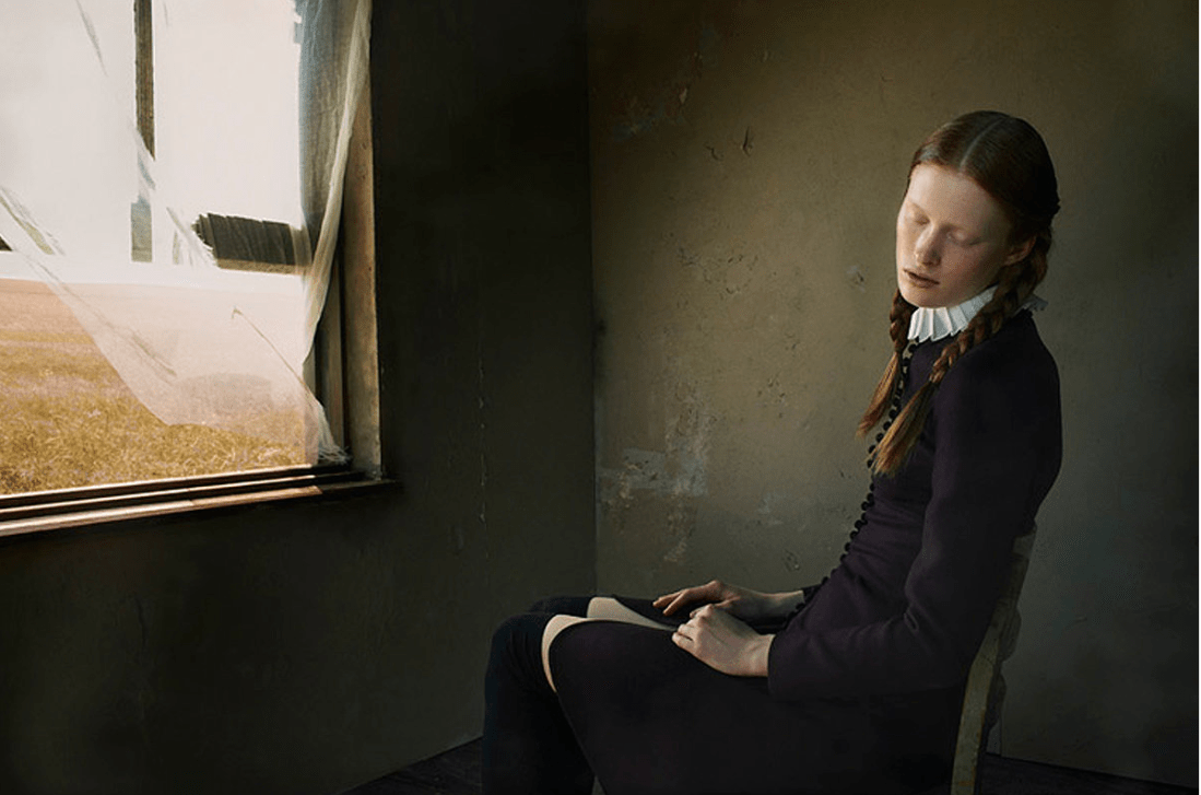
I’m going to be out of town, but I wanted to post a reminder that today’s theme is scars! I have eight symmetrical scars on my spine from an injury I suffered in 2010. While it was one of the most traumatic things I’ve ever experienced, and I deal with pain everyday, I think about how often artists transform pain. Brooke Eva looked at my scars and saw something else. Scars are healing. They’re the place where the cut was. They’re the place where the skin is growing over the hurt. They are your Earth’s earnings. Your transaction with time. A sign that you survived something that might have killed others.
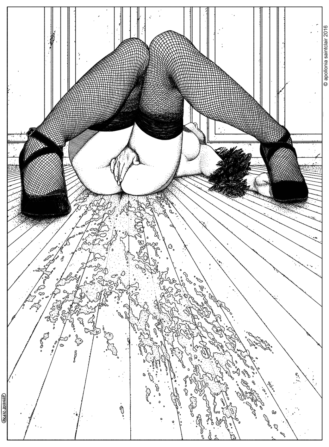
Hanna

Brooke EvaHanna Grace (2015)

I don’t–for once–have a raft of commentary about this image. It’s entirely too dark and the placement of the subject in the frame is governed less by any pervasive aesthetic logic and more presenting an overhead-ish view without including the camera operators feet.

That’s not really intended as a slight against the image. In being entirely too dark and given the prominence of the vertebral column, there’s a clear parallel with Sally Mann’s work.

However, I talk about Mann entirely too much and it’s seems especially pointless given that when you perform a Google Image Search on this image, the top result is actually a Sally Mann image. No one reads what I post in order to discover something an algorithm could teach them.

What interests me about this is the subject herself: Hanna Grace.

I noticed her work about six months ago and was so impressed with the inherent potential in one of her photosets that I featured it in a post.

Subsequently, her work as well as her commentary/writing keep commanding my attention–there’s something devastatingly insightful in the way she articulates her thoughts. And there’s a certain rawness to her presentation that applies whether she’s modeling, making self-portraits or explaining her singular perspective.

I’ve struggled in the writing of this post–deleting everything multiple times and starting over. I can’t seem to get the tone right. The laudatory aspects is easy enough. Since I legitimately enjoy her work. But there’s also something else I want to address but I’m hesitant…

In several earlier drafts, I’ve tried to suggest a correlation between Hanna and Francesca Woodman. That’s a little too easy and pat, though. What I see as relateable between the two is Woodman’s asymptotic approach to something not unlike malediction in the later work.

However, Woodman’s later work tends to toe the line separating curious exploration and experimentation from outright narcissism. In other words, the precociously astute interrogation of visual representation and gender identity grow that defined her work as a teenager growsincreasingly redundant and struggles to find a solid contextual footing.

Now I’ve read a great deal on Woodman but I’m unfamiliar with critical commentary that has taken issue with her ostensible white, cishet privilege.

That–in turn–propelled me to consider similarities between Woodman’s work and Ana Mendieta’s. Again, that’s probably to pat and easy a corollary but they were both wunderkinds, who were celebrated during their lifetime and who both died under similar circumstances–falling from tall buildings. (Although, it is worth noting that unlike Woodman, Mendieta was probably pushed.)

On top of those similarities, there’s an overlap in their respective tones–a similar maledictory thrust. (In fact, several of Mendieta’s performances invoke violence in ways I consider objectionable.)

Despite that, I find it interesting the degree to which Woodman receives adulation and Mendieta remains lesser known. I’d argue both are equally important. But Mendieta does–at the least–contextualize her work in a broader, historical sense addressing a more primal, magical sense of gender as construct. (By that account, she’s objectively more mature than Woodman.)

Grace’s work strikes me as adjoining these two women. The malediction is subverted into a means of exorcism and the context is intersectional feminist discourse. In that regard, she’s closer to Mendieta than Woodman. However, I do have to point out that in the quote with which Grace introduces the above image, I do think the final sentence is telling: A sign that you survived something that might have killed others. [Emphasis mine]

It doesn’t quite read as an explicit notion of personal exceptionalism. But it does beg the question how surviving something that might have killed others is somehow more noteworthy than surviving something that might have killed you.

Rendering death as an alterity is rather an odd maneuver given the intensity and rawness of the work. Especially given the momento mori of the above image. And I mention it not so much as criticism; more from the realizations that its often the seemingly irreconcilable contradictions between how we think of a thing and how we articulate our thinking about that thing which provide the most staggering growth in our work–creative or otherwise. 

Adi PutraOnce in a Blue Moon (2014)

This is an impressive image. Not so much based on its virtues as its success in the face of ubiquity.

By that, I mean: I’m pretty sure everyone who has ever tried to make images of nudes in situ, has tried to produce an image like this and found the eventual product to be far less compelling than the impetus that spurred the act of creation.

This succeeds partly because of perspective (the horizon divides the visual field into constituent parts: 40% water and 60% sky–a result of the camera being positioned several feet lower than the usual human POV, which would’ve rendered the horizon bisecting the model’s waistline), allusion (pretty sure this pose in this environment is intended to recall The Colossus of Rhodes), ambiguity (the object in the sky is the sun, but with the weird effect of the strobe it’s difficult to tell whether or not its the moon, which is after all in keeping with the title) and the blue hair (which always commands attention).

Also, I really like how if you look closely you can see that she’s wearing sandals–a necessity if you’re going to walk on volcanic rock like that without cutting your feet to ribbons, the subtle reflection of her legs along with the sparkling glitter of the sunlight on the water’s surface and the fact that if you zoom in you can actually distinguish her shadowed labial cleft (not that it is a sexual image but to merely convey that whether or not nudity is sexual has nothing to do with nudity and everything to do with intent and consent.

Karel Temny**** (2015)

There is something curious about Temny’s work.

Skimming through it’s easy to latch onto an essential Russian-ness to his aesthetic; from there, to pick apart various apparent influences, & etc.

Such actions ultimately impune the images as both derivative and internally redundant.

However, there are some interesting things to be gleaned if you squint a bit and think outside the box. In other words: Temny does literally thousands of things wrong but at the very least he does them consistently–and in that consistency there is something not unlike a recalcitrant artfulness.

To start with: the above is a shining example of #skinnyframebullshit. The vertical orientation serves no other purpose other than to–given a tight space–include as much of the young woman’s body as possible; even though the frame runs contrary to the logic of the lines of the door and oblique angle of the light which push the eye leftward. (The way the lower frame edge amputates the bottom third of her right food and her left leg mid-calf is also unappealing. Also, a wider frame would’ve diminished the distraction of light falling from a window onto the floor that can be seen in the background between her face and the edge of the door.)

Yet, in this botching of composition, there is something instinctive that should be celebrated. Given this scene the light is hardly ideal. Given the bright spot on the door and the reflected spill onto the floor, this image was made at or very near to mid-day.

A ‘better’ image maker would’ve waited for more diffuse illumination but there is something to be said for the way the light accentuates the texture of the flaking paint on the door, the pattern of tile floor (further enhanced by the fact that the hyper focal point of the image is actually mid-way between the model and the floor), and the arabesques of her sandals.

Also, the pose doesn’t work. Her upper body seems transfixed on something playing out just beyond the edge of the frame; whereas her knees press together in a slightly demure self-consciousness. (Contrast with these MetArt images of Brionie W or this still of Laney from an Abby Winters masturbation video; both are made with a voyeur clearly in mind but although stylized they present a realistic unself-consciousness that is designed to de-emphasize the voyeuristic imperative.)

There is at least one other thing of interest to note–despite the inherent Russian-ness of the image, there’s also a way in which the muddy mid-tones invoke a Francesca Woodman-esque tone; a tone that neither exactly fits nor doesn’t fit the image but strikes me as intentional. If so, whether or not it work, it’s an audacious inclusion and I hope Temny is better able to address the extensive technical flaws with his work because I get the feeling he’s got some truly bad ass ideas he just hasn’t quite figured out how to accomplish yet.

Apollonia SaintclarL’archipel du plaisir [Liquid joy II] (2016)

During my undergrad stint, I flirted with layout and design..

There was something heady about pre-CS Photoshop image manipulation that appealed to me. I could take existing pictures and turn them into reasonably compelling posters for campus events.

I called what I did graphic design. And for the most part, I never said it loud enough or in the company of anyone who was a legit graphic designer until after I graduated.

But as I came into contact with folks who paid their bills doing design related stuff. I quickly learned that being able to layout out a flyer was only a fraction of what graphic design entailed.

Pros were always obsessed with the pedigree of typefaces, serifs vs sans serifs, integration of content and form.

Generally, I found such people intolerable. The work they made was thoroughly accomplished in a utilitarian sense but lacked passion and flair. (It would take me a full five years to realize that although I wasn’t really interested in graphic design, I am very interested in the underlying notions of UX/UI in regards to design.)

Anyway, I mention all that because two terms that design folks toss around a lot are ‘minimal’ and ‘clean lines’. And those are two terms I would use to describe Saintclar’s work.

As far as terminology goes: ‘minimal’ with ‘clean lines’ might as well be pointless in their ubiquity. However, given a visual context, they can be useful when it comes to orientation.

For example: Saintclar’s work always reminds me of Dürer. But it’s an association in negative–by that I mean, although Dürer’s work is maximal, he uses space and line in a very similar fashion to Saintclar.

Yet, what I also appreciate about Saintclar is that the artist uses lines in a surprisingly varied manner. They can imply shape, give form to negative space or–as above–emphasize dimenstionality.

What’s more: the framing is actually ingenious. A lesser artist would’ve inched the frame back enough to include the full swath of the messy on the floor. By allowing that to trail out of frame, the viewer is given a sense of continuity of space beyond the frame edge. Combined with the fact that the perspective is render in such a way so that vanishing point of the image is hidden behind the woman’s hand, it presents an image that is both erotically charged and artfully composed. (This is definitely not some #skinnyframebullshit due to its internally consistent use of composition and the fact that it is mindful of the fact that the viewer’s eye is meant to wander up and down instead of side to side.)

Bruno DayanWinter’s Tale for Ilva Hetmann and Erin Axtell Flair Italy (2011)

I really like this image.

A big part of my attraction is tied up with perhaps the closest thing I have to a legitimate paraphilia, namely: I get unspeakably aroused by things which press up against the boundaries separating traditional conceptions of the sacred vs the profane.

In this image it’s the Amish inspired wardrobe rubbing up against a quasi-masturbatory sensuality. (I can’t tell if the white on her thighs is her pulling her dress up to reveal knee-high stockings and a swatch of skin–essentially exposing herself to the open window and summer breeze–or if it’s pattern that’s a part of her pants; either way, it’s extremely evocative.)

The other part of it is the art historical resonance. This image immediately aligns with at least three other undisputed masterpieces: the young woman’s expression is a riff on Bernini’s sculpture The Ecstasy of St. Teresa and the view out the window of the scorched grass is obviously intended to invite associations with Wyeth’s painting Christina’s World, as well as Malick’s film Day’s of Heaven.

Also, perusing Dayan’s other work, this project is interesting as it steps well outside his usual pre-Raphaelite sensibilities.

Alexander Talyuka*** (2016)

You know how there’s a statistically relevant correlation between being a fan of Smash Mouth and being a Douche Bro?

I’m here to suggest a similar relationship between white cis men who identify as ‘fashion & nude photographers’ and shitty, quasi-exploitative imagery.

Talyuka is a sterling example.

However, much like the infinite monkey theorem suggests, even a douche-y bro can sometimes stumble upon a good picture–consider the above.

And it’s not even necessarily good. First and foremost, there is no compelling reason for this to be a vertical composition. Second, I’m going to take a wild stab and suggest that it was shot on some sort of full manual, setting. This would’ve been an image that would’ve benefited from an extremely shallow depth of field as her knees and hands contribute decidedly towards creating a foreground and the wall behind her is an obvious background. Rendering both bokehlicious, could have accentuated her expression–somewhere between coy and perhaps deflective of unwanted insinuation.

But really, I’m all about the mussed hair. It’s like she just pulled a wool jumper over her head and her hair is all wild with static electricity. It flies in the face of the prerogative for perfection in fashion moded work and her it at a cute, down-to-earthness to the image that renders it palatable.

Rachel BanksVenus from seasons change and so do you series (2014)

Back in the late-90s, I went to a job fair for a big chain bookstore–now long defunct. I interviewed for a position and was fascinated by the questions the interviewers asked. It wasn’t the usual corporate boiler plate–tell me a challenge you faced when you worked at X, how you handled it and how in hindsight you could’ve improved your handling of the situation?

Instead, they asked my favorite book, movie, album. It was all stuff I was more than ready to provide an answer for until the progression turned to this strange sort of abstract free association where I was asked to respond to various prompts with one word.

I remember one prompt was how would you describe yourself. I answered: ‘observant’. But I cheated. I was supposed to say the first word that came to mind. The actual first word was ‘insular’.

‘Insular’ is one of those words that has unfortunate connotations. It bears the patina of the same sort of associations as ‘isolationist’ in the context of geopolitical scenarios.

Yet, what I meant when I thought to label myself as ‘insular’ is a perfect corollary to Banks’ images.

Her frames are tightly curated. There’s a feeling that they teeter between the freedom that a certain level of restriction allows and a lurking claustrophobia.

There’s also an ephemeral-ness. As if the moment presented were a chance occurrence, a glimmer that was some how miraculously frozen in time.

For example: with the image above everything is staged, the hair over the face is arranged with a precision, the relationship between the top of her head and the top of the hedges. Yet, the fabric seems as if it is suspend on a line and an opportune gust of wind whipped out up and out of the way allowing an unblocked view of the subject.

(I love the details: the tattered fringe of the fabric, the billowing arc of it; the way her arms are pressed taught against her back rendering the body suit semi-sheer.)

I adore the way Banks presents her work. From seasons changes and so do you:

When I was very small, my father and I made a water slide that killed all of the grass in our front yard, but he never cared. Many years later I found myself being yelled at for leaving tire tracks from my first car in his front yard. There is a hole in the tree from my teenage home where boys used to leave me notes.

seasons change and so do you is a series of work about memory and the physical and emotional impressions that are left in the landscape and on the heart. As the landscape alters and blooms from the weather, other things die and shrivel away. I find that the always changing Texas terrain mimics the mechanism in which I create, distort, and store away memories of the past. This series was photographed in the Northern Region of Texas in locations that I drive by multiple times a day. This body of work is inspired by drastic changes in weather, metamorphosis and memories associated with seasons from the past.

Although it is too abstract and keyword-y to pass muster as an artist’s statement, there’s a way in which the text addresses something specific both explicitly and implicitly. A better way to put it might be that what is included–especially with the first paragraph–speaks equally if not more to things that were elided, excluded or obfuscated.

So while I don’t think it’s a good artist’s statement in the traditional sense, it compliments the work by accomplishing with text the same sort of lateral emotional resonance for which the images seem to strive.