Karel Temny – **** (2015)
There is something curious about Temny’s work.
Skimming through it’s easy to latch onto an essential Russian-ness to his aesthetic; from there, to pick apart various apparent influences, & etc.
Such actions ultimately impune the images as both derivative and internally redundant.
However, there are some interesting things to be gleaned if you squint a bit and think outside the box. In other words: Temny does literally thousands of things wrong but at the very least he does them consistently–and in that consistency there is something not unlike a recalcitrant artfulness.
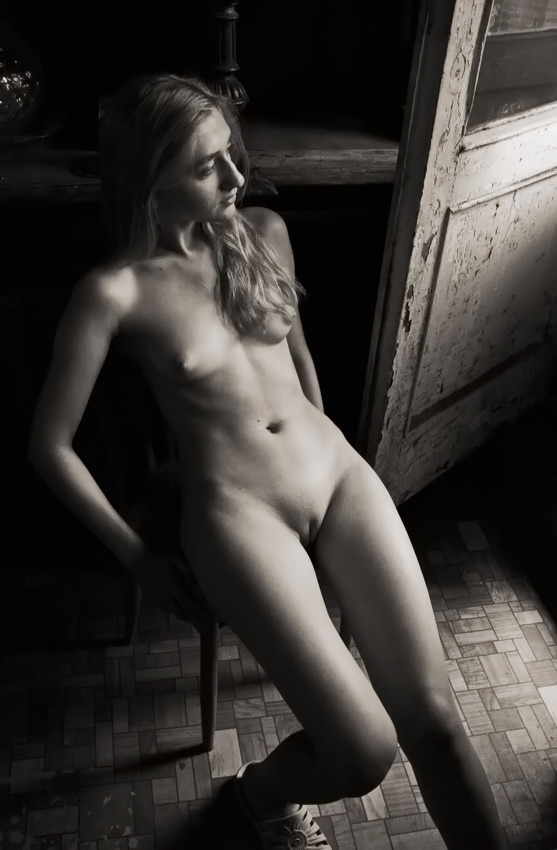
To start with: the above is a shining example of #skinnyframebullshit. The vertical orientation serves no other purpose other than to–given a tight space–include as much of the young woman’s body as possible; even though the frame runs contrary to the logic of the lines of the door and oblique angle of the light which push the eye leftward. (The way the lower frame edge amputates the bottom third of her right food and her left leg mid-calf is also unappealing. Also, a wider frame would’ve diminished the distraction of light falling from a window onto the floor that can be seen in the background between her face and the edge of the door.)
Yet, in this botching of composition, there is something instinctive that should be celebrated. Given this scene the light is hardly ideal. Given the bright spot on the door and the reflected spill onto the floor, this image was made at or very near to mid-day.
A ‘better’ image maker would’ve waited for more diffuse illumination but there is something to be said for the way the light accentuates the texture of the flaking paint on the door, the pattern of tile floor (further enhanced by the fact that the hyper focal point of the image is actually mid-way between the model and the floor), and the arabesques of her sandals.
Also, the pose doesn’t work. Her upper body seems transfixed on something playing out just beyond the edge of the frame; whereas her knees press together in a slightly demure self-consciousness. (Contrast with these MetArt images of Brionie W or this still of Laney from an Abby Winters masturbation video; both are made with a voyeur clearly in mind but although stylized they present a realistic unself-consciousness that is designed to de-emphasize the voyeuristic imperative.)
There is at least one other thing of interest to note–despite the inherent Russian-ness of the image, there’s also a way in which the muddy mid-tones invoke a Francesca Woodman-esque tone; a tone that neither exactly fits nor doesn’t fit the image but strikes me as intentional. If so, whether or not it work, it’s an audacious inclusion and I hope Temny is better able to address the extensive technical flaws with his work because I get the feeling he’s got some truly bad ass ideas he just hasn’t quite figured out how to accomplish yet.
