1. An artist’s conduct in his life:– An artist should not lie to himself or others
– An artist should not steal ideas from other artists
– An artist should not compromise for themselves or in regards to the art market
– An artist should not kill other human beings
– An artist should not make themselves into an idol
– An artist should not make themselves into an idol
– An artist should not make themselves into an idol2. An artist’s relation to his love life:
– An artist should avoid falling in love with another artist
– An artist should avoid falling in love with another artist
– An artist should avoid falling in love with another artist3. An artist’s relation to the erotic:
– An artist should develop an erotic point of view on the world
– An artist should be erotic
– An artist should be erotic
– An artist should be erotic
4. An artist’s relation to suffering:– An artist should suffer
– From the suffering comes the best work
– Suffering brings transformation
– Through the suffering an artist transcends their spirit
– Through the suffering an artist transcends their spirit
– Through the suffering an artist transcends their spirit5. An artist’s relation to depression:
– An artist should not be depressed
– Depression is a disease and should be cured
– Depression is not productive for an artist
– Depression is not productive for an artist
– Depression is not productive for an artist6. An artist’s relation to suicide:
– Suicide is a crime against life
– An artist should not commit suicide
– An artist should not commit suicide
– An artist should not commit suicide7. An artist’s relation to inspiration:
– An artist should look deep inside themselves for inspiration
– The deeper they look inside themselves, the more universal they become
– The artist is universe
– The artist is universe
– The artist is universe8. An artist’s relation to self-control:
– The artist should not have self-control about his life
– The artist should have total self-control about his work
– The artist should not have self-control about his life
– The artist should have total self-control about his work
9. An artist’s relation with transparency:– The artist should give and receive at the same time
– Transparency means receptive
– Transparency means to give
– Transparency means to receive
– Transparency means receptive
– Transparency means to give
– Transparency means to receive
– Transparency means receptive
– Transparency means to give
– Transparency means to receive10. An artist’s relation to symbols:
– An artist creates his own symbols
– Symbols are an artist’s language
– The language must then be translated
– Sometimes it is difficult to find the key
– Sometimes it is difficult to find the key
– Sometimes it is difficult to find the key11. An artist’s relation to silence:
– An artist has to understand silence
– An artist has to create a space for silence to enter his work
– Silence is like an island in the middle of a turbulent ocean
– Silence is like an island in the middle of a turbulent ocean
– Silence is like an island in the middle of a turbulent ocean12. An artist’s relation to solitude:
– An artist must make time for the long periods of solitude
– Solitude is extremely important
– Away from home
– Away from the studio
– Away from family
– Away from friends
– An artist should stay for long periods of time at waterfalls
– An artist should stay for long periods of time at exploding volcanoes
– An artist should stay for long periods of time looking at the fast running rivers
– An artist should stay for long periods of time looking at the horizon where the ocean and sky meet
– An artist should stay for long periods of time looking at the stars in the night sky13. An artist’s conduct in relation to work:
– An artist should avoid going to the studio every day
– An artist should not treat his work schedule as a bank employee does
– An artist should explore life and work only when an idea comes to him in a dream or during the day as a vision that arises as a surprise
– An artist should not repeat himself
– An artist should not overproduce
– An artist should avoid his own art pollution
– An artist should avoid his own art pollution
– An artist should avoid his own art pollution14. An artist’s possessions:
– Buddhist monks advise it is best to have nine possessions in their life:
- 1 robe for the summer
- 1 robe for the winter
- 1 pair of shoes
- 1 begging bowl for food
- 1 mosquito net
- 1 prayer book
- 1 umbrella
- 1 mat to sleep on
- 1 pair of glasses if needed
– An artist should decide for himself the minimum personal possessions they should have
– An artist should have more and more of less and less
– An artist should have more and more of less and less
– An artist should have more and more of less and less15. A list of an artist’s friends:
– An artist should have friends that lift their spirits
– An artist should have friends that lift their spirits
– An artist should have friends that lift their spirits
16. A list of an artist’s enemies:– Enemies are very important
– The Dalai Lama has said that it is easy to have compassion with friends but much more difficult to have compassion with enemies
– An artist has to learn to forgive
– An artist has to learn to forgive
– An artist has to learn to forgive17. Different death scenarios:
– An artist has to be aware of his own mortality
– For an artist, it is not only important how he lives his life but also how he dies
– An artist should look at the symbols of his work for the signs of different death scenarios
– An artist should die consciously without fear
– An artist should die consciously without fear
– An artist should die consciously without fear18. Different funeral scenarios:
– An artist should give instructions before the funeral so that everything is done the way he wants it
– The funeral is the artist’s last art piece before leaving
– The funeral is the artist’s last art piece before leaving
– The funeral is the artist’s last art piece before leaving
Category: Uncategorized

Ofer Dabush – Untitled (2016)
This image doesn’t so much fit with this project. I’m including it for two reasons:
- I effing love it; and,
- the vast majority of Dabush’s work is of a piece with the rest of the stuff I feature here
Seriously, it’s really worth spending some time with his work. I don’t necessarily love all of it–he plays fast and super loose with compositional grammar and he frequently present work that’s miles of style with only a couple centimeters of conceptual depth–the two influences on his work that come through the most clearly (at least to me) are Ryan McGinley (whose work is gorgeous but almost entirely vapid) and Yung Cheng Lin.
No matter: Dabush’s work is all capital Q Quality (as far as I can tell).
I’m especially interested in this because of the texture. The tightly knotted pile of the carpet as a backdrop for the linear forms of the ribbed knit pullovers against the softness of the women’s faces.
The .exif data on this was not stripped prior to upload. Take a gander:

The 29mm focal length suggests this is a zoom lens.
There are two kinds of lenses: prime lenses and zoom lenses. The characteristics are not interchangeable but let’s consider Canon’s 28mm f1.8 to establish some sort of framework.
The minimum focus distance for the 28mm f1.8 is .25 meters, a bit under 1 foot. Thus, with the lens dialed into the the nearest focus, something .25 meters from the camera will be in sharp focus.
BUT! The wider the angle of view provided by the lens, the greater the depth of field. (ex. a 28mm f1.8 lens will have a much greater depth of field when set to the minimum focus distance and widest aperture than a 85mm f1.8 set to the minimum focus distance and widest aperture).
As the aperture narrows, the depth of field increases. Thus, given that this is already a wide angle lens and the aperture is stopped down slightly less than halfway, you’ve got a reasonable slice of the area of view in focus. To say it another way, given these settings it would be difficult for you to not capture a frame that is in sharp focus.
What’s interesting and artful about the way this frame is handled is–unless my eyes deceive me: the camera is focused so that the majority of the area in focus in the frame is actually behind these two women. The carpet is very sharp, the sweaters still sharp but maybe a touch less so and you get an additional, softening flattering affect on their faces due to the fact that the near focus is just beginning to go a little soft.
But there’s a third element to what makes this work that is even more notable: color.
There’s this notion named chromostereopsis–it’s basically the idea that red advance and blue recedes, aka why 3D movies are a thing.
Yes, the carpet here is grey but it has blue in it and therefore it seems to recede from the focal plane, whereas the red pushes upward toward the viewer. The result is that although the red is just as close to the carpet and the camera as the yellow, the red stands out more and this illusion contributes dimensionality to the yellow, also.
Lastly, the yellow to red spectrum of the two sweaters include the skin tones of the two women; in combination with the grey-blue carpet this emphasizes their faces in the frame.
Great work from someone who is clearly an astute image maker.
Mike Suchmann – Title unknown (201X)
Scrape your knee: it is only skin
Makes the sound of violins
–Joanna Newsom, Only Skin from Ys (2006)


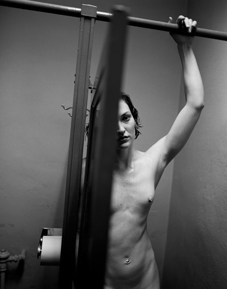
Ken Schles – Untitled from Night Walk series (198X)
This is a fan-fucking-tastic photo for dozen of reasons.The eye scans the frame left to right, following the crossbar over the stall doors. The stall divider plunges sharply, emphasizing the door as obstruction–this is actually crucial to the legibility of the scene (for example: if the door was open a bit wider it would seem that the woman was looking either at the back of the door or along the back of the door toward the camera, drawing attention away from her and towards the scene space between her and the camera; any less of the stall door and it wouldn’t read as easily as a stall door, just as some sort of shadowy occlusions).
The Dutch tilt imposes a dimensionality that a perfectly level and balanced frame wouldn’t have permitted. Also, it forces the viewer to do some of the work w/r/t organizing shapes. Note: how the stall divider, out of focus stall door edge in the foreground and the back corner divide up the picture plane; how this is also echoed with the horizontals, the upper stall cross bar and the top corner of the door.
All that is further augmented by the use of light. There’s a truncation of mid-tones… perhaps two zones mostly centered on the walls, her arm hooked over the cross bar and her left breast. The nuance in tone in the highlights and shadows is crazy. A less talented photographer would’ve taken a stylistic approach, much how a painter layers on paint to create the illusion of three-dimensional space in a two-dimensional representation.
Schles goes a different route. light falling like a drape over the scene. It’s not just more realistic, it adds a numinous immediacy to the scene.
The balance between light and dark is extremely astute, also. I can’t think of another image maker–okay, maybe Uta Barth… but I digress who could so aggressively chop of their frame up into three distinct sectors, while keeping everything organically interrelated and holistic. In the parlance of the Corleone’s: the composition is the offer and the lighting is what renders the offer impossible to refuse.
Not white of the toilet paper, adjacent to the darkest portion of the frame, the porcelain white of the left side of the woman’s face and how despite how the rivulet of deep black that is the door edge in the foreground, the blur caused by it being too close to the lens to allow for sharp focus, creates a similar burnt in sort of hazing similar to the transition from the toilet paper to the aforementioned lower shadowed blot. The way the shadow from her hand over the upper crossbar bleeds outward, not merely in how it would be case but also tying the triangle in the upper right corner seamlessly back into the whole.
Then there’s her inscrutable expression, and why the fuck is she naked and drenched–is her hair wet and dripping, is she sweating? The answer remains eternally unclear.


[↖] Ian Boys – Lizzie Bayliss (2012); [↗] Peter VR – Alessandra Gulia, Rome (2016); [↓] Nagib El Desouky – Untitled (2015)
Follow the thread.

Joanne Taosuwan – The Cold, The Dark & The Silence (2008)
I could probably yammer on for a couple of paragraphs about opacity–you know: transmission vs reflectivity w/r/t light.
But even thought it’s just a shower curtain, I can’t help but see it as the surface of a puddle seething with tadpoles and she’s a god like figure who unfolds time and space and unfolds her creation by unfurling it, throwing it away from her, letting the wind catch it and then letting it drift slowing to lay upon the ground–not unlike you’d cover a bed with the topsheet in the process of making it.
If you see it like that it’s not hard to imagine this as an image of a piece with William Blake’s metaphysical illustrations. Perhaps that’s why this has imprinted itself so indelibly on my mind.


Richard Prince – Untitled from Censored Art series (2011)
Richard Prince is the reigning king of appropriation in the art world.
He’s made a career of stealing work from other artists without permission. This can take the form of rephotographing an image–Sam Abell’s cigarette ad vs Prince’s Untitled (Cowboy). And there was the recent kerfuffle where Prince took images created by others on Instagram, more or less as is, and sold them as his own work.
I’m not someone who dismisses what Prince does entirely out of hand. I mean consider the quote that’s frequently (and inconclusively–to the best of my knowledge) attributed to Oscar Wilde about talent borrowing and genius stealing–and you have to accept Prince’s work merely as proof of concept.
And although he’s definitely an entitled white, cishet asshole, there is some conceptual merit to his interrogations. With his appropriation of Abell’s photo, he introduces notions of authorship/ownership and the relationship between process and commodification in the advertising world vs. in the art world.
Similarly, his selling of Instagram images he did not make, can be interpreted as the art industry paying exorbitant sums for work that is unoriginal/stolen or worse. Also, it presents questions about who owns the copyright for work displayed on social media sites. (I’m sure everyone reading this has gotten those concerned messages about whether or not uploading work to Flickr or FB will result in losing one’s All Rights Reserved proviso.
The problem with the Instagram business was he primarily stole work from young women–which is very different than stealing corporate art from a tobacco company. (For example: there’s continued disagreement on the appropriateness of rape jokes in comedy–and it’s pretty much agreed that the acceptability of the jokes depends on which way you’re punching–like if you’re making the victims of rape the punchline, that’s not cool, whereas making the perpetrators of rape the punchline is punching upward, and OK.)
Prince’s career in my experience is centered around looking for easier and easier targets.
That being said: I do like the work from the series of which the above is a part. Reason being that apparently the photos are images he made himself and then placed the stickers over them. (The appropriation becomes an organic part of the whole instead of the works raison d’etre.)
Conceptually, there’s a lot to unpack. The notion of paywalls–you don’t get to see this unless you pay us, the question: does the disconnect between the work and the intervention of the sticker upon the work enhance or muddle meaning. Also: does censoring something increase merely it’s interest or does it contribute otherwise unfounded creative merit? Questions about whether or not limited resources of consumers limit societal creativity–the notion that this is a photograph infringed upon by a sticker from a DVD from one of the definitive punk bands, i.e. do we consider connections we’re not explicitly told to consider by artists, critical types. It’s also interesting that the photos are all of the type that you would see in mainstream pornography (something which is made with a profit motive) and mementos of consumption–those stickers on CDs serve no purpose other than to facilitate commerce; thus, they serve no purpose. Further, does censoring the graphic parts of the image also make the images less useful as porn, and more appropriate as art.)
They all seem like profound questions, at first. Except they are all really rather staid. It’s kitschy but also clever.
I’m reminded of seeing Junot Diaz speak earlier this year. He was asked about cultural appropriation and made a stunning observation that essentially (this is a rough paraphrase) the line dividing cultural appropriation from cultural appreciation has to do with one’s degree of personal engagement with a particular culture.
It’s like that scene in Dead Poet’s Society where Robin Williams encourages his class to all walk in a slightly different way and one of the students stays leaning up against a wall. When confronted, the student points out that he’s exercising his right not to walk. And Robin Williams thanks him for proving the point of the exercise.
Richard Prince is that kid. Only his entire career has made his actions entirely predictable. At least Censored Art reflects upon the culture with which he is most ostensibly engaged.

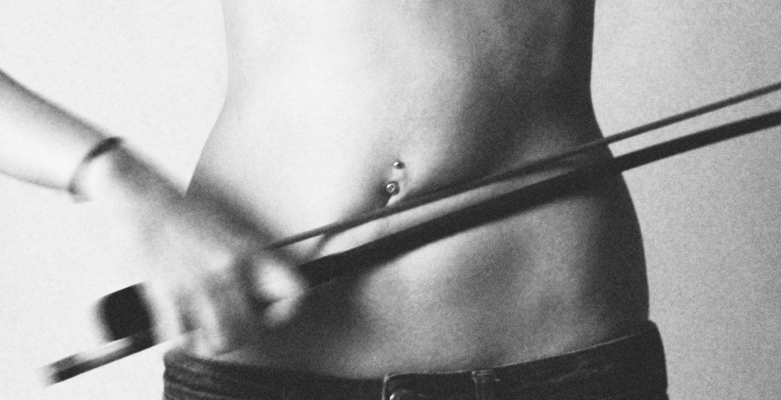
WowGirls – In the Seventh Heaven (2012)
—two lips opening
like petals in a blaze.Natalie Wee, from “Least of All” contained in Our Bodies and Other Fine Machines (via pairedaeza)
