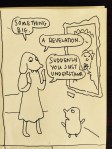
ChunaeTitle unknown (2017)

There are hundreds of reasons I LOVE these two illustrations.

The first image recalls Tammy Rae Carland’s Lesbian Beds series. So that’s automatically #AllTheFeels territory.

But the attention to detail is just so beyond on fleek in these.

Let’s just start with the first image. Note: the pictures on the walls. Two of the two women as a couple. The no smoking sign. The succulent on the window sill. The slippers toe-to-toe. The discarded socks. The position of the cat. The iPhone on the night table.

Everything is so perfectly balanced between an idealized, stylish living space that is just lived in enough to not appear staged.

The second image is less economical but offers two additional bits of information. These women are married–that’s them in their wedding gowns on the wall. Also, the brunette is supportive of the blond’s creative streak. (Also note how the light from the window casts their shadows against the far wall.)

Sequentially, I’d wager that the second image came first but I prefer it the way I have it here because for me I feel like you have the have the intimacy suggested by the first image for the sharing of space and time to be as meaningful as it appears in the second image.

Also, to use the vernacular: this is #goals for me. Maybe one day I won’t be so irrevocably alone. (Probably not though.)

Source unknown – Title unknown (201X)

There’s this notion in acoustics called the Precedence effect.

Given two identical sounds in rapid succession, the two distinct sounds fuse into what is perceived as a single tone.

Interestingly, as long as both sounds can be heard before there is any echo, the sound will always be heard as if it is emerging from the first source, even if the second source is positioned on a drastically different axis.

I think there’s something similar with the notion of pornography. If an initial reaction to something is instinctively a knee-jerk, clutch the pearls OMFG, that’s pornographic, then I think the tendency is to lump whatever follows into the same category. Like that’s not something I think about that’s something I don’t care to see or want to jack/jill to.

Unlike acoustics, however, the porn precedence effect isn’t a result of biology, it’s a product of acculturation. I’ve always found it more interesting to ask questions like

What about this do I find arousing? What do I find off-putting? Why?

This leads to the questions what is done well? vs. what could be done better?

I think this is interesting because my first thought is not that this is pornographic. And it’s interesting that not seeing it immediately as porn widens the scope of my reactions to it.

I think about things like mutual desire, consent. How’s she’s presented completely in the frame–bearing in mind that this has almost certainly been cropped from a horizontally rectangular orientation.

(It’s also a bit sloppy. His arm is blocking her light but that mistake somehow contributes a great sense of personal agency and given her position and movement within the frame–which is compellingly dynamic–there’s no way this could’ve been shot from a different angle so as to not interfere with the light.)

This conveys a feeling of tenderness in intimacy for me which I think is as rare as it is adorbs.

Cem EdisboyluFRG3519 (2015)

I’m trying to figure out how to talk to you about Edisboylou’s work.

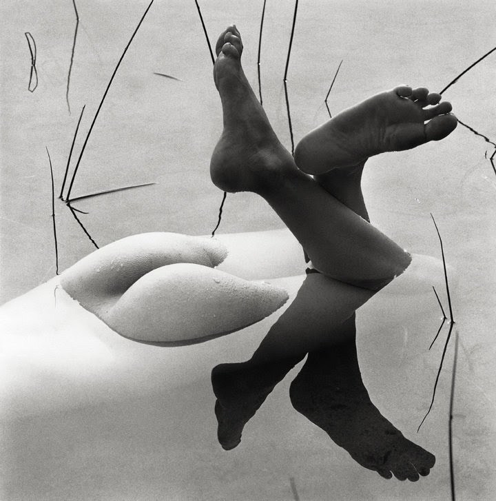
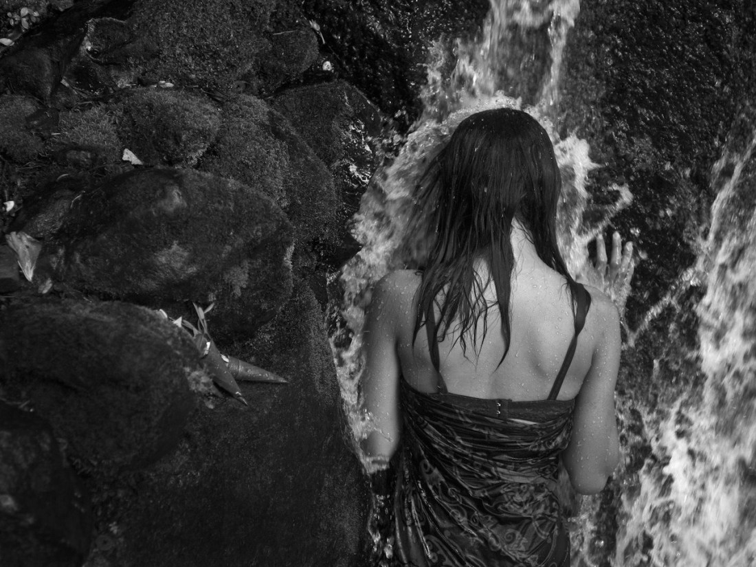
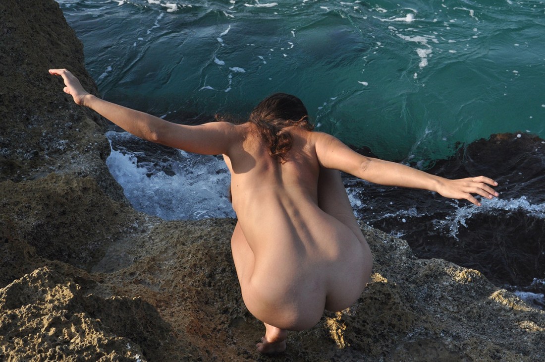
As best I can tell the work is primarily digital monochrome. There’s no one unifying thread. Yes, there’s a consistent focus on the solitude-isolation spectrum and a fascination with an arguably too rigidly circumscribed preoccupation with femininity as form–which is, yes, you guessed it: problematic.

It’s been said that the edges of an image’s frame are like a thumbprint. In other words, through attention to what’s included vs excluded, it is possible to reliably determine authorship.

No one is every going to confuse a Richard Avedon photo with one made by Robert Frank.

Avedon and Frank aren’t really the best examples. Genre-wise Avedon was a fashion photographer/portraitist and Frank was a documentarian. (Salgado–a fellow documentarian would have been a better choice…but I digress.)

Edisboylou doesn’t combine his work to one genre. A few of his images qualify as portraits, the rest are mostly distinguished by lofty, fine art aspirations.

The thing I keep coming back to in struggling to figure out how to encapsulate his work is an analogy to alchemy.

Generally, we’ve come to think of alchemy as some bent back old nutter with a Fu Manchu beard pouring bubbling concoctions from one test tube into another and then holding them up to light streaming in through a single clerestory window into a dank, moldering basement lab.

Of course, we think that the alchemist struggling to untangle the riddle chrysopoeia is hogwash. Although alchemy as a metaphor for leading a fulfilling, creative life is entirely valid–and arguably one of the less fundamentally detrimental metaphors for leading a better life; we take transmutation of lead into gold as literal, therefore deeming it inexcusably absurd but give Xtianity (a profoundly flawed metaphor at best) and Catholicism (with its transubstantiation, bread to flesh, wind to blood–an appropriation of alchemy) a pass.

It has always fascinated me that virtually all ancient traditions have a tradition of 4 or 5 most basic elements. And there’s a surprising overlap in that they all consider fire, water, wind and earth to be. (The eastern tradition includes metal as an element.)

Interestingly, these 4 (or 5) elements prefigured the eventual discovery and implementations that eventually became The Periodic Table. (The proposed fifth element in the western tradition, aether, informed early manifestations of Newton’s thinking on gravitation.)

So while yes, water and earth both figure prominently in Edisboylu’s work, it’s really aether to which, conceptually, I keep circling back. I’m not sure I can explain to you exactly why. But I think it might have something to do with potential vs. limitation.

I’m not a mathematician–I don’t have the chops for it (although number theory intrigues me), but it strikes me that the alchemical systems tend to be open ended whereas science is focused on replicability and that which is measurable–empiricism. (I can’t help but revel a bit in the fact that Rene Descartes, essentially the father of science, retroactively applied scientific precepts to interpolate ‘truth’ as to the interpenetration of the physical by the metaphysical, the perniciously resilient mind-body problem, Cartesian dualism et al.)

Alchemy is about potential, whereas science is about limitation. Or maybe, the better way to put it would be that alchemy aspires to outward expansion whereas science seeks accuracy and precision. (And it occurs to me that I’m further complicated things by setting this notions up as a diametric opposition. I’m not sure that’s helpful. It might be better to say that one is a hammer, the other a screwdriver; each has specific uses and secondary uses, including substituting the tools for each other in the absence of the other. Am I the only one who’s used the handle of a screwdriver as a hammer and vice versa?)

Kurt Gödel‘s incompleteness theorem famously used math tor prove that a system of symbols cannot be proven as true utilizing nothing more than the symbols intrinsic to that system.

There’s a great deal that one might reverse engineer about psychology with all this mess but I’ve meandered rather off the beaten path and I’d like to get back to the image above.

Perhaps one of the reasons I struggle to talk about style using more than a few distinct handholds here and there is because style is a category and by delimiting a category into increasingly specific subcategories, one eventually ends up with a category that holds only one thing–and what use is that beyond specificity for the sake of specificity.

A good category is one that is specific enough to group things with a prevailing theme or concomitant purpose without excluding a panoply of related overlap or intersection. It’s for this reason that I think stream of consciousness is actually one of the few truly useful categories. I loathe Joyce, for example. Have mixed feelings on FaulknerThe Sound and The Fury can bite my ass but As I Lay Dying is effing brilliant. Yet I adore Virgina Woolf. (Part II of To the Lighthouse is one of the most incredible bits of writing I have ever encountered and I’m trying to convince myself to actually excavate enough time in the near future to write that essay I’ve always been meaning to write on the Influence of To the Lighthouse on Antonioni, specifically the ending of L’Eclisse and Tarkovsky’s Mirror.

To those who actually read through all this: thank you. I realize this has been inexcusable intellectual masturbation (not to mention self-indulgent af) but it seemed disingenuous to just deem it aethereal without showing my work w/r/t how I arrived at that conclusion.

Aimery J. JoësselHolly Waterfall (2015)

Aspects of this are wonderful: the visible band and twisted straps of Holly’s bra, water droplets dotting her skin and the way her right hand is splayed against the rocks behind the falling water.

Overall, it’s underexposed–but given the motion blur of the water this was probably the slowest shutter speed Joëssel could use handheld–which suggests the underexposure was due to an overall lack of light instead of sloppy metering.

Personally, I would’ve preferred the contrast between the porous texture of the rocks vs the smooth compliment of water droplets against skin. But the picture suggests that it was not a situation where both were technically achievable.

I don’t think much of the rest of his work, honestly–but there is something to be said for identifying (correctly) and pursuing the better of two less than pristine options in a difficult setting.

The View from the Queue

Hey! Yes, you. I hope you’re doing well. 🙂

I appreciate you following this little blog that could more than I could ever adequately articulate–you rock socks. Thank you!

There’s still a two week queue running and I’m managing to stay a bit ahead (somehow).

In theory this should indicate that there should be at least one post a day through the summer. But as soon as I say that I’ll tempt fate and things’ll implode.

However, I do feel I can guarantee a post every day between now and mid-July. So if you’ve been thinking about supporting this project via Patreon–this is probably the perfect time to do it. Yay!

Take care of all your beautiful selves everyone!

Gil BlaySeagull (2016)

I’m not here to suggest Blay is a gifted image maker. Hardly.

However, as I’ve stated previous (and it bears repeating), like the old adage about monkeys and typewriters even crappy creatives get something right on occasion.

This probably would’ve caught my attention even if it didn’t come immediately after this image of Nicole Vaunt in Patagonia by Corwin Prescott.

My first thought was when the fuck am I going to Patagonia–got damn.

My second thought was that I would’ve really liked to have seen Vaunt in a less Den lille Havfrue and more like the above.

More often than not Tumblr is super frustrating–with the porn bots, shitty attribution striping personal aesthetic as self-definition blogs but occasionally the slap dash gumbo of seemingly randomized post aggregation results in seeing things in a completely different way.

It reminds me of David Bowie’s process–decoupage, which I found out about through the fabulous BBC series Luther, featuring the formidable (and hot as eff) Idris Elba.

Unlike most of my peer group–who are decidedly secular–I was raised in an ultra-conservative Xtian cult. Unlike my friends, my folks didn’t bestow a solid familiarity upon me with regard to the cornerstones of modern art rock. (I’ve had to blaze my own trail, in that regard.)

I began to learn about Bowie after he died–which meant discovering the allegations of rape and pedophilia that (as with most similarly aligned superstars in that day and age) never quite stuck to him because he was white, rich and male. (Jia Tolentino, who gets my vote for the best up and coming young writer and is my secret dream person to guest curate Acetylene Eyes, covered this negative legacy for Jezebel with an impressively clear-headed and thoroughly nuanced analysis.)

I’ve dipped my toe into Bowie’s oeuvre. It’s not all exactly my cup of tea–but what I like I like quite a lot.

This design by Daniel Gray turned up later and I think it fits a little bit too well here not to offer it as a summation:

image