
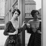
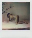
Daniel Southard – Title unknown (2010)
There are souls that you feel to lean forward to, like a sun-filled window.
–Federico García Lorca
Daniel Southard – Title unknown (2010)
There are souls that you feel to lean forward to, like a sun-filled window.
–Federico García Lorca

Kirill Kikiboy – Title unknown (2016)
Under the usual circumstances, I’d advise you to steer clear of this guy and his work. It’s just another example in an interminable string of dime-a-dozen cishet asshat male image makers who possess a modicum of technical acumen and believe this gives them the right–nay: obligation–to produce work that has no raison d’etre whatsoever beyond the beatific rendering of sexually objectified femininity.
But as much as I detest the rest of his work, this image is difficult to disavow.
I find it exceptional because of the way that it uses the extremely shallow depth of field to shift the emphasis away from her genitalia and to the way he’s holding her foot. (If I was a better person, I’d say that bokeh is consistent with Canon glass.)
This being the case: the focus is less implicitly carnal and more tied up in a symbolic shift in power dynamics.
Another point: I won’t suggest this is #skinnyframebullshit–given the angle of her left leg, it reads up and down as opposed to left and right.
Interestingly though, while there is a compositional logic to support the vertical orientation, I’m pretty sure this was originally a horizontally oriented frame that was cropped down in post. (I think this for a number of reasons but the main two are that it’s not exactly easy to square a camera vertically with only one hand–you end up with your elbow thrown up like you’re doing the funky chicken in a Jazzercise class; also, the top 15% of the frame is negative space–yes, it ends up balancing out the fact the the image is decidedly bottom heavy… yet that’s not something that would be easy to see in the moment of trying to visually parse the scene.
I’d actually be super interested in the original framing of this–assuming my gut feeling on this is correct. I think it’s probably a more immersive image for the added narrative implication.

viiviid – i m p u l s a t i n g from Serene Minimalism collection (2016)
This is quite lovely but I would argue that it’s not–strictly speaking–pornography.
But, you inquire, there’s a great big old erect phallus carefully positioned and–presumably–ready to get down to business.
I mean, yes…that’s true. But notice there’s nowhere for it to go.I mean you can argue it’s going there but I don’t see it like that.
There’s something here about anticipation–a desire without a means of satiation.
The image possesses an unresolved tension. In the face of that tension, other things effervesce; for example: the style of this is exactly half woodcut, and half Matisse cut-out.
It also reminds me a bit of shunga–which tends to exaggerate the act of sexual congress but also features awkward positioning or feet and arms. I mean it’s clearly that the cock haver’s feet are splayed out to the left and right but they don’t seem to completely align quite right.
I do really love the tension between the two hands. The hand on the kneeling figure’s left flank is so worshipful and reverent. Whereas the other hand is so forceful–holding it just below the elbow joint allowing it to both pull back and twist the arm, rendering it immobile and to a degree controlling the body to which its attached much the way a leash and maneuver a pet.


Aaron Tsuru – just you and me feat. Lorelei (2015)
There’s this marvelous @reverendbobbyanger quote from one of his Sunday Posts a year or so ago:
There is more than finding the right light to shoot in. You must find
the people with the right light in them.
He’s absolutely correct. That’s always the first step. But a think a indispensable second step follows implicitly given that first step.
I remember being told once that the Sanskrit word ‘namaste’ translates to something like the light in me sees and acknowledges the light in you.
It’s not enough to find the right light in someone else–you must also find that right light in yourself.
Whether it was Hemingway or Leonard Cohen who said it first or best, it’s still true: the broken parts are where the light gets inside.
Or to borrow a monologue from the film with the best color cinematography of all time that was subsequently appropriated by Texas post-rockers Explosions in the Sky:
If you’re curious what it looks like when someone has passed through this night is seen by someone who has also passed through similar nights: it looks like this. Exactly like this.


Petr Žižák – [↖] tereza (2015); [↑] tereza (2015); [↗] bety (2014); [+] jen tak (2010); [↙] kamasutra (2010); [↘] bety (2014)
Žižák’s works in 6×6 exclusively–which I don’t believe to be the format most well suited to the type of work he’s pursuing. (In my mind–square formats are best suited to portraiture.)
Well, aren’t these portraits? Yes and no. Strictly speaking–from the photos above–you could make an argument that jen tak and the second one of bety (on the lower right) are portraits. (Both feature eye contact with the camera and so ostensibly with both the photographer and the audience.)
But something like kamasutra? No. That’s more whatever the fuck you’d call what Jan Saudek does…
Additionally, figuring out what Žižák‘s about is complicated by his lackluster and toothless editing. He presents his work separated out chronologically, it’s easy to see how he frequently includes two very similar images side-by-side (with one exception, the second image is always the better–and honestly I think the one exception has been purposely had the shot order switched in order to thwart would otherwise appear a rather staid and knee-jerk tendency to indulge base voyeurism over contemplative seeing.
Now I could be seeing things due to these poorly edited near duplicates but I don’t believe I am. After all, the first thing that commanded my attention was the way he uses his frames. It’s inspired, actually.
See one of the reasons square formats are better suited to portraiture is that you can situated your subject dead center and the frame will still scan in most cases. This being the case, most square work tends to be centered. Žižák? Not so much.
There are two things he does in particular that I think are very much worth studying: one deals with the distinction between finding a frame and constructing one; the other has to do with what I don’t know how to convey except to say that his frame edges are almost always permeable.
I think the vast majority of us find a frame as opposed to making one. It’s a bit like a dance. You find an alluring subject and then you try to position yourself and by dint a camera so that you can coordinate various respective positions in such a way that the world arranges itself neatly around the subject. Often its finding the square or rectangle surrounding the subject that is suggestive of some notion of ‘a photograph’.
Making a frame is different. It involves selecting a scene and then given that scene positioning various elements within that scene so that it reads in such a fashion as if one just happened upon it wait for you there in situ, as if by magic.
It’s partly the difference between street photography and landscape photography, partly dance vs choreography.
Almost without exception, Žižák favors to stand in relations to a backdrop in one of three ways–parallel to a backdrop or so that the backdrop recedes at an acute angle from either left to right or right to left (such as in the first photo of bety above).
Let’s stick with this photo of bety for a bit… see how there’s that small rectangle of an adjacent building in the upper left corner of the background. Žižák does something like this in just about every photograph he makes. (Although very much in the foreground of the adjoining photo of tereza, note how the rectangle along the edge of the frame is used not only to balance the composition–in this case offsetting the relative shadowness of the frame–but also seems to speak to their being continuous space beyond the frame edges’ boundaries.) Also, here the reflection also serves to opens the frame.
There are themes that become a bit cloying in the work. Žižák show a penchant for semi-clothed to nude; he’s models frequently forgo clothing below the waist and he definitely has a thing for women with books and cameras.
Some of the technical aspects of the work is uneven. It’s tough to tell if it’s the scans or that the stock was underexposed in camera but it’s rare for him to get things as perfect as he does in the photo of jen tak above–which is a thing of heartbreaking beauty.
Art is love made public.
Jan Durina – [↖] Untitled, Prague (2015); [↗] Untitled, Ivan and Maria, Berlin (2015); [↙] Untitled, Tiergarten, Berlin (2015); [↘] Untitled, Maria’s Bed, Berlin (2015)
When I scrolling through my dash, I’m thinking about three things:
Things fitting the second criteria generally provide the prima materia for the best posts. The first are the easiest posts to write.
The third? Well, I have nearly 200 drafted items that in one way or another came to be saved as drafts because I thought I had something to say about them but–unfortunately–now I can’t figure out what to say about them but I still feel as if I can’t delete them either…
Seemingly without variation, my approach to this glut of things about which I want to say something but cannot fit thoughts to words, I tend to trot out a game I like to call pin the tall on the influence.
I’m resisting the urge to do that with Durina’s work. (Although seriously, if I’ve ever posted a veritable who’s who of contemporary internet famous image making, it’s absolutely Durina. Were this an academic setting I’d posit Ryan McGinley, Inside Flesh, Diana Reinoso, Myles Pedlar, Ben Zank, Errance L., and Dara Scully.
As far as a showcase of up-and-coming talent, it’s not a bad list. The struggle I have is that beyond a point–ticking off a checklist of influences is a little like one of those word find puzzles: a good distraction for 5 or 10 minutes but galling boring for any more extended period of time. (Hell, I don’t even like crossword puzzles and I’ll spend hours with those before I’ll waste more than a few minutes on those damn find a word bullshit things.)
I’m of a mind, however, that at a certain point we want art to demand that we, that is the viewer, do some work. I personally find it frustrating when art demands that I fastidiously obsess over influences. For example: I absolutely get why the Beastie Boy’s Paul’s Boutique is widely considered to be one of the best albums ever made. I won’t argue the point. But gimme License to Ill, over Boutique any day–if we’re talking about putting something on to listen to for the express joy of listening.
That’s why I think that Durina’s Polaroid’s are so impeccable. I mean Polaroid’s are exceedingly immediate. You depress the shutter and what you’ve got is what you’ve got–a singular physical artifact of the moment. (I’m going to gloss over the whole conceptual grey area that is using a medium typical pigeonholed for private porn creation as a medium for creativity and how compelling I find that grey area.)
Also, it’s EXTREMELY difficult to make a good Polaroid–and when you do it’s typically a testament more towards stubbornness than technical acumen. The colors are never quite right–but can be more luminous than anything this side of a perfectly exposed chrome. (Honestly, if I could afford to, I would use 65% B&W, 25% Polaroid and 10% slide film.)
That immediacy clear cuts all mess of influences on shirt sleeves and presents something surprisingly candid in its front-facing carnality. It’s as if the whole porn vs art false dichotomy as well as the naked bodies aren’t always inherently sexual can and do coexist because they are obverse faces of a single coin: the eternal battle between the sacred and the profane. Durina’s Polaroids dismiss that narrative and instead present carnal desire less as appetite and more as a symptom of physical embodiment. (I’m putting it poorly because it sounds as if I am suggesting that the same assertion that everything reduces to sexuality–and that’s offensive to asexuals. Here’s the thing though, I think asexuality and queerness have more of a home in these murky Polaroids than in much of the work hitting the interwebz today that is produced from behind a very LGBTQ+ prism.)

Mœbius – Angel Claws cover (1993)
I was super into comic books in my late teens–roughly circa 1991 through 1997.
I followed the spate of hot shot upstart pencilers–who would go on to become Image Comics’ freshman class–Dale Keown, Jim Lee, Rob Liefeld, Todd McFarland and Marc Silvestri.
I was aware of the edgier stuff out there: Neil Gaiman’s run on The Sandman; the Frank Miller/Geoff Darrow collaboration Hard Boiled–alternately, I never got what the fixation was with Alan Moore…
I fell out with the medium for two reasons: it became too expensive of a hobby for me to keep up with–there were also more things that I wanted to read each month than I could afford to acquire myself. And, my more professional interest in it waned.
At a certain point, I entertained the notion of writing and perhaps drawing sequential narrative work. I was especially partial to Jim Lee’s dynamic frames and diversity of depiction. His figures seemed solid in a way that others didn’t, his poses more considered. (Although in hindsight her frequently favored what in filmmaking you’d call insert shorts a wee bit too much and his economy of frames and layout were sometimes questionable.)
I was really taken with his Deathblow style reinvention. It was much darker, more abstract–with heavier lines, looking often more like a photographic negative than a comic book panel. I obsessed about this style; so much so: that when we were ordered to write a report on an artist my junior year of HS, I picked Lee.
This was pre-Internet. And it was daunting to find enough sources to build out a workable biography, let alone find information on development and growth of style and technique.
I managed to find enough information that I could stretch it to make the project work. But what I enjoyed most was selecting samples of his work and drawing an exact copy of one of his pictures and then drawing something using his style but applied to an original work.
My copy was a redux of the gatefold cover to X-Men #1. (Yeah, I’ve always been super ambitious/or a glutton for punishment, depending on your perspective.) My original in-the-style of was a riff on Cyberforce’s Velocity character in Lee’s Deathblow style.
I was ridiculously proud of it. I mean it wasn’t a masterpiece by any stretch but I’d applied myself in a way I rarely did on projects and if nothing else it showed a stubborn potential.
Things didn’t go so well. You’ll remember I went to an Xtian HS. And my art teacher was unspeakable offended by the degree of inappropriateness that my project demonstrated. I was ordered to give my presentation to my classmates as per normal but I was required to give a disclaimer that I had picked an insanely inappropriate artist and that I was very apologetic for bringing such filth into a place founded for the worship of and bringing glory to the name of God.
I was given after school suspension for a week–where I would sit with my art teacher, she would drape her arm around my shoulder and we would take turns praying that good would forgive me for the sins of the flesh I had committed by allowing this stuff into my head.
Since then, I’ve never been able to draw. It makes me violently nauseous.
Anyway, it’s nice to actually re-encounter Mœbius though. Logically, the preponderance of his work popping up on Tumblr likely has to do with the current ramping interest for Besson’s upcoming Valérian and Laureline adaptation (another Franco-Belgain comic book classic).
I have little interest. Besson hasn’t appealed to me since 1995. (However, in fairness, Léon: The Professional is what ended up making me a film student not ten years later.)
Also, does anyone else notice the degree to which Apollonia Saintclair has been influenced by Mœbius? It’s kind of cray-cray…
Iris Schomaker – Aloe (2011)
Artist bio via Galerie Thomas Schulte:
Born in 1973 in
Stade, Germany, Iris Schomaker has reached international acclaim through
her often large-scale, watercolour paintings of landscapes and figures.
What is actually represented in her paintings is secondary to
Schomaker’s oeuvre: her work is primarily about the process of
representation, about exploring painterly possibilities and the
reproduction of atmospheric content. The artist finds her own original
visual language in the tension between figurative representation and
painterly abstraction.Schomaker’s palette,
mainly applied onto paper, is quiet, and its pastel hues diverge little
from black, white, and grey tones. This lends her paintings a
drawing-like aspect, which is emphasized still further by the remaining
traces of the working process. The searching movements of the lines that
document the process of composition appear through the glazed
application of paint and fuse with them. Her paintings are just as much
about the process of capturing something in a drawing and the discovery
of a painterly composition, as they are about the motif itself and its
atmospheric and physical qualities.Iris
Schomaker studied Fine Arts in Kiel, Germany, and Trondheim and Bergen,
Norway. She has participated in various national exhibitions, including
Berlinische Galerie in 2007 and 2010 and in 2013 at Frankfurter
Kunstverein. In 2014 she was participant at the biennale in Posnan. Her
works can be found in numerous public and private collections.The artist lives and works in Berlin.
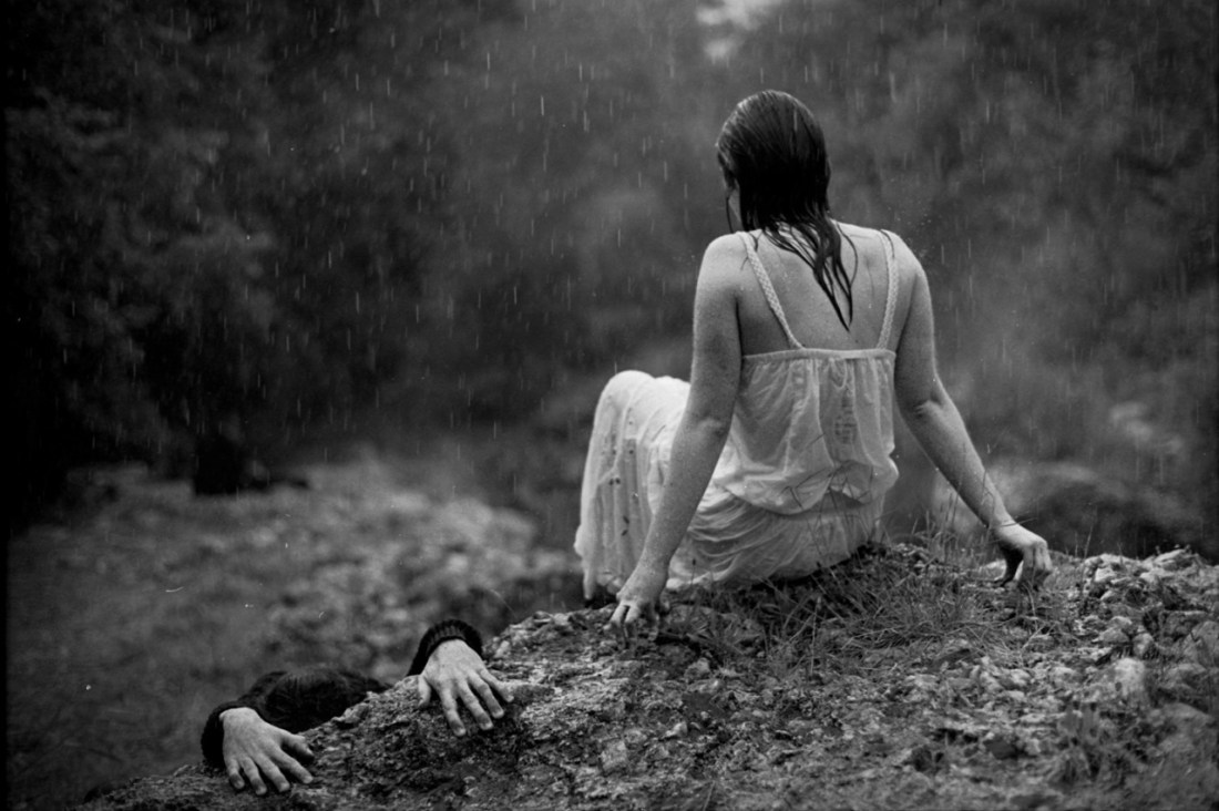
Andrea Torres Balaguer – Untitled from hypnogogia series (2013)
It’s probably just a knee-jerk response but there’s something about this image that feels melancholic.
I mean: yes, it’s a function of the rain; it’s also how the image is composed. From left to right, we see what is presumably a boy dressed in black trying to climb up on the rock and the young woman already atop the rock but her position there looking decidedly temporary–as if she’s going to jump down as soon as the boy manages to climb onto the rock.
It feels very cyclic–a play on the notion of the yin-yang symbol.
But looking at this I can’t help but thinking of two children on a playground. One sitting at the top of the slide and the other climbing the ladder to the slide–the endless repetition of work and reward–climbing the ladder, hurtling down the slide. Again and again and again–all day long if the bell never rang calling all back to desks, books and irritable teachers.
Historically, Mozart remains a psychological anomaly–an artist from who work emerged Athena-like, fully formed and final drafted on the first go round. And as valuable as repetition is to learning and mastery, the educational faculties insist that at a certain point, we should be able to crap out work that’s good enough on the first try. This is actually a dangerous precedent to accept. Unless you’re writing a fugue–which I can say from experience is difficult as fuck–repetition is one of many tools that contributes to the notionality of a ‘form’,
It’s a shame that we allow what we deem worthy of repeated actions generally orbits a sense of social obligation. I go to work each day in order to pay my bills. Whereas we feel as if we’ve wasted time by watching a movie we love or listening to a song that moves us for the billionth time. We feel that the former is a good use of time and the latter extravagant, frivolous–wasteful even.
However, the things that truly matter, we pursue with that same dogged child-like determination–up the ladder, down the slide. Repeat ad infinitum.
