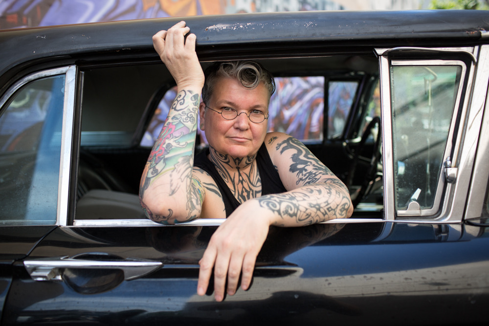
Meg AllenUntitled from Butch series (2013-2016)

Because dyke hands are the sexual organs of lesbian love,
they can be as shocking to view as the penis through an open fly, or as
bold (delicious) to behold as the breast of a woman suddenly uncovered.

–SDiane A. Bogus, Dyke Hands and Sutras: Erotic Lyric, 1988

(Note: @lesbianartandartists originally posted this content. I’m reposting only because I prefer to showcase images with greater resolution where available; I was also able to provide ever-so-slightly more specific attribution details. Still Lesbian Art and Artists is an indispensable resource and I hope you’re all follow their blog because it is one of the most consistently exceptional blogs on Tumblr. 10/10. Highly recommended.)

Larry WoodmannFrancesca for self-control (2014)

An image maker with the last name Woodmann (even with the extra N), working with a model named Francesca, it really would be foolish to think that the resulting work is going to somehow riff on that.

What I find most interesting is the way this image mirrors my all-time favorite image by Francesca Woodman.

I don’t think the above is nearly as strong of an image but I do really appreciate the attention to detail. It absolutely lacks the subtlety of Ms. Woodman’s photograph but it operates similarly by establishing distracting the viewers attention away from the graphic sexual implication of the images–the hornet on Ms. Woodman’s throat dominates the viewers attention because of the threat of this woman being stung, diverting attention away from the masturbatory gesture she’s making with her left hand and right index finger.

The focus of the above image is the highlighted edge of her face and the thin disruption of the necklace chain encircling her neck. It’s nice, I think.

Michel ComteCourtney, New York (2008)

As best I can tell Comte has presented this image as it appears above–you can apparently buy it as an archival inkjet print here–as with ever so slight variations (pay attention to her eyes and the position of her left leg) as the way it was originally made, i.e. in color and part of a fashion shoot.

I am primarily interested in the presence absence of color but insofar as either image works it’s because of the way Herron’s pose mimics the water mark on the set wall behind her.

The B&W version of this has been in my queue for months. I have mixed feelings about it. As I’ve already mentioned the pose is exquisite. There aren’t any real highlights to speak of–if we’re using the Zone System, then I’d say we’re dealing with zones 0 through V only. This results in less than ideal skin tone but it works within the context of the image–drawing attention to the resonance between the pose and the water mark as well as giving it a vintage feel.

I can’t look at it without positing that whoever made it has a massive hard on for Weston’s nudes.

But it doesn’t quite work for me. There’s something off about it.

So in a way the color iteration makes more sense as a total package. The form pose as echo of water spot is de-emphasized. The color is meticulously controlled–what appeared to be a limiting in the B&W version now makes sense–the apricot top sheet and the beige grey of the wall and mattress offer just enough of a dash of color to keep the scene from going flat, cause’s the pink of her sock and the red in her skin to dynamically pop in the frame.

The acute angle of the corner where the two set walls meet is not vertical in either frame–however, it stands out more prominently in the color version. (Probably because the B&W version includes the entirety of her left foot–thus distracting from the odd angle, whereas the color one chops off her toes.)

This is really one of the prime reason I hate digital. An image that is intended to be in B&W needs to be approached with a completely different mindset and tools than a scene that is intended to be presented in color.

Now I don’t know that Comte used a digital camera. It’s entirely possible that he had two cameras set up side by side and triggered the shutter at almost the same time–one with B&W stock the other with Color. But I’m of a mind that this was one digital camera and the files were manipulated post process.

Erika LustPansexuals (2015)

I probably shouldn’t base my opinion of this scene based on an 8 minute excerpted cut

…but all the problems I have with Lust crop up in abundance: solid concept hindered by uneven/lackluster execution.

I think the problem–besides the fact that her grip/gaffe team can’t set up lights fer shit (sheesh, invest in some softboxes and close down that key light by 2.5 stops)–is that Lust seems inherently preoccupied with subverting the male gaze typically associated with pornography.

She does this by soliciting fantasies from women which she then enacts for her cameras. Take Pansexuals, it treats a group sex scene in a typically porn-trope turn by using strip poker as a throw away plot device. That’s something I’ve never understood–strip poker is such a means of symbolically addressing power dynamics, creating tension, building anticipation. In essence, the game itself is a chance to hone the subsequent eroticism, to contextualize it. This seems to skip over all that to hurry up and get to the fucking. (Watching this I felt exactly like my 16 year-old self fast forwarding to the parts that got me the wettest.)

So while: yes, I’m always going to support a FFMM group sex scene that skews full on gay once your too far into it to back out. (I love shit like that because as I’ve said if you like watching people fuck, you should be fine with watching people who don’t fuck like you in the process of finding representations of people who do fuck like you), I do think everything about this scene is almost to awkward to even be sexy.

I mean sex at it’s best is always a bit awkward and group sex–in my admittedly limited experience–tends to be awkward. So I feel like maybe kudos for being honest in the depiction?

Truthfully, though I don’t think it’s the right kind of awkwardness. Like in this scene it’s Ermagerd Girl level awkward. And really, it’s usually more tender, idiosyncratic and charming.

Like this:

image

Or this:

image

Also, I’m reminded of Pina Bausch’s prompts designed to get her dancer’s to enact a mood or desire:

  • Copy someone else’s tic.
  • Do something you’re ashamed of.
  • Write your name with movement.
  • What would you do with a corpse?
  • Move your favorite body part.
  • How do you behave when you’ve lost something?

suspendedinlight:

suspendedinlight:

photominimal:

Snowy morning. With @suspendedinlight: Montreal / Polaroid Spectra Pro / Impossible

Shot with my soul sis yesterday

Photominimal appreciation post: if there were a greatest hits of my portfolio, a great number of them would be authored by this one here. We met in 2014 and immediately became regular collaborators. During this time, he mentored me as a photographer and enthusiastically supported me in my artistic growth. We studied Poetics of Space together while creating our book Fluent Dream

He has very recently launched a Patreon campaign with the simple wish of continuing to purchase his favourite types of film. Please consider supporting this artist, lord knows he’s been generous. 

I don’t usually plug other Tumblrs but ya’ll, fer rull @suspendedinlight is just effing INCREDIBLE: whip smart, with excellent photo instincts, an accomplished model and a jaw-droppingly talented musician. (She gave me a list of musical recommendations that has reduced me to a sobbing mess–in the best imaginable way.)

Also, she is beyond correct: her work with @photominimal is FUCKING EXTRAORDINARY. You would do well to dig deeply into eithers’ back catalog–you will be enormously rewarded for your time, I promise.

And maybe think about supporting their continued creative endeavors through their respective Patreons. (Photominimal’s linked above; Lyndsie’s here.)

urbanfaerietalesTitle Unknown (201X)

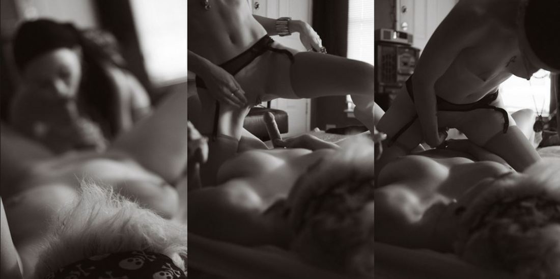
The above images are interesting–if a bit muddled. Yet, the way in which they’re muddled suggests several things to me about visual grammar. So like good Wittgensteinians, let us conduct a grammatical investigation!

A lone photo or image must stand on its own. However, as soon as you position photos or images adjacent to one another–each subtly shapes and informs how we read not just the one image or photo but how we read both of them together.

In the loosest sense there are two ways that photographs can relate to each other: as polyptychs or as sequences.

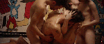
The above is not a triptych.

Strictly speaking, a diptych means ‘two-fold’. A triptych would indicate three folds. As such you can see panel A alone, panel B alone, panel C alone or panel A & B together or B & C together or A & C together or A, B & C all at once.

While polyptychs can be seen as relating to each other in a way that conveys are broader, overarching narrative–their construction is not intrinsically narrative. The each panel stands alone but that together each comment, enliven and enrich each other so that the piece as a whole comes to constitute more than the sum of its parts.

A sequence, on the other hand is fundamentally tied up with the movement of time. (To be 100% clear, a polyptych can be sequential but a sequence is not automatically a polyptych.)

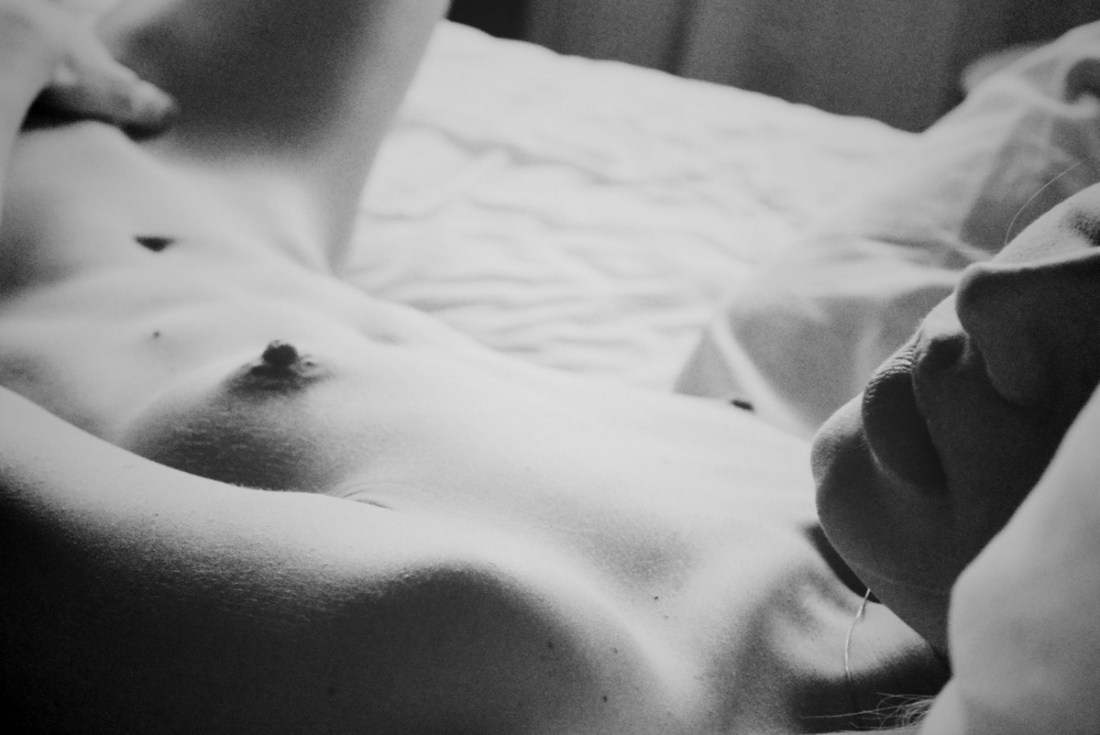
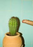
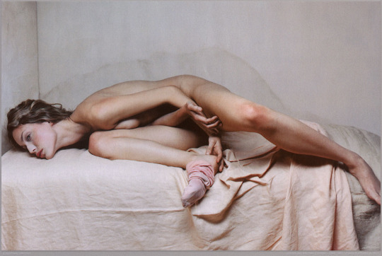
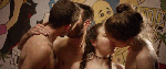
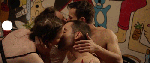
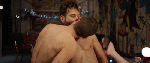
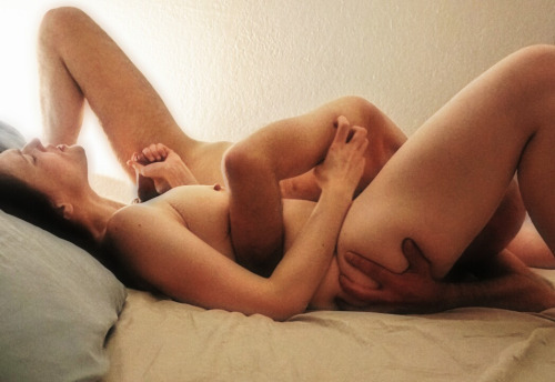
There’s several things the above sequence does well. First off, the use of depth of field to direct the viewers eye is totally on point–in the first panel, only the top of the head in the foreground is in focus while everything else goes soft; in the second panel, the focus point is ever-so-slightly behind the kneeling figure; the final panel shifts the focus towards the middle ground between the two lovers.

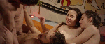
Compositionally, the first and last panel are #skinnyframebullshit–there is absolutely no effing reason given the frame that vertical orientation contributes fuck all to the logical consistency of the whole.

In the first panel, the way the supine figure’s legs open up to the room begs for landscape orientation, further given the narrative auspices of the piece as a whole–it’s extraordinarily poor form to employ portrait orientation.)

The contrast and overall tonal range are best in the third panel; however, the frame feels constricted; it makes me nervous that it’s so clearly supposed to be set in this room but the view of the room is so claustrophobically limited.

The second panel is actually a fabulous example of when a vertical orientation actually serves a goddamn purpose–the frame reads up and down and by fitting it to a form that is predisposed to that sort of scanning, the image maker employs the appropriate visual grammar to convey to the viewer how to best engage with the image.

In summary, there is a great deal of raw potential here. I’m of a mind that this would’ve been more effective if all the images had been landscape oriented or if the second panel had been extracted and presented independent of the others (I do think you’d lose something but the image is strong enough to stand on its own).

Alternately–and probably even stronger–would have been if the first and third image were landscape oriented and the second image remains in its current, portrait orientation. This would’ve pushed things more in the direction of a polyptych and would’ve also suggested an altar piece–which is more in keeping given the almost liturgical tone of the images.

And that’s why I make such a big deal about using portrait orientation correctly. Maintaining that it doesn’t matter is the same as saying that the comma in Let’s eat Grandma vs Let’s eat, Grandma doesn’t make any difference in the end result.