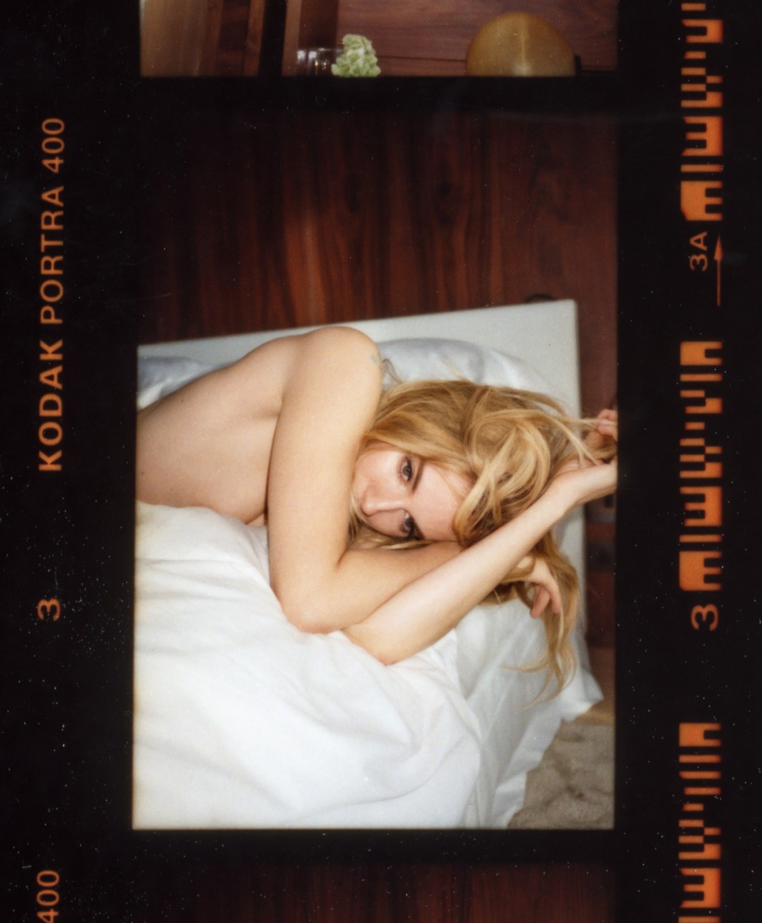
Tom CraigSienna Miller (2014)

There are a number of interesting aspects to Craig’s work.

The thing that stands out predominantly to me comes as a result of my time as a student of film making. In my program, there was one student who cultivated a persona not unlike Francesca Woodman while she attended RISD–essentially, I am the personification of commitment to excellence in craft and the fulfillment of the future of art in my medium due to my vast reserves of talent and genius.

This kid–let’s call him Martin–held that it was art if it was able to be replicated identically. In other words, a measure of the artistic merit of a work of film meant that with infinite resources, it would be impossible to recreate exactly a sequence or scene. The art in cinema for Martin was in its singularity.

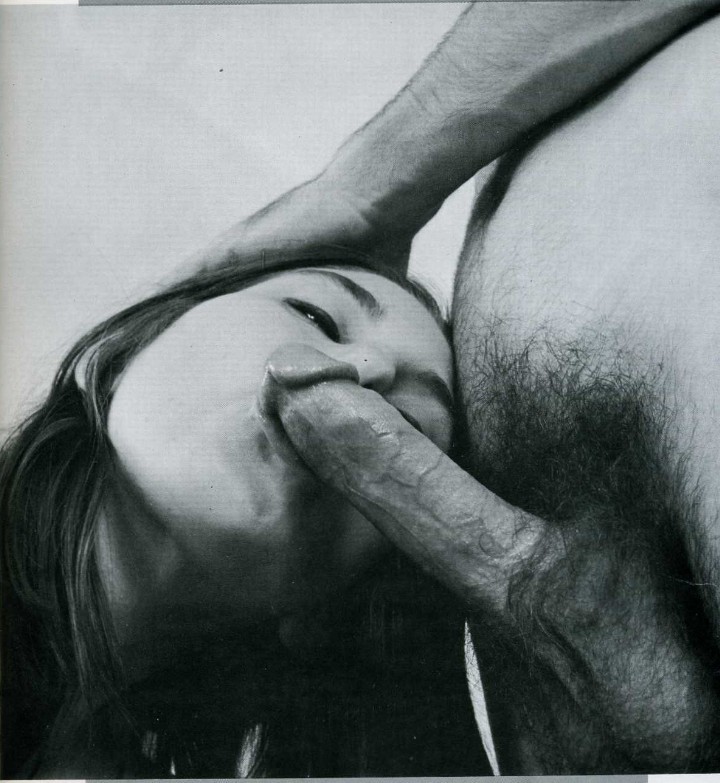
That’s one thing Craig is exceptional at–providing a sense that his camera not only carefully parses the visual world to not only show the viewer a scene but to instruct us subtly on how to see the scene with which we are shown. (Here I am thinking less of the above and more of this or this one on the top right.)

He’s a bit of a chameleon. His approach to various commercial efforts demonstrate a surprising versatility. Eddie, London (2014) has a sort of polished flat affect; it looks corporate and commercial. Yet, appearing as such this carefully diminishes the clever, preciousness of the work. The result is playfully coy, offhand and casual in a way that marries the aesthetic to the conceptual underpinnings in an unexpected manner.

In other work, he’s riffing splendidly on William Eggleston or re-imagining Paul Graham. One thing that is almost consistent across his work is his use of light. I mean, to my eye it’s obvious that he’s obsessed with Joel Sternfeld–the attention to light in any of his images suggests this but in particular, the light in this is pretty much in line with virtually any color plate in American Prospects. (Oddly, even this doesn’t stay 100% consistent across the work. Consider this new-ish image with it’s recollection of the sort of dreamy haze in someone like Paula Aparicio’s work, mashed up with an affinity for Uta Barth, Andrew Wyeth and Whistler filtered through a mash of UK flavored ambience.

Lastly, I think the vertical orientation in the above is intriguingly utilized. Given the bed and the position of Miller’s body, my own instinct would be to use a horizontal frame. However, one of my objections to #skinnyframebullshit is that the compositional logic that the orientation echoes the positioning of the subject within the frame is not an acceptable reason to fly your camera on it’s side before firing the shutter. But it works both ways… the rationale for a horizontal frame instead of the vertical above is predicated upon a specious, knee-jerk association. In practice, had this frame been horizontal it would’ve contributed a sense that Miller is merely recumbently lazing about. Instead, the skinny frame encourages the eye to drift up and down–reinforcing that Miller is by no means a layabout and is actually rather pensive.

vextape:

fourchambers:

“Eaten or rotten I am all mouth”

+ moth and rust 

watch / support more projects

favourites.

(you can get physical thank you cards (these are this month’s) posted through your door every month with a $20 or more pledge to our patreon)

Marxism holds that changes happens via a process called dialectical materialism–wherein a market, a concept or a phase of evolution (the thesis) clashes with an opposing force (antithesis) to create something new from parts of both (synthesis).

It’s an appealing framework as it divides everything in the world into opposing factions, this vs. that, either/or. (Bakunin was effectively a century ahead of his time, in recognizing the missteps in Lenin’s implementation of Marx’s ideas.)

A truly ridiculous number of things lend themselves to fitting this form: the scientific process, three act narrative structure, how everyone is taught to format an academic essay in fifth grade…

I’ve always thought that if one could introduce a third factor (a wild card) that one might be able to salvage the framework–or at least get it to chart more usable results.

As someone who knows a bit about work being made on the fringes or art and pornography, there’s a very dialectical approach to things. On one side, there’s folks attempting to make more inclusive, realistic and or contemplative pornography (thesis=pornography, Antithesis=subverting problematic porn tropes); on the other, there are efforts to apply rigorous technical acumen to the production of pornography in an effort to increase the quality of the work (thesis=pornography; antithesis=superior production value).

Four Chambers doesn’t fit comfortably in either cubbyhole. Yes, they are definitely subverting problematic porn tropes. Yes, they continue to release material that is of the highest quality w/r/t production values. But, it feels more like they view pornography as another potential subject for consideration under the aegis of artistic practice.

If you’ve followed this project for any time, you know I agree with this notion wholeheartedly.

Now–full disclosure–I’ve yet to watch one of their complete scenes, only promo clips and materials they’ve released. But that in itself is instructive. Whether you’re challenging porn conventions or working to achieve higher quality material, both processes are undertaken in service of a final, ostensibly marketable product.

I won’t say Four Chambers’ work is made with no regard for the final product–that would be foolish and absurd. However, the product is not only intrinsically tied into the process–their promo materials are always so assiduously assembled. I mean they could just as easily throw an edit together and then release that trailer into the wild. They don’t do that, however. They take their time, adhere to a cohesive aesthetic/visual styling reavealing as much as concealing–building interest, but also trusting the interest commitment to their process allows them. Further, the profits from the product go back into making more and better content. In other words, it’s not about stacking Heisenberg levels of cash in a storage unit, it’s about continuing to pursue the process so that it can refine over time and evolve. (And what does that smack of, except the artists obsession with perfect?)

Consider these two oracle gifs and this gif from a scene in their recent release entitled recursion.

Honestly, though it’s their print materials like the above that really knock my socks off.

Also, bonus tidbit: the title of the above images is a line from a Sylvia Plath poem Who.

Source unknown – Title Unknown (201X)

It’s a damn shame this is floating around uncredited since it’s especially thoughtfully presented.

The fallen tree splits the frame diagonally–imposing parallel right triangles. The upper boundary of the wood forms the hypotenuse of the lower triangle. This decision serves the composition well.

The portion of the trunk in the lower left corner is the closest thing in the frame to the camera and is evenly illuminated–as such, it anchors the foreground; the portion of the trunk in the upper right corner is only partially illuminated–as if it is being slowly consumed by an approaching shadow tide; this bit of the trunk anchors the background.

It would be a clever compositional coup on it’s own but the depth of field runs closely parallel–the lower left corner appears in focus as does the upper right corner. (The indication of thicker woods behind the trunk in the upper right corner, go a bit bokeh blurry, which also adds nicely to the frame.)

Across this diagonal divide, there’s also a balance between positive and negative space. The upper triangle is negative space interspersed with small plant leaves and tendrils; while the lower triangle contains the majority of the structured, non-amorphous, subjective content.

The position of the man is also just about perfect. His pose creates a third triangle–this one more equilateral than the other two. He is positioned a bit off center–situating him within the frames positive space; but the arm raised to cover his face reaches into the negative space and creates a flowing interplay between positive and negative, light and dark, human and nature.

Yet, the thing I’m most impressed with is the where the top and bottom of the frame lay. In my own work, I try to perfectly balance the space between the top of my subject’s head to the upper edge of the frame with the space between the bottom of their feet and the lower edge of the frame.

In this case, the lower edge of teh frame actually cuts off just a sliver of his shins/feet, whereas there’s a wee bit of breathing room at the top. (Functionally, the angle of the trunk draws the eye from lower left to upper right, drawing attention to the otherwise implicit depth of field. The slight imbalance between the relationship of the subject to the bottom and top of the frame, respectively, gives a slight sense of upward momentum–which also helps to balance the slightly less pronounced negative space against the heavier positive space.

lolaloopsTitle Unknown (2016)

My initial thought had been to run this image side-by-side with this fetish image as a part of my juxtaposition as commentary series. (But I always worry that they may be seen as me ‘phoning it in’ so I do try to hold them to a higher standard as well as only posting them occasionally–unfortunately, this week has been kind of insane with a dear friend having a life-threatening medical emergency in Russia and me having to fly her back to the US where I am now single handedly responsible for her care; it’s a lot but I don’t fuck around when it comes to the people I love in this life.)

Anyways, juxtaposing this above with the fetish image wouldn’t necessarily convey everything I would want to say on the subject. I mean the above image is definitely superior in technique, form and execution. The fetish image–despite being some first rate #skinnyframebullshit–does actually present an interesting variation on the notion of nipple clamps.

In this case I don’t want to suggest that as far as it pertains to the exploration of pornography as a subject for capital A Art is superior to the fetish image; it’s more that I think the distinct between Art and Pornography hinges on the distinction between figurative vs. literal.

I mean there are literally hundreds of thousands of ways in which art history is rich with works that actively engages questions of desire and sexuality–but these topics usually remain little more than implicit. Whereas pornography tends to be the venue for explicit depictions of sex and desire.

It’s easy to say lolaloops’ image is better than Candle Boxxx’s and art history will obviously validate that distinction; and I want to make clear that such is not what I’m advocating for–I am more of a mind that the fetish image, in this case, has the spark of something interesting too it; it’s just presented in an offhand, informal and not especially well visually parsed manner, a record of an event that is interesting for what it depicts but fails at not objectifying the woman depicted. (Conversely, lolaloops’ image is obviously about sexuality but requires the viewer to activate the work by making certain associations, otherwise it’s just a pretty still life.)

For example: the fetish image is clearly from a hotel room. (Where else have you ever seen those types of hangers?) Why is she there? Who is she performing this scene for? (The lighting and the fact her hands are cuffed behind her back suggest this isn’t masturbatory in nature.) It would be nice to know a bit about her. Did she come with a suitcase? What time of day is it? Is she a natural masochist or is this a part she’s playing for someone else’s gratification?)

Admit it. You aren’t like them. You’re not even close. You may occasionally dress yourself up as one of them, watch the same mindless television shows as they do, maybe even eat the same fast food sometimes. But it seems that the more you try to fit in, the more you feel like an outsider, watching the “normal people” as they go about their automatic existences. For every time you say club passwords like “Have a nice day” and “Weather’s awful today, eh?”, you yearn inside to say forbidden things like “Tell me something that makes you cry” or “What do you think deja vu is for?”. Face it, you even want to talk to that girl in the elevator. But what if that girl in the elevator (and the…man who walks past [you]…at work) are thinking the same thing? Who knows what you might learn from taking a chance on conversation with a stranger? Everyone carries a piece of the puzzle. Nobody comes into your life by mere coincidence. Trust your instincts. Do the unexpected. Find the others…