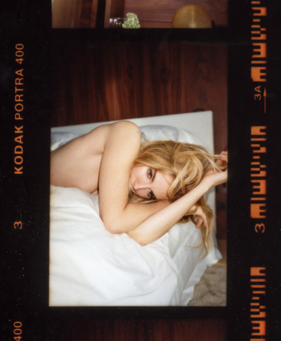
Tom Craig – Sienna Miller (2014)
There are a number of interesting aspects to Craig’s work.
The thing that stands out predominantly to me comes as a result of my time as a student of film making. In my program, there was one student who cultivated a persona not unlike Francesca Woodman while she attended RISD–essentially, I am the personification of commitment to excellence in craft and the fulfillment of the future of art in my medium due to my vast reserves of talent and genius.
This kid–let’s call him Martin–held that it was art if it was able to be replicated identically. In other words, a measure of the artistic merit of a work of film meant that with infinite resources, it would be impossible to recreate exactly a sequence or scene. The art in cinema for Martin was in its singularity.
That’s one thing Craig is exceptional at–providing a sense that his camera not only carefully parses the visual world to not only show the viewer a scene but to instruct us subtly on how to see the scene with which we are shown. (Here I am thinking less of the above and more of this or this one on the top right.)
He’s a bit of a chameleon. His approach to various commercial efforts demonstrate a surprising versatility. Eddie, London (2014) has a sort of polished flat affect; it looks corporate and commercial. Yet, appearing as such this carefully diminishes the clever, preciousness of the work. The result is playfully coy, offhand and casual in a way that marries the aesthetic to the conceptual underpinnings in an unexpected manner.
In other work, he’s riffing splendidly on William Eggleston or re-imagining Paul Graham. One thing that is almost consistent across his work is his use of light. I mean, to my eye it’s obvious that he’s obsessed with Joel Sternfeld–the attention to light in any of his images suggests this but in particular, the light in this is pretty much in line with virtually any color plate in American Prospects. (Oddly, even this doesn’t stay 100% consistent across the work. Consider this new-ish image with it’s recollection of the sort of dreamy haze in someone like Paula Aparicio’s work, mashed up with an affinity for Uta Barth, Andrew Wyeth and Whistler filtered through a mash of UK flavored ambience.
Lastly, I think the vertical orientation in the above is intriguingly utilized. Given the bed and the position of Miller’s body, my own instinct would be to use a horizontal frame. However, one of my objections to #skinnyframebullshit is that the compositional logic that the orientation echoes the positioning of the subject within the frame is not an acceptable reason to fly your camera on it’s side before firing the shutter. But it works both ways… the rationale for a horizontal frame instead of the vertical above is predicated upon a specious, knee-jerk association. In practice, had this frame been horizontal it would’ve contributed a sense that Miller is merely recumbently lazing about. Instead, the skinny frame encourages the eye to drift up and down–reinforcing that Miller is by no means a layabout and is actually rather pensive.