The capacity to be alone is the capacity to love. It may look paradoxical to you, but it is not. It is an existential truth: only those people who are capable of being alone are capable of love, of sharing, of going into the deepest core of the other person—without possessing the other, without becoming dependent on the other, without reducing the other to a thing, and without becoming addicted to the other.

Sally Nixon – Various Untitled (2016)

I am absofuckinglutely head over heals for Sally Nixon’s illustrations.

The thing that most people immediately note about them is the obvious: she draws women liberated from the dichotomy of simultaneously being and being aware of being seen as being.

These are unglamourous, unpretentious, unselfconscious and the realness of the results are a real breath of fresh air.

I love the detail. These women are not symbols or placeholders. They clearly are full-realized individuals with hopes, dreams and complicated interior lives. The richness with which that is communicated in the work is rare.

Note: the care with which the making of french toast is depicted, the way sweets (pancakes and cake, respectively) are best enjoyed with a hint of transgressive celebrity chic–i.e. behind sunglasses.

But what I love most about these is–despite the majority of the stuff I post to this blog–I am increasingly having a crisis of conscience w/r/t what I call unmotivated nudity.

It’s like yes, the human body is fascinating and we all like looking at nekkid folks. However, I keep thinking that while it’s visually arresting to make an arty black and white image of a beautiful nude standing atop of boulder, why is she standing there naked on it? Just because it was there? And some person with a camera said: hey, that’s going to look cool?

So to me what’s really revolutionary about Nixon’s work is that her use of nudity is 120% non-gratuitous. The characters when they are naked are naked in situations where you’d expect them to be; or where there is a reason for them to be given the circumstances. In fact, it would be awkward if they weren’t.

This has suggested two criteria for nudity in work that I am trying to figure out how to incorporate into my own work:

  1. Is there are reason for this person to be nude? Or is it merely nudity for the sake of nudity?
  2. Does the nudity tell me something about the person who is nude or does it instead render them a generic stand-in, an any person ™.

A better way to ask the last question might be: who wants to be nude, the person who is nude or the person making the image? Ideally, the answer is both. But, more often than not, the emphasis of the decision is deferred to the latter.

I mean, honestly, I just realized that the woman in the final panel brushing her teeth in the shower has a sunburn indicating she’s been to the beach. I think this image really should become the gold standard of whether or not nudity is gratuitous. Like if you can’t do at least present a person with enough detail to make them seem like a fully formed person, then you maybe really ought to questions why you insist on shooting nudes almost exclusively. Just sayin’.

Miro ArvaKyotocat (2016)

Has anyone else noticed how Kyotocat is absolutely slaying it on the modeling front lately? (The image above, this one, god, like everything she’s doing is effing fabulous.)

Evocative expressions, visceral poses–an ethereal presence in space and time (not like a fairy, more like the presence of the mystic).

Her tumblr is kind of incredible because it not only showcases her latest work–but it also gives you a kind of angle on the mechanics motivating it (passion for art, music and activism).

I think that’s many things that folks forget. Have a vision is one thing. But your vision is not unlike a second body that very much needs to be fed, watered and tended to much like your actual physical body. You have to read, you have to look at the world around you and continually explore what art teaches you about the infinite complexity of how the world is seen and how in being truly seen the world shifts under the gazes, expands, grows and changes.

Traci Matlock & Ashley MacLean – Title Unknown (2006)

This was the first image from Matlock and MacLean’s collaboration that I encountered.

I remember being profoundly impressed with the simplicity of it. The edge of the bed perfectly aligned with the top-left corner and the exact middle of the frame to the right. The woman’s body stretched out intersecting the bottom of the bed plane at a perfect 90 degrees.

It was simple but so intricate in its mannered specificity.

And the light–fuck me, the goddamn perfectly sublime light: the way the right hand is almost blown out and the rest of the skin is so exquisitely perfect.

It was as if someone had taken Caravaggio’s stylized lighting and mashed it up with Helmut Newton’s can’t-decide-whether-it’s-fashion-or-trash/heavily-expressionist-inflected work (some of the very little work of merit the shit heel ever made).

I immediately went through everything they had posted on Flickr, then clicked over to their absolutely gorgeous website (which like most gorgeous websites, turned out to be nearly impossible to navigate). Hell, I even bought a year’s subscription to Nerve to follow their column.

Almost a decade later, I still find the effect of this photo to be hypnotic. And I think if there’s one thing their work has taught me it’s that good creative work doeen’t answer all your questions–instead it ensures that the questions you ask of the work are productive.

And honestly the questions their work asked of me–continues to ask of me–is the reason (for better or worse) I’m still out there fumbling around with a camera myself.

The Death of Youth – Guetcha (2016)

As I’ve noted several times already: a cliche is a cliche because it allows one a reasonable handle on something that is otherwise unwieldy and fraught with complications.

The adage against cliches emerges from the fact that by using them, one is refusing to re-engage with and analyze a concept that isn’t necessarily one-size-fits-all anew. In other words, the advice against cliches isn’t that cliches are inherently bad so much as their ready made-ness presents an obstacle to independent thinking.

The elements of this image are cliche to the point of ubiquity: luminous lighting kissing the skin of a nude model standing before a milk white background.

Here though, the cliche serves as a foil–drawing attention away from the elements; instead, highlight the compositional attention to shape, line and tonal form.

I’d argue it’s too dark–and I don’t think that’s a matter of opinion given that the underexposure results in lose of shadow detail in Guetcha’s hair and along the right side of her face. But it’s easy to let that sort of teensy mistake slide when the result is this dynamically eye-catching.

Hannes Caspar* (2013)

I’m always yammering on about the role color plays in lens based image making.

And I’m nowhere near a place where I can coherently articulate my thoughts on the subject but in general when we’re talking about fine art photography and the question of the purpose of color, the conversation will (rightly, in my mind) revolve around masters such as: William Eggleston, Harry Gruyaert, Stephen Shore, Joel Sternfeld and Jeff Wall.

If we are to point to unifying themes with regard to the work of these artists and what it tells us about the nature of color in image making, I think there are two principles that bear mentioning:

  1. Color in a fine art image is never the point of the image but is indispensible in rendering the point of the image with unequivocal clarity.
  2. A heightened sensitivity to the interplay between conceptual foundations of the work, composition and form.

A better way of putting it would the pictures would absolutely work whether they were in color or black and white but the color is what ‘activates’ them.

There aren’t many people producing work today that I feel are making work that adheres to these criteria. (I’ll consider @thebodyasconduit as an exception, to this point.)

Conversely, there are artists doing visionary things with color that insist upon color as a the singular unifying point. (In other words: the desaturated work would realize a diminished impact.)

For example: @pru-e‘s work would be almost banal sans color. And although she doesn’t fit the above formula for color in fine art image making, she’s right up there with Eggleston when it comes to incomparably brilliant practitioners of color work.

But as much as I dig Ms. Stent’s work, her strobe heavy, co-option of a glossy fashion aesthetic, isn’t something that I can apply to my own work.

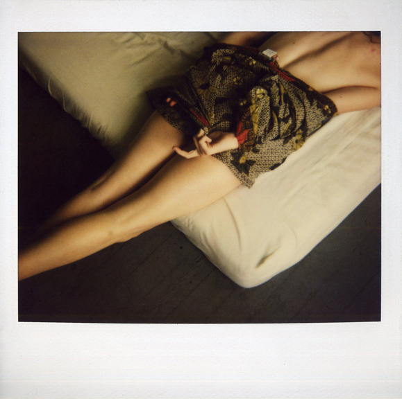
Hannes Caspar–on the other hand–is more applicable. And yes, I think he absolutely needs to be mentioned when the discussion turns to photographers doing radical things with color in their work.

In the case of the above, you have the vivid red, with no bleed whatsoever. (This effect is absolutely assisted by the off-blue color of the painted, scuff mottled floor planks. There’s an intense dynamic range but the mid-tones are almost entirely reserved for the skin and the wall/radiator in the background. Given such dynamic range, the skin tone is exquisitely perfect in its rendering.

In tone and form, this image actually reminds me of an image by the enigmatic Pole STOTYM.

There’s the accepted wisdom that B&W images, through their abstraction, allow us to bear witness to the foreign in the familiar. The historical struggle of color lens based images makers–if you accept my presumptions–is to render the mundane, somehow both mundane and transcendent at the same moment.

It feels like both Stent and Caspar are in their respective ways, calling bullshit on the notion that it has to be both or neither.