Open yourself. Let the human person come forth. Breathe in the air and the silence.
Franz Kafka, from a diary entry featured in The Diaries Of Franz Kafka: 1910 – 1923
(via violentwavesofemotion)
Open yourself. Let the human person come forth. Breathe in the air and the silence.
(via violentwavesofemotion)


[←] Autumn Sonnichsen – Title Unknown (201X); [→] Polasquare – Ar shiúl ó na solas (2016)
Juxtaposition as commentary
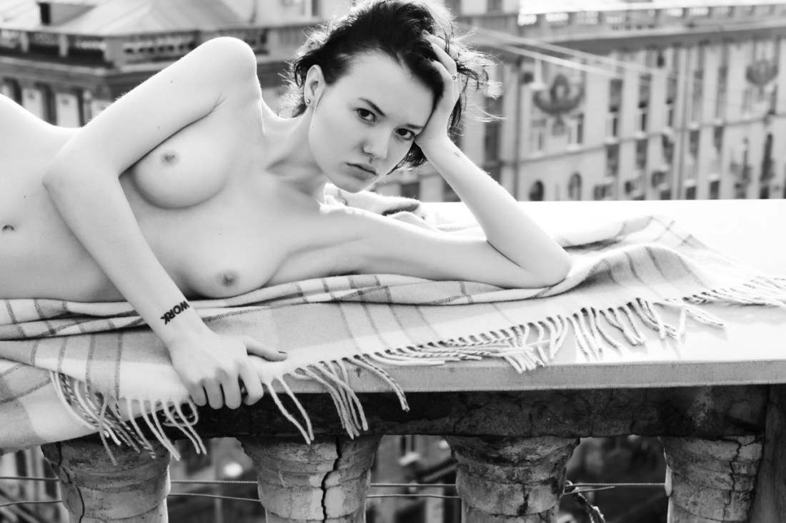
Anastasia Tikhonova – Untitled (2014)
I’m intrigued by Tikhonova, or as she calls herself: Antipictures.
‘Anti’ meaning to stand against and also a clever contraction based upon the first two letters of her given name and patronymic.
It’s the exactly the same sort of multivalent turn upon which most of her work hinges.
She introduces her self in her anti-artist statement, as follows:
Photography is
a survival mechanism for me. My generation was the first to come of age
following the collapse of communism – my youth coincided with an
esthetic and existential wasteland experienced on the national scale. We
were caught between the institutional aesthetic of the Soviets and the
gaudy taste of the nouveau riche, and there was no established cultural
norm, no expectations to rebel against. That lack of expectations was
disorienting, but also liberating – and I focused on drawing out the
sublime from the surroundings both vulgar and mundane. Photography is a
way to carve beautiful moments out of the habitual, and I live for that.
Projects followed, with magazine deals and exhibits. I moved to London
and sought to give a conceptual focus to the most basic of my drives –
to reveal the beauty and to show it to those who share a similar sense
of life… Yet the yearning for prestige and recognition gave me nothing
but panic attacks. I am back now – we haven’t met yet but take your
chances.
The added emphasis is mine because it hits upon something I’ve been trying to pin down for years; namely: the sort of It-factor that allows you to spot a mid-career Eastern European or Russian image maker from thirty paces is exactly that space between ruins and crass, resplendent decadence.
It’s a prescient observation. Unfortunately, it’s much more in keeping with say Igor Mukhin than Tikhonova.
I’m only halfway intending to knock her though. For example: the image above is–without question–pretty. Beyond that I’m not sure what it’s purpose is. There’s not enough context to determine what’s being said about notions of public vs private. And the ‘work’ tattoo on the subject’s right wrist suggests there might be something to do with notions of images as means of person expression vs agency-less objectification. But it’s all too muddle to decrypt.
Still, even though I don’t necessarily like all of her work it still resonates with me. I think she has excellent instincts. For example: I appreciate her artist statement for the fact that it functions in a way that mirrors the majority of artist statements splayed on gallery walls–except it replaces superficial pretension with something real. (Every statement I’ve ever written has made a similar gambit.)
And although it’s unspeakable poor form from the standpoint of webdev standards and practices (animated splash pages are just the worst, y’all), I do appreciate the way Tikhonova overlays her images with quasi-religious/meditative aphorisms. It underscores the degree to which her work is preoccupied with searching.
Ultimately, I think that’s what appeals to me about her work. I think, I’ve mentioned before that my training is as a film maker. Essentially, I stepped away from that world because I had developed extensive, existential doubts about narrative structure and the authentic telling of a story. A decade later, I’m still wrestling with messy questions but the crux of the debate boils down to two questions:
Looking at Tikhonova’s work I can’t help but think that she’s still trying to resolve for herself:
These may not be the questions she’s asking herself exactly but despite some of her works failings, with regard to the process with which she’s addressing these considerations, her work is shockingly forthcoming if you’re willing to put in the time with it.
I can’t think of another contemporary image maker who show there work more faithfully and completely. So even if her work isn’t quite there, her process is very much on point.
As a head’s up: things might be a wee bit sporadic here at Acetylene Eyes for the next fortnight or so.
There’s some boring work stuff (tying up loose ends with a long/involved systems transition that I’ve been in way over my head with since day one), some wonderful and simultaneously personally terrifying stuff (the day-to-day of my life will likely change drastically in the next six months) and I’ll be traveling over the upcoming extended weekend.
Over that weekend: I have at least one photographic collaboration scheduled; a second that’s still tentative but looks to be evolving towards a ‘definitely happening’ status. Both are going to be effing huge and I’m simultaneously thrilled, overwhelmed and anxious as fuck with regard to the implications. (There’s a certain safety in doing the work attentively but I want to embrace the risk of doing the work in a way that matters deeply to me.)
Also, on a more housekeeping related note: there’s been a recent influx of new followers. To each and every one of you: welcome!
Last, I really try not to do this frequently and it’s likely not the best time for repetition but I spend approximately 25 hours a week on this blog. Not complaining AT ALL. But a constant source of stress for me is knowing how much better this project could be were I able to dedicate more time to it. (I stupidly daydream about maybe one day figuring out a way to make this sort of thing my day job). Anyway, if you want to help out, maybe consider supporting this project via Patreon.
For realz, if a quarter of my followers donated $5/month, this could almost be my day job. So if you get something you deem worthwhile here, please consider donating.
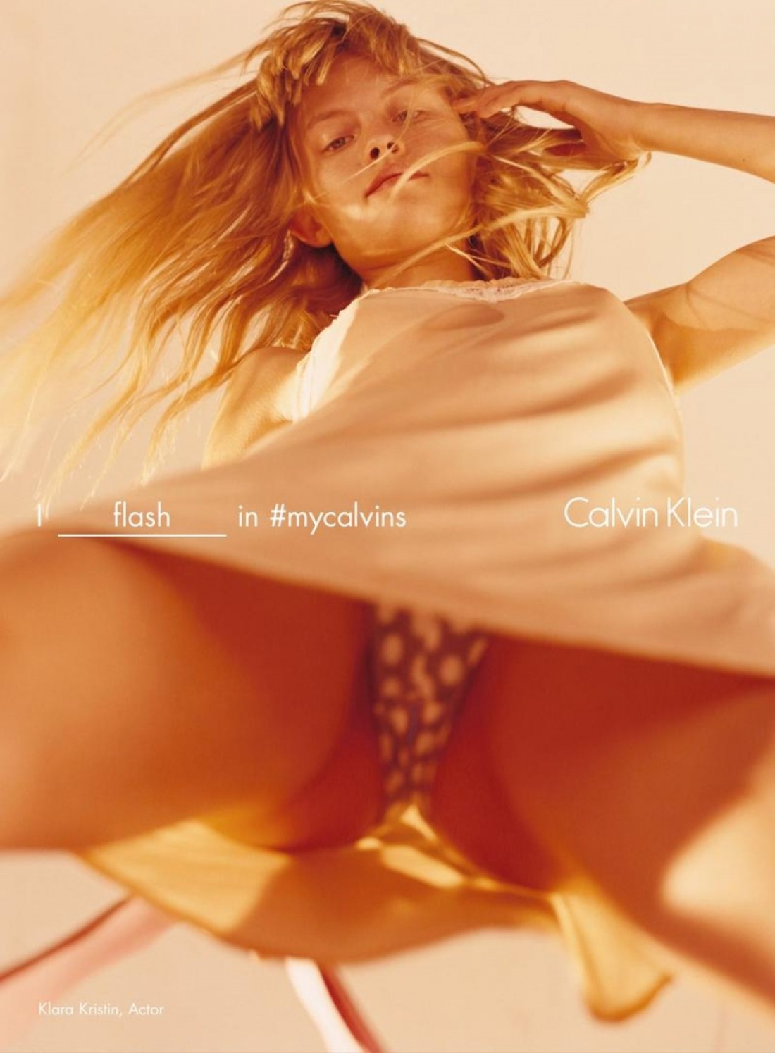
Harley Weir – Klara Kristin for Calvin Klein (2016)
Unless you reside under a rock, you’ve heard of the furor surrounding this image.
I’m normally the last person to defend haute couture edgy ad excess but in this case, I’m more than a little befuddled by the mass concern fapping fit this is causing.
While I’m not exactly a Harley Weir fan, per se, I have warmed to her work over the last few years and I know unequivocally that she’s no slouch when it comes to conceptual acumen.
There’s always going to be an ultra fine line between ‘edgy’ and ‘exploitative’. As a form, the so-called upskirt image is enormously problematic as it usually involves a complete lack of respect for consent.
There are those who will argue that this image makes a mockery of all the efforts and activism to shine a light on the problems women face because of persistent and pervasive street harassment. Honestly, I think that response is actually thoroughly lazy and intellectually disingenuous.
Yes, this resembles any of thousands of upskirt images. But there are some notable differences. The association with upskirt is implict–the viewer will make that leap independent of the image. But consider all the ways this image is different than standard upskirt fare.
Let’s ignore the text for the time being. The subject in this frame is standing with her legs apart, leaning forward slightly and making eye contact with the camera. Unlike surreptitious upskirt shots, the subject is aware, consenting to and participating in the production of the image–I mean there’s no way during an ordinary day that she’d stand like this, the reason she’s standing like this here is to straddle the image maker and her camera.
In case there was any doubt, there’s added text to make sure no one gets the wrong idea–I flash in #mycalvins. Note: that the implicit assumption inherent in the form is that this is an upskirt image; thus the subject is passive and unaware. That’s not the case here. But to obliterate any sort of ambiguity, the assumption is turned on its head by making the subject active in the exchange–it’s not upskirt, it’s flashing.
Next, the objection that the subject’s haircut is intended to make her look pubescent is countered by text identifying the model as Klara Kristin–who is 23, a grown ass women by any known metric. Further, she appeared in my sworn mortal enemy Gaspar Noé‘s latest ‘cinematic’ shit show Love (where Kristin engages in explicitly graphic unsimulated sexual intercourse on screen).
Lastly, the objections that it unnecessarily sexualizes her is actually aggressively countered by the actual grammar of the picture. Yes, we can see up Kristin’s skirt but she’s also aware of and there’s reason to believe that she’s consented to this sort of picture being taken even without the text. But the most stunning oversight of all is that yes, while her underwear is ostensibly the focus of the image, note that the point of sharpest focus is actually her face–and that runs counter, from the standpoint of visual grammar, to any of the knee-jerk objections that get tossed towards this work.
However, what’s most telling for me is Weir’s response.
So I think it’s stupid and slut-shame-y and dumb to argue that men are going to see this and it’s going to fuel more aggressive harassment. It’s like arguing that it’s not rape culture which fuels sexual assault, it’s clearly got to be porn that inspires men to rape. And sorry, but I’m done with that bullshit, specious, critically weak tea noise.
In essence, when you practice and develop any skill you transform yourself in the process. You reveal to yourself new capabilities that were previously latent, that are exposed as you progress. You develop emotionally. Your sense of pleasure becomes redefined. What offers immediate pleasure comes to seem like a distraction, an empty entertainment to help pass the time. Real pleasure comes from overcoming challenges, feeling confidence in your abilities, gaining fluency in skills, and experiencing the power this brings. You develop patience. Boredom no longer signals the need for distraction, but rather the need for new challenges to conquer.

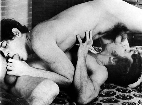
Source unknown – Title unknown (2014)
I am super supportive of work that’s trying to recast bullshit heteronormative assumptions pertaining to MMF.
The frustrating thing is the vast majority of it is artless garbage. (I mean seriously, do a Google search and see how fast you X out of the image results tab.)
I like this for two reason–first there’s at least a baseline of thought with regard to composition. Her body shifts the gaze from left to right. The angle of the cock she’s kissing the head of pushes back against that drift and subsequently you follow the angle of guy in the rear’s erection which he’s pressing into the boys puckered lips.
The lighting is warm and inviting and there’s just enough black in the frame to invoke the tone and tenebrism of someone like Rembrandt.
Second: this is one of those things that I look at and think, oh hey, decent concept but I think it would be better if…
In this case: I don’t care for the way this lens compresses space. (It’s probably a result of optical zoom on a zoom lens paired with APS-C sensor pushing towards the telephoto edge of the spectrum.) Also, the angle of view is super porny as far as let’s make sure everyone gets a good view of the action.
I can see pulling the camera back a couple of feet but then you’d have to deal with some of the additional negative space. In which case, she would have to have a finger in his anus or something to justify the wider perspective.
I’d actually love to restage this and execute the following adjustments: Turn the action so that the boy laying on his back is about 15 degrees off parallel to the focal plane (instead of perpendicular to it as above). Reposition the other guy so that he is kneeling behind the boy with respect to the camera, so that it’s possible to still present his action so that it is legible for the camera.
The woman would stay in more or less the same position she is now, but with the scene rotated 90 degrees so that you can see both the way she’s kissing him as well as her genitals since her butt would be facing towards the camera. Maybe angle her slightly so that it’s visible but not blatant.
The frame would be closer to a panorama and I’d play up the sort of Baroque lighting to sort of recall the gratuitously over-the-top everyone-rolls on molly and relives their birth scene from Sense8–which is actually a decisive nod to Eugenio Recuenco’s work.
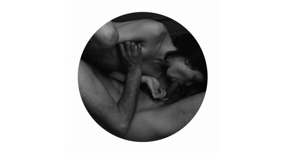
Madeleine Froment – Untitled from Accord/#1 DM series (201X)
I make a pretty solid effort when it comes to familiarizing myself with the work of the artists I post here.
Frequently, I find that while a particular image resonates it seemingly telegraphs to my eye that the I will end up considering the rest of the work an–at best–mixed bag.
It’s frustratingly rare to find work which truly fans the flames of my curiosity.
But when @reverdormir2 posted this drawing by Froment, I was immediately taken by it; I don’t know, I think it’s the obsessive and perhaps even a little awkward details of the hair–the way her hair obscures her face, the careful rendering of the hair on his back, arms and legs, the texture of his beard contrasting against her tightly cropped pubic hair.
I clicked over to her web site and promptly dropped into a sensual erotic K-hole for the better part of an hour.
For the record, not all of her stuff works. But unlike the majority of intellectually dishonest wannabe creatives out there, she doesn’t foist the work on her audience despite its flaws. Instead, she presents the work in a fashion that patiently bridges the gap for the audience between the impetus for the work, the details that drive and enliven it–all subsequently recontextualized in the final work.
It’s really goddamn ingenious. However, what makes it even more exceptional is the degree to which Froment understands her own aesthetic peculiarities and formulates her installations in such a way as to further compliment it, but to also enrich the complex relationship between the work and the world it inhabits.
If you think I’m being a pretentious blowhard and talking out of my ass, just browse through her website and notice how the work flows from documentary like snapshots, to more refined images which in turn provide prima materia for her spare, meticulous drawings. Note: also the holistic way each project is presented to emphasize how the work is supposed to be viewed–ethereal (representative) vs actual (representational).
This is extremely high end work. And it’s thrilling to see an artist this young and this preoccupied with the sort of topics that I think are all too often excluded from artistic discourse–much to the detriment of Capital A Art, unfortunately.

Lupinum – Darlings (201X)
And I’m starving – in the literal sense. Idiots think hunger – is
the body. No, hunger – is the soul, the whole weight of it falls
directly on the soul.–Marina Tsvetaeva, from Earthly Signs: Moscow Diaries, 1917 – 1922