I drink from your gash I spread your naked legs I open them like a book where I read what kills me.
Georges Bataille (via wordsnquotes)
I drink from your gash I spread your naked legs I open them like a book where I read what kills me.

Paul Maffi – La fin featuring Waleska Gorczevski (2015)
Maffi trades in grungy/gritty street wise anti-fashion-as-fashion polemics.
As an aesthetic, there’s no love lost between it and myself because for the most part it seems to pride itself in the sheik, sloppy, ad hoc presentation as a means of conveying an immediacy and/or lack of pretense.
Even though I think of most of this sort of work as trash, Maffi seems to be using the aesthetic as a means to an end. The models he shoot lack the stylized contrivance of pose favored by most editorial minded image makers–you know, the it looks stunning unless you stop and think about and then the underlying physics/mechanics of the pose scream of the inherent unnaturalness.
It would clash horribly with the aesthetic if Maffi veered to the other end of the spectrum and sought to portray models in a state of relaxed, uncontrived naturalism. Instead, he splits the difference and gives this almost stylized but still somehow stunted/interrupted poses that always have at least one foot over the line into awkward self-consciousness.
I find myself wondering frequently who the people he shoots are, where they are and what they were thinking/doing before the intrusion of the image maker and the clacking shutter interferred.
Take the image above for example: there’s no rhyme or reason too it. It’s clearly a cellphone shot of an image on a computer screen. But despite all the things about it that make no goddamn sense, I’m still fascinated by it’s partially uncaring/partially whimsical oddness.
I’d never say it’s an objectively good image but it is interesting. And with the depressing state of eye-bloodying repetition that marks contemporary image making, interesting counts for quite a bit.
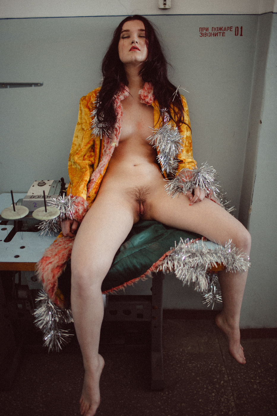
Alexander Tikhomirov – *** (2015)
Honestly, Tikhomirov’s work makes me feel like I need to take a scalding shower after looking at it. It’s sleazy, heteronormatively entitled and objectifying as fuck.
Further, it’s mostly garbage. Except for the one-offs where he seems to demonstrate something like an understanding of when to use landscape vs. portrait orientation–and it has to be noted that most of these smack of nothing so much as spending a week binging on Garry Winogrand and deciding you’re suddenly by osmosis: a street photographer, Tikhomirov couldn’t find a thoughtful composition if that thoughtful composition was his ass and he was given the use of both his hands and a fucking map.
And although the above is some downright egregious #skinnyframebullshit, there is something to this that grabs my attention.
Perhaps it’s the table and the strange device on it. Even with a horizontal frame, that would probably still remain a mystery. BUT, I did take a year of Russian in college and while I only remember dribs and drabs, it seems the stenciled Cyrillic text means something like Fire Command Station 01 And to me that suggests that if not exactly a public area, this is not an entirely private area either.
With the interpenetration of public and private and the flagrant, zero fucks given coyness of the pose, eye contact with the camera (vis-a-vis the audience) would have been too suggestive. Similarly, sans the coat, it would’ve also been too much. As it is–even though a vertical frame would’ve done more to ground her in the space and to mitigate the sexualization of the tableau,
It’s probably a totally wild hair conjecture, but I sort of feel like this probably happened sometime between Xmas and New Year’s. Tikhomirov was out drinking and this young woman came home with him. He came, she didn’t and while waiting for the second shift, she became fixated with the tinsel on a tree.
And like all men who use their minimal familiarity with a camera as an excuse to ask women to disrobe for them in the panty dropping name of Art, he figured maybe a couple pictures are as good as popping a couple Viagra. She threw on a coat, tossed the tinsel on like a boa and they proceeded to Fire Command Station 01.
It’s still sleazy but it inadvertently communicates something determined and fiercely optimistic about the subject in a way that also manages to critique the narcissism of the image maker.


Plume Heters Tannenbaum – [↖] Je serai un combat; [↗] Je serai tes yeux; [↙] Je serai ton intérieur; [↘] Je serai tout ton amor featuring Misungui from GenderNoGender Room Series (2015)
GenderNoGender Room includes 30 images. It positively crackles with fascinating ideas. However, there is a very real sense that everything is a little too muddy, too abortively realized, too goddamn fucking frantic.
When it manages to remain still long enough to act with deliberation, it’s nothing short of spectacular. The problem is: it only really does that in maybe 1 out of every 5 images.
The seemingly random reframing of other images to create diptychs comes across as either arbitrary or so knee-jerk and lacking in subtlety as to be lazily feckless.
Yes, the conceptualization could be more tightly twined to the material but it’s not the improvised nature that irks me–there’s sort of a charming punk rock playful desperation to it which I find ridiculously charming. It’s really the presentation that dissimulates. The project as a whole needs to either make the throw everything at the wall to see what sticks approach more interpenetrative–it seems like there is supposed to be a notion of continuous physical space which is not at all supported by the work; or, the presentation needs to abide a more minimal approach.
This edit I’ve put together attempts to imply a sense of continuous physical space while attempting to invoke a minimalism in-line with Beatrix Mira.
I need to look at Tannenbaum’s work more closely but if it suggests as much raw potential as these images do, then she could easily become one of those artists I follow with something not unlike religious devotion.
Erwin Olaf – Joy (1985)
I didn’t immediately recognize Olaf’s name when msjanssen reblogged this image (which I have an inkling is a self-portrait) and it seemed like it sort of wanted to riff on Peter Hujar’s haunting portrait of David Wojnarowicz masturbating and formed an informal point-of-departure for Jeff Wall’s rigorously formal and uncharacterically garish Stereo. (Also, if you want an interesting thought exercise: consider the trajectory from Blade Runner through Olaf to something like say the post-production infusion of underexposed tenebrism in a show like Hannibal while Wall is very painstaking, using a fucking shit ton of light to communicate gloaming.)
But you remember those hideous nudes with the bags from monolithic fashion designers over their heads? It’s called Fashion Victims and well, let’s just say it lacks any sort of subtlety.
Having said that: Olaf’s done some excellent work–though you wouldn’t know it from his website is basically MySpace with Quicktime VR plugin dragged kicking and screaming into some sort of javascript from hell bullshit. (There is no acceptable excuse for an image maker to subject people to such a goddamn awful fucking page.)
The Advocate put together an excellent edit of his work last year; you should absolutely check it out.


Russell Peborde – Zu (201X)
I’ve had this saved as a draft for several months because the model makes me feel like I need to stare at the ground and shyly kick at imaginary dirt with my boots.
But despite the fact that Peborde favors absolutely inexcusable #skinnyframebullshit (I mean come on guy, your landscape stuff is super on fleek) and the fact that he’s another boudoir photographer using the minimalist Tumblr theme to showcase a barrage of beautiful women in suggestive states of undress/poses, there is substance to his work.
I’m not really sure I can say it better than comparing it to something not unlike the way mrchill‘s work and its obsessive meditation on the interplay of color actually dignifies the work and belies the artists profound respect for those he photographs. There’s an undertone in Peborde’s work that he somehow manages to foster an environment wherein the people with whom he works seem to possess a bedrock comfortability and confidence in their own bodies. It comes off as almost magical, really.

Jane Burton – Limbo #8 from Other Stories series (2008)
One-offs always a risk. By doing something that defiantly refuses to sit at the table quietly with the other children, there is always a very real danger of exposing things the artist would rather remain hidden.
In some ways this work is better than Burton’s other work. Well, maybe not better–more ambitious. The rest of her is so flat. It functions with something like the unexpected flatness in layer that is always the unexpected result of layering multiple negs to make prints in a traditional darkroom–you expect the way the sandwich looks to your eye to transfer to a dimensionality in the print and it never does.
Here: the vague reflection of the trees in the cracked glass speaks to that scrim like compression of dimensionality. Most of Burton’s work functions with the implication of one-point perspective. Whereas this is decidedly two-point. The purposeful center-weighted symmetricality of the rest of the work is thrown heavily off balance. The framing doesn’t make sense–it certainly doesn’t fit an sort of rule of third compliant framework.
In fact the composition is solely about the reflection and the cracked glass. The positioning of the character in the frame is intended to associate the violence of the broken glass with the female genitalia. Note: that the echoing cracked glass is higher and there is no one similarly positioned behind it. There is the ghost of a collapsed heteronormative relationship haunting this image.
And for how easy that all is to ready, it’s troubling that the frame wasn’t cropped. For the closer the frame gets to a 2.1:1 aspect ratio, the more appealing something more along the lines of a rule of fifths becomes aesthetically appealing. Although it’s not exactly, applying a rule fifths does actually contribute a degree of previously missing legibility to the composition.

(via Queer Poetics)
How to Make Love to a Trans Person
By Gabe Moss
Forget the images you’ve learned to attach
To words like cock and clit,
Chest and breasts.
Break those words open
Like a paramedic cracking ribs
To pump blood through a failing heart.
Push your hands inside.
Get them messy.
Scratch new definitions on the bones.Get rid of the old words altogether.
Make up new words.
Call it a click or a ditto.
Call it the sound he makes
When you brush your hand against it through his jeans,
When you can hear his heart knocking on the back of his teeth
And every cell in his body is breathing.
Make the arch of her back a language
Name the hollows of each of her vertebrae
When they catch pools of sweat
Like rainwater in a row of paper cups
Align your teeth with this alphabet of her spine
So every word is weighted with the salt of her.When you peel layers of clothing from his skin
Do not act as though you are changing dressings on a trauma patient
Even though it’s highly likely that you are.
Do not ask if she’s “had the surgery.”
Do not tell him that the needlepoint bruises on his thighs look like they hurt
If you are being offered a body
That has already been laid upon an altar of surgical steel
A sacrifice to whatever gods govern bodies
That come with some assembly required
Whatever you do,
Do not say that the carefully sculpted landscape
Bordered by rocky ridges of scar tissue
Looks almost natural.If she offers you breastbone
Aching to carve soft fruit from its branches
Though there may be more tissue in the lining of her bra
Than the flesh that rises to meet it
Let her ripen in your hands.
Imagine if she’d lost those swells to cancer,
Diabetes,
A car accident instead of an accident of genetics
Would you think of her as less a woman then?
Then think of her as no less one now.If he offers you a thumb-sized sprout of muscle
Reaching toward you when you kiss him
Like it wants to go deep enough inside you
To scratch his name on the bottom of your heart
Hold it as if it can-
In your hand, in your mouth
Inside the nest of your pelvic bones.
Though his skin may hardly do more than brush yours,
You will feel him deeper than you think.Realize that bodies are only a fraction of who we are
They’re just oddly-shaped vessels for hearts
And honestly, they can barely contain us
We strain at their seams with every breath we take
We are all pulse and sweat,
Tissue and nerve ending
We are programmed to grope and fumble until we get it right.
Bodies have been learning each other forever.
It’s what bodies do.
They are grab bags of parts
And half the fun is figuring out
All the different ways we can fit them together;
All the different uses for hipbones and hands,
Tongues and teeth;
All the ways to car-crash our bodies beautiful.
But we could never forget how to use our hearts
Even if we tried.
That’s the important part.
Don’t worry about the bodies.
They’ve got this.
ashleymaclean – Avocado (2007)
Confession: in a week I eat probably a half dozen avocados–chunks of them in salad, guacamole in burritos; hell, I regularly halve them and spoon them out into my face the way most people eat that Greek yogurt stuff.
But it’s never occurred to me until I saw this that the color of a ripe avocado is extremely close to my all-time favorite color–which I call acid green but is sometimes termed pistachio. Or, an even more apt example: the green of the absinthe in Mark Romanek’s video for nine inch nails The Perfect Drug.
(As an aside it occurs to me that we stop asking certain questions of people beyond a certain age, i.e. what’s your favorite color? what’s your favorite animal? Why do we do this? Such questions are so much more informative and revealing of the quality and nature of inner life than small talk about how we pay our bills or commentary on the fucking weather.)
So beyond the fact that like black, avocado/pistachio/acid green compliments other loud colors well.
But this is an interesting photo for more than just the use of color. It’s a killer example of logic that justifies vertical orientation. (And unlike most cases where I merely refer to the compositional logic without showing my work–so to speak–I can explain myself in this case.
We’re dealing with a frame within a frame here. Actually, it’s a frame within a frame within a frame… but let’s keep it simple: there’s the frame and then the door into the dark hallway is a second frame. Note how the balance of the frame leans to the left and how that pattern is reiterated in the relationship between positive and negative space w/r/t the dark hallway vs. the light falling from the window in the far room.
Was MacLean thinking about that repeated form when triggering the shutter? There’s no telling. It’s possible.
But it doesn’t really matter whether it was instinctive or intentional. The logic is there–plain as day. This image would not have worked any other way.

