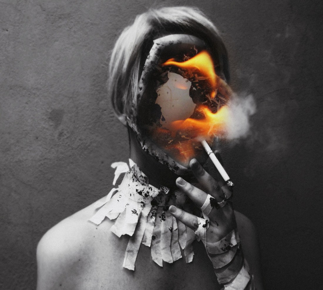
Heitor MagnoUntitled (2013)

There’s no question: this piece owes a debt to David Lynch.

I know that portraits of someone’s head and shoulders presented in front of a textured wall in contrast-y B&W or monochrome is so ubiquitous as to be cliché but consider the preponderance of this motif in portraits of Lynch himself–it’s almost as if this manner of presentation is an extension of his brilliant white button ups, under shadow dark sports coats.

I’ve talked a fair amount of piss about Lynch in the past. I am a huge fan of most of his work–in fact, if you disregard Dune and Inland Empire, his oeuvre situates him as among one of the most consistently masterful, active, contemporary artists.

I watched the Twin Peaks revival in it’s entirety this spring. I am of a mind that it’s the best work he’s ever done–by quantum margins. There is honestly no way whatsoever I can oversell it; it’s an ingenious tour de force that is utterly exquisite to experience. (Also: some of the criticisms that I’ve lobbed Lynch’s way previous about the demarcation between the surreal and the oneiric–and how Lynch tends to play fast and loose with that boundary–well, Twin Peaks: The Return demonstrates that even if such a criticism was valid previously, it is certainly no longer the case.

I’ve not seen all the original run of Twin Peaks. (I was a about three years to young to catch Twin Peaks fever and subsequent efforts to re-watch it have been sabotaged by a constellation of factors. At this point: it is unlikely that I’ll ever see it.)

I am curious if the trope of facial voids and flames feature in the original run–because while the notion of a facial void is very Lynchian, I’m not sure I can recall that specific image in the rest of his work.

Lynch is one of those influences from whom artists would do well to exercise caution in riffing on without careful consideration. Someone much smarter than me pointed out how many ‘artists’ use Lynch as an excuse, i.e. going light on plotting so as to focus on compelling visuals and a sinister surrealism to pull things together. There is always an underlying logic to Lynch’s work–to the extent that even inconsistencies will be consistently applied.

Anyway, I would be curious if the facial void image occurs in the original Twin Peaks because if it doesn’t then I feel like Magno’s image is actually even better than I understand it to be–and I’m basing that of the premise that it ceases to be theft if you take an idea and in the process of making it your own, improve upon it.

This is fantastic for the way it constantly turns in on itself. The lit B&W cigarette resonates with the flame burning through a print. (This appears to be a collage effect, where the picture of a burning print has been digitally imposed over the B&W portrait–creating a mask that is in turn a void with dimension deeper than the image on which it has been overlaid; like one of those haunted houses that is bigger on the inside than the outside.)

Also, the trope of burning photos possesses a sinister value. Typically, when we see this in a piece it indicates someone surrendering something that costs them too much to keep. Think of unrequited lovers burning pictures of the one who has abandoned them or of a criminal destroying evidence.

In a lot of ways I feel like this takes ideas that almost certain were sparked by Lynch and internalizes not only the symbolism but the logic underlying the symbols; then: applies both to personal expression. That would already be impressive. But what I adore about this is that this goes even deeper by then taking the concept and then applying the same system of logic and symbols that codified the conceptual trappings and then applying that awareness to questions of how the presentation of the work will be seen and interpreted by the viewer.

It’s a level of commitment to consistency that is damn impressive. Even more so if it intuited this underlying theme in Lynch’s work and then extrapolated it into something that pushes things a great bit further than Lynch manages to in the Twin Peaks revival.

Agnieszka Handzel-KordaczkaCosmos (2016)

The way these figures are rendered is very similar to another artist; unfortunately–for the life of me, I can’t recall whom.

Thus, I am going to describe this as what you’d get if you told an intern from the art department of a Tim Burton movie to draw Maleficent fucking Capt. Jack Sparrow except draw them in the style of Aeon Flux.

The backdrop is what you’d get if Mark Rothko challenged the Bauhaus painters to a jousting competition.

There’s even a touch of that thing they do in hentai where they show sexual penetration as if they camera were inside whatever orifice is being penetrated.

Each distinct element is–in and of itself–unappearling; yet, combined… they form something a good deal more than the sum of the parts.

In fact, this painting stands out from the rest of her work: it’s more accessible but less resolved. (Honestly, to me here style is particularly well suited to the way I visual things when I read Camus, Moravia or Ferrante.

deluckas13Untitled (2018)

There’s this delightful sense of yin and yang balance to this image.

Imagine there’s a diagonal line dividing the frame from the lower left to upper right; note: how with the exception of the highlight on the shoulder & back of the arm in the upper left corner, almost everything in the upper portion of the frame is composed of shadow to midtones (with heavy preference given to shadow areas); in the lower part of the frame it’s the inverse mostly highlight but hints of mid-tones, too.

I also really dig how the area of shadow at the left of the frame suggests a right pointing triangle–which strengthens the urge for the viewer’s gaze to move from left to right across the image. This in turn conveys a sense of the extended tongue slowly advancing over highlight-blown, pale skin.

There’s a second triangle formed between the slightly parted lips, tongue and shoulder grasping hand at frame right–which forms a roughly up pointing triangle. (This is part of why the image reads as if the tongue is being dragged upward and not downward.)

It’s nice how the image begins with the darkness of the underlit separation between bodies; whereas, the grasping hand at the right seems to merge two bodies into something singular and inseparable.

Plus, it’s really great how this is technically ‘gram safe–attending to the letter of the law while flipping both middle fingers in the direction of the the spirit of that law.

Most impressive, however, is the rare care both in underscoring the voyeurism inherent in the image as well as telegraphing that you are welcome to watch but this isn’t for the viewer or about the viewer so much as the viewer is just being allowed to see something and they should be grateful for the glimpse.

Petter HegreAqua feat. Cleo (2015)

When it comes to Hegre and his ‘art’, I have mixed feelings.

One the one hand: no matter if it’s his artier forays (a la above) or his more pornographic stuff, he absolutely has a knack for carefully considered, subtly nuanced rendering of light–especially in terms of skintone.

The other hand? He has access to a stable of imaging gear far exceeding the inventory of most high end rental establishments. (For example: the images above were made using a PhaseOne IQ3 80MB medium format digital back–an item that likely set Hegre back $60K when he purchased it.)

I’m not going to hate on someone for having the wherewithal to invest in a camera that costs as much as a sports car. But more often than not I don’t see what that investment contributes to his work. For example: it’s not exactly ideal but there but there is more than a passing resemblance between these images of Cleo and Jock Sturges color work. (Yes, Sturges is working in 8×10 large format–thus there is again the issue of the preciousness of the equipment. Also, I think Sturges’ is probably a gold star pedophile and I think his efforts to sidestep this diminish his work. In the case of his B&W photos, they are–IMO–over-praised. However, his color work is not as easily shrugged off.)

Anyway, I was looking at the set from which I culled these images. (If you click the Aqua in the title, you can see the set 16 images of which these 4 are a part.)

Looking at all 16 images, it occurred to me that likely what bothers me about Hegre so much is his emphatic insistence that his work is art.

Now, if he means that his work exhibits technically accomplishment–that’s one thing. It’s rather another for him to hire a model, get her to disrobe and then take a bunch of pictures of her and then edit hundreds of photos down to a dozen or so of the best of the best.

Yet given the 16 images in this series, there’s not a great deal of consistency. The one vertical composition arguable has better tonality than the rest but it sticks out like a sore thumb. Also, the order in which the vertical composition is inserted actually distracts from the visual flow between images in the series. Further, the look at the camera ignore the camera on the part of the model is hell of indecisive. (Although, it occurred to me that although it is unlikely this was the intention: there is something about seeing vs not seeing that is highly erotic–i.e. when I am watching a lover body intersect with my own I may alternate between watch out bodies coming together to heighten the physicality of my arousal, however as arousal stretch ever closer to crescendo there grows a tension from which focus on visual stimulus may actually prove to be a distraction.)

It wasn’t easy to distill this series into a smaller grouping. I do think there are several of the images that could easily be dropped. There are several where the angle of her face is unflattering–but I suspect the image was kept because of the posture of her body. And I specifically dropped the one image that shows most clearly that Cleo is positioned in shallow water near a ledge where the water suddenly becomes deeper.

With this edit, it’s not so hard for me to concede that maybe Hegre isn’t as pretentious as a think of him as being. I mean if you sort of squint and take the sense of the portrait in the top left image, the sense of quiet reverie in the top right image, the sense of place in the lower left image and the sense of ethereal physicality in the lower right image–there is a fully formed and conceptually sophisticated single scene that suggests itself in the intersections between the images.

However, that I chose these images from a wider set and then ordered them in the fashion I did (which suggests something not unlike a narrative progression) is what it took for me to be able to see that.

Perhaps Hegre had something roughly analogous in mind. Or not. In all likelihood what he does requires a certain degree of open ended-ness in order to account for the various interests and appetites of the consumer. Really, I think that’s the crux of my frustration with Hegre: he could clearly produce more resonant and uncompromising work but he seems more interested in commercial viability. (Something which strikes me as a shame and a waste of talent.)

Tommy Nease – Celest (2015)

Speaking of music, this reminds me of the cover art for Body Void’s I Live Inside a Burning House–which is so thoroughly incredible that if it were already September (and there wasn’t a Lingua Ignota album arriving in two weeks), it would be my preemptive pick for metal AOTY.

While we’re on the subject, here’s some other 2018 releases I’ve been obsessively shoving into my ear holes: Ilsa’s Corpse Fortress, LLNN’s Deads, Dark Buddha Rising’s II, Yob’s Our Raw Heart, Thou’s Inconsolable and (duh!) Sleep’s The Sciences.

Jane ChardietPharmakon’s Contact album cover art (2017)

The most successful photos–at least for me–are ones that inspire questions which photo refuses to answer.

Before seeing this, I had no idea who/what Pharmakon was. As it turns out it’s Margaret Chardiet’s NYC based harsh noise act. (I have heard of Chardiet’s Red Light District art collective, however.)

Margaret is the face in the middle of a sea of hands above.

The photo was taken by her sister Jane. In fact, all the Pharmakon albums feature Jane’s cover art. (I dig them all but Abandon is beyond exceptional.)

I am not sure I’ve ever divulged this before on here but music may be the single most important aspect in my life. I’ve gotten higher off music than I have off of any drug I’ve ever taken–and I’ve done a goddamn fucking shit tonne of drugs.

Of course, I popped over to Pharmakon’s Bandcamp page. (Cannabis edibles and Bandcamp are respectively first and second as far as things that have demonstrably improved my life.)

Contact is reminiscent of a lot of the uniformly exceptional work The Body has been releasing.  (It’s also similar in concept to one of last year’s best metal offerings: Ragana’s You Take Nothing.)

Source unknown – Title unknown (201X)

I think the point of what’s being depicted here is arguably better presented given the following reframing:

You lose the distraction of the handles on the bathroom cabinets, power outlets and although I do love the angle of the top of her foot perched on top of the counter, the angle of it and the way it aligns with that brighter area from the window behind her (and the way that lines up in the original with the side of the window) is super distracting.

You are losing the view of her bum but for me what appeals to me is what happening with her face. I’d have likely framed it so that the inner thigh of her left leg dictated the left frame edge. But you’d have needed either a slight shift in the camera position or a different lens to pull that off. (I could’ve just cropped it but I did make an effort to preserver the original aspect ratio.)

Honestly, I’m much more intrigued by what her arm is doing in the mirror than I am by actually seeing-not-seeing what she’s doing with her fingers. (That sudden gasp/jaw drop at the loop point is tres adorbs.)

Megan CullenUntitled (2016)

I am the type of girl who sees something and pretty much immediately feels something about it. It’s a great skill for someone who is–ostensibly–an art commentator. (Honestly, it’s effing exhausting af in the here and now of day-to-day exigencies.)

Usually, I’m pretty good at pointing in the direction of why I feel the way I do about what I see. However, there are times when I know that I like something but I am not immediately able to convey any sense of the why of my feelings.

This is one such image.

The pace of keeping up with running this blog, on top of holding down a FT job and also trying to focus on my own various creative efforts–I am not always able to dig in long enough to suss out the whys.

Typically, I either append relevant quotes which expand, compound or complicate the photo/image in a way that feels like it points in the direction of what I feel but have no idea how to articulate. (Same with my #follow_the_thread and #juxtaposition tagged posts; #palette posts were originally similar but increasingly it’s just proven to be a much more clearheaded and coherent–therefore less abstract–way of “speaking” about color.)

Present, I am–after much weeping and gnashing of teeth–finally operating with a bit of a queue buffer. So I’ve had a little bit of time to sit with this image and work to untangle some of what appeals to me about it.

At first blush, I have mixed feelings about the composition. Either the camera or the bus is not level and the camera has not been especially reoriented to compensate. The mass of black in the upper left corner renders the frame top heavy and cumbersome.

However…

The immediacy of what’s depicted diminishes the impetus on getting a perfect frame in favor of baseline visual legibility requirements.

And I’m cheating a bit and putting the cart before the horse here. My initial reaction to this was bus (public), boob (’private’). (I am and will forever be a sucker for things that transgress on entrenched notions of what constitutes public and what constitutes private.)

The next thing I notice is that there’s two people in the frame. The anonymous young woman flashing people on the street (?) and another woman cracking the fuck up inside the bus–presumably aware of what’s happening. (The initial immediacy of the image expands by placing the image maker and by dint the viewer in a relationship of both see and seen, in a way which self-referentially indicts the voyeurism of seeing with an empathy of an awareness of the political and absurdist facets of being seen given discontinuous overlapping contexts.)

This immediate sends my brain scurrying to make connections with other examples of similar charged visual depictions. In this case, I immediate remembered oan-adn – The passenger (2015) and k.flight’s 2008 self-portrait titled in the back of the bus.

After a bit more contemplation I noticed that there’s what is without question the symbol for an eighth note on the side of the bus directly below the boob peeping through the open window. This adds a narrative implication to the image. (I think anyone who attended a quotidian American middle or high school has experiences of the abject tedium of being stuck with a bunch of classmates on an interminable bus ride. It’s not difficult to image that boredom inspiring the students to see if they can begin a process of brinksmanship where you do things in such a way as to be seen by your classmates but not noticed by chaperones. I am very taken with narrative potentiality–always.)

Really, though in this case I’m all about that eighth note, or as the British refer to it a quaver. Consider the definition of quaver:

verb (used without object)

  1. to shake tremulously; quiver or tremble:
  2. to sound, speak, or sing tremulously:
  3. to perform trills in singing or on a musical instrument

verb (used with object)

  1. to utter, say, or sing with a quavering or tremulous voice

noun

  1. a quavering or tremulous shake, especially in the voice
  2. a quavering tone or utterance
  3. Music (chiefly British). an eighth note

Quaver is actually the pitch perfect word-concept to accompany this image. And it pushes my brain even further because although it’s been years since I’ve studied music theory it strikes me that generally eighth notes are more a function of time signatures with an integer divisible by 3 in the numerator–as opposed to the more standard numerator divisible by 2.

When I was a child my mother referred to this as the difference between march time (2s in the numerator) and waltz time (3s in the numerator). She explained that all you had to do was pay attention to the way your body wanted to move with the music. If you want to march in a straight line it’s two based; if you want to turn in circles it’s three based.

This image is absolutely in waltz time.