andre-jblue veins and goosebumps (2010)

Generally, I am against frame line decapitation; however, my interest in synesthesia– esp. visual conveyance of the tactile–overrides that objection here.

This is a rare instance where the tendency for digital to render textures more-or-less plastic-like contributes to the image by blurring the boundaries between beaded water droplets and goosebumps. In my opinion, the ambiguity serves to emphasize the skin.

Source: Unknown

There are several dozen reasons this is a really lovely image but I would like to focus specifically on its careful use of tonality.

It is meant to be scanned left to right. The skin of the male bodied partner is exposed a hair below complete overexposure and loss of highlight detail. (Making a traditional darkroom wet print, you would probably have to split grade and burn the edge in with a 4 or 4.5 filter.)

The male bodied participant is rendered an ethereal specter; his body only begins gaining form and dimension in relation to his proximity to his partner.

The right half of the frame is heavy with a mid-to-dark range of tones. The female-bodied partner’s teeth represent the only tone in from the highlight range. This balances against the dark tones of the pubic hair in the left half of the frame–in a way the skin and high heel encircle the penetrative sex act, highlighting it.

The darkest areas of the frame are in the armpits of his t-shirt, the area shadowed by her left thigh and his right forearm and her hair.

Thus the tonal composition reduces to a figure not unlike: 0>.

What is interesting to me is the discrepancies from the figure and how they actually enhance the image. If you follow the highlight of her blown out high heels suspended in midair–a porno trope I loathe but that serves here–your eye is led in the direction of his face (where his eyes are locked on his erection as it is consumed by her body); whereas, if you are following the mid-to-dark tones, your eye descends to note the way her knees hook into his elbows.

All that definitely appeals to my aesthetic sensibilities. But it’s the way that despite the emphasis on the graphic depiction of intercourse, that I am entirely preoccupied with her calm and beautifully meditative expression.

Michaela KnížováUntitled (2008)

Besides hypnotic, I have zero clue what these images are.

The rectangular shape with the clipped edges in the frames appears to be an x-ray.

It’s less noticeable in the lower two images than the top where there appears to be a skeletal formation suggestive of a spinal column, laterally viewed.

There’s another image: some sort of samurai armor or a barrel.

The presentation suggests several layers of negatives/transparencies sandwiched to create an photographic print. (Alternative, you could print on transparencies and shoot on a light box–which is closer to the look this gives but the quality lacks the sort of wavering sharpness one would expect to see.)

Usually, I am less than impressed with this mode of image making. But this is exquisite.

And the degree of it’s exquisiteness is driving me more than a little bit nuts. There is like nothing about Knížová beyond her citing the formative influence of Joel-Peter Witkin on her work and her current enrollment in with the The Department of Fine Arts and Inter-Media in Košice, Slovakia.

Whoever she is, she is a freaking bad ass who deserves wider recognition.

Inside FleshHostage (2011)

Suka Off is a Poland-based artist collective founded by visual/performance artist Piotr Wegrzynski.

The second member of the collective is Wegrzynski’s partner philologist and performance artist Sylvia Lajbig.

For all intents and purposes, Inside Flesh is the arm of Suka Off concerned with the production of explicit pornography.

Inside Flesh is a mixed bag. They insist upon unity of medium and message in porn; eschew mainstream porn.

A lot of words get bandied about with regard to their work: dark, kink, fetish. All lazy designations. The work Inside Flesh makes fixates on the violence of physicality. Depictions of intercourse are reduced to a visual amalgamation of genitals, erogenous zones all while imposing a rigid post-human mechanical anonymity.

I appreciate the attention to detail, the seamlessly glitchy/degraded production aesthetic. Further, a good bit of their work I have explored, not only embraces but emphasizes the potential beauty of the viscous effluvia accompanying human carnality.

It’s interesting that in its mission to counter the inconsistent production ethos of mainstream porn and in it’s implicit critique of the tendency of said industry to reduce expressions of sexuality to a field of grinding, thrusting genitals, Inside Flesh actually recreates much of the insipid repetition they claim to oppose.

All that being said, in spite of my general objection to the decontextualization of close-ups, I really do like this image. The sickly light emanating from what appears to be florescent tubes glaring off the coloration mottling the swollen glans, the saliva wet texture of the curled tongue and toothy pearl glint.

FYI, narrative = story, account, or history and makes no reference to structure in the least.

If we are establishing meaning based on correlating synonyms, then yes. But that’s not how meaning works. Two similar words used in an identical context rarely convey the exact same meaning. There are different shades, connotations, etc.

Also, I am going to invoke Wikipedia’s definition of narrative which states: “A narrative (or story) is any account of connected events, presented to the reader or listener in a sequence of written or spoken words, or in a sequence of moving pictures.” [Emphasis mine.]

Structure is, in fact, implicit in the definition.

Hello. Caught your comments this am and was impressed by how much you had to say. I’d like to take issue with a few of your criticisms, namely your narrow definition of portrait. Likewise the assertion that my image doesn’t fit the standard of narrative is baffling. Narrative simply implies a story, which you so thoughtfully tied to the image making process. I think it’s safe to say the image implies something more / less obvious. Apologies for the haphazard composition. Image date 2010. D

Thank you so much for the image date correction. I made the corresponding edit to that post.

Let me walk the portrait criticism back a bit. As the author of the image, you are the authority on it. If you say it’s a portrait, it’s a portrait—at least insofar as you are directly able to dialogue with the audience. When the work leaves the nest it becomes beholden to ideas and standards beyond your conceptualizations/intentions. In effect: how it is read by the audience is becomes equally valid.

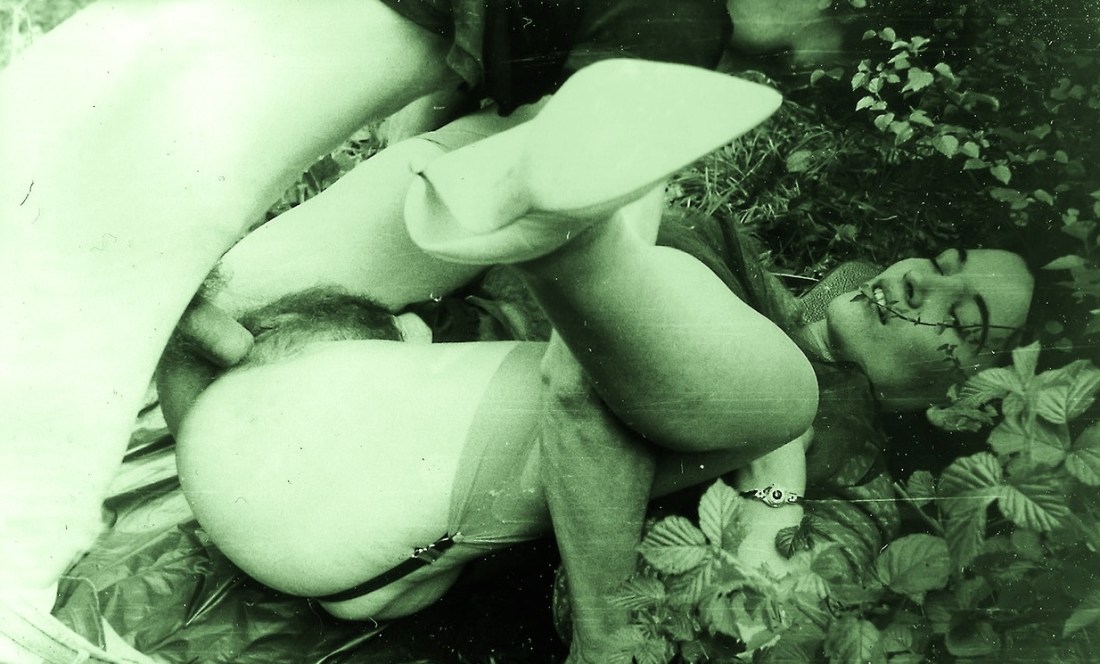
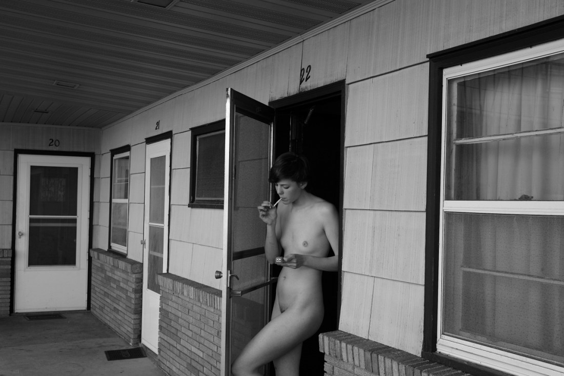
I was—admittedly clumsily—arguing that given the definition of the word ‘portrait’: a likeness of a person, especially of the face, as a painting, drawing or photograph; and given the fact that in the aforementioned image the subject’s physical likeness takes up perhaps 15% of the entire frame area, her face perhaps 4%, this does not jive with the core concept of what a portrait entails. I feel that’s less narrow definition than respecting that words have meaning because of how they are used. Especially, in that context this is rather anomalous given my passable familiarity with the tradition of portraiture in painting and photographic traditions.

But what does any of that matter? It’s all so much word nerd rigamarole. “How it is a portrait?” is what I should be asking you.

On the narrative tip, ‘narrative’ and a ‘story’ are not equal or interchangeable notions. I am likely going to run afoul of academic narratologists with this but considering I am an autodidact dabbler—it is what it is. Again operating from the premise that words have meaning because of how they are used in the weave of life, there are two senses of a story. One centers around the notion of conflict. Having taken a screenwriting course in which students were asked to write a five page script in which there is zero conflict, I know people can get super fucking philosophical about how existential ennui entails conflict, etc., etc. I prefer to phrase it more directly: one sense of a story is does it incite in the audience a tendency whether exercised or not to inquire: so then what happened?

The second sense of a story is when one is taking coffee with an extravert friend and s/he says: oh I have to tell you this story and what follows is a nearly insufferable string of impressions, commentary and events that swim in and out of focus.

On the other hand, the word ‘narrative’ has to do with structure. A story told in a three or five act structure, is a narrative, for example. (Structure, the setting of either explicit or implicit expectations, is part of what causes the instinctive ‘what happens next question?’ inquiry.)

My definition of narrative is dependent on the first sense of the story— the question ‘so what happens next?” or conflict conveyed in a structured fashion. It’s much more difficult for a story in the second sense to be a narrative unless the absence or fragmentation of structure includes—eventually—some sort of conflict that is discernible after internal reassembly.

The sequence of events I suggested with regard to the image are linear—this then that. But there is not a sense of conflict. I don’t find myself asking: and then what?

To put it another less abstract way: Vermeer’s staggeringly brilliant Girl Reading a Letter at an Open Window is unequivocally a narrative: what precedes is clear and what is to follow, at least initially, is suggested—much the way an acorn contains an oak—within the single still frame. Looking at the painting there is a itch to watch the frame, as if were one to watch long enough the letter might fall away from her hands, her head bending forward as she gives in to her massing grief.

D. Robert StanleyEmily (2010)

I appreciate the effect this is chasing; an ex post facto insinuation wherein the moment portrayed implicitly addresses the events immediately preceding it:

  1. The image maker stares out across an empty parking lot, a Leica M8 dangling from a strap around his neck;
  2. He hears the screen door opening to his left. A young woman–not wearing a stitch, presumably his companion–stands in the doorway, a cigarette hanging from her mouth and fumbling with a book of matches;
  3. Registering the base elements of An Image, the image maker sights through the viewfinder while pivoting, rocking focus hard right then slow left as the match head flares, drifts upward;
  4. As the flame touches cigarette tip, he triggers the shutter.

Although I am tempted to refute the assertion that this is a ‘narrative’ image–it’s not; there far are more urgent fish to fry.

Here: I want to point out once again that I dig the idea underlying this. I really do.

I am bothering to reiterate that point because I am afraid what follows may really harsh the image maker’s buzz.

First, I am very sorry but this is not a portrait. Welcome to Name That Genre, I am your host Jon Rafoto. And oh, I’m sorry you said ‘portrait;’ the answer we were looking for is: street photography. (EDIT: Unfortunately, I got a ahead of myself here and started playing fast and loose with the terms. What I meant is that the perspective of the image is closer to street photography than portraiture but I conflated how with the what and that led me to attribute (wrongly) the content to the genre of street photography. This was a mistake.)

See: a portrait preferences the subject over their surroundings. This preferences the surroundings over the subject.

Sure, I’ll see the ’environmental portrait’ call and raise with a ‘the tendency of a sitter in a portrait to acknowledge the camera’.

All that doesn’t even matter though because in this case I am holding pocket aces in ‘the camera that made this image was hand-held’. Now, that’s not to say portraits can’t be hand-held, they certainly can. But the failure to square the frame against the verticals of room 20’s door jamb to and the rightmost window edge is either shoddy composition or an effort to emphasize the pivoting pan of the photographer–suggestive of street photography.

Further, squaring the frame would have made the questionable compositional logic gallingly obvious.

That being said there are some insightful inclusions. There is an effort to include the texture of the roof as a compositional feature. As is, it doesn’t play. But the instinct to include it was excellent.

What was needed was either for the photographer to take two steps back and square the frame. Or to have a half-step left and squatted down. The former option would have shifted things even more toward street photography, the latter would have shifted it closer to portrait.

Both would have had the additional benefit of not bloody making the most annoying newbie mistake in the book–if you have to amputate with the frame edge do so in between and not at joints.

JoLee KirkikisUntilted (2014)

Browsing Ms. Kirkikis’ work, I associate it instinctively with Erin Jane Nelson’s early work.

Both capture themselves/friends in wistful moments, awkward spaces between presence and absence. Both tend to use image making as a means of documenting performances related to text or sculptural elements. Both have images featuring finger traps.

It feels to me as if both build out off a similar foundation: a sort of belief that the world is too big to feel small. In Nelson’s case, she led with her angst–as if her creative process were an interrogation room scene, with her playing the good cop, the bad cop and the suspect.

Whereas, Kirkikis is more circumspect; evincing a confidence perhaps not yet in her work but certainly in the searching nature of her nascent process.

It’s interesting to me that it appears Nelson has disavowed her early work. That’s a mixed blessing. Yes, most of her work was disturbingly uneven and much of what worked seemed a fortuitous accident. Still, she made a handful of images which indelibly seared themselves onto my mind’s eye. (I find it interesting the degree to which the work she is making now is aggressively confrontational.)

And while Kirkikis’ work would benefit from culling her extensive output to something learner, more focused… unlike Nelson, I think we’ll probably still see the above image recur as she matures along with her work.

Brooke LaBrieBlack Tape 1 (2013)

I’ve said it before and it bears repeating: if you aren’t following Cam, you’re doing Tumblr wrong.

Without question, Cam is one of the preeminent models in the Tumblr-verse. She’s extremely intelligent, has a nice voice, is six feet tall, has really cool tattoos; and when fuckwits antagonize her she spouts incredible, tongue-in-cheek mythological backstories, is socially awkward and a consummate bad ass. (I don’t feel the three things I haven’t linked require additional documentation.)

I have mixed feelings about this image. It was made with a Hasselblad 500C/M and I am all about analog photographic processes. And I don’t think I’ve ever seen Cam presented squared to the camera. (She really is beautiful.)

I am not quite sure how I feel about the tape is being used to cover her tattoos, though. I mean Cam has some AWESOME ink work.

But looking at this what stands out to me is the compositional logic to the placement of her tattoos. I mean if you suggest the body as a canvas for art, there is more than just a passing reminiscence in the lines suggested by the tape to Piet Mondrian paintings or the De Stilj aesthetic.