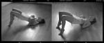
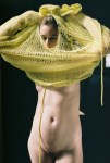
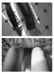
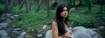
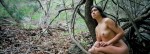
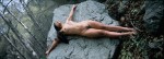
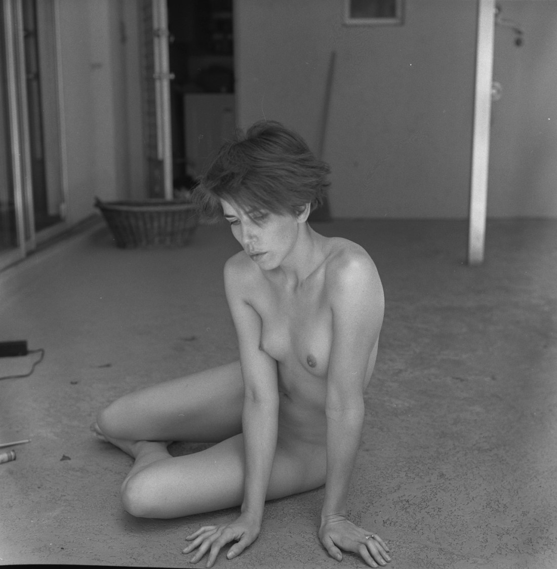
Nobuyoshi ArakiErotos (1993)

If there were a social media site that used Facebook-esque relationship statuses to track opinions regard an array of notable artists, my entry for Araki would be: It’s Complicated.

I appreciate his life-long commitment in documenting the erotic and/or transgressive aspects of human experience. But by the same token his prolific output–and let’s be honest, prolific isn’t even close to a strong enough word, something closer to ‘profuse’ is more apropos–is off-putting; the feeling it instills is one of throw everything at the wall and let’s see what stick instead of any coherent, contemplative, and disciplined editing.

The above photograph is causing me to rethink some things. For example: I’m not sure it changes anything about how I feel w/r/t what I interpret as lackadaisical editing. However, it’s probably intellectually dishonest to use that as a justification to disqualify everything the man has ever made. And in fairness, while I do find much of his work to be redundant and under-edited, Araki has produced six or eight images that are indelibly imprinted upon my visual imagination.

All that reminds me of one of the best pieces on understanding art that I’ve ever encountered in which Maria Popova unpacks Jeanette Winterson’s Art Objects essay.

Winterson, finds herself in Amsterdam, describes the experience thusly:

I had fallen in love and I had no language. I was
dog-dumb. The usual response of “This painting has nothing to say to me”
had become “I have nothing to say to this painting.” And I desperately
wanted to speak. Long looking at paintings is equivalent to being
dropped into a foreign city, where gradually, out of desire and despair,
a few key words, then a little syntax make a clearing in the silence.
Art, all art, not just painting, is a foreign city, and we deceive
ourselves when we think it familiar. No-one is surprised to find that a
foreign city follows its own customs and speaks its own language. Only a
boor would ignore both and blame his defaulting on the place. Every day
this happens to the artist and the art.

We have to recognize that the language of art, all art, is not our mother-tongue.

This attitude is presented as a prophylaxis for the I just don’t get it mode of art criticism.

It’s as stellar a metaphor as it is nuanced and astute. Yes, it’s great to know what you like and to be able to explain why you like it–I’d venture that it’s integral to any creative practice.

But part of seeing is resisting the tendency to avoid engagement with what you are seeing. And viewing something through the filter of past experience, of trenchant opinions, is a mistake.

One should never cease to questions assumptions, values and opinions–because to stop might mean pulling up short of the one question that toppled the entire house of cards.

This photo has made me realize that I’m likely very wrong about Araki. And as much as we strive to always be in the know and adept at negotiating understanding, taste and opinions–it really is incredible to be presented with the opportunity to correct a long, unconsciously repeated mistake.

So here’s to being wrong. Learning and growing.

June CanedoVarious Untitled (201X)

I shouldn’t be as completely over the moon about Canedo’s work as I am–almost without exception she composes vertically, she’s all about Kodak Portra and she’s exploring the currently trendy no man’s land between portraiture, fashion/editorial and so-called lifestyle photography.

But, contrary to everyone else hanging out in that space–her sensibility comes across as generally curious and engaged instead of being just another cookie cutter hipster affectation.

The above photos are my favorite and they fit the theme of this blog. However, I do feel a little conflicted for focusing solely on photos featuring nudity to the exclusion of some of the other work.

For example: Canedo has a bunch of what appear to be medium format film portraits of people in Wal-Mart parking lots. That these images are luminous and enduring is one thing; but as someone who frequently feels a desperate urge to make something against the odds and my own personal stagnation–I can’t tell you how many times I’ve thought about doing something similar in order to run some film through the camera. It’s never something I do–because I’m convinced that there’s no way the ends will justify the means. It works for Canedo, though. And the results are noteworthy.

She also does fashion/editorial work.Yet, although it fits the expected mold for that sort of thing, her work always features a distinctive personal style–low angles re-envisioning the customary tropes into towering and statue-esque abstractions, rendering a cool and detached view of something that is fundamentally unreachable; or a stunningly humane flicker between subject and photography, the splendor of which the viewer sees without ever being fully able to decode the entirety of the context surrounding what they’re seeing.

Lúa OcañaUntitled selections from Don’t break series (2011)

One of Nietzsche’s most oft quoted aphorisms comes from Beyond Good and Evil:

Wer mit Ungeheuern kämpft, mag zusehn, dass er nicht dabei zum
Ungeheuer wird. Und wenn du lange in einen Abgrund blickst, blickt der
Abgrund auch in dich hinein. [He who fights with monsters should look to it that he himself does
not become a monster. And when you gaze long into an abyss the abyss
also gazes into you.]

It’s the second bit about gazing into the abyss which seems to me to be applicable to Ocaña’s photos.

This was the first image of hers I stumbled upon.

The photo on the left reminds me of the stuff Sally Mann was doing between Deep South and Proud Flesh–too dark to determine whether its twilight pastoral or turgid nightmare.

Yet paired with the second photo of a bloody finger–which might have been taken by any number of internet famous photographers–any sense of sinister menace resolves into something closer to the slow ache of an unrequited longing; as if the beauty as well as desperation of existing in a desolate space transform one into something that mirrors similar beauty entwined with desperation.

Ocaña is doing revelatory work in exploring the interplay of images. (I especially admire the way she’s employing text, mixing B&W and color–something I’ve struggled with how to pull off in my own work–and so openly demonstrating her process.

But here we should return to the images with which this post opens from the series Don’t break.

My Spanish is godawful but here’s what I’ve got as far as an ultra literal translation of the artist statement:

This project is about delicate-ness; where absence, the unattainable and loneliness form the central conceptions. Nudity is de-emphasized and employed as a means of establishing an intimate, relateable frame for the work.

Each photo/diptch presents an anonymous protagonist. The relationship between photos morphs across the series and establishes a larger context given the work taken as a whole.

Assuming I got even a fraction of that right, I would deem the work highly successful.

However, heading back now in the direction of the quote with which I opened this post: I read this article recently in the NYTimes about a newly discovered ‘music center’ in the brain. I was fascinated and appalled in equal measure.

See: I’m a disciple of Wittgenstein. And one of the most salient facets of Wittgenstein’s work is the notion that contrary to the accepted Cartesian model, meaning does not derive from internal mental processes. As W. puts it: if every time I understand how to solve a problem I experience a white flash as if a light bulb is suddenly illuminated above my own head, the white flash is not ‘understanding’. I am justified in saying I understand only when I am able to correctly solve the problem.

Thus, if we say that music activates a certain area of the brain that language and aleatoric sound do not–how much further is it to test if something is music or not by strapping someone into an MRI and playing them a sample and then judging by how they react deeming music or not?

One of the great sadnesses of my life is that I possess no talent for playing music–although I am more sensitive to music than any other form of art. (I’ve gotten higher off songs than I’ve ever managed with any illicit substance.) To me there’s something musical about walking through a snowy forest with no one around for miles and you can actually hear real silence for once or the way the calack-calack of trains always ends with a half-measure rest instead of the expected completion of the rhythmic expectation. Hell, right now I’m listening to Tim Hecker

Is what Ocaña does photography or collage. I’d argue it’s both. And to me that both is incredibly important.

Imagine I’m standing listening to you tell a story. You’re back is to the ocean and I’m facing you. We’re standing on a hill and the sun falling toward the ocean. And then something between your story and the orange-mauve color of the sky sets my brain on fire. I point and you turn and look. Either you’ll see it or you won’t. By the time I find the words to indicate that to which I am pointing, it’s spell on me will have ended. But by pointing there is a chance that you might catch the tail end of the same spell. That I might share it with you. That you might know too.

Arthur Tress – Kent on Slide, N.Y. (1979)

As much as I like Tumblr, I think spending a lot of time on here ends up being a bit of a mixed bag. Yes, it’s reasonably on-point when it comes to keeping abreast of new work and new artists making work in lens based visual arts.

Unfortunately, the volume is such that I can’t always properly follow up on various makers.  I mean I have around two dozen names of people whose work resonated with me strongly after only a glance.

Tress’ name is on one of those post-its. I remember a while back Getty released a spate of images Tress made during the 60s where he staged children’s nightmares for his camera.

I was extremely impressed with several of the photss but ultimately haven’t made time to return to his work because it didn’t seem to fit the purview of this project. I’m now seeing my mistake.

Some of his more surrealist inflected work is nothing short of stunning. He takes a Minkkinen-esque approach as far as mood and tone but his images seem more grounded in an even-handed incisively observed eroticism. In other words, the work adopts the structure and form of a glimpse from a dream but it retains the same fluidity that inspires the dreamer to remain unaware that they are dreaming.

Lastly, Tress is clearly EXTREMELY familiar with photo history. Were I a photo teacher, I’d assign an essay wherein students could pick between Ralph Eugene Meatyard, Rodchenko or Ed Ruscha and compare/contrast with Tress.

Renee Kingself portrait (2015)

This photograph takes my breath away.

There’s room for improvement: the background–a patio/porch, a sliding glass door and a door leading into a laundry room–is ho-hum; the basket is an interesting touch and the depth of field does a good bit to focus attention on the subject; conversely, the three items intruding into the frame on the lower left are ultimately distracting.

But look at the way her hands are perfectly aligned with the bottom of the frame! And the tautly sinuous effortlessness of it. (Perhaps half a demerit for the oddness of not being able to see her right foot–a slight shift so that it would be seen protruding behind her right thigh would’ve accent the dynamics of her pose.)

Anyway you slice it, Renee King is splendidly talented photographer. I hope you’re all following her.

Anastasiya Shevela. (2015)

According to the tags in the original post, this image was made with a sheet of 4×5 Kodak Ektachrome.

Long story short: Ektachrome ‘replaced’ Kodachrome. (The scare quotes are to respect the opinion that Kodachrome was without equal and irreplaceable.)

It’s a fine grain color positive (or slide) film. It was discontinued in 2013.

There’s no way of knowing when the sheet resulting in this photograph was exposed. It could’ve been in 2013, while the film was still ‘fresh’. If it was exposed this year–which would be my guess–it’s held up reasonably well. (There’s a blue shift due to the boat and a yellow shift in the skintone but both facets only contribute to a stronger image.)

I used a few rolls of Ektachrome before it was scrapped. I’ve never really cared for Kodak film stock–the T-Max grain structure irritates me and Tri-X has never been as smooth as the high end Ilford stocks to my eye. And I’ve had several interactions with Kodak as a company that have left a very bad taste in my mouth. But Ektachrome was solid. It never had the dazzling skin tone of Fuji’s Astia. (Now sadly also discontinued–but I do still have a small stockpile in my freezer.)

If you’ve never shot slide film you aren’t going to appreciate the nuance in this photograph. Unlike negative film–which has a sometimes a nearly five stop exposure range wherein you’ll get a ‘usable’ photo–slide film is unforgiving in the extreme.  Without perfectly even lighting, Fuji’s Provia 100 in medium format gives about ¾ of stop range; 35mm is ¼ a stop if you’re super lucky.

So, if it’s that much fussier to shoot slides as opposed to negs, why bother? Well, on the one hand, I’m a photographer who strongly dislikes the lemming-like obsession so many fashion/editorial/’fine art’ folks have with Kodak Portra. If you’re using a flash and/or have controlled lighting, you can do some interesting stuff with it. But it’s texture tends to be plastic-like and the colors skew a little too pastel for my taste. (I suspect so many people use it because it tends to provide a ‘flattering’ skin tone by default.)

The truth is: I only ever shot one negative stock which rendered what I would refer to as acceptable color fidelity–Afga’s Optima II. (I’m convinced it was better able to render grey scale in the shadow areas.) Alas, it was discontinued soon after I stumbled onto it.

The first time I shot slide film was the first time I was really even halfway on board with regard to color fidelity. So I continue to shoot it.

And I think what I’ve come to realize is slide film just renders color in a fashion closer to the way my eye sees color. For example, in the above image, it’s difficult to tell if the blue is bleeding out from the boat into the pebbles or if the pebbles were just close enough in color as to provide that illusion. A well exposed slide leaves that ambiguity. Just pop in down on a light table and you’ll see it one way or the other depending upon how you look at it.

With a negative, that distinction would be something that one would develop in printing. (And it would take a long time of futzing back and forth and printing a bunch of images that didn’t work.)

That’s why slide film appeals to me: if you shoot it and it looks like crap, there’s no fixing it. It’s not strictly WYSIWYG but it’s so close it may as well be. I appreciate it’s unforgiving nature. It forces me to think and then think again before I click the shutter.

Laura KampmanUntitled (2015)

I’d post this just based on the exquisite tonal range and use of the depth of field–the mid-ground is soft while the background (both actual and reflected are sharp).

But really this deserves to be celebrated as a testament to discipline.

Anyone who’s ever tried to take a Traci Matlock-esque mirror self-portrait without looking through the viewfinder, knows it’s nowhere as easy as it looks.

But here Kampman is using a TLR–so she doesn’t even have the benefit of a  straight forward view as I’m reasonably certain that Rolleis mirror left to right in the waist level finder.

And she’s set things up with very thin margins as far as composition, so this is emblematic of a degree of mastery I’ll admit I lack the patience necessary to cultivate.