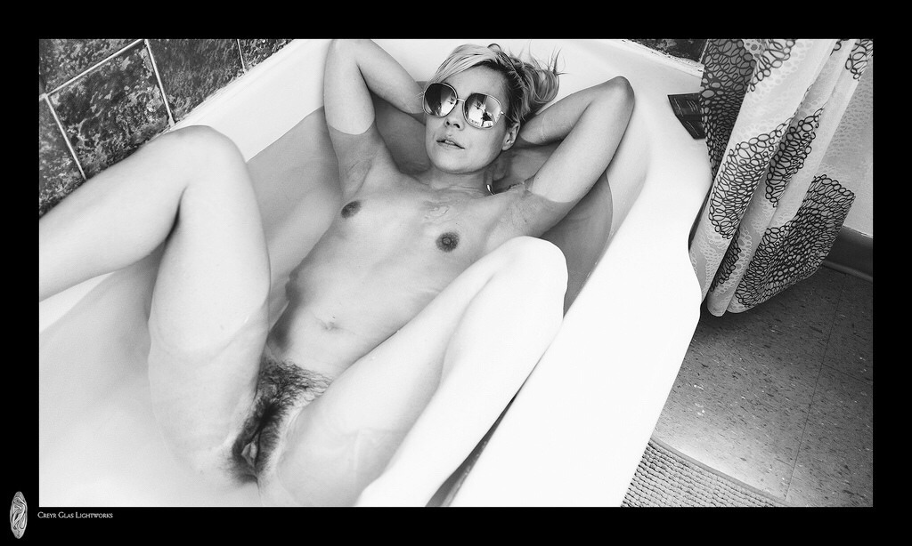
Creyr Glas LightworksIsola Bathing Nude (2016)

I find it positively odd how many photos of people in bath tubs there are on Tumblr. I mean, if you want to think of a room with decent lighting bathrooms are not the first option that comes to mind. (Perhaps it’s because I live in New York City where most bathrooms are windowless, feature only overhead lighting and are so small where if you turn around too fast, you’ll run into yourself.)

Most of these photos tends to strive for the sort of ideal frame within a frame as exemplified by Lee Price’s Pink Cupcake along with his latest series Surfacing.

The rest seem to juggle having a high enough angle to see into the tub while also being close enough to the subject so as to not have the composition overwhelmed by bathroom related scenery.

Chip Willis’ extremely clever use of a mirror to open up this incredible image of Nathalia Rhodes is a personal favorite. And I’d wager Creyr Glas Lightworks is familiar with it based on the image above. The pose is reminiscent and the mirrored sunglasses suggest further points of comparison.

Compositionaly the angle of the tub edges lead the eye at an upward angle toward Isola’s face, the shower curtain calls out, demanding attenting and we’re aware of the fall off of light as we move away from the tub, the eyes snap back, drifting back and forth between her genitalia and her mirrored shades.

The rule of thirds informs this shot. The inside edge of the tub at the top and the inside edge of the shower curtain.  The top of her right leg is also more or less aligned with a third segment of the frame.

I just really do not like the fact that her legs are amputated at the ankle. It implies a lack of mobility and given how wide the angle of view is I suspect the image maker lined up the shot to perfectly observe the rule of thirds and then leaned in closer to give it a little bit edgier feel. That edgier feel does not vibe at all with the tone and feel of the image. (Isola seems pretty comfortable and devil may care about what anyone else thinks about her or her body in the moment presented.)

I have no idea regarding the image makers background but this was taken with a Fuji X100T (a great for the price, MFT rig). But it’s digital and the black frame is something you’d not have the option for if you were working in traditional B&W–although it would work for B&W slides (further the mirrored sunglasses are positively made for B&W chromes, but I digress). That ultra bright bath tub edge in the lower right foreground would have to be substantially burned in to read on a traditional print, which would make getting a more or less even white across the entire bathtubs visible surface a nearly day long process in and of itself.

Still, despite the considerable flaws, it’s a memorable image in a way that 95% of the tubshots I’ve featured previously just do not accomplish. That’s worth noting, I believe.

Raven MacabreAimee IV American Beauty (2009)

I can’t remember who said it but a noted photographer–doubtlessly riffing along the lines of Warhol’s infamous 15 minutes assertion–claimed that in the future everyone will take one good photo in their lifetime.

This is Raven Macabre’s one ‘good’ photo.

I use the scare quotes because Macabre is one of those image makers whose work I just freaking detest–super-saturated colors limited to aggressive strip club chromatic palates, completely bereft of even the vaguest understanding of compositional logic (to wit: Macabre treats #skinnyframebullshit as his default orientation, earning my wrath) and despite being a ‘visual’ artist employing a text-only watermark (I pointedly opted to find a version of the image that excluded the watermark).

All that said: there is something about this image. It’s digital–so there’s some color exchange between the bright light flooding in and the area between Aimee’s right shoulder and the window; but this is a sublime exposure given the scene–yes, her left eye is a little too dark but a negative shot at the same settings would’ve rendered just enough of a kiss of extra latitude to distinguish the white from the pupil.

The slight tilt of her head and the play of the light accentuates the perfect classical shape of her face and flouts the conventional wisdom that when both a subjects head and shoulders are square to the lens, the resulting affect is to render the person as if they were dead.

The skin tone skews a little to yellow and magenta but were you to get in there and edit it, you’d have to be careful about losing some of the grace notes (i.e. the darker pink of her right nipple against the lighter pink of her areola and the slight reddening around her vulva indicating less than eight hours from her last depilatory session).

In summary: there’s no reason this should be vertically composed and it breaks a number of rules but the moment it captures is authentically unmediated enough that the stillness of it makes it a surprising editing choice for an image maker who seems desensitized to anything that isn’t loud and obvious.

Little Liza Jane – Title Unknown (201X)

It seems the person who made this image deactivated her Tumblr–I’m pulling it from @wyyoh‘s reblog of it as part of a photoset.

I may not get this entirely right but I think Little Liza Jane was a frequent Coffee Club submitter.

As you can see from the aforementioned photoset her work while definitely a cut above the typical nude submission kind of lacks variation beyond a certain template.

That’s not to diminish the work at all. She does quite a lot within what I consider to be an aggressively restrictive form. However, the above image really does not to be singled out for it’s stunning display of creativity.

To start, I want to draw attention to the peep hole-esque vignetting. But–for now–let’s just note that it serves to render what would’ve otherwise been an ugly dorm or hostel bathroom, into something that appears as if at least some sort of cursory production design preceded the image.

Use of color has always been a feature in LLJ’s images–even if it isn’t always as readily discernible as it is here. Note: the aquamarine tile, the sea form bath curtain and the drab olive towel; the variation between the tungsten vanity light, the soft-white overhead bulb (seen reflected in the interior of the shower), the wooden door and the orange hand towel.

Together these elements coordinate to render a highly stylized but extremely appealing skin tone–something anyone who strives for a degree of photo-realism working with mixed lighting sources knows is a damn accomplishment.

But this is all superficial compared to the brilliance of the pose, the line of the bra and the way it both accentuates her back and draws attention to the one glint of light you can see between her thighs.

This image is composed in a way so as to underline the point of the implicit nudity while refusing to put it on parade.

But back to the peep hole–the pose and everything else suggest a coy awareness of the viewer. However, the audiences’ gaze is only permitted to see what the subject wants them to see.

Barbara NitkeBathroom Kiss from Kiss of Fire series (1995)

I have mixed feelings about Nitke.

Besides her stated aim of “find[ing] the humanity in marginal sex,” her work all features a clinically dispassionate eye.

This allows the viewer to bear witness to an awkwardly tender moment such as above. Her presentation of action as jarring, motion blur and off-kilter compositions have become endemic in the work of image makers interested in both fine art and BDSM documentation (I’m thinking here specifically of Aeric Meredith-Goujon and his ilk.)

What irks me is the insistence upon conceptual layering for the pornographic to receive art world credibility. It’s almost like for something to be deemed Capital-A Art, the pornographic has to be somehow mediated and/or commented upon by the work.

Let me give you an example: I’m beginning to consider (with some level of seriousness) pursuing a PhD in Art History. What I am interested in is studying the dichotomy between Art and Porn throughout history and then insofar as it can be reconciled suggest transgressive art as an art historical current seeking to point toward a synthesis between these two allegedly opposite poles.

Invariably when I’m talking to academics–trying to sort potential recommendations, seeking advice w/r/t receptive/non-prudish programs–invariably people ask me why I’m so interested in Jeff Koons or throw Noam Chomsky at me.

I detest Koons. And my favorite incident in Miriam Elia’s indispensible We Go To The Gallery relates to Koons–it’s the perfect take down of his vacuous work but it also serves as a damning critique of why the ‘art world’ tolerated his’ short-lived foray into porn with his Italian porn star partner.

(As far as Chomsky goes, I’m not even going to address it because people far more eloquent than I’ll ever be have already pointed out how it’s bullshit to code switch from critiquing capitalism to a feminist perspective without acknowledging the overarching shift in context. Chomsky’s is allowed to find porn distasteful; he’s not allowed to use his status as a notable (white, cishet male) Academic to attribute unassailable factual status to his own poorly considered concern fapping.)

I guess my point is simply: the subject of Art is inherently relateable to the human experience. Sexuality (or asexuality) is a facet of the human experience. Therefore it is well within the purview of Art to consider it.

I object to the pretense of bending the work into conceptual pretzel shapes to earn a distinct of being meritorious. I want more de Sades, Bellmers and Batailles; fewer Gaspar Noés.

photominimal:

There and Back. With Suspended in Light: Montreal / Polaroid Automatic 100 / Fuji FP3000b

I am absolutely dead-to-rights, head-over-heals for this ‘Polaroid’.

Yes, the tonal variations are effing exquisite. Note the gradual grade from right to left–reversing the convention set by Dutch Golden Age (that’s been more or less continued uninterrupted ever since).

And the light slides into the frame in such a way as to imply a right triangle. There are so many grace notes: the way the sunlight accentuates the curve of the bottle like a hand that can’t quite decide whether to lift the object or merely luxuriate in the cool press against its palm. The two plants–how they are just illuminated enough to separate them from the background, rendering them legible. The way the brightest point in the image is the echoing right angle formed by Suspended In Light’s left forearm the sink edge and the side of her top.

Oh, and the way the light from her left thigh pops against the gloaming darkness. And the second bottle to the left of the mirror with the sprig of something standing at attention. And the light on her reflected face…

Instant film stocks tend to provide an unpredictable softness of focus. It is used to masterful effect here were the paneling, sink pedastal and skin all appear to have visual texture that almost seems as if were you to touch it, it would feel like wood, porcelain and flesh.

But I think what I love most is the washing machine and dryer nudging in along the lower left edge of the frame. Not only does it balance out what would have otherwise between a frame leaning decidedly off balance to the right, the inclusion renders a greater degree of interest in the frame as a whole. There is a timelessness feel to the image but it is clearly anchored in the present.

I especially admire this image because in my own work, I am generally loathe to work indoors. I always tell myself that one day I’ll be able to afford to live in a place like the apartment in Mirror. This image serves as a reminder that even if I had that apartment, I’d still struggle to shoot in it because when you’re working in close confines, at a certain point you have to play it as it lays. I’m too much of a control freak to do that–and I think my work suffers as a result.

Harry GruyaertTitle Unknown (1966)

My dalliances with photography began out of a certain degree of misdirection.

Long story short: I took a film-making course in college to see if I could successfully complete a film that was (by some miracle) not unwatchable. Next I knew: I was a film-making kid.

Initially, my interest was directing. However, increasingly, I gravitated towards the cinematography side of things. (If you’ve ever questioned why I am so vehemently anti-digital, I learned both platforms side-by-side and was thus able to experience first hand the possibilities/limitations of either–digital is just awful if/when analog is an option.)

The reason I ended up shooting still images was less my being proactive due to the cost of shooting 24 frames per second on film and truthfully more to do with the fact that I have an outsize problem with authority and I repeatedly ran afoul of The Powers That Be™ in my film program/institution.

Cut off from access to school equipment, I purchased a Nikon 8008s and a circa 1960s Nikkor 50mm f1.4 lens.

I mention all of this to illustrate a point. Yes, I have absolutely benefited from an albeit short-lived but thoroughly academic indoctrination to so-called fine art photography. But that arrived subsequent to a period of autodidactic exploration.

Often folks find my ideas and approach to be heavily skewed in favor of underground/outsider work. Such is not a rebellion against my late-in-the-day academnification (or not only that); I spent those first two or three years trying to find stuff I thought was cool on Flickr.

The flip side of that background is there are still large swaths of historically significant photographers that I know seriously fuck all about.

I’d never heard of Gruyaert until early this week. His work is effing stunnning. I could follow the thread of his work down the line to Storm Thorgerson and Monika Bulaj; but, what I feel is more interesting is to compare his work–entirely contemporaneous with William Eggleston’s first divergences in color.

As fond as I am of Eggleston, I realized–and this is entirely in keeping with a theory I have regarding Eggleston; namely he was a Balthus level pervert (and pervert is a word like ‘slut’ that I think needs to be reclaimed already) who never managed to figure out how to make peace with who he was–his work fetishizes color; his dye transfer prints are fetish objects.

Gruyaert, on the other hand, uses color to abstract, highlight shape and/or form.

As great as the work is, it seemed like something I’d never get to showcase here. Then this afternoon I stumbled on the above image. It was featured in a showcase of 14 Magnum Photographers explaining what image of their own making proved to be the A-ha! moment that propelled them to the next level.

Here’s Gruyaert on the above image:

In 1966, I was losing my girlfriend, to her new lover. So, I decided
to make a movie about her and him, hoping that, when she would see the
result, she would understand how much I loved her. Filming her, I was
able to create distance. I became less vulnerable. I understood her and
myself better. I was able to let her go.This became an important thing
in my photography, to be less there and more there at the same time.

Chip WillisNathalia Rhodes (2015)

As someone fluent in only one language (English); and who therefore is in the habit of reading left to right, this image caters to my expectations.

I wish I had the time to super impose angled rule of thirds indicator markings similar to what I did with this photograph by Igor Mukin. It would be immediately clear that what I’m guessing is an out-of-focus towel rack in the lower left foreground, the inside edge of the tub and the mildewy grout-line between the tub and the wall separate the image into thirds diagonally.

As a westerner who’s first language is English, I read left-to-right. thus I scan this image starting from the top left. The repetition of the diagonal draws my eye down and right, along the outside edge of the tub.

What’s interesting here is that unlike the Mukhin image, the diagonal of the top of the diagonals of the top and bottom of the mirror and the front and back of the toilet lid don’t align with thirds–but they do represent the most dense range of contrast with in the image.

In the absence of the second set of guiding third indicators, The angle of Rhodes legs functions as the compositional element that redirects the eye from right to left. (Notice: that the angle of her legs forms the base of an acute triangle of which the reflection of her face is the vertex.)

I’m not ready to attribute to this a status of some next level visual shit. It is inspired though. The pose and boots all scream tired porn tropes. However, the effort to include the face–anytime you shoot with mirrors you’re introducing seven different flavors of hell to the process–subverts the seeming unmitigated sexualization of the body as object. (In other words, even though Rhodes is effectively chopped in two by the frame edge, her holistic totality is at least illustrated.

The more I look at this the less I see it as gratuitously graphic. There are details that command attention: the black bobby pins against the white porcelain toilet lid, the strategic placement of the the rear hem of her dress and her gaze focused on the photographer instead of the camera are all inspired touches.

This is the first of Willis’ images I’ve seen where I’m convinced that my suspicion he uses porn tropes in a critical instead of incidental fashion is on the right track. And the fact the above is maybe a little heavy handed in its efforts to conflate fashion editorial work with pornography; however, the criticism is too stunningly on-point/fiendishly executed for me to even thing of docking points.