
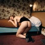
[←] Félix Edouard Valloton – Nude (1915); [→] Bettina Rheims – June 26, Paris from Chambre Close series (1991)
Juxtaposition as commentary
[←] Félix Edouard Valloton – Nude (1915); [→] Bettina Rheims – June 26, Paris from Chambre Close series (1991)
Juxtaposition as commentary
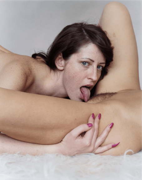
Bettina Rheims – MC6 II from Morceaux choisis series (2001)
I’m not especially familiar with Rheims work but from what I’ve seen of it, she seems to meet her subjects halfway.
What I mean by that is not something I know how to easily indicate. It’s kind of like this: most photographers/image makers operate with a reliable fixation on appearance as factual representation. In other words: they trade in the ontology of I can see this and I can show you this, so this must be ‘real’.
There’s a lot made of Rheims and her use of color in concert with insanely high quality printing to “[make] the flesh appears living and [contribute] a disconcerting realism.”
I don’t disagree with that summation. It’s more that I think the way Rheims uses her erotics as a mode of unsettling the viewer serves to create work that trades less in establishing sacred cow archetypes and more to show people as they are instead of how they would like to be seen or represented.
And isn’t that just the central tenet of artfulness–the dialectic between hyper-stylization as a destination in and of itself vs that rare effortlessness that takes oodles of effort to accomplish but the accomplishing carefully erases any sign of over-the-top intentionality on the part of the creator.
For something as heavily contrived as the above image is: shot in a studio, with precise lighting orchestration, there is something compelling about the way it absolutely doesn’t read as pornography in spite of what it depicts.
(Full disclosure: the above is not the image I wanted to post most of all. I am especially fond of this one from the same series but I couldn’t find a HQ scan of it, unfortunately.)
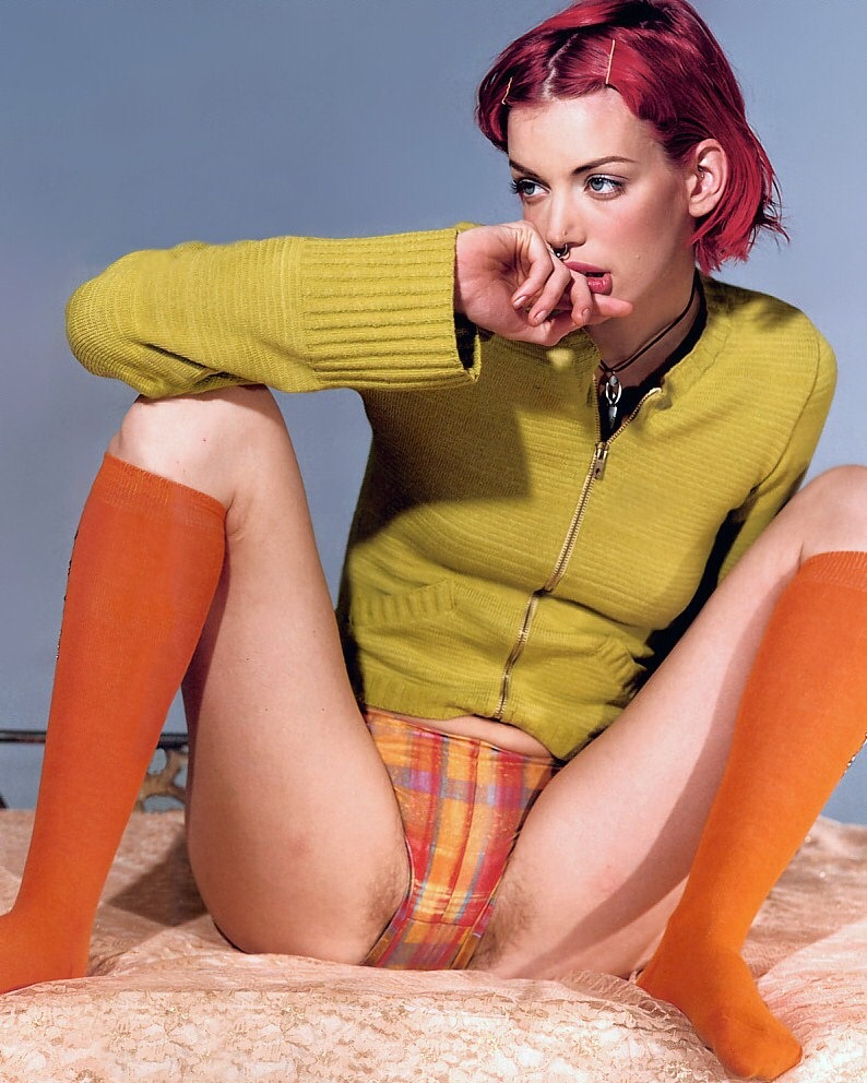
Bettina Rheims – Sibyl Buck (1996)
This is by no means a great photograph. The strobe mutes the edges of what would have otherwise been garish palate and the pose is over stylized to the point of contrivances.
Interestingly, both those complaints end up being turned in on themselves, transformed into functional elements. Her knickers are what ties the color together–the pattern includes the color of her stockings, her top, her eyes, her hair and the backdrop; her skin tone is of the same spectrum as the duvet. (If you want to look even closer: the offset between the predominately vertical lines of her underwear which also has the implication of horizontal lines that in turn emphasize the horizontal texture of the top.)
In fact, although the color isn’t as polished and the image appears almost forcibly restricted to the foreground, the loud color does remind me of one of my favorite images I’ve posted on here.
And although the pose is precarious, it manages to telegraph a zero fucks given self-confidence.
I also really like that this is using the form of a glamour editorial but instead of obvious airbrushing, there’s clearly visible pubic hair along her bikini line.
There’s the little touches as well, the bobby pins in her hair, the way she’s pushing her lip with her finger and her septum piercing are all thoughtfully rendered. The necklace though–at least to my eye–is distracting. The line against the neck is great but the pendant part’s metal against the black of Buck’s undershirt is like the sun glinting off something bright in the distance.
