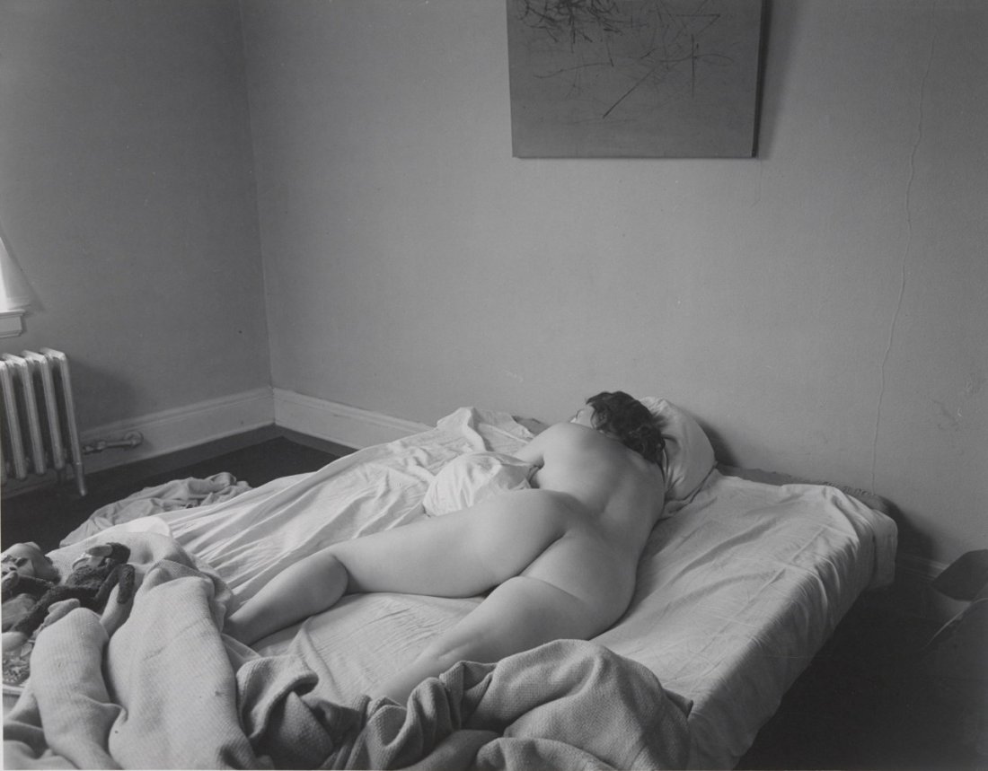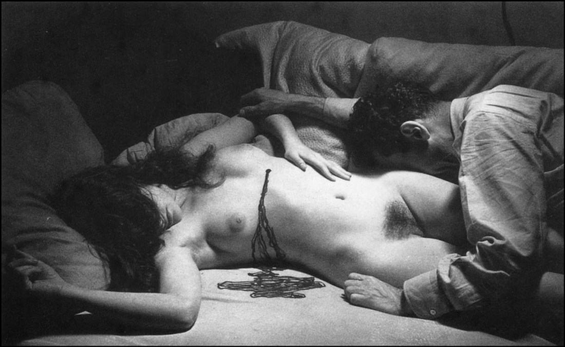
Man RaySelf Portrait with Dead Nude (1930)

Excluding the eleven years he lived in Hollywood to wait out the Second World War, Man Ray was an American artist living in Paris.

He moved in the same circles as Picasso and the two were well acquainted. I mention this–less to try to suggest any stylistic overlap in their oeuvres and more to distinguish between the degrees of overt sexism in their respective work.

By now, you’ve probably already seen Hannah Gadsby’s Netflix comedy special Nanette. If not, you should put a pin in this and go watch it now. (It’s exceptional on virtually every level imaginable but it’s act to is a brilliant riff on art history–specifically Picasso.)

Gadsby notes that Picasso offered this perspective on how he felt about women after breaking up with him:

Each time I leave a woman, I should burn her. Destroy the woman, you destroy the past she represents.

“Cool guy,” she follows up.

This isn’t even close to the worst shit Picasso pulled. But in so many ways, Picasso was a colossal, inexcusable and monstrous misogynist. Yet, much of his latent sexism is just as visible in other works of the time. This, for example: not only continues the art historical tradition of presenting female bodies in only specifically proscribed poses.

For example: Duchamp’s Nude Descending a Staircase, no. 2 was rejected from the 1912 Salon de Indépendants with the following note:

A nude never descends the stairs–a nude reclines.

(This anecdote was brought to my attention by PBS Digital Studios’ The Art Assignment’s The Case for Nuditywhich is a bit uneven but by and large worth keeping up with.)

In Man Ray’s photo above, the nude is once again reclining. She’s portrayed as dead–a chest wound ostensibly bleeding out onto the bed.

The photo is indicated as a self-portrait (and in that identification the identity of the artist is reaffirmed while the woman is little more than a placeholder) and it’s uncertain whether Man Ray found her already dead and then felt the need to embrace her one last time (a necrophiliac connotation) or perhaps he killed her and is now grieving her demise (a vampiric connotation).

Neither of these are particularly encouraging interpretations with regards to inherent sexism. However, whereas Picasso uses stylistics to bend, break and otherwise deface women in his work, there’s an honesty about what Man Ray is doing here that–while it does not absolve it of fault, it at least self-implicates the relationship between the author and the problematics.

For example: I read this now as a sort of inverted pieta. This in turn invites a reading of the manic pixie dream girl narrative–that, unfortunately, still exists. Also, you don’t have to stretch it very far to push this into feminist criticism territory–the way that men seek in female bodies, some semblance of salvation. (I’d argue that this lines up especially well with the history of pieta as religious symbol and the way modern pietas interrogate the problematics of Xtian history and the way the form is now moving towards being a trend welcoming of appropriation by sensualist humanists.

Source unknown – Title unknown (201X)

I always think it’s hilarious when someone like Lars von Trier or Luc Besson are accused of sexual harassment or assault, respectively–and the news is treated as if there’s a real question as to whether the accusations are true. For example: I’ve seen the entire back catalog of both men and given that it’s not actually difficult for me to believe the accusers. (Same with Woody Allen, honestly; like have you ever suffered through one of his preposterous, narcissistic films?)

But there’s also the backlash against these moves toward something more like parity of justice. Reactionaries tend to say things like: so I guess I’ll have to quit being nice to my female co-workers or else I might wind up saddled with harassment chargers. I find that a disingenuous rejoinder–if you are making the remark then you’re both aware that you said something that made someone else uncomfortable and feel that it wasn’t the big deal the other person made it out to be; in other words: you know that you’re behavior can be seen as a problem but you think it’s incumbent upon others to cater to your comfort level even if it means ignoring their own.

The point I’m making and what it has to do with this image is that in the immediate aftermath of #MeToo there were a group of prominent models that wanted to ban photos or images where the photographer/image maker reaches into the frame to touch the model’s body. (The folks in this case were arguing for a de facto ban on such images.)

I was super onboard with the spirit of the law in this case. I mean work by Insuh Yoon and 9mouth are intensely problematic with a lot of the stuff they do.

The letter of the law? Yeah, I’m less on board with that. So much has to do with context and across the board prohibitions tend to be problematic.

I think if you frame things as a photographer or image maker should never touch a model. That’s probably a good rule. However, I can see situations where touching the model is agreed upon. I’m generally very much against touching models in any way shape or form but as I’ve become friends with models and have built a solid foundation with them, things get a little more porous. When I do touch a model it’s usually to brush aside a loose strand of hair or to change the angle/way they are holding something. I’d never be comfortable touching a model as in the above image whether or not my hand was also in the frame.

But that begs the question as to whether or not this is a model. Like if this is two lovers and making images is part of some sort of ritual foreplay, is it wrong for their to exist images like this.

As gross as the trope of photographers and image makers who use their steady stream of lovers as models in their work, I do think there’s likely situations where it’s appropriate for a photographer/image maker to document things in their lives.

I’ve noted before that the bottom frame edge in any photo or image has an intrinsic functionality as a sort of fourth wall. So I think it might be better to first ask whether or not the viewer of the photo/image is a witness or a voyeur? (One of the biggest problems with work that features the photographers hand jutting into the frame is when it equivocates on whether or not the photographer/image maker is seen as a surrogate for the viewer.

The hand here is absolutely a surrogate for the viewer. The composition is voyeuristc and less documentary… except: it’s more complicated than that.

The depth of field is such that both the foreground and background are blurred. (And effect I adore.) In the background, the woman’s face is just enough in focus to determine that her face has taken on blissed out expression but the blurring allows her a degree of anonymity and privacy.

It’s clear she’s reach back to either indicate her anus or most likely to insert a finger to begin to loosen her sphincter for anal penetration. In most cases when a disembodied hand enters the frame if the hand is meant to read as the photographer/image maker’s there’s usually an emphasis on the taboo nature of the touch. It’s a possessive squeeze of a buttock or the spreading of labia, in this case the hand is more about maintaining the explictness of what is being seen while rendering it less graphically illustrative. That taken together with the flash and the ostensible scene of presumably a prelude to coitus–there’s something surprisingly sophisticated about this.

But that’s the other thing: this is one girl’s interpretation. Others’ mileage will almost certainly vary. Which is I suppose my point: I’m not very much in favor of a total ban or total permission. I suspect it’s really more nuanced than that and that given the language and familiarity with social, political and historical context I think the average person can easily learn to identify what’s maybe not ideal but is at least less outstandingly creepy and inappropriate.

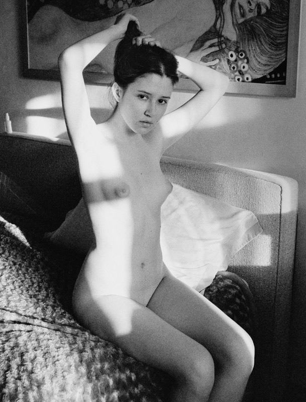
muse-of-maestroI’ve been lost in my own skin lately. The season is about to change and so, to, must I. (2017)

I see literally hundreds of boudoir selfies and self-portraits slide across my Tumblr dash every damn day–the idea is painfully self-same; the execution is almost universally shitty.

This, though? This is effing intriguing.

Yeah, you’ve gotta ding some points for the camera not being exactly level–but neither are the frames on the wall, so it could feasibly be that. (I’d bet that it’s both, fwiw.)

Also, it’s overexposed by more than a stop–the adage for analog being expose for shadow, develop for highlight gets reversed with working with digital; in other words: expose for the highlight by making sure the brightest area of the frame is what your exposure (when something digital is overexposed it leaves you zero data to work) and then add shadows back in post. (I’ll never be an adherent when it comes to digital but having just returned from Iceland where I shot an equal amount of film and digital for the first time ever, I can say that if you abide by this dictum, you’ll be able to correct things enough to get a usable shot in post.)

I actually copied this image into the iPhone editing interface–which is infuriating until you realize that the engineers have built out the workflow in such a fashion to teach the user through repetition how each adjustment interacts with the base image and subsequently applied adjustments. (Getting the hang of this will actually sharpen your Photoshop chops immeasurably.)

But yeah, I corrected the overexposure as best I could. (The rainbow artifacting along the left edge, near the middle is a result of the lack of data from overexposure.) Adjusted for a more balanced skin tone–added some shadows (if I was doing it in Photoshop I’d have gone back and selectively dialed back the shadows on the right most frame–which go too dark in this edit.)

Pushed the color just a little and then added a bit of a warmer cast.

And viola! You can see that although it’s imperfect there’s a bit of the feel of a Flemish oil painting to this–which is likely what I responded to upon seeing this.

image

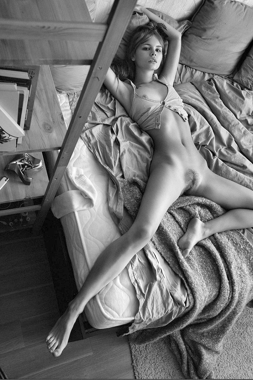
Dmitry ChapalaAnastasia Scheglova from La Mégère apprivoisée series (2015)

The composition here is so muddled and dunderheaded that I don’t even feel as if I can weighing in on whether or not it qualifies as #skinnyframebullshit–maybe, maybe not? What is even with this perspective? Are we supposed to interpret that bed as positive space and the Ikea shelf–why does everyone I know have this shelf, it’s ugly af–floor and rug as negative space? :::shrugs:::

Why am I bothering with this picture then? More specifically: why am I bothering with Chapala’s work at all? (It’s not like he’s especially good at what he does… he lacks the edginess/audacity of Giancomo Pepe and there are times when I effing swear he’s genuflecting in Marcel Pommer’s general direction. (Not to say he has never produced interesting snaps… he has a handful that are almost good. I simply feel his work is nearly completely derivative. He seems to be this breed of image maker that insists upon himself and his ‘fine art bonafides’ and folks just go along with it because the work superficially conforms to some arbitrary median threshold…)

Again, why bother? Well, in this case, there are two reasons. First, it seems as if every snap from this session is available online–a sure indication of less than adequate editing rigor.

I want to circle around to two of the more widely circulated shots from this series; both echo each other as far as composition–far more sensible but it still doesn’t entirely work. In one the woman has her eyes open, in the other her eyes are closed.

As far as order goes there’s a sense that the picture above preceded the other two. The falling trajectory of her left hand across the three images suggests that the subsequent order is eyes open then eyes closed. (You’ll notice–also–that the other two have had the contrast dialed up compared to the one above.)

The angle of view and the position of the ugly Ikea shelf contribute a feeling that the viewer of the image has walked into a room with which they are familiar and have found a beautiful, naked woman comfortably stretched out on the bed.

The second image is Playboy softcore-esque; the third is more unsettling given the first and second image. It suggests that either the woman is no coyly pretend as if she’s napping or worse–that this is sort of an on the fly revision, a sort of masturbatory fantasy change on the fly. (”I walk in and she’s stretched out on the bed, gazing coquettishly at me. Wait, no… she’s alseep…” Yeah, I like that better.”)

Point number two w/r/t why bother with this image is despite the litany of flaws with the above image, it does actually do something a lot of fine art nude work fails stupendously at: aligning a candid perspective with actually candid body language.

I recently realized there’s a way to describe this as long as you don’t mind a minor digression. Okay? Cool.

Mark Twain’s The Adventures of Huckleberry Finn is one of the few books I’ve actually had to read on three different occasions across years of schooling. As you’ll recall, Huck runs away, encounters Jim and then hears about a drowned body found on the river. He wonders if it’s his father so disguising himself as a girl, he approaches the abode of Mrs. Loftus to seek information.

Mrs. Loftus quickly puzzles out that something isn’t quite right and so she challenges Huck to three tests: she has him toss a lump of lead at a rat, thread a needle and finally the old woman tosses a lump of lead into his lap to note how he catches it. He fails each test. His aim is true with the rat, he thoroughly botches threading the needle and instead of opening his legs to let the material of his dress act as a trampoline to catch the lead, he slams his legs shut to avoid the potential of getting his gonads struck.

There’s a way in which supposedly candid shots always seem to have this demureness that undercuts the scene. As humans we carry and arrange our bodies different based on whether we are in public or in private. In public, we tend to favor decorum over comfort, in private, it’s the other way ‘round.

In other words: there’s a tendency with the sexualization inherent in the male gaze, frequently candid work features extremely stylized and self-consciously demure poses. In effect, there’s a tendency for the subjects in candid fine art nude work to make the same mistake as Huck–responding instinctively instead of naturally.

This doesn’t do that–which despite it’s numerous flubs–is actually to its credit. However, I will admit that the two subsequent images sort of screw with that by subverting the comfortable naturalness to the end of something that I can’t help by read as holding some sort of unsettling psychosexual implication.

Source unknown – Title unknown (19XX)

I’m not 100% sure the framing works here–both his legs and here right shin are amputated in awkward places. While there is very much a sense of context–i.e. a boudoir, there’s a flatness to the print that does no one any favors.

On the plus side: I’ve never seen the above position enacted in porn prior to viewing this–it’s rather charming; emphasizing giving over receiving and I simply adore they way their lazily holding hands and caressing each other.

Also, that Cheshire smile she’s wearing would’ve been enough on its own to convince me to post this.

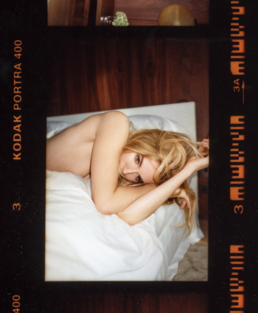
Tom CraigSienna Miller (2014)

There are a number of interesting aspects to Craig’s work.

The thing that stands out predominantly to me comes as a result of my time as a student of film making. In my program, there was one student who cultivated a persona not unlike Francesca Woodman while she attended RISD–essentially, I am the personification of commitment to excellence in craft and the fulfillment of the future of art in my medium due to my vast reserves of talent and genius.

This kid–let’s call him Martin–held that it was art if it was able to be replicated identically. In other words, a measure of the artistic merit of a work of film meant that with infinite resources, it would be impossible to recreate exactly a sequence or scene. The art in cinema for Martin was in its singularity.

That’s one thing Craig is exceptional at–providing a sense that his camera not only carefully parses the visual world to not only show the viewer a scene but to instruct us subtly on how to see the scene with which we are shown. (Here I am thinking less of the above and more of this or this one on the top right.)

He’s a bit of a chameleon. His approach to various commercial efforts demonstrate a surprising versatility. Eddie, London (2014) has a sort of polished flat affect; it looks corporate and commercial. Yet, appearing as such this carefully diminishes the clever, preciousness of the work. The result is playfully coy, offhand and casual in a way that marries the aesthetic to the conceptual underpinnings in an unexpected manner.

In other work, he’s riffing splendidly on William Eggleston or re-imagining Paul Graham. One thing that is almost consistent across his work is his use of light. I mean, to my eye it’s obvious that he’s obsessed with Joel Sternfeld–the attention to light in any of his images suggests this but in particular, the light in this is pretty much in line with virtually any color plate in American Prospects. (Oddly, even this doesn’t stay 100% consistent across the work. Consider this new-ish image with it’s recollection of the sort of dreamy haze in someone like Paula Aparicio’s work, mashed up with an affinity for Uta Barth, Andrew Wyeth and Whistler filtered through a mash of UK flavored ambience.

Lastly, I think the vertical orientation in the above is intriguingly utilized. Given the bed and the position of Miller’s body, my own instinct would be to use a horizontal frame. However, one of my objections to #skinnyframebullshit is that the compositional logic that the orientation echoes the positioning of the subject within the frame is not an acceptable reason to fly your camera on it’s side before firing the shutter. But it works both ways… the rationale for a horizontal frame instead of the vertical above is predicated upon a specious, knee-jerk association. In practice, had this frame been horizontal it would’ve contributed a sense that Miller is merely recumbently lazing about. Instead, the skinny frame encourages the eye to drift up and down–reinforcing that Miller is by no means a layabout and is actually rather pensive.